
From a Paint Regret to a Dream Dining Room: A Client Case Study
This client hired me because she hates decorating.
Not just in an "I'm too busy" way. But in a "I've tried, multiple times, and it never looks like it does in my head" way.
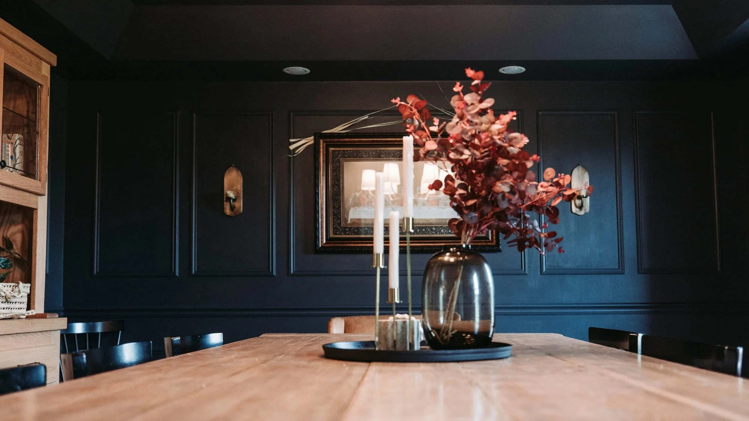
She'd buy something, hang it, hate it, and feel like she'd just lit twenty bucks on fire. In fact, she reached design paralysis after she painted the dining room walls a moody green (Jasper by Sherwin-Williams, and genuinely a beautiful color) and realized it wasn't what she'd hoped. That's a rough place to be. You pick a good color. You spend time and money painting a whole room. And it's still wrong. At that point she wasn't just tired of decorating; she was discouraged by it, which is a whole different animal.
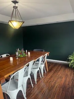
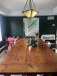
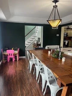
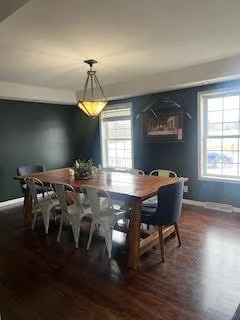
The one bright spot in the room was a chunky dining table her husband built by hand. Everything else? Basically a blank slate. So we weren't tweaking a room; we were starting over, with one gorgeous, non-negotiable anchor piece to build around.
Figuring Out the Direction
There were also some built-in challenges: red-toned flooring that wasn't going anywhere, a tray ceiling that needed to feel intentional instead of just there, and this one's non-negotiable with kids in the house: everything had to be durable enough to survive actual family dinners. Washable, wipeable, no precious fabrics (because parents with young kids deserve beautiful houses, too!)
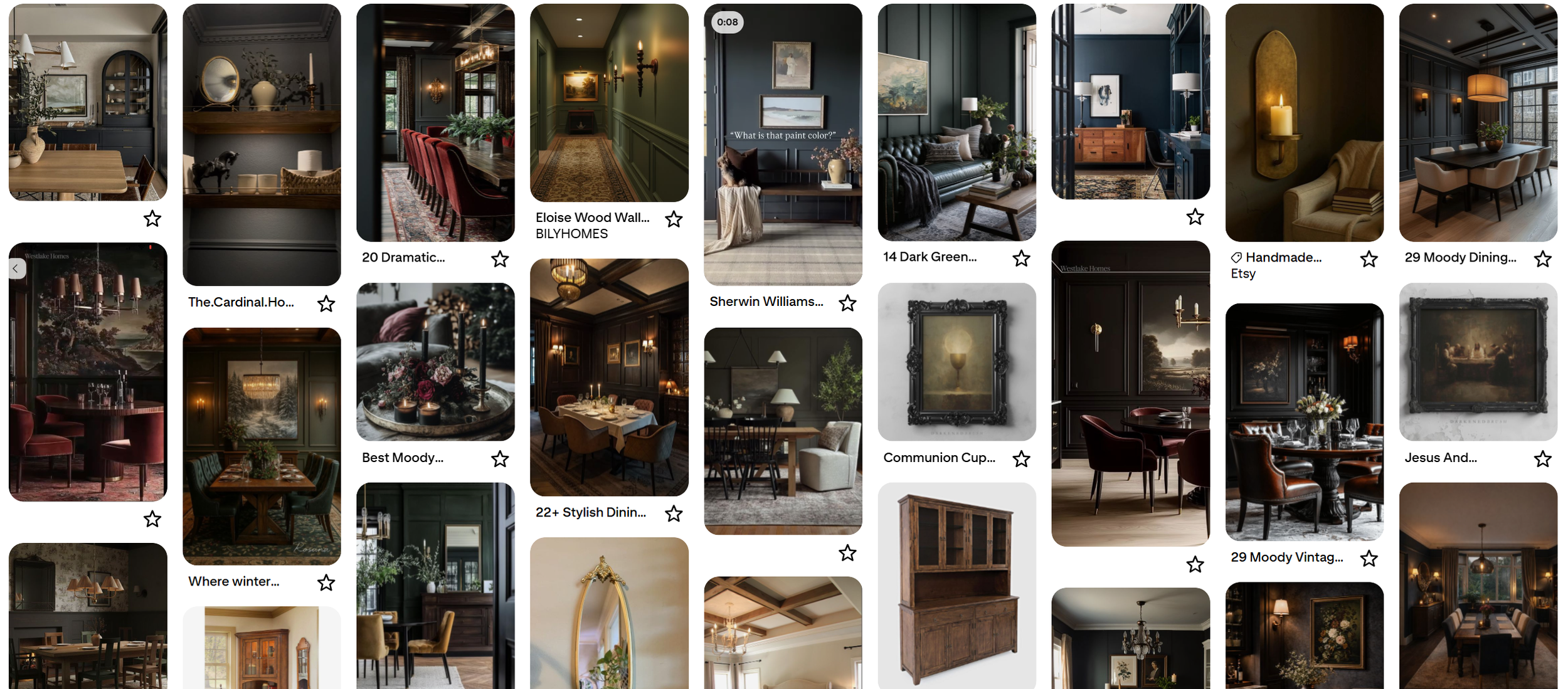
Before we touched anything, I built a shared Pinterest board for my client and me, as I do with every client. I find it gives people a way to show me what excites them without them having to figure out the design terms. At our first meeting, we scrolled through it together, and the throughline was obvious: dark walls (no surprise, given the moody green she'd already committed to), plus a lot of traditional touches: wall trim, a statement chandelier, formal captain's chairs anchoring each end of the table.
This was the perfect time to pull out my paint decks and find some colors that were more in line with what my client pictured. We landed on Cyberspace by Sherwin-Williams, same moody depth but slate blue instead of green. She tested it on the wall, and it was an immediate yes. No hemming, no second-guessing. Once the paint was settled, everything else started clicking into place.
Making the Plan Real
Although we landed on a paint color, the walls still felt like they needed something more. Since my client's style leaned traditional, picture molding felt natural, but to keep it from looking fussy, I pushed for color-drenching the whole room, molding included. I'll be honest, that suggestion got a nervous look at first. Painting your ceiling, walls, and trim the same color feels like a big leap on an average day, but even more when you've already been burned by one paint decision. But once I explained what it would actually do: let the tray ceiling settle into the background instead of hogging attention, and let the molding read as texture instead of a statement, they were in.
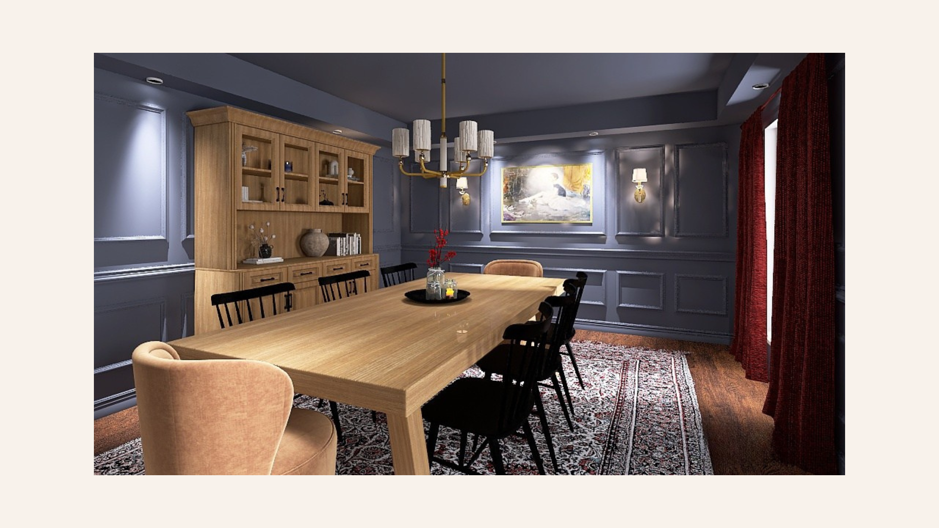
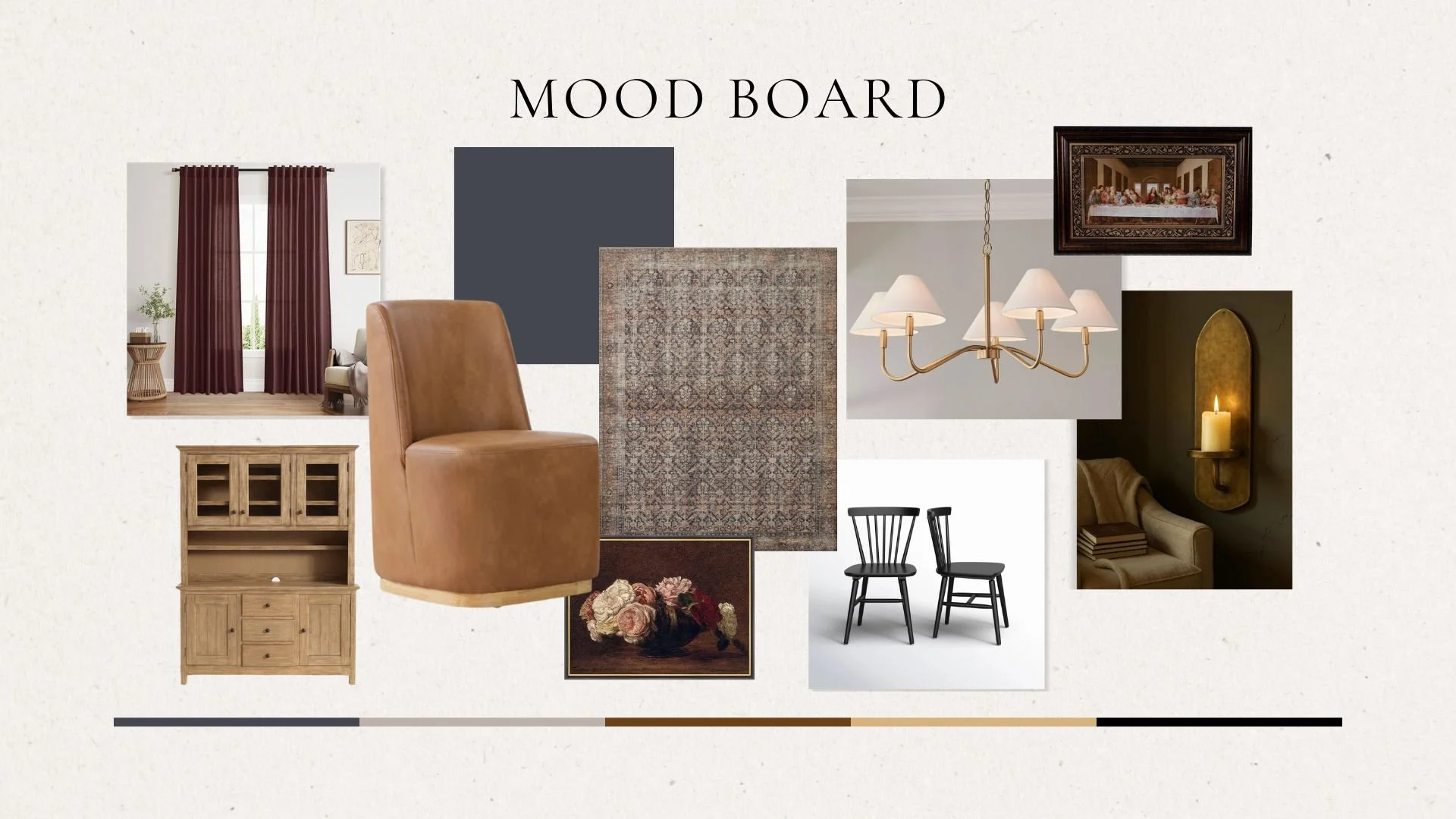
As an anchor piece and for functional storage, we wanted to incorporate a hutch on one of the larger walls. My client and her husband found the perfect one at a nearby woodworking shop. We decided to have it stained a light wood color to add contrast to the space and keep it from feeling too heavy. The table her husband built got a refinish in a matching wood tone.
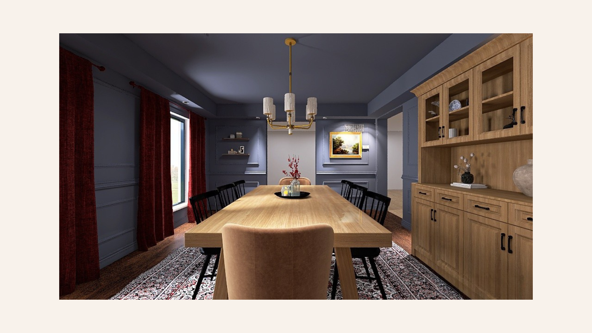
Then came the chairs, and this is where the "hates upkeep" brief really mattered. The old fabric captain's chairs were a nightmare to keep clean, so those got swapped for a caramel faux leather (wipeable and they swivel, which nobody asked for but everybody loves). Classic black Windsor chairs fill out the rest of the table.
Grounding it all: a low-profile patterned rug, chosen specifically so spilled juice and dropped snacks wouldn't be a crisis. Burgundy linen curtains pick up a pink undertone from the rug, add a little texture without blocking light, and, bonus, hide fingerprints far better than anything lighter would. A brass semi-modern chandelier ties into brass sconces and a picture-rail shelf, and a few faux stems in burgundy tie the color story together.
The Reveal
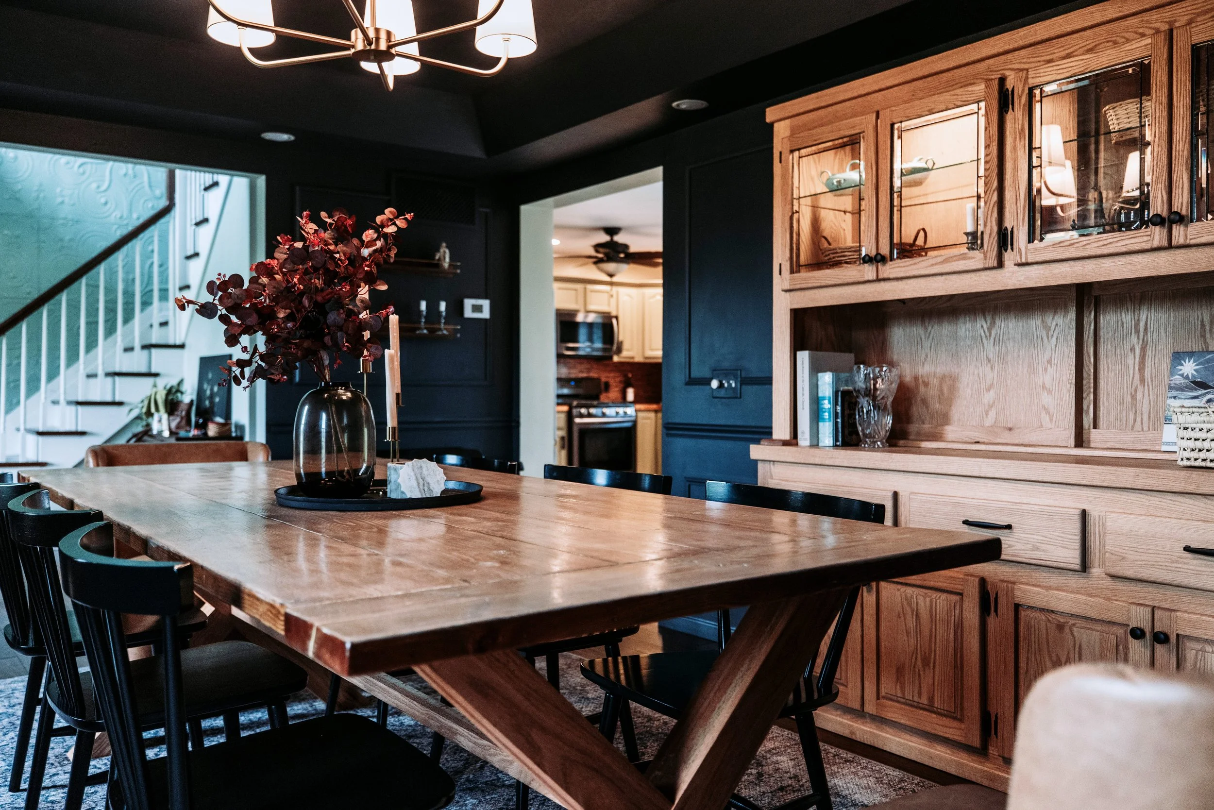
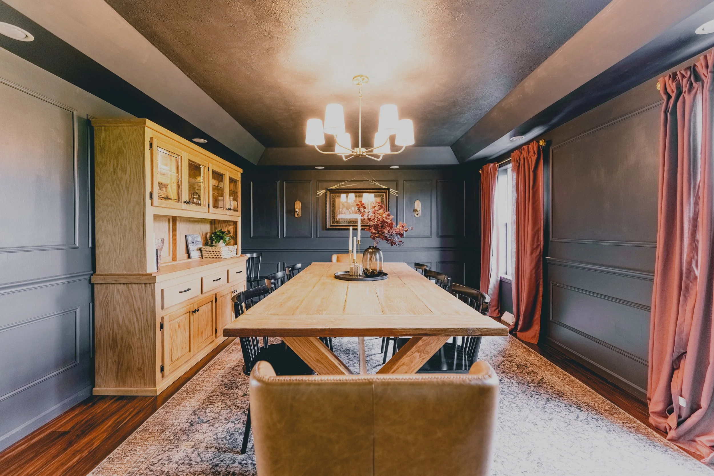
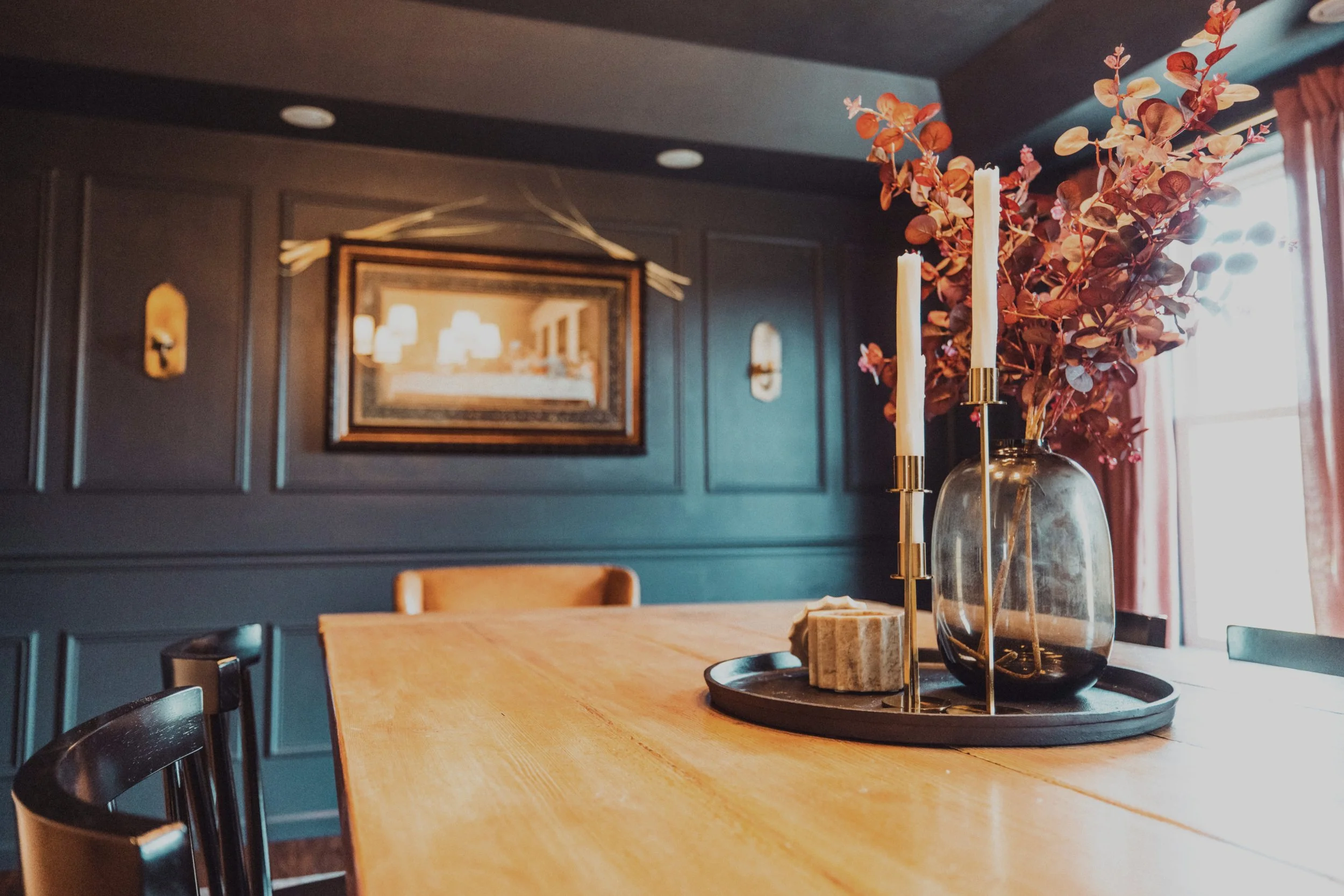
When it was all done, my client walked into a dining room that didn't feel like a compromise, a paint mistake, or a pile of decisions she'd second-guess for the next five years. It felt finished. It felt like her. And she didn't have to pick a single swatch to get there.
Her only complaint? Now the dining room is so good it makes the rest of the house look sad by comparison. Which means I'll be back, and honestly, I can't wait!

Want to see more?
If you're ready to stop decorating alone (or just want to see the room in full), here's where to go next:
Work With Me
Hate decorating too? Let's talk about your space.
Powder Room Remodel Reveal
Another small space, another moody transformation: see how the same bold, go-all-in approach plays out in a powder room.
Slate & Brass Dining Room: Full Portfolio Gallery
See the finished room in full, without the play-by-play.