Office Renovation Reveal: Before, After, and What's Next
Renovations are one of my favorite things. Transforming a space into the vision I see in my head is incredibly rewarding, especially when the transformation is extreme. But sometimes, even the best-designed spaces aren't meant to last—they're meant to evolve.
In this post, I'm showing you two rooms I designed three years ago... and explaining why I'm tearing them apart.
Where It All Started
If you've followed along with our building journey, you may be familiar with our office building renovation. If not, let me catch you up!
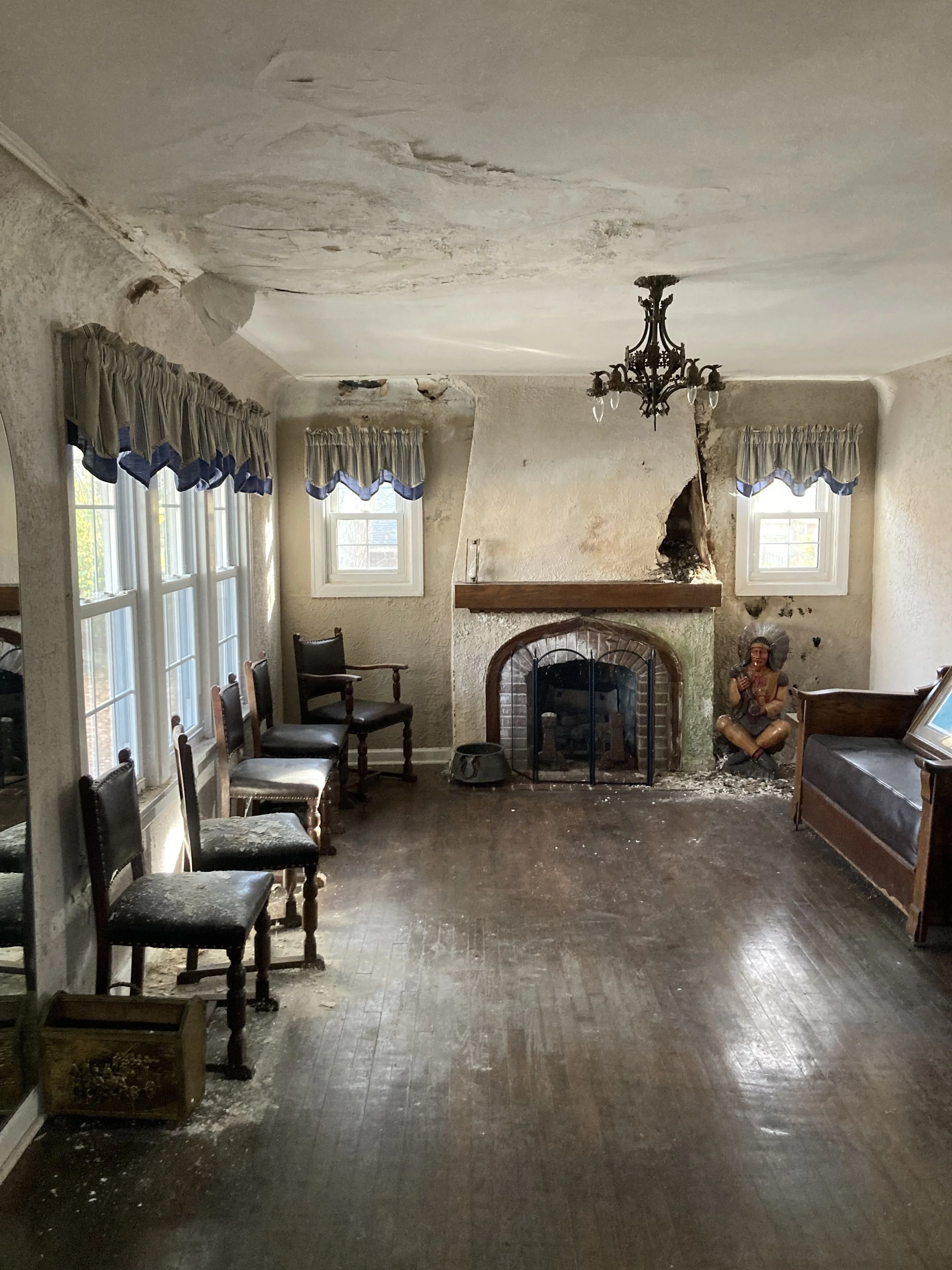
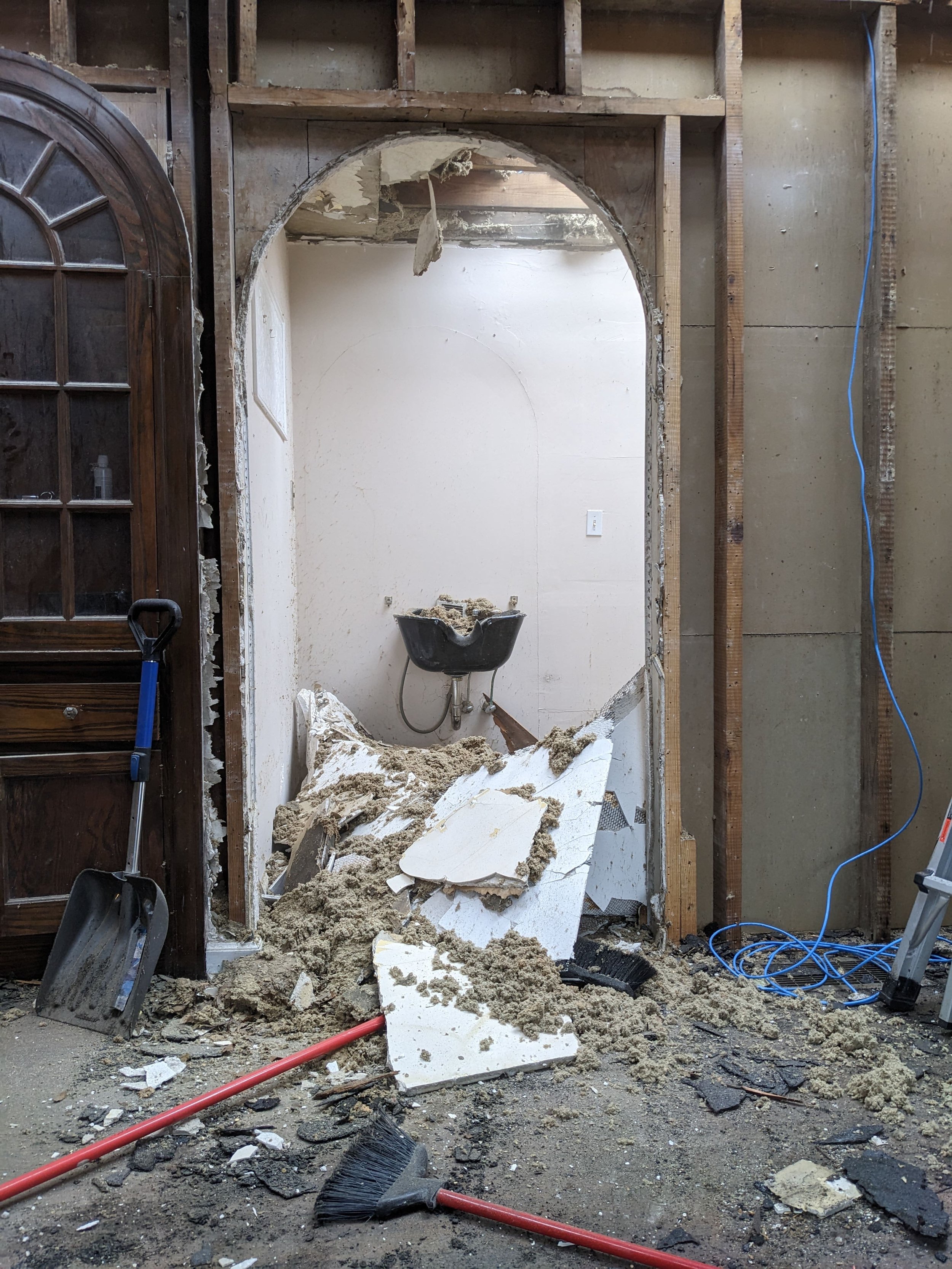
Four years ago, we purchased an old hair salon that had seen better days with the intention of converting it into an office for my husband’s real estate business.
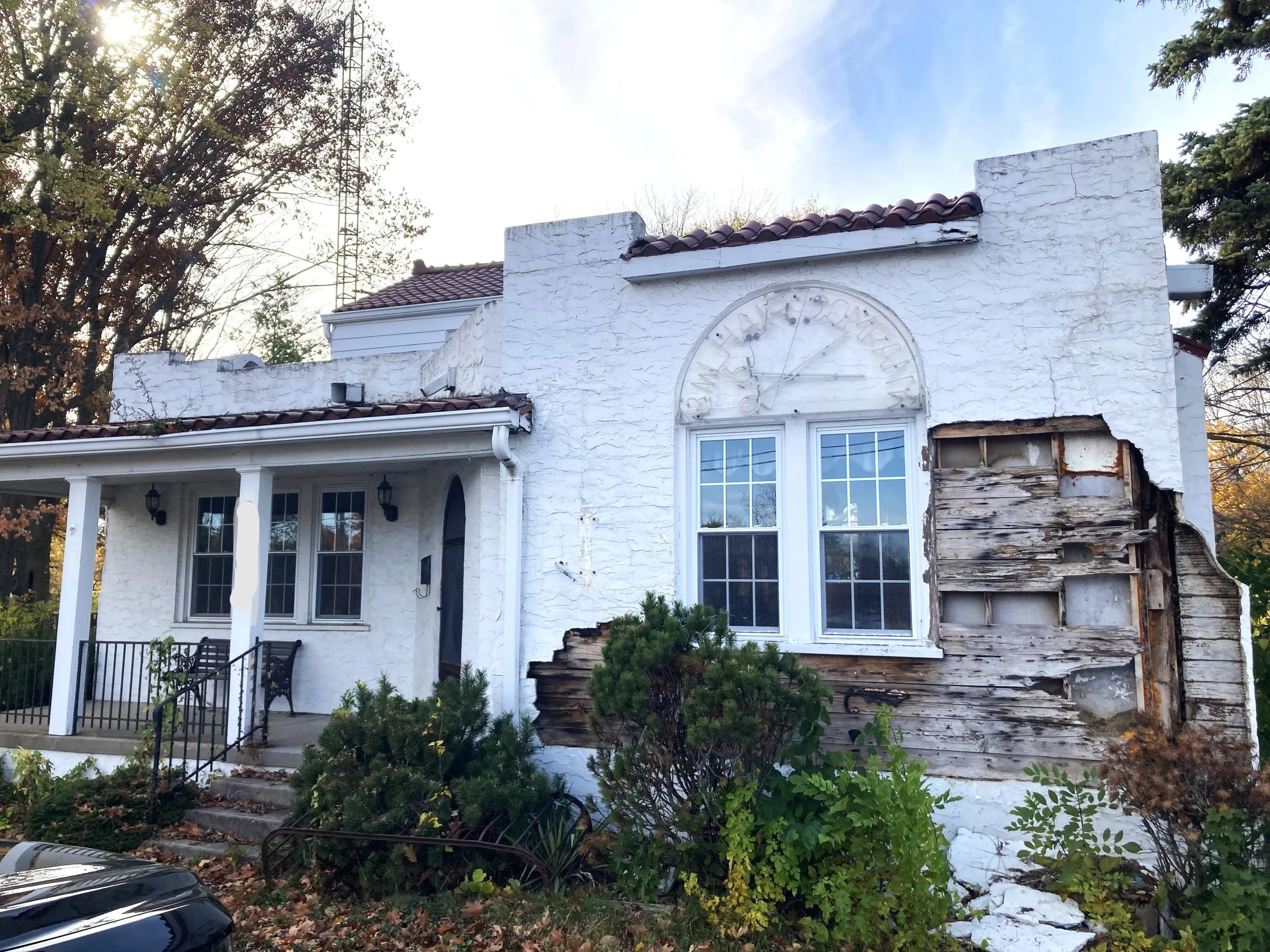
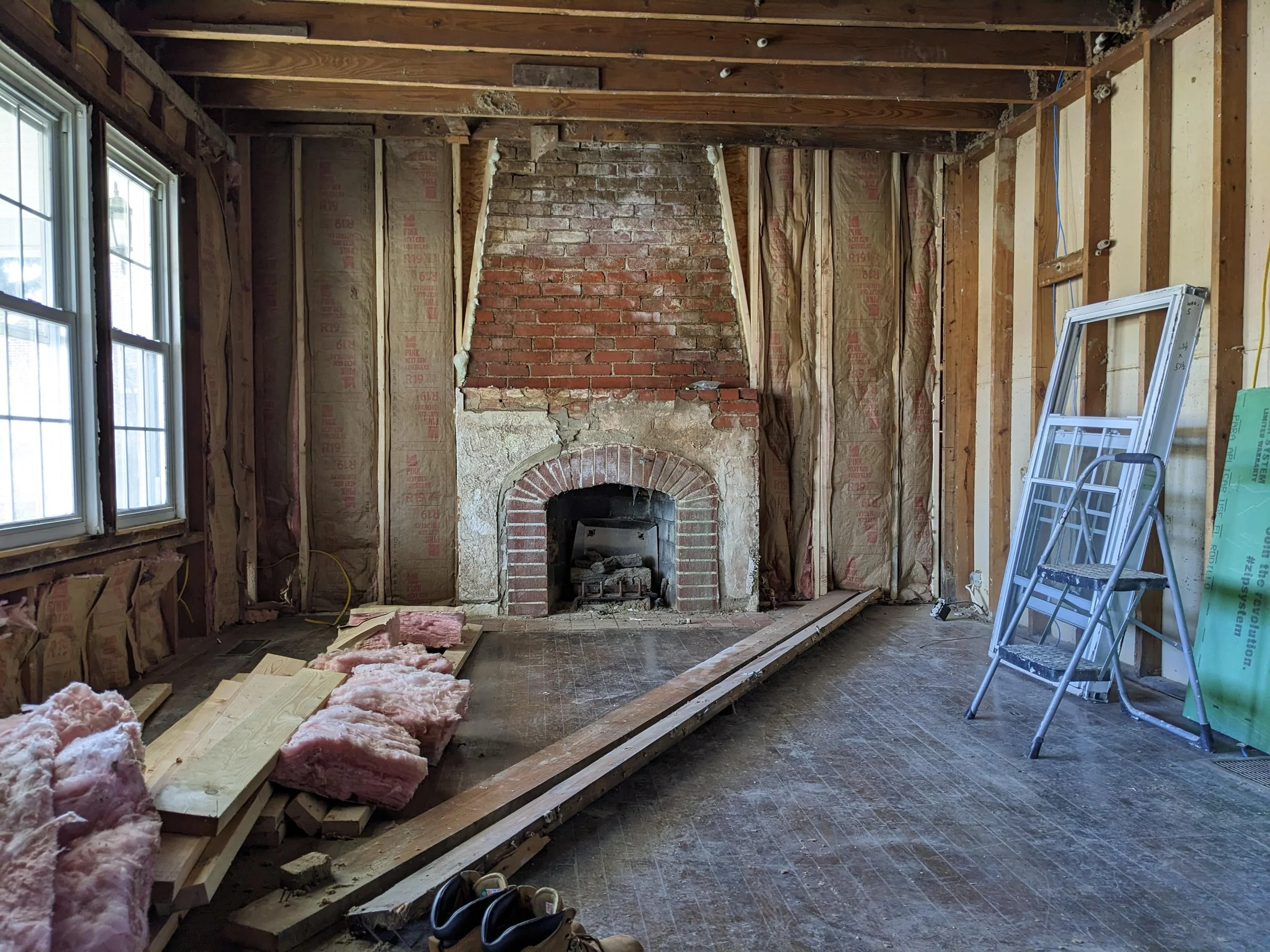
We spent a year renovating the building, which required gutting it to the studs (and removing 30 tons worth of rubble in the process). In the end, we were left with the blankest of canvases.
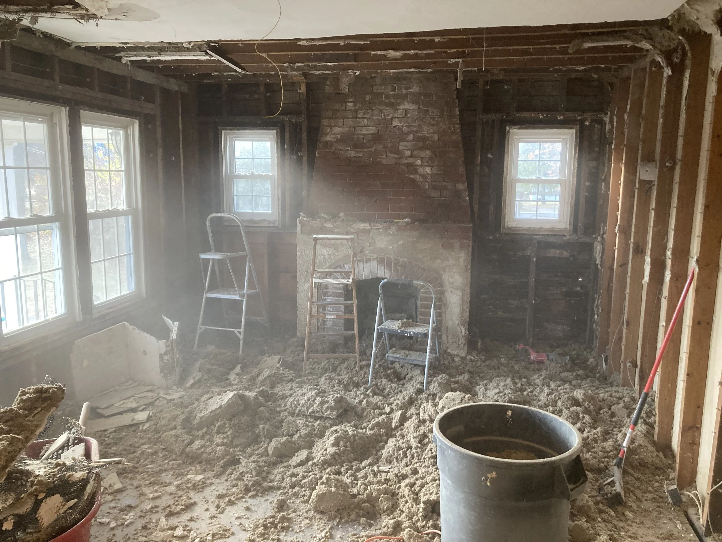
During that time, I shared progress of the renovation along with design plans for each room. The unique design challenge was creating commercial office space that broke away from the typical sterile corporate aesthetic—balancing warm, inviting residential design elements with professional functionality.
I loosely leaned into the Viking theme (the company is Viking Realty, after all) by using earthy colors, slightly masculine finishes, and natural textures without being too "on the nose."
But I never actually shared the final product. Other projects took priority, and these reveals got pushed to the back burner.
So, while it may be a little delayed, I was recently able to get photos of a couple of the rooms I’m proudest of in the building: the conference room and lobby. So now, for their official entrance, please enjoy the…
Office Lobby and Conference Room Reveal
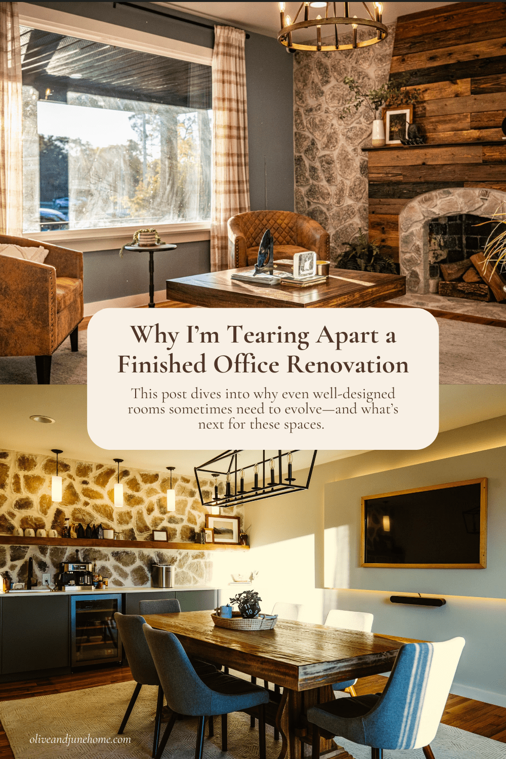
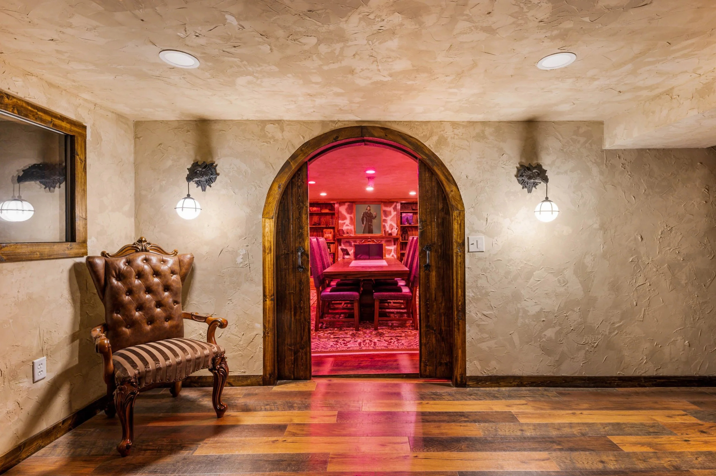
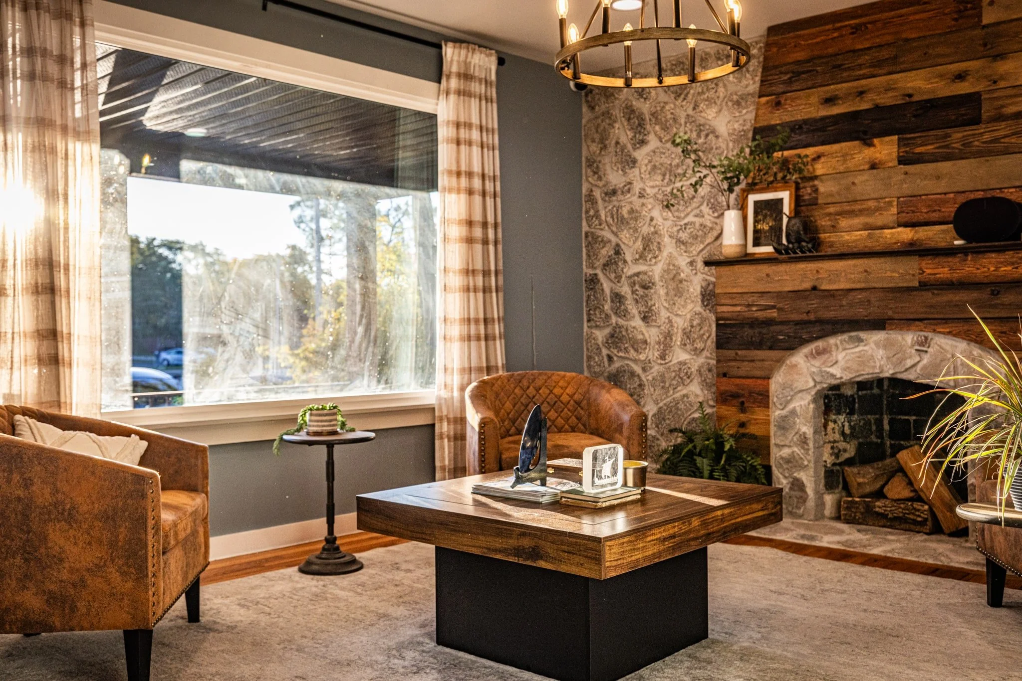
The Lobby
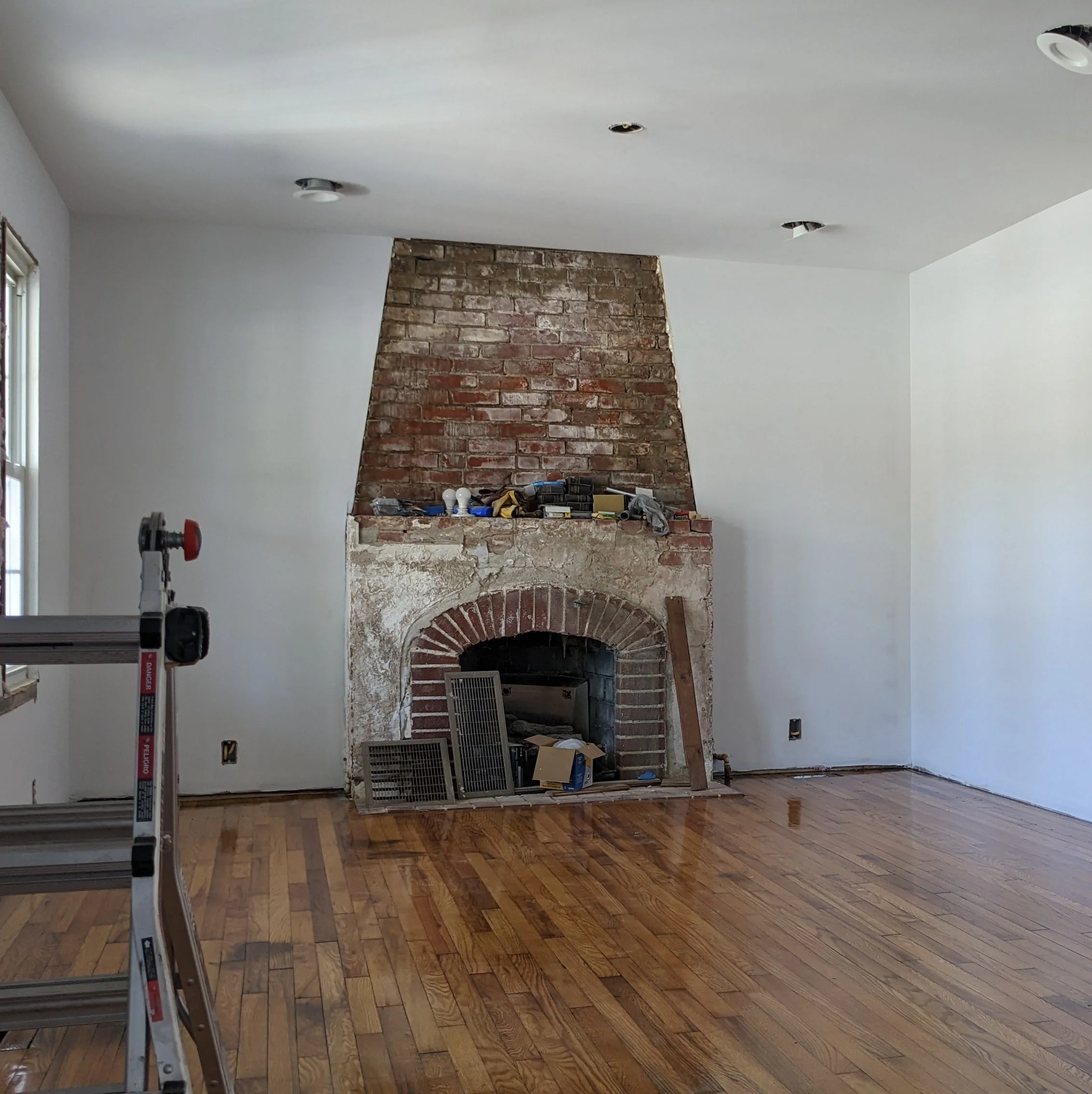
The lobby, with its perfectly positioned fireplace, was the most obvious place to start. It was immediately clear that the fireplace wall needed to become even more of a focal point.
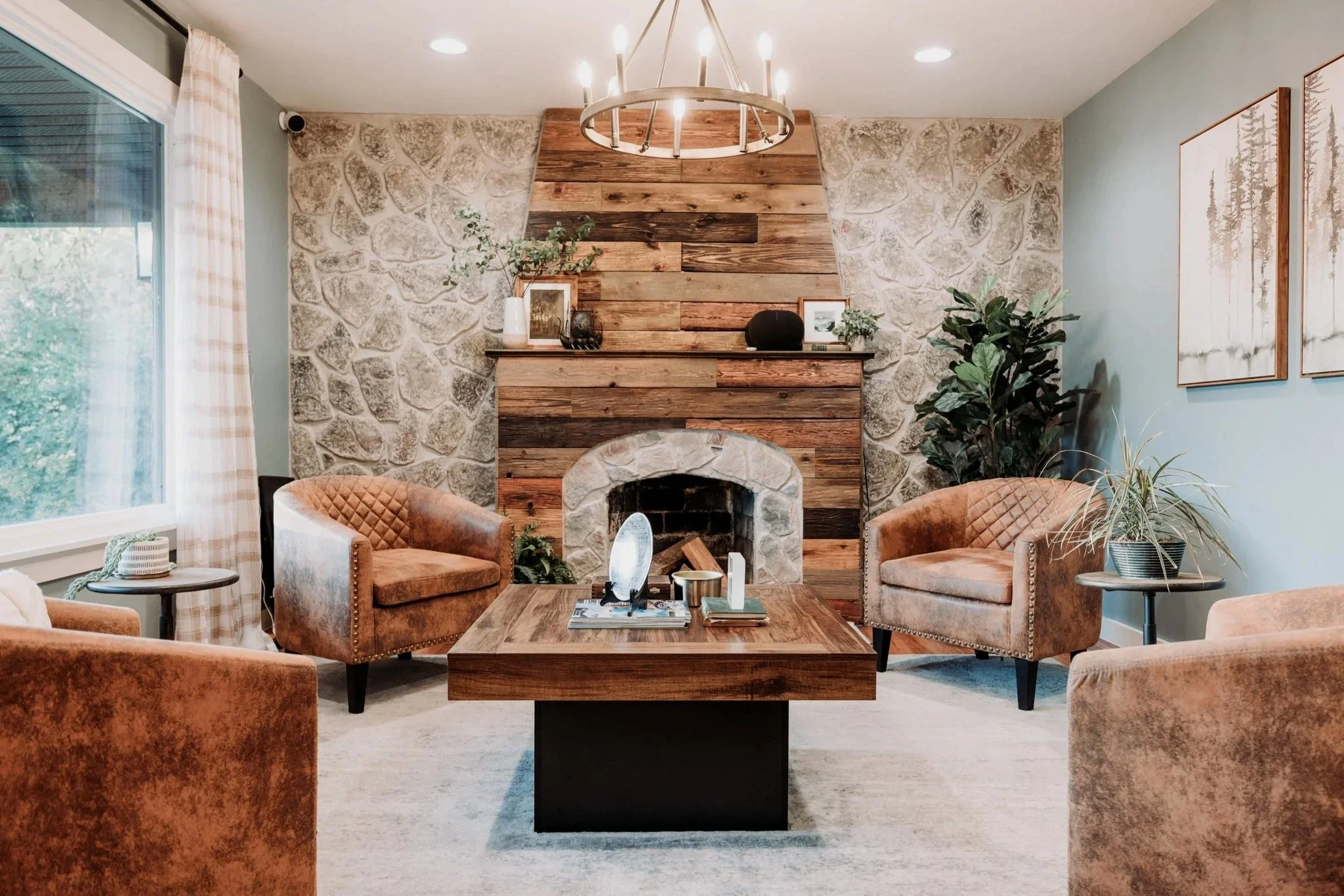
The original brick with stucco was in pretty bad shape, so we took the opportunity to clad it in distressed wood, which we stained with different shades for added interest and that true reclaimed wood look. On either side, we removed the failing windows and I experimented with hanging stone veneer that I softened by over-grouting.
We layered lighting with a mixture of recessed lights and an overhead wagon wheel chandelier. I painted the walls a soft blue color (Debonair by Sherwin-Williams), which adds another layer while still acting almost as a neutral. It’s seriously the perfect mid-tone blue!
We swapped three smaller windows for one large picture window, giving the building more of a business presence. On either side of the window, I hung plaid curtain panels in a sheer fabric to add a little femininity back into the space. I grounded the room with a subtly-patterned gray area rug.
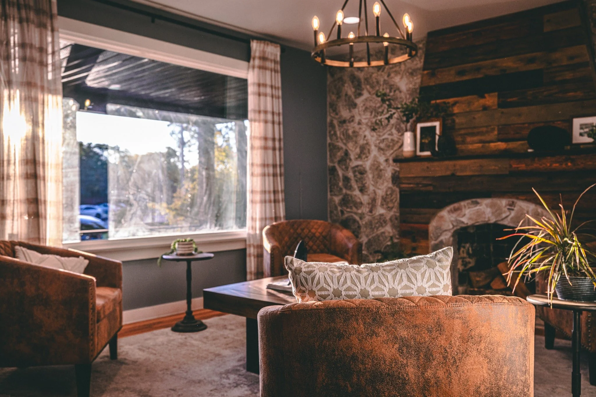
Four matching barrel chairs around a table create an inviting gathering spot where clients, visitors, and staff can hold meetings, work solo, or simply sit and talk (or "lobby," as we've come to affectionately call it)
The design principle here was layering - adding texture through the stone and wood, depth through varied lighting, softness through textiles. Each element balances the others to create a space that feels collected rather than decorated.
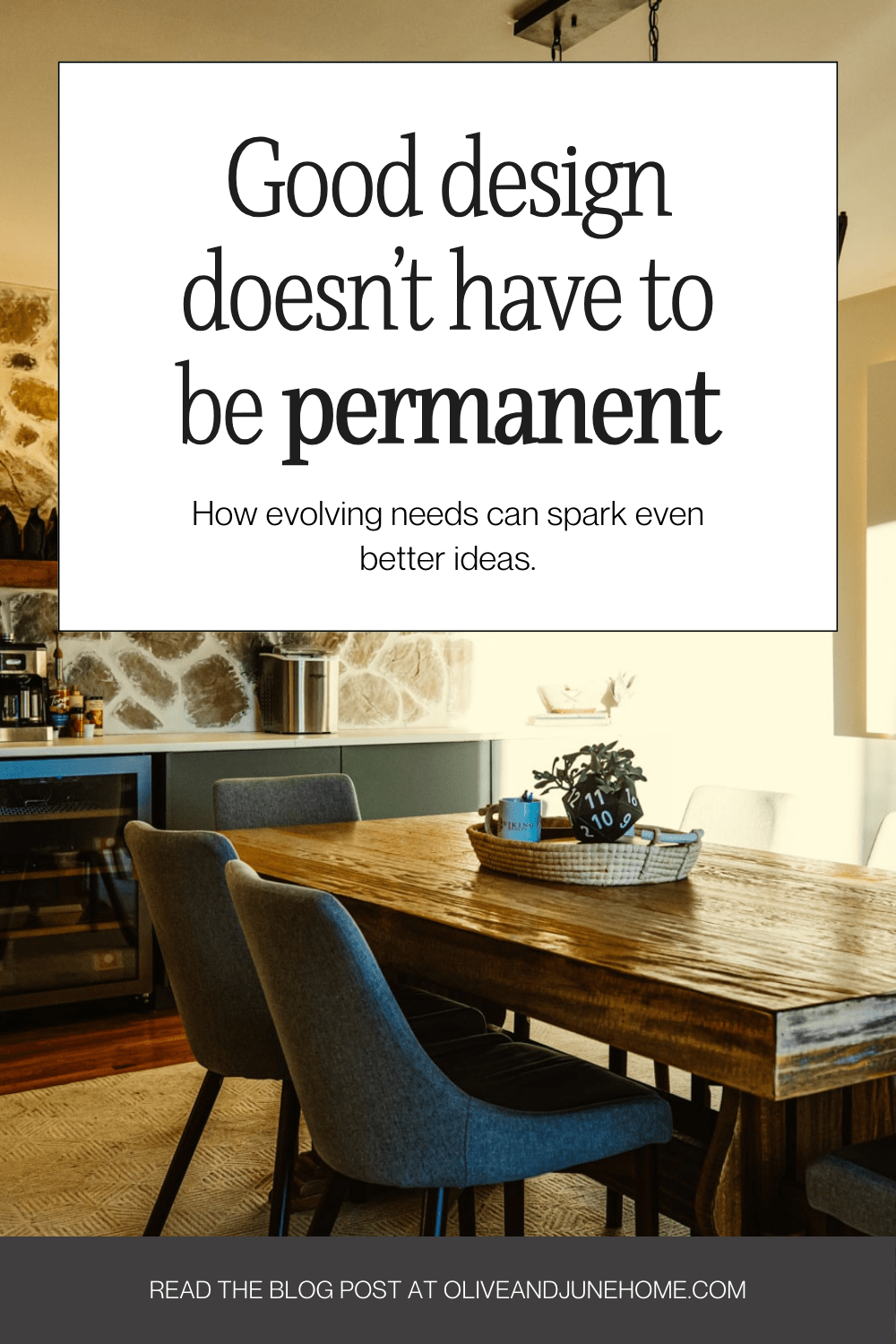
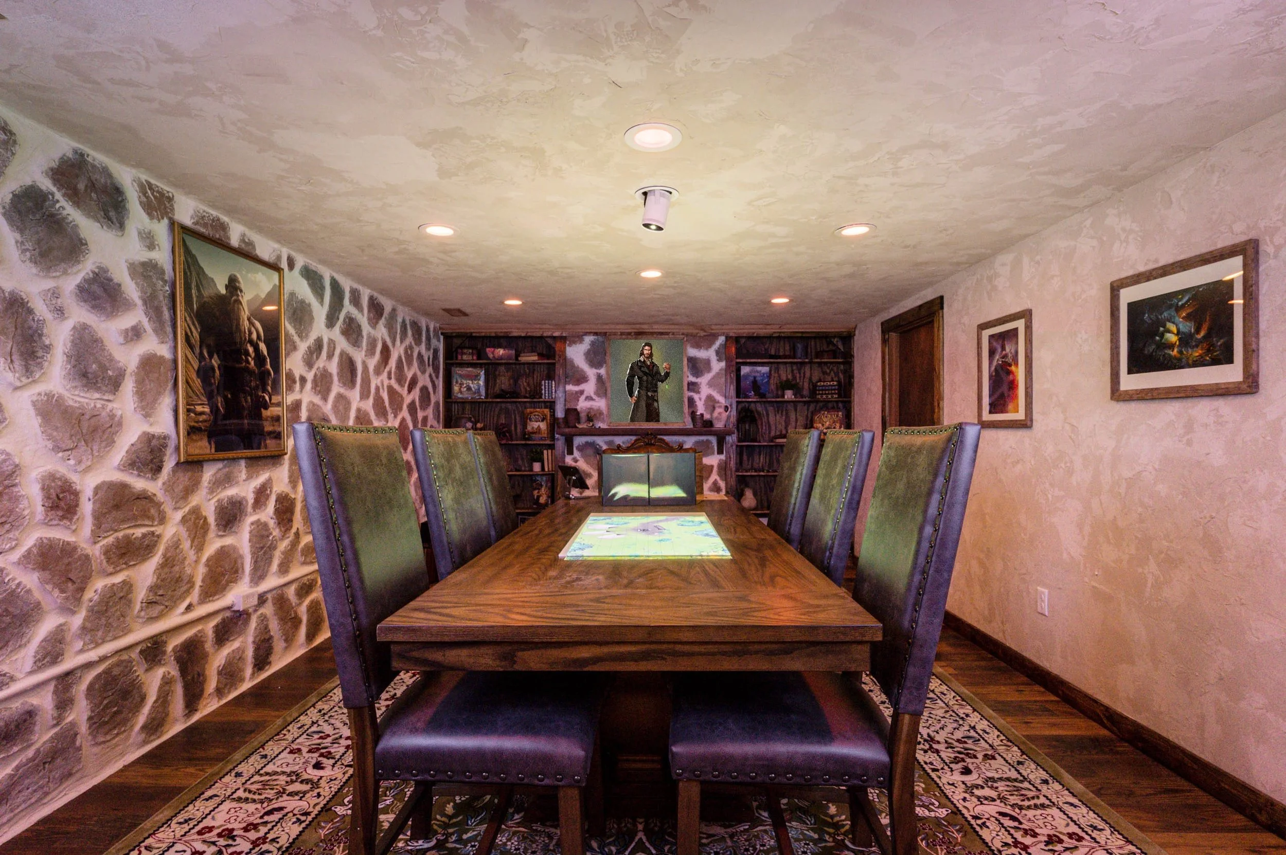
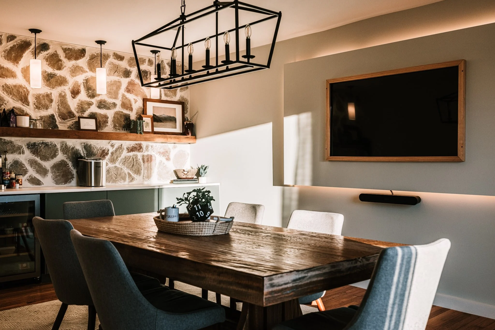
Conference Room Reveal
Directly next to the lobby through an open doorway is the conference room.
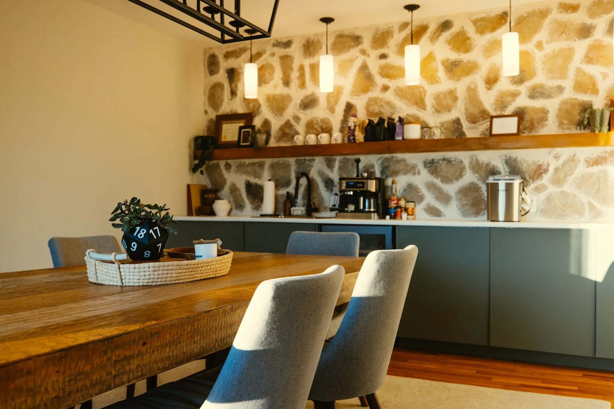
In this space, we built a kitchenette along the back wall, which once housed hair-washing stations for the salon that took residence here prior to us.
I repeated the stone veneer above the countertop to tie back to the lobby. Then I built a super-duper long floating shelf to break up the stone, incorporate more wood tones, and add functionality.
To keep the space feeling modern, we installed cabinets with slab doors in a grey/green color along the length of the wall, paired with a row of sleek pendants.

One challenge in commercial spaces is making them feel custom rather than cookie-cutter. The floating shelf and mixed materials gave this conference room character while maintaining the clean, professional aesthetic needed for client meetings.
Layered lighting was an important aspect of this large room, too. While we have the pendants over the kitchenette, I also incorporated a chandelier above the table, which stylistically pairs well with the chandelier in the lobby, as well as recessed lighting evenly distributed throughout the room. To top it off, we built a faux wall with LED lighting behind it for the TV mount, which breaks up the long expanse of wall and creates depth.
As another callback to the lobby, the same curtains are hung in this space. The table also references the lobby with its chunky, rustic wood frame. The chairs balance the rawness of the table with their clean lines. Because this room has quite a bit pulling your attention, I chose to keep the walls very neutral with a custom off-white/gray color.
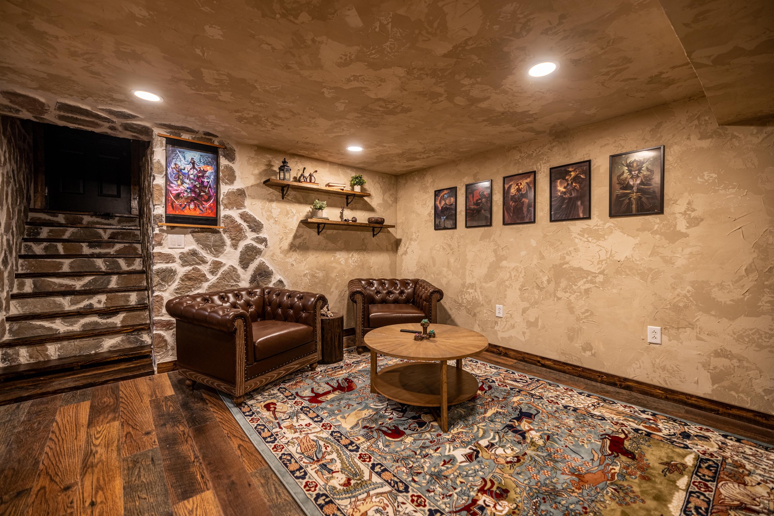
D20 Dungeon Renovation Recap
Once the renovation of the main parts of the building was complete, we identified an opportunity in the unfinished basement. What if we could further increase the value in our building by turning the unfinished basement into usable square footage? What if we took it one step further and created something that didn't exist in our area? That something happened to be an immersive, rentable tabletop gaming venue. The D20 Dungeon became my most ambitious design project yet.
This project pushed me beyond traditional interior design into experiential design - creating an environment where atmosphere is as important as function. The design goal wasn't just beautiful and functional; it was transportive.
You can see more pictures and get the full reveal in this post.
It's been humbling to watch this concept succeed. Press coverage, frequent bookings—birthday parties, graduation celebrations, weekly campaigns—and daily walk-ins curious about the giant red dice on our roof have validated that thoughtful design creates spaces people want to experience.
After the success of the D20 Dungeon (a true collaboration between my husband's business instincts and my design execution), we're ready for the next phase: opening a D&D-themed retail store. The only problem is, we don’t have any other rooms in our current building to use… or do we?
The Twist
While the lobby and conference room make a great professional impression for real estate clients, they don’t get used nearly enough, and my husband, being the business-minded individual he is, can’t stand it. So… we’re re-renovating them to become retail space. But this won’t be your ordinary game store.
Here's the design challenge: How do you transform professional office spaces into inviting retail while maintaining cohesion with the D20 Dungeon below? The solution isn't just swapping furniture for shelving - it's reimagining customer flow, lighting design, brand identity, and the overall experience from the moment someone walks through the door.
D20 Retail Store Design
It would be easy to remove all the furnishings, add some shelving, load it up with merchandise, and open the doors. But where's the imagination in that? Where's the excitement? Where's the pizzazz?
I'm not here to run a retail store—I'm here to design the coolest game store you've ever seen.
Rather than creating a traditional game store layout, I'm designing two distinct but connected retail experiences that bring the D20 Dungeon's immersive world to street level. The lobby becomes The Apothecary. The conference room transforms into The Blacksmith's Workshop. Each space has its own identity while maintaining design cohesion throughout the building and incorporating even more fantastical flair. Let’s dive in!
The Apothecary
Picture this: you step through the front door, and you're greeted by a gnarly, aged tree growing out of the corner of the room. It stretches to the ceiling and beyond, branches extending outward. That’s the first impression I can’t wait to give our visitors - but I’m even more excited to extend that same level of wondrous immersion throughout the entire retail space.
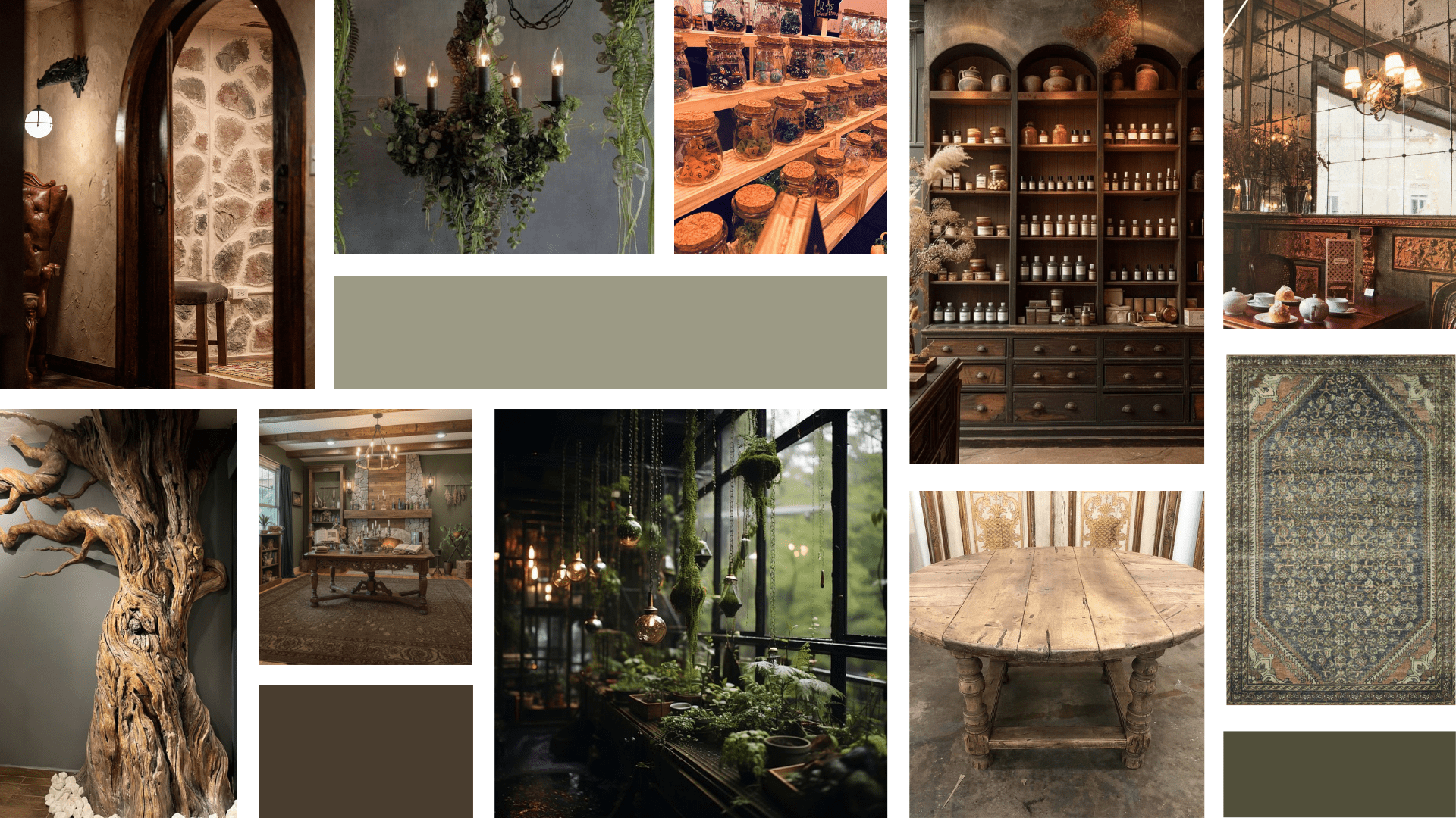
To the left of the tree, three custom floor-to-ceiling bookshelves will play into the apothecary aesthetic with dark stain, carpentry detailing, and maybe some Easter eggs (wink wink). Beyond aesthetics, the bookshelves provide a functional merchandise display. To fill the center of the room, I picture a chunky, antique table—a table that has seen some things. A table with character.
A large, patterned area rug with earthy colors will anchor the center of the room. I'm pulling the wall color from the rug—likely a soft green that adds dimension while receding into the background.
The fireplace wall stays as-is with the addition of floating shelves. I'm keeping the recessed and overhead lighting, as they create the layered lighting we need both functionally and aesthetically. To add texture, I'm carrying the Dungeon's wall treatment onto the ceiling. Theme-appropriate beams will finish the space, pulling wood elements to the ceiling.
The Blacksmith’s Workshop
Rather than extending the apothecary theme, I'm giving the conference room its own personality. That’s why I’m designing it around a blacksmith’s workshop aesthetic. Repetition creates cohesion. Carrying the ceiling beams into this room is a no-brainer for character and continuity.
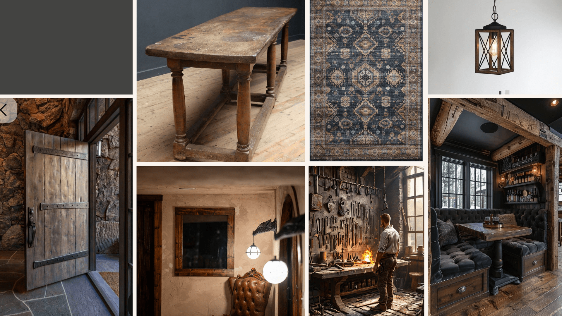
I'm keeping the veneer over the kitchenette for continuity, but making other changes in this area. The cabinets are in good shape, but they’re the wrong color and style. To keep costs reasonable, I plan to cover the cabinet doors in wood-look contact paper. Swapping the pendants for a more rustic style transitions the space from modern to medieval.
For that dark, smoky, blacksmith shop feel, the walls and ceiling will be painted charcoal gray - Iron Ore by Sherwin-Williams, specifically. The area rug will be swapped for a darker, moody design that coordinates with the Apothecary rug.
Strategic shelving includes a pegboard around the TV (painted to match the walls) for hanging merchandise, plus other smart storage and display solutions.
Final Thoughts
I won't lie—it was a bit of a punch to the gut when my husband suggested redesigning the lobby and conference room. I was proud of those designs and genuinely enjoyed spending time in those rooms! But the excitement of a new design and new adventure is undeniable, and I'm deep in it now.
This project reminds me why I love what I do: taking a space—whether it's an unfinished basement, a dated office, or a room that just isn't working anymore—and transforming it into something that makes people stop and say "wow."
If you're sitting in a space that isn't quite right, or you have a vision you're not sure how to execute, I'd love to help. I work with clients on everything from full renovations to design consultations—residential and commercial. You can reach out here on my contact page or send me a DM on Instagram @oliveandjunehome.
In the meantime, make sure you're following along to see what these retail spaces become. The Apothecary and Blacksmith's Workshop are going to be something special. You won't believe your eyes!
See you next time!

More From This Building's Transformation
Ready to see how this all began? Catch up on the full journey:
We Bought a Hair Salon (And Turned It Into An Office)
Where it all started—the moment we purchased this building and the vision we had for it.Office Renovation Updates
Follow along with the original gut renovation that transformed the old hair salon into our office building.New Office Lobby & Reception Design
The original design plans for the lobby—the space that's now becoming The Apothecary.Office Conference Room Design
The original design plans for the conference room—now transforming into The Blacksmith's Workshop.Airbnb, But Make It D&D: Introducing the D20 Dungeon
How we came up with the idea to turn the basement into an immersive tabletop gaming venue.D20 DND Dungeon Reveal
The full basement transformation—designing an experiential space that proved immersive retail could work in our building.D20 Retail Space Design Updates
The D20 Dungeon retail renovation took a major turn. Get a behind-the-scenes look at the new immersive gaming hall concept.