Color Drenching Tips for Open Floor Plans
The Smart Way to Drench an Open Concept in Color
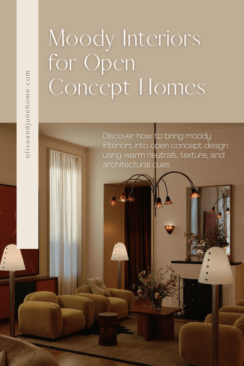
If you’re dreaming of a moody color drenched space but you’ve got an open concept floor plan, I hear you. It’s a common conundrum—especially with how popular open layouts have become. One of my readers recently asked this same question. Here’s my take:
Reader Question
I just purchased my first home with my fiancé and I want it to have a traditional/moody color drench feel to it. The only issue is that it’s an open concept plan and I’m having a hard time visualizing how to do that without the color becoming overbearing. Do you have any tips?
My Answer
The easy answer here is to say, “Go bold and go all in!” But even I know how scary that can be—especially when it means painting every wall and ceiling the same color. You’re justified in your hesitation.
In an open floor plan, color drenching can walk a fine line between dramatic and overwhelming. But there are ways to pull it off without feeling like you’re living inside a paint swatch. Let’s break it down.
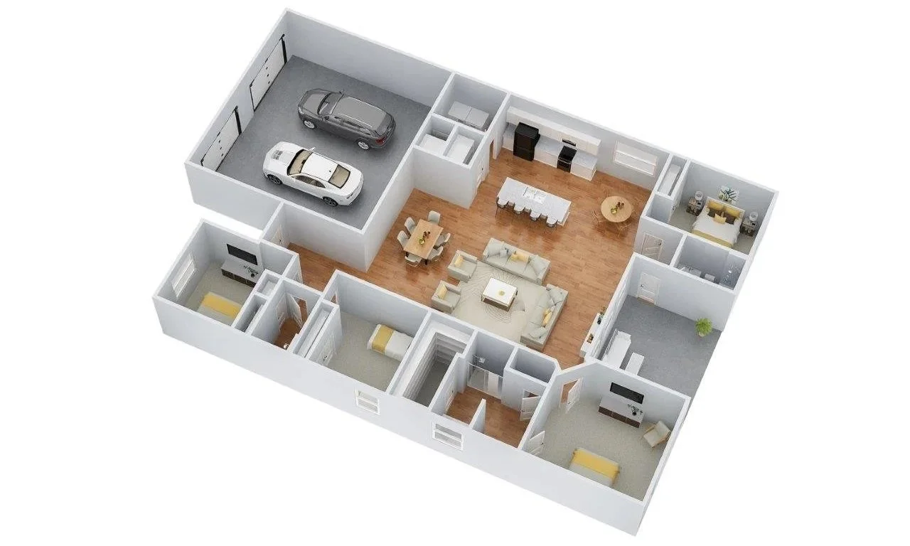
Create Visual Breaks with Architectural Transitions
One strategy? Add visual or physical breaks between zones.
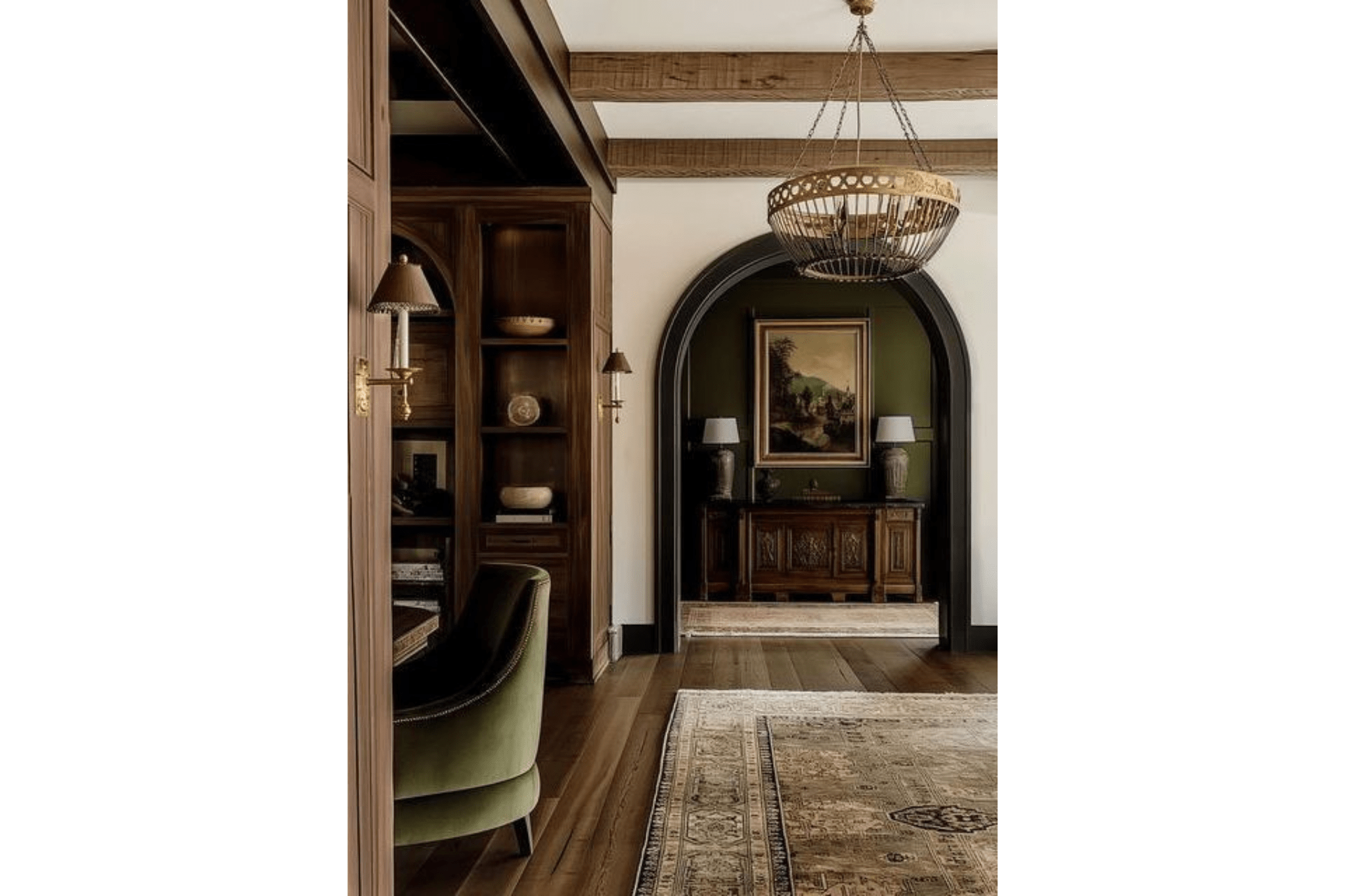
Image Source: Unknown
Think framed openings, built-ins, ceiling beams, or even subtle shifts in floor height. These create definition without closing off the space, and give you the flexibility to only color drench one area at a time. Bonus: these tricks also support that traditional moody home style you love.
That said, if your space has wide sightlines (which yours does), actual framing might be expensive and maybe more than you want to tackle right now.
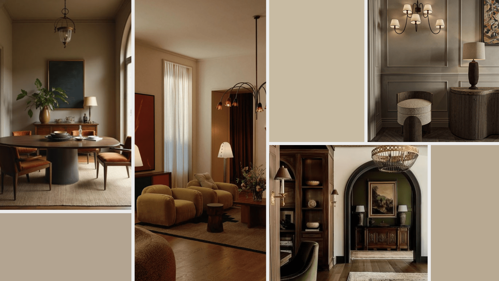
The Warm Neutral Hero Option
My favorite (and let’s be honest, most practical) solution for a moody open concept space is to use a warm, rich neutral paint color throughout.
I know, I know. “Neutral” doesn’t sound exciting. But hear me out.
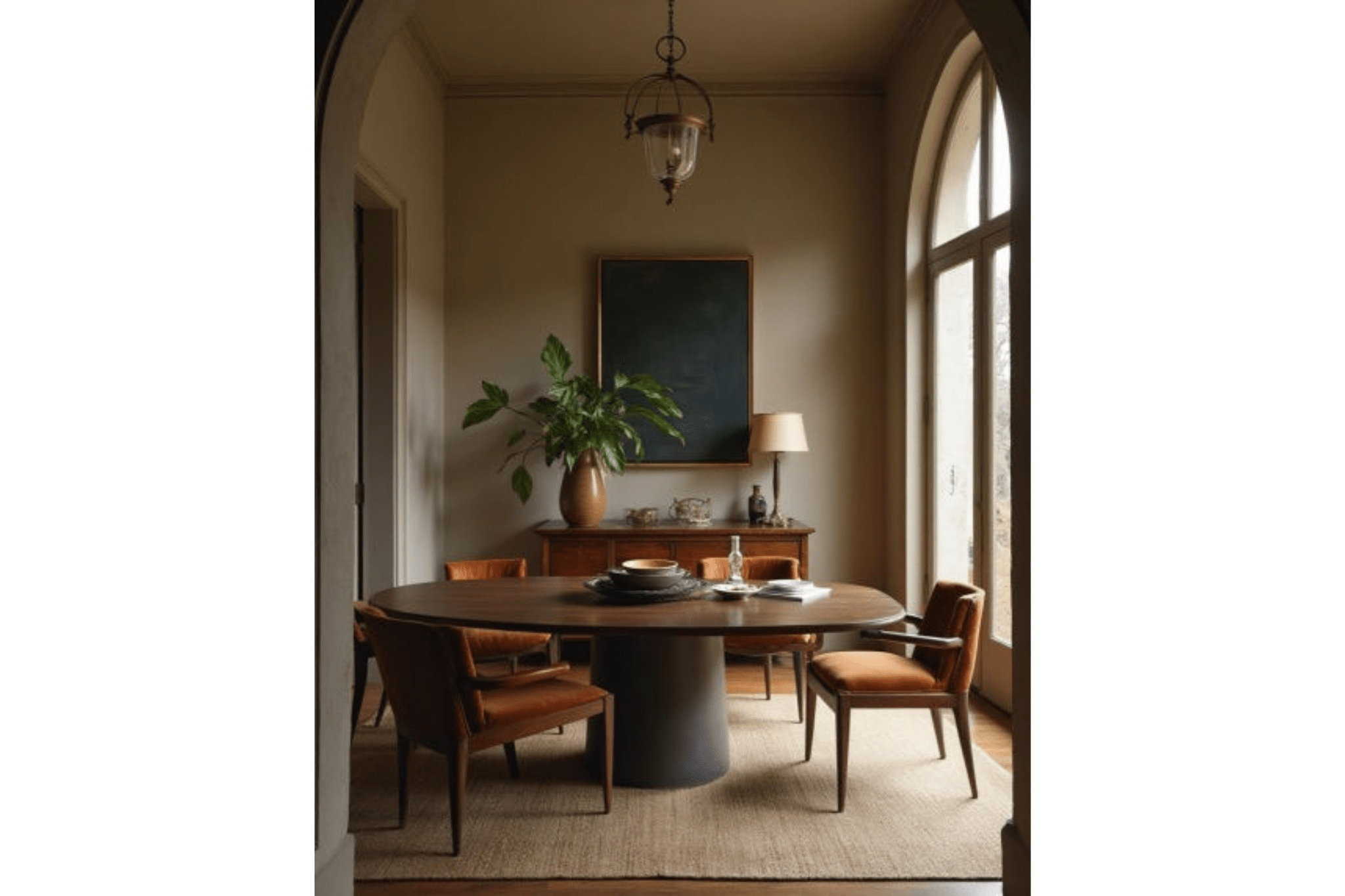
Image Source: Unknown
Choosing a neutral doesn’t mean boring. It means longevity. It means comfort. It means you won’t get sick of it two months after painting your walls, ceiling, and trim. Warm neutrals—think mushroom, taupe, oatmeal, or muddy greige—give you that cozy, cocooned vibe without sensory overload.
They’re soft enough to live across multiple “rooms” in an open concept, but still moody enough to set the tone and act as the perfect backdrop to layer in other pieces.
Below are a few colors I recommend to get you started. And no, you won't find any stark whites on this list. Bright white is the absence of color, which is the opposite of what we’re going for here. We're talking inviting, layered, vibey neutrals.
Warm Neutral Paint Colors for Moody Interiors
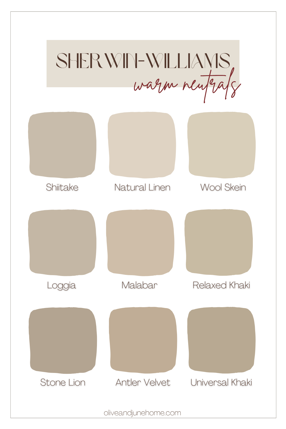
Tip: Always sample! These colors can read very differently depending on your light.
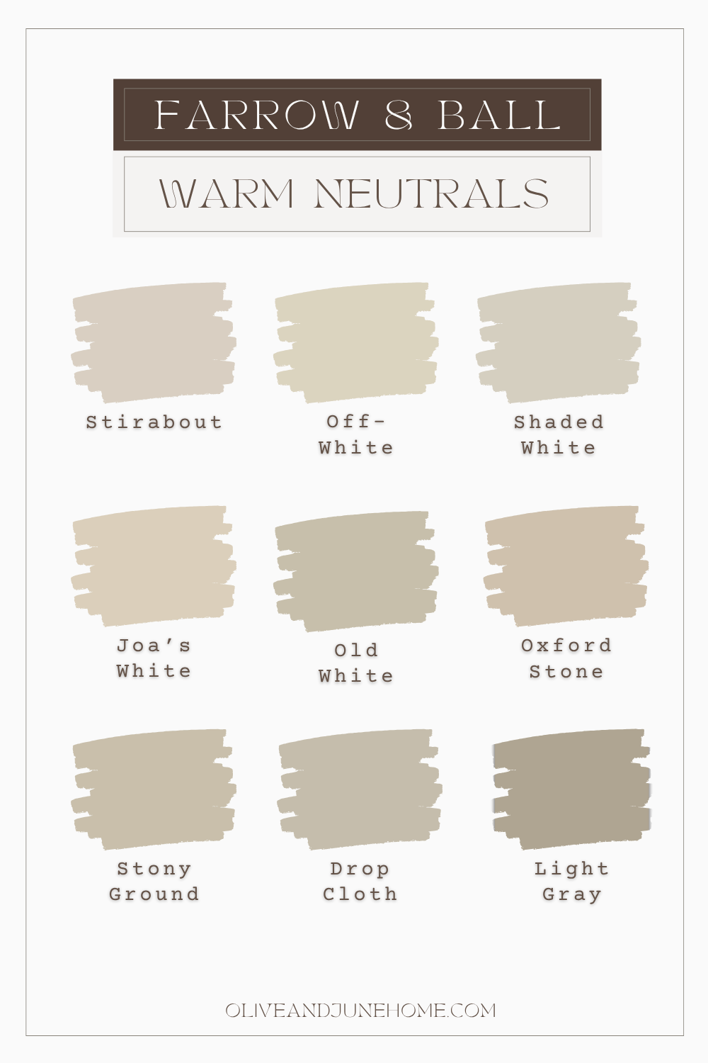
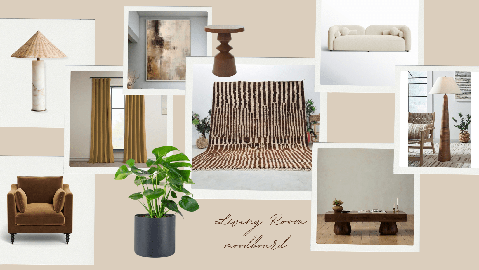
Build the Mood Beyond Paint
Moody interior design doesn’t start and end with a paint can. Texture and materials do so much of the heavy lifting. So even if you go with a more subdued paint color, you can still crank the drama with finishes and textiles.
Image Source: In Common WIth
As an Amazon Associate, and partner with other brands, I earn from qualifying purchases. This post may contain affiliate links, meaning I receive commissions for purchases made through those links at no cost to you.
Try layering in:
Velvet or linen drapes pooling on the floor
Bouclé or leather upholstery
Vintage or black-stained wood
Statement lighting with brass or patina finishes
Deep, plush rugs with rich patterns
These tactile elements create visual weight and contrast, which makes the space feel layered and intentional—even if the walls are neutral.
Here are a few pieces I’m loving right now:
Tone-on-Tone Architectural Details
Want to go next level? Add character with architectural details, like wainscoting, beadboard, or picture-frame molding, and paint them in the same color as your walls.
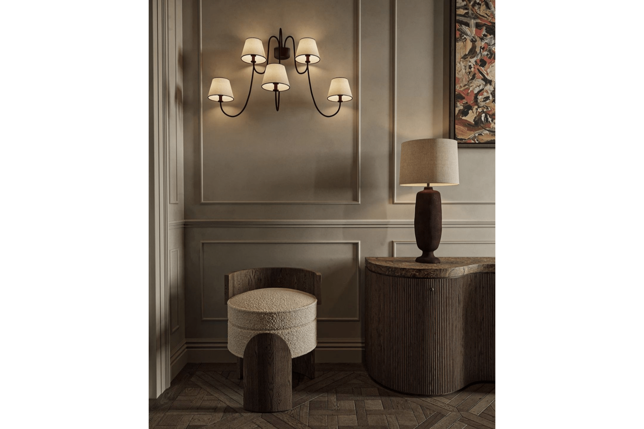
Image Source: Unknown
These details add depth and sophistication without introducing visual clutter.
Play With Paint Finishes
Last but not least: don’t be afraid to mix up your sheens. Just because you’re using one color doesn’t mean it has to be the same finish on every surface.
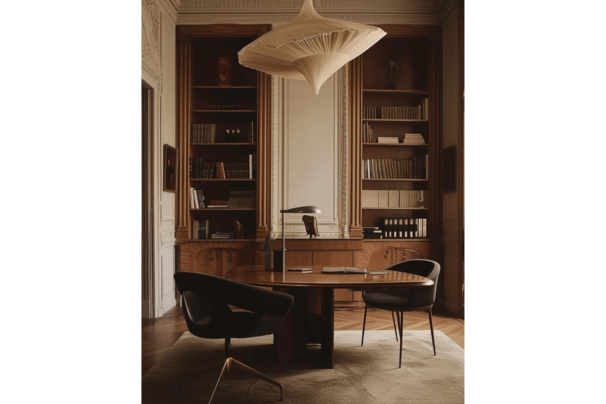
Image Source: Unknown
I like to use:
Eggshell for walls (easy to clean, low-sheen)
Satin or semi-gloss for trim and doors (adds just enough reflectivity to make them stand out subtly)
This tiny shift in sheen catches the light differently and gives your eye something to rest on—without disrupting the tone-on-tone look.
Final Thoughts
You don’t need to color drench every surface in a deep navy to achieve a moody vibe. Open concept spaces can still feel intimate and layered—it just takes a little more intention.
Focus on cohesiveness over contrast. Let the architecture, lighting, and materials work together to create visual zones and balance. And above all, don’t feel like you need to rush into a decision. Sometimes living in the space for a little while is the best way to know what it needs.

Want more guidance?
Dive into my Color Drenching Design Guide for examples and tips on getting it right in any space.