

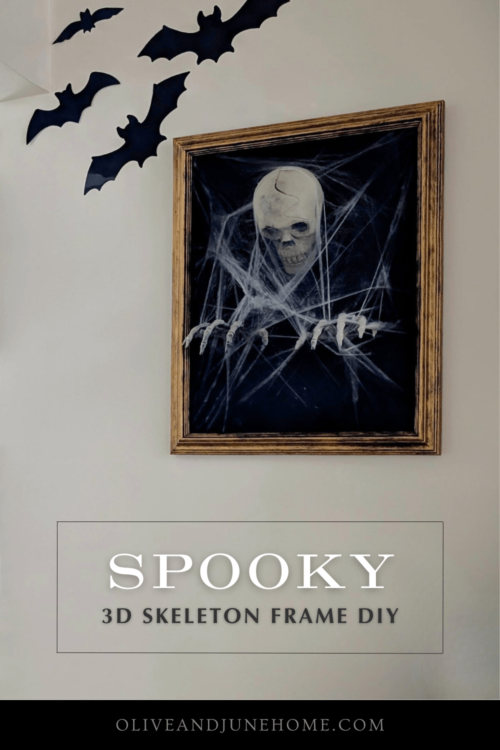
3D Skeleton Halloween Wall Art DIY
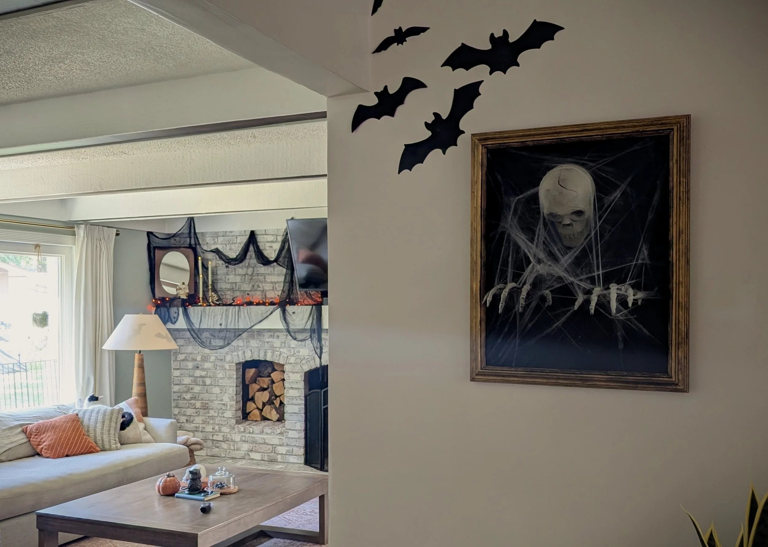
Looking to up your Halloween decor game? You’ve come to the right haunted place. This 3D skeleton picture frame DIY is easy, inexpensive, and seriously spooky. Perfect for anyone who wants to make a big Halloween statement without spending a fortune.
Haunted Portrait Halloween Decoration Tutorial
Looking to up your Halloween decor game? You’ve come to the right (possibly haunted) place. This 3D skeleton picture frame DIY is easy, inexpensive, and seriously spooky. Perfect for anyone who wants to make a big Halloween statement without spending a fortune. Keep reading for the full step-by-step tutorial on how to create your own 3D skeleton wall art that looks like it’s crawling right out of the frame.
Why You’ll Love This Halloween Craft
Halloween is one of my all-time favorite holidays. Something about spooky season just speaks to me. I look forward to decorating every year—and yes, even though I’m deep in my mudroom renovation, I had to make time for a Halloween DIY.
I stumbled across this decoration on Pinterest, but couldn’t find a tutorial anywhere. So, naturally, I decided to make my own and share it with you! Here’s how to tackle this creepy-cool DIY Halloween skeleton picture frame project.
Tools & Materials
As an Amazon Associate, and partner with other brands, I earn from qualifying purchases. This post may contain affiliate links, meaning I receive commissions for purchases made through those links at no cost to you.

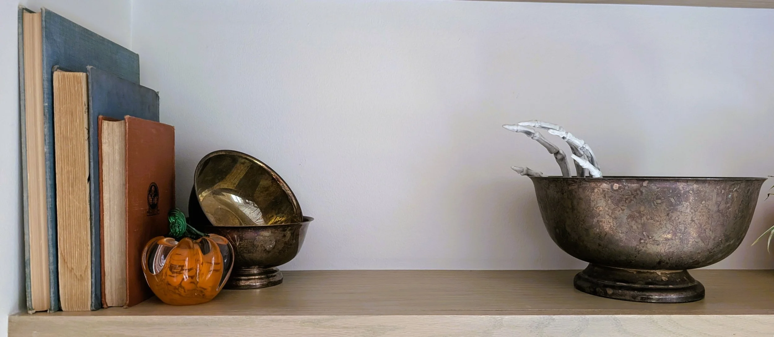
- Picture frame (mine was thrifted — bonus points if it’s ornate!)
- Matboard or sturdy cardboard backing
- X-Acto knife
- Ruler
- Black spray paint
- Rub ’n Buff (your choice of metallic finish) and a fluffy brush
- Hot glue gun + glue sticks
- Skeleton hands and skull (Dollar Tree for the win!)
- Faux cobwebs
- Optional: Picture frame point driver (if your frame doesn’t have tabs)
Pro tip: Lightweight skeleton pieces work best since they won’t pull on your backing or frame.
Step-By-Step Instructions
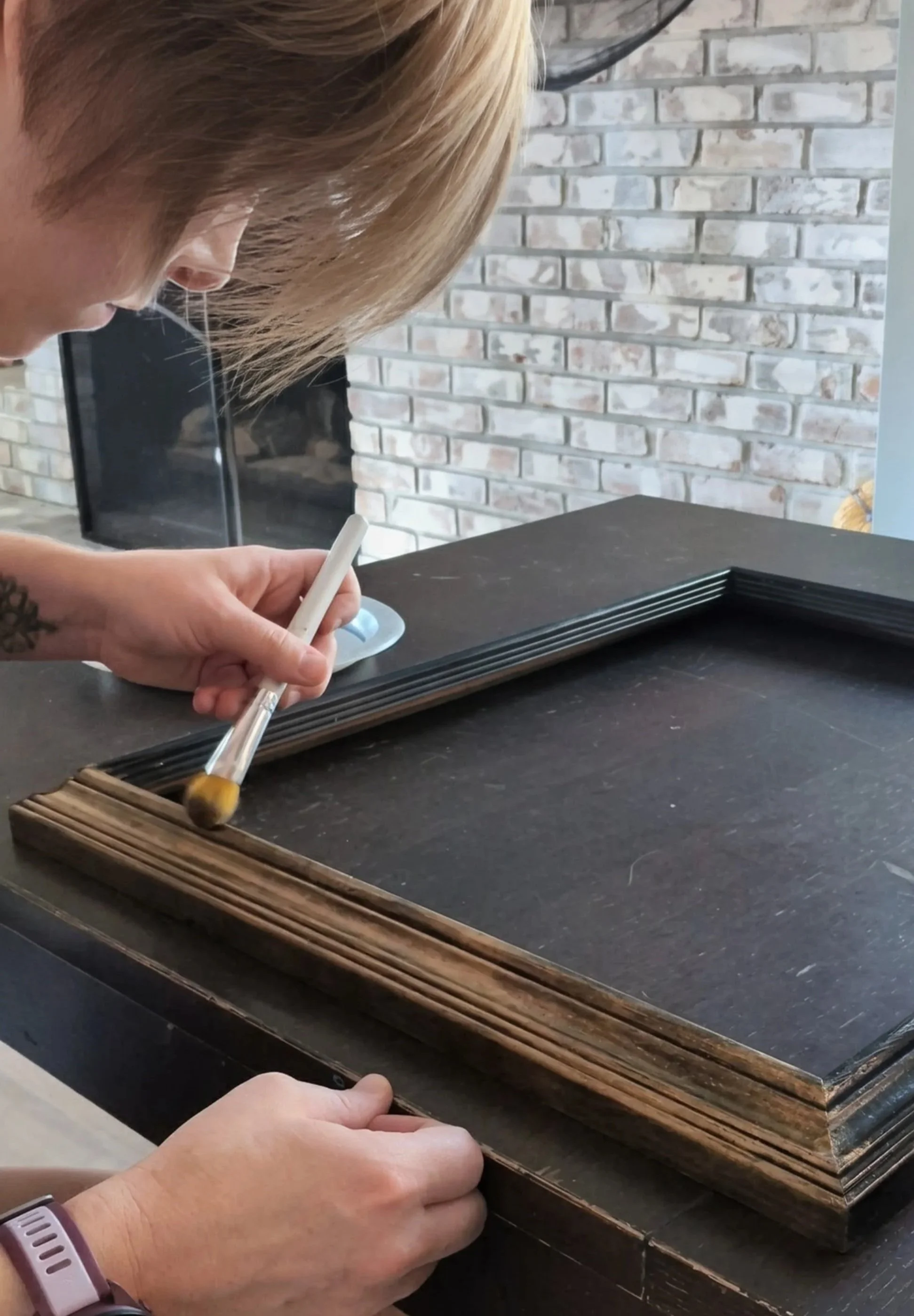
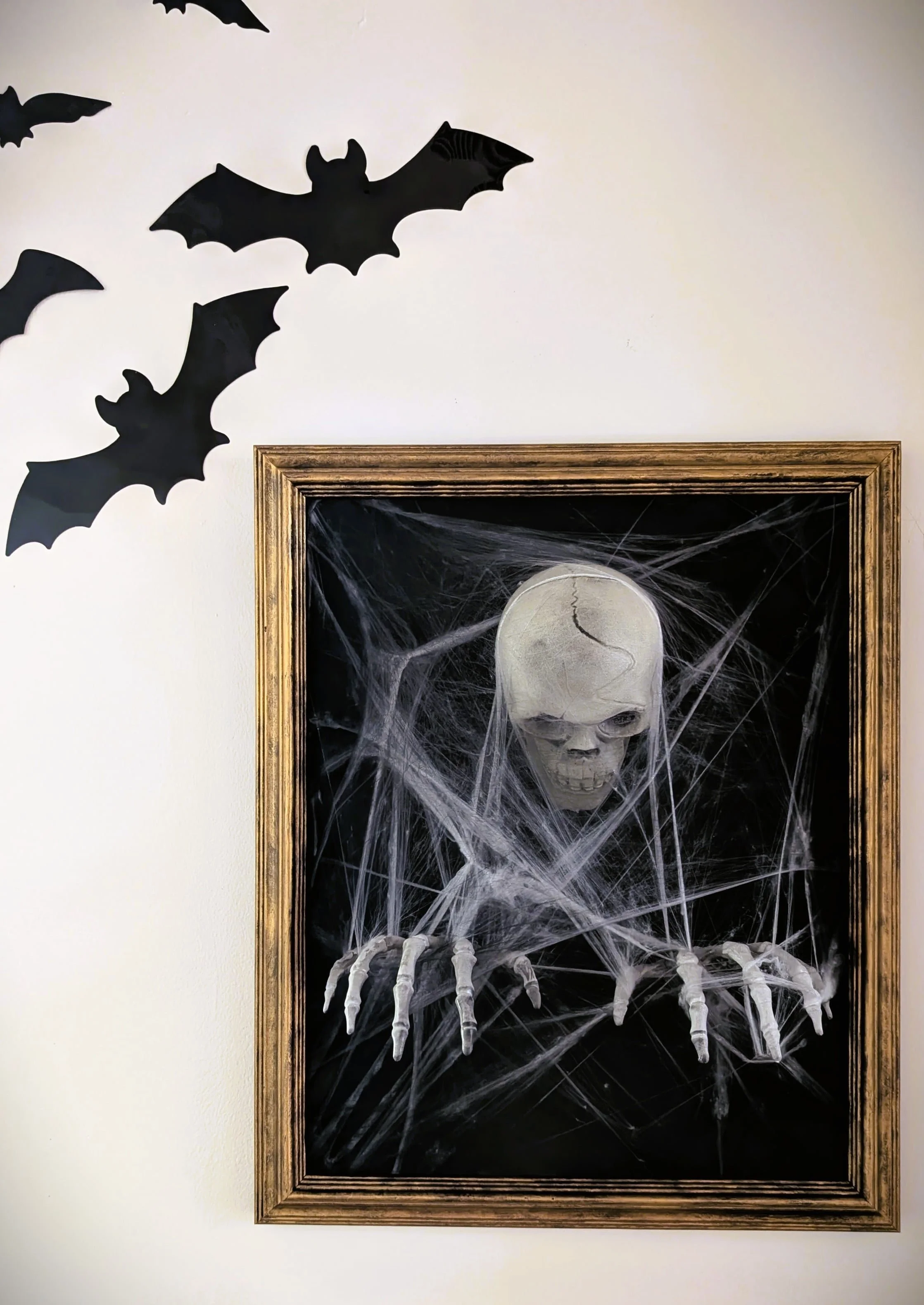
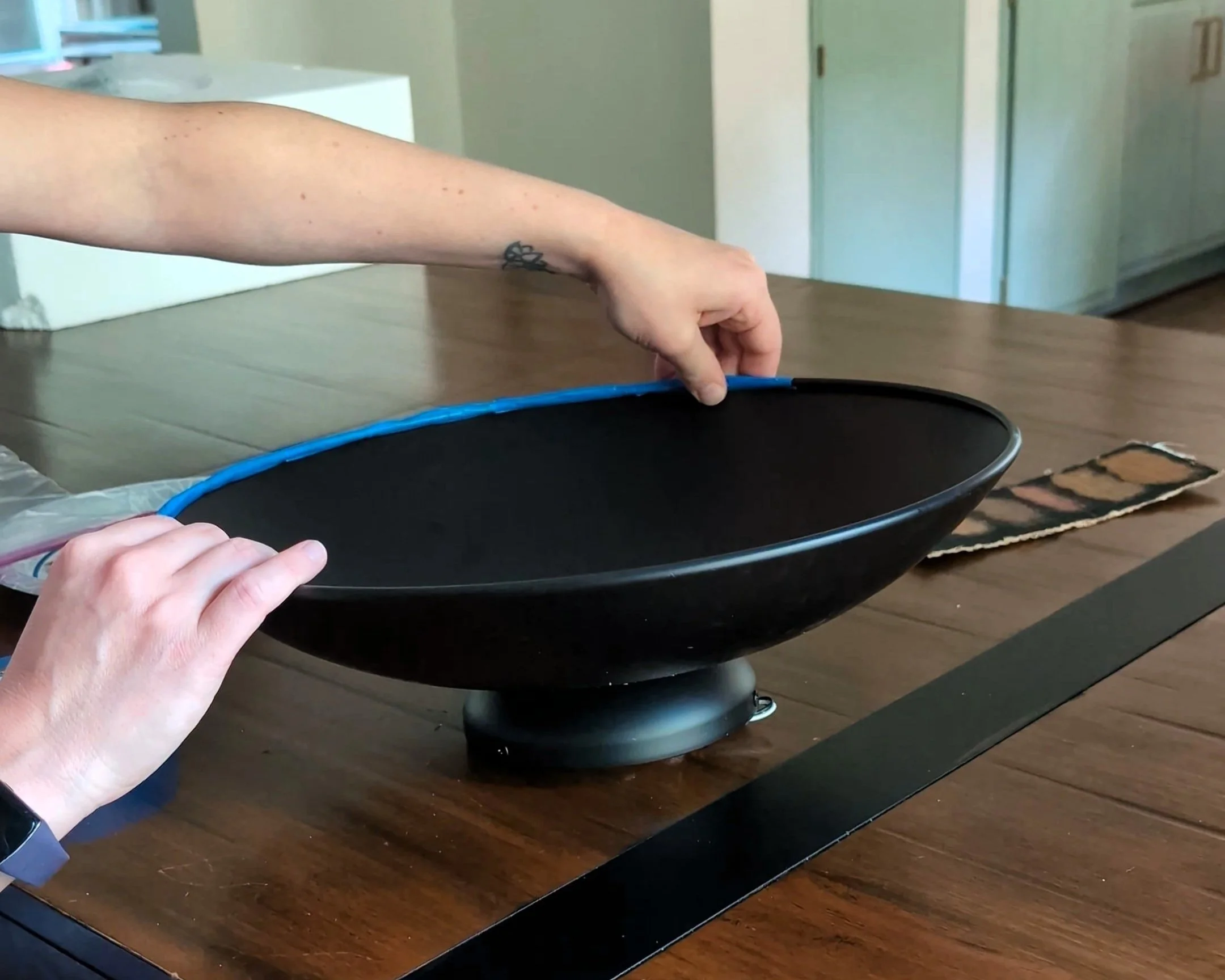
Step 1: Antique Your Picture Frame
To sell the illusion that this spooky piece has been lurking in the attic for years, we’ll start by antiquing the picture frame.
Spray paint your frame black and let it dry completely. Once dry, use Rub ’n Buff to highlight the details and edges. Dab off any excess before applying. It’s better to build it up slowly than to go full “golden mirror from a haunted mansion.”
The goal is an aged, distressed finish where bits of black peek through. This gives your DIY Halloween frame that perfectly eerie, time-worn look.
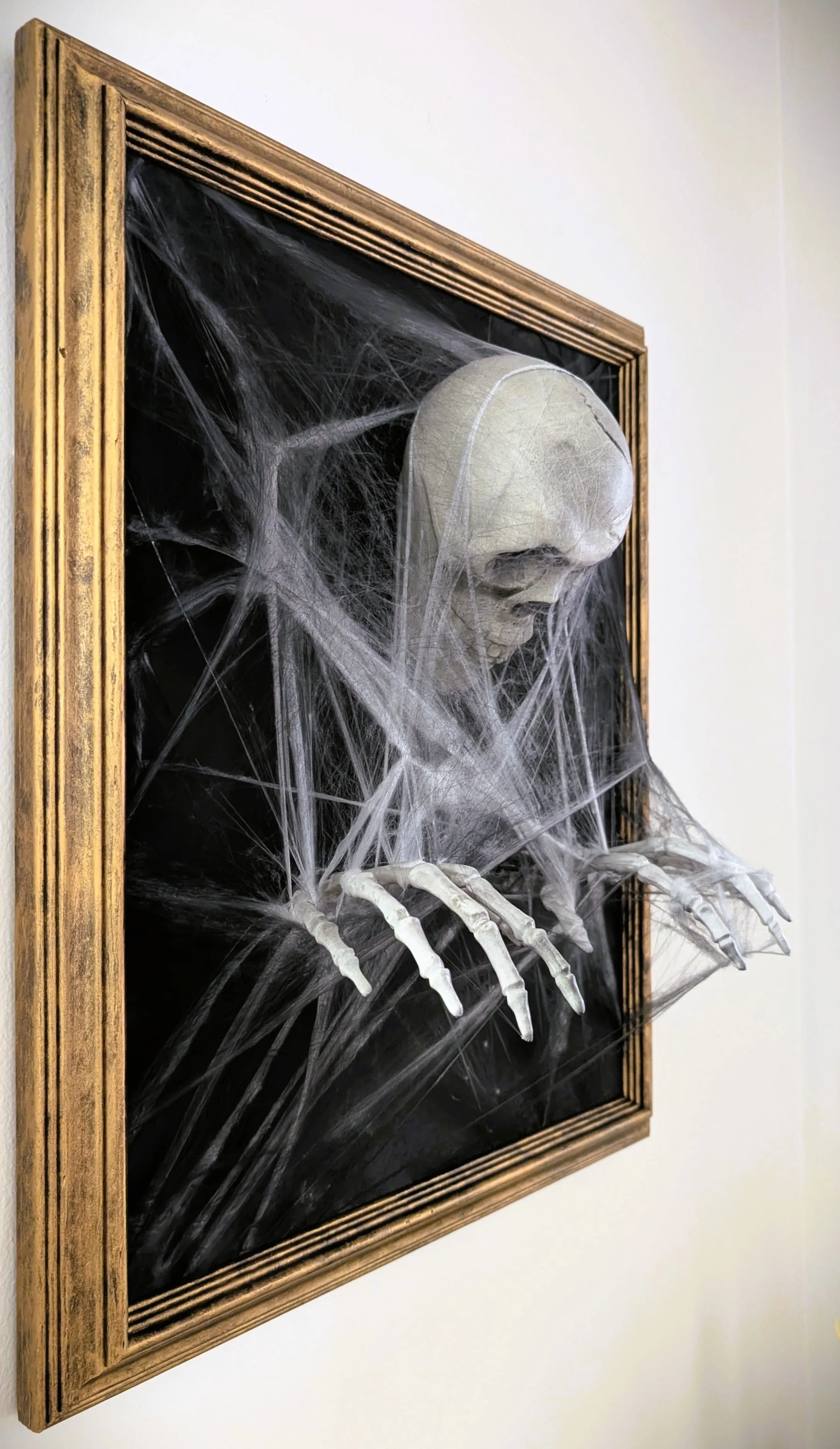
Step 2: Secure Your Skeleton
Now it’s time to bring your spooky subject to (after)life. Cut your matboard to fit snugly inside the frame. If it’s not already black, give it a quick coat of spray paint.
Next, position and mark the skull and hands where you want them. The skull will glue flat to the matboard, but you’ll probably need to cut holes for the wrists so the hands can reach through the surface. (Creepy, right?)


I also cut holes through the cardboard backing of my picture frame for the wrists. I noticed my wrists would have stuck out past the back of my frame, so I trimmed them with an oscillating tool. (That’s the weirdest sentence I’ve written in a WHILE, but they cut like buttah!)
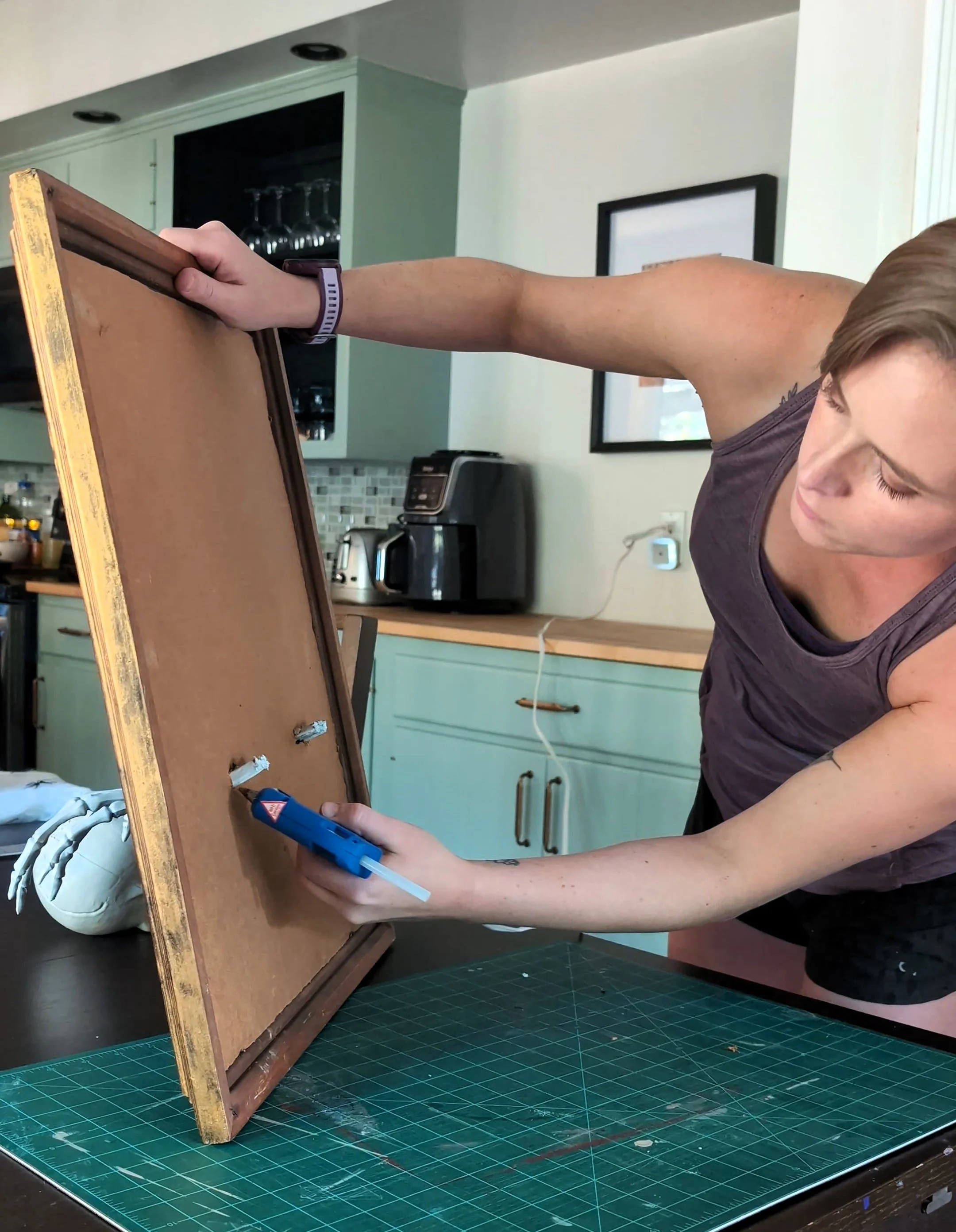

Using a hot glue gun, secure your body parts in place (and the sentences just keep getting weirder…). I made sure to put hot glue above and below the wrists on the front and back of the matboard to make sure they were extra secure.
Step 3: Add Cobwebs
Now, take your cobwebs and thin them out. The thinner they are, the more realistic they tend to look.

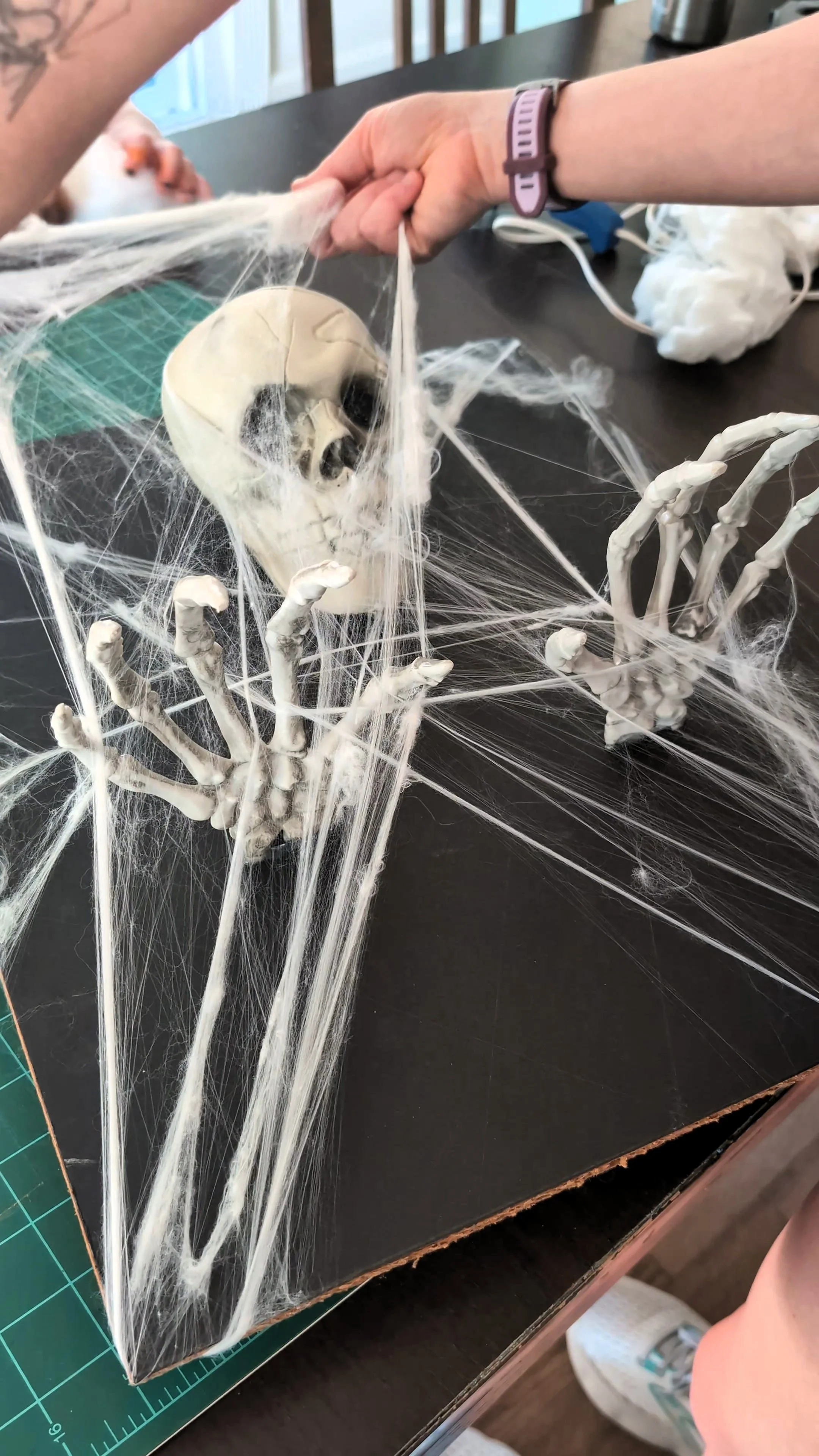
Then start wrapping them across the skeleton. You can use the corners of your matboard to help them stick, or even wrap them around the back. If you’ve ever used this stuff, you already know it likes to stick to just about anything anyway.


Once the cobwebs are in place, you can take it one step further and lightly spray around the edges with black paint. It adds depth and that aged, smoky/dusty look that really sells the haunted portrait vibe.
Step 4: Assemble the Final Product & Enjoy!
After the paint dries, pop everything back into the frame and hang it up!
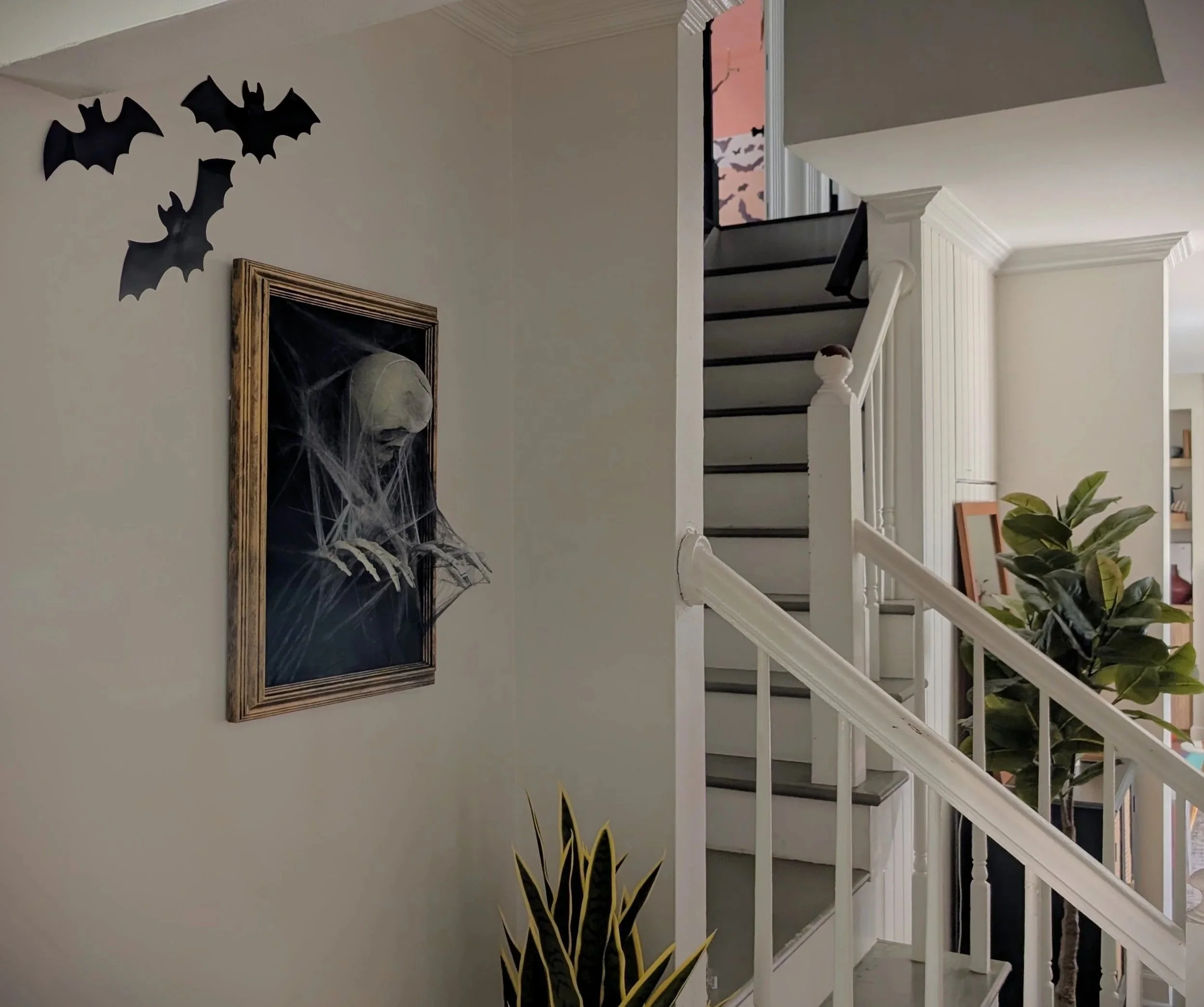
This project came together faster than I expected—just a few hours, even with paint drying time. And the final result? A creepy, dimensional DIY Halloween wall art piece that looks straight out of a haunted mansion. It’s eerie, eye-catching, and guaranteed to get a few gasps (and maybe a nervous laugh or two) from your Halloween guests. Or, in my case, oohs and aahs from all the neighbor kids.
More Halloween Decor Ideas
If you loved this DIY 3D skeleton wall art, you’ll probably enjoy a few of my other DIY Halloween decorations too. Here’s how I styled the rest of our home for spooky season — all easy, budget-friendly projects that still pack a dramatic punch.


Check out my other Halloween decor ideas and budget-friendly home projects!
Transform an Old Frame into Spooky 3D Skeleton Art

Small Details, Big Impact: DIY Mudroom Locker Design
They say the devil’s in the details—but in design, I think that’s where the magic is. My mudroom has been begging for custom storage for years, and now that I’m finally building my own DIY locker built-ins, I’m realizing just how many small design choices can take this space from “functional” to “freaking fabulous.” In this post, I’m sharing all the plans for how I’m turning a blank wall into a thoughtfully designed custom storage moment.
DIY Built-In Mudroom Lockers with Stylish Storage Details
They say the devil’s in the details—but in design, I think that’s where the magic is. My mudroom has been begging for custom storage for years, and now that I’m finally building my own DIY locker built-ins, I’m realizing just how many small design choices can take this space from “functional” to “freaking fabulous.” In this post, I’m sharing all the plans for how I’m turning a blank wall into a thoughtfully designed custom storage moment.
In interior design, the opportunities to add details and special touches are endless. It’s all about knowing where they fit in to create both function and style.
When I began my mudroom makeover, I shared an overview of the entire room’s design. But now that I’ve started building the DIY mudroom locker built-ins (more on that below!), I’ve realized just how many details I can add to them to make the space even more of a showstopper. In this post, I’m diving into what’s really going to make this room pop.
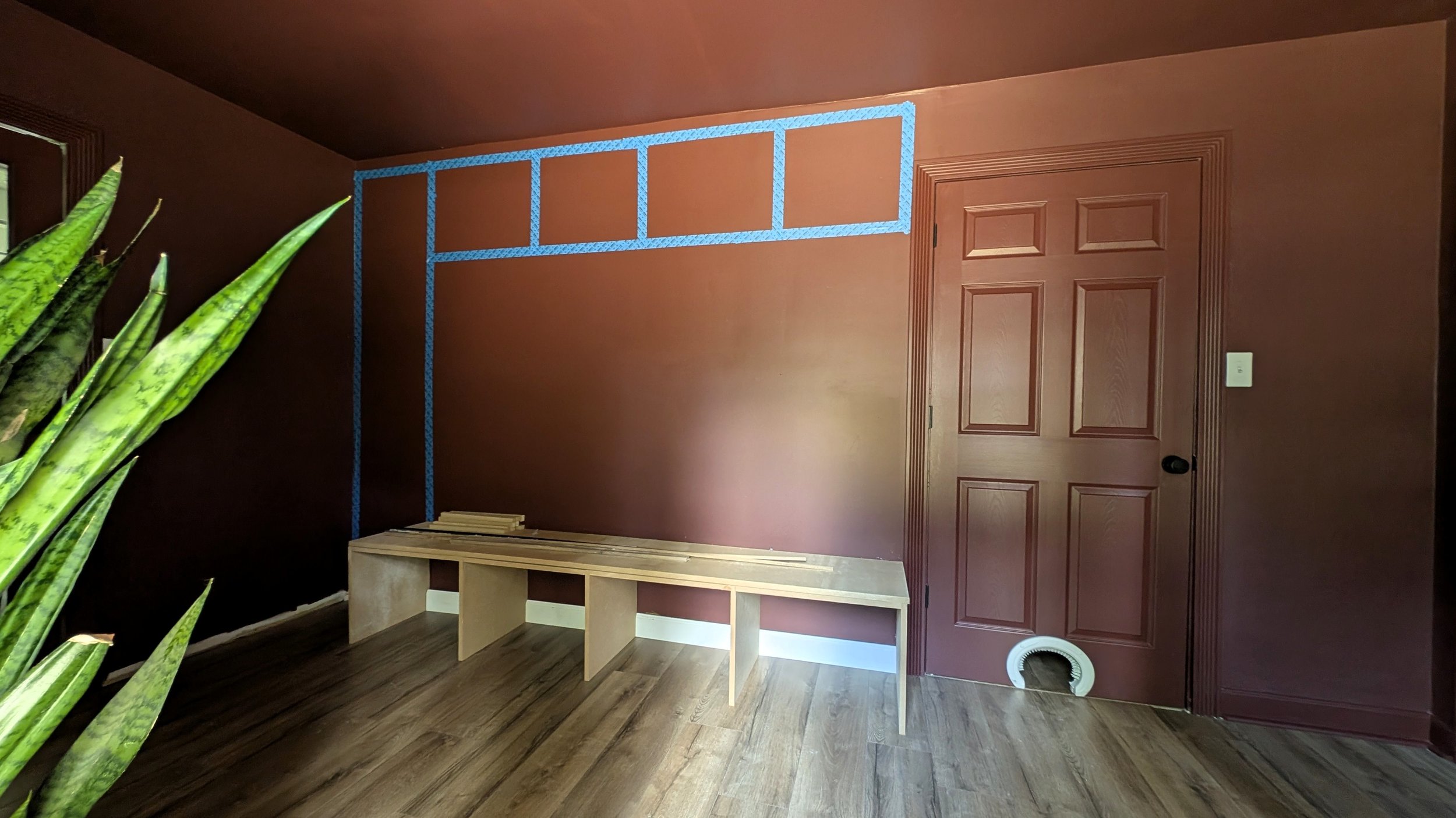
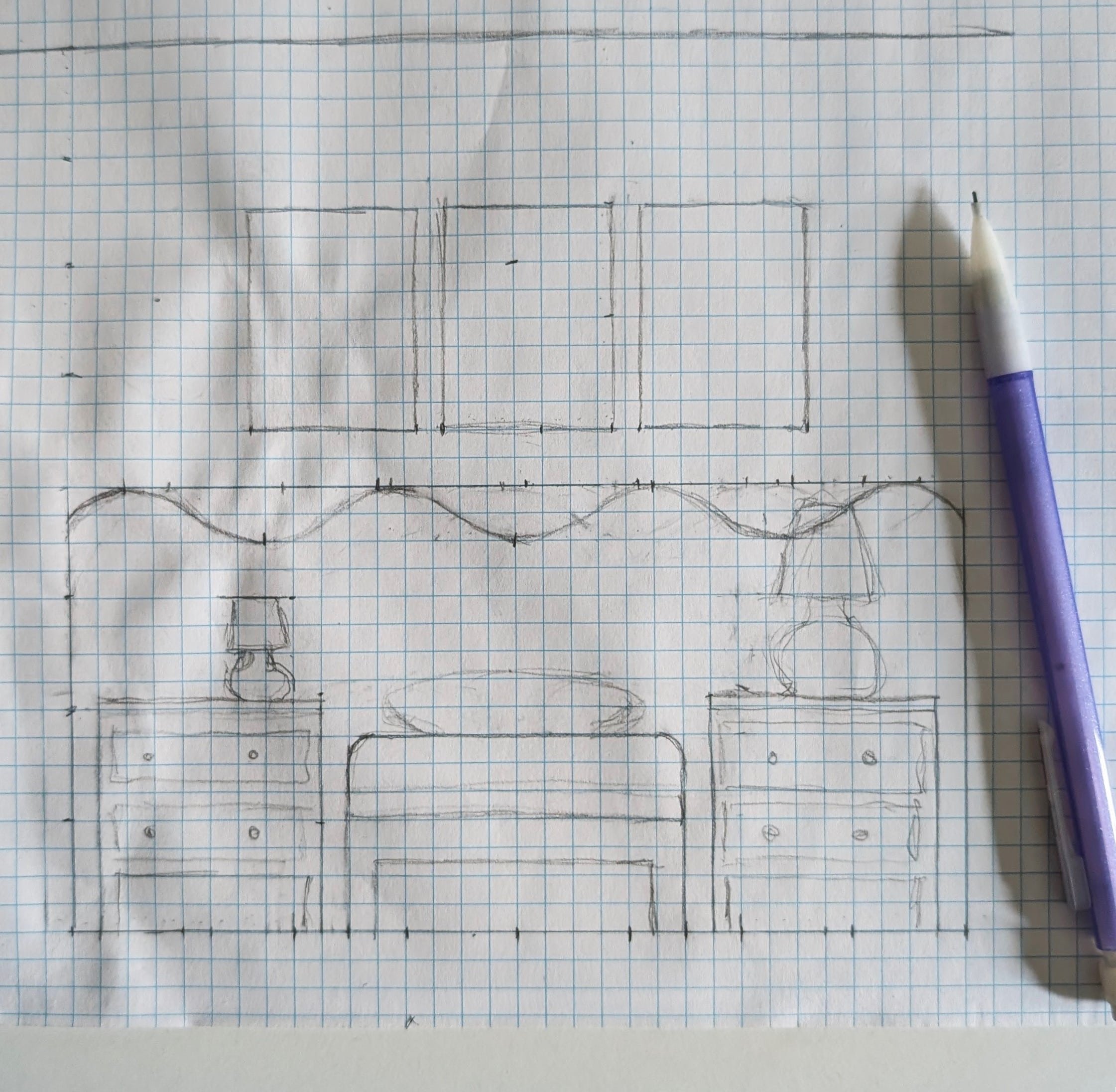
To give you a good idea of what I’m working with, here’s a sketch of my mudroom locker layout:
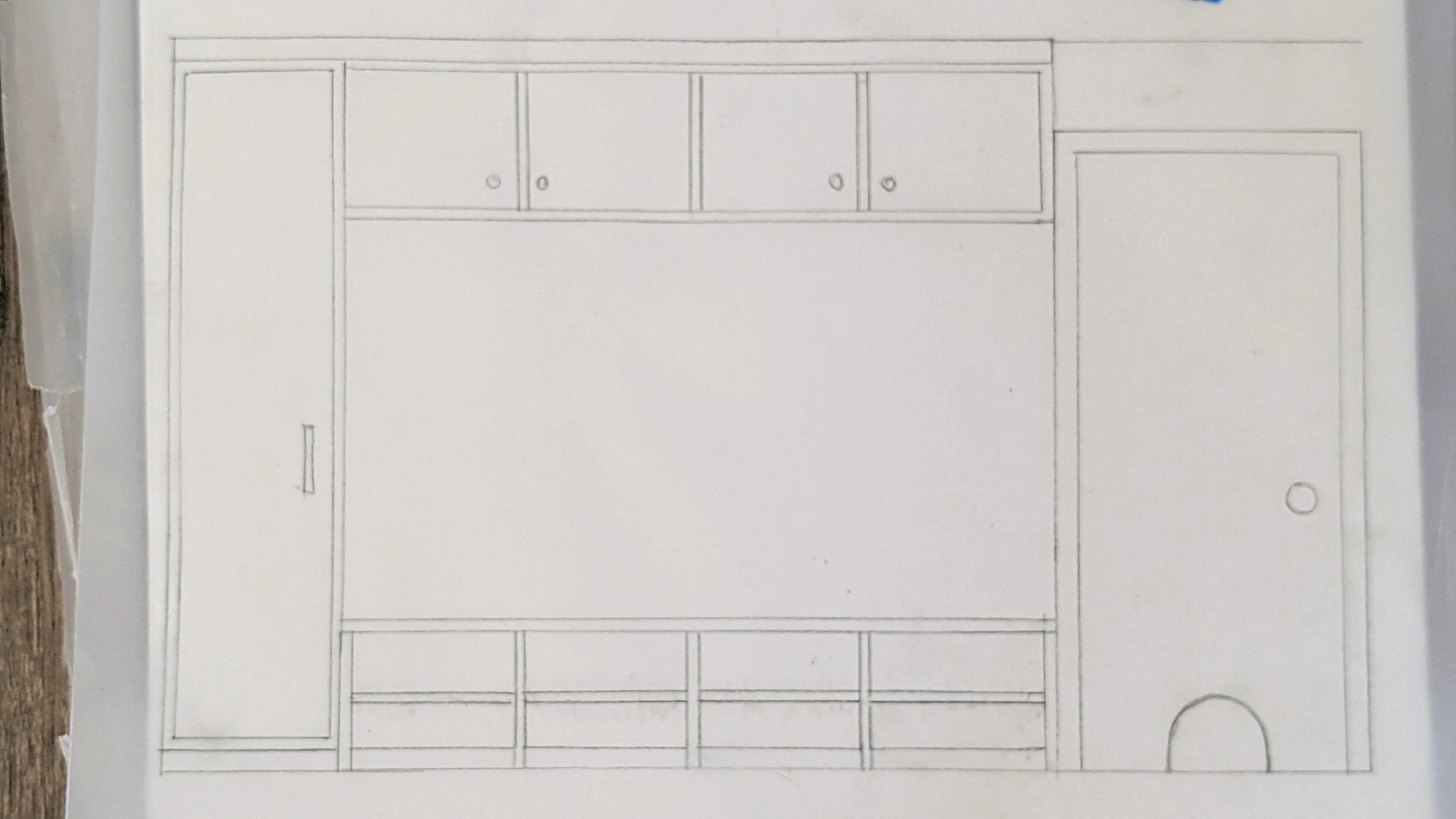
For context, the wall between the cabinet on the left and the door on the right is about 10 feet long with standard 8-foot ceilings - plenty of space to pack in smart storage solutions. Okay, now let’s dive into the fun stuff!
As an Amazon Associate, and partner with other brands, I earn from qualifying purchases. This post may contain affiliate links, meaning I receive commissions for purchases made through those links at no cost to you.
Why I Went With MDF Instead of Plywood
At first, I debated building the lockers out of plywood (keeping the natural wood tones) versus MDF. While both would have looked great, I ultimately chose MDF for this built-in project - and here’s why:
It’s a chance to try something new. I’ve never worked with MDF, and I’ve heard it gives a super smooth finish for painted cabinetry.
It’s about half the cost of cabinet-grade plywood. Budget-friendly win.
This is already going to be an intense build. I didn’t want to add the additional complexity of staining everything, which is certainly not my forte. Instead, I’ll be painting the lockers Dark Auburn to match the color drenched room. But not to worry, these lockers will be anything but boring.
The 8-Foot Mudroom Bench That Balances Form and Function
The main catalyst for this entire makeover was to use this space for functional storage. That all starts with a massive 8-foot bench chock-full of shoe storage. As you can see in the drawing, I’m building shoe cubbies for each family member, with a shelf for maximum storage-ability.
I intentionally kept the cubbies open and level with the floor, because let’s be honest, if shoes don’t slide in easily, they’ll just end up in a pile. My hope is that even the laziest kid will be able to manage this system (we’ll see how it goes).
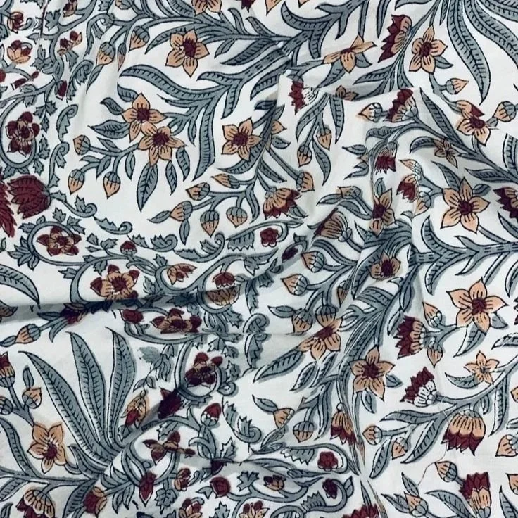
On top, the bench will be upholstered in a patterned fabric cushion. Because most of the room is the same color, I want to use this as an opportunity to lean into a fun, maybe unexpected pattern to add texture, movement, and a little softness to balance all the hard surfaces.
I haven’t done a deep dive into fabric options yet, but below are two (very different) options that I’m liking so far. The tiger fabric has that unique flair I’m looking for, but the light color makes me a little nervous. The floral pattern leans into the softness and will bring out some other colors I’ll be incorporating throughout the room, but might not be edgy enough to fit the vibe I'm going for.

Beadboard Walls & Unique Hooks
Now, here’s where the “lockers” part gets a twist. I’m not actually adding dividers above the bench. Instead, I want to keep the wall open for a cleaner, more modern look. To avoid a big blank wall, I’m heavily considering beadboard paneling. Not only will this bring in extra texture, but it will also echo the beadboard from our half bathroom - a subtle callback that ties the spaces together.

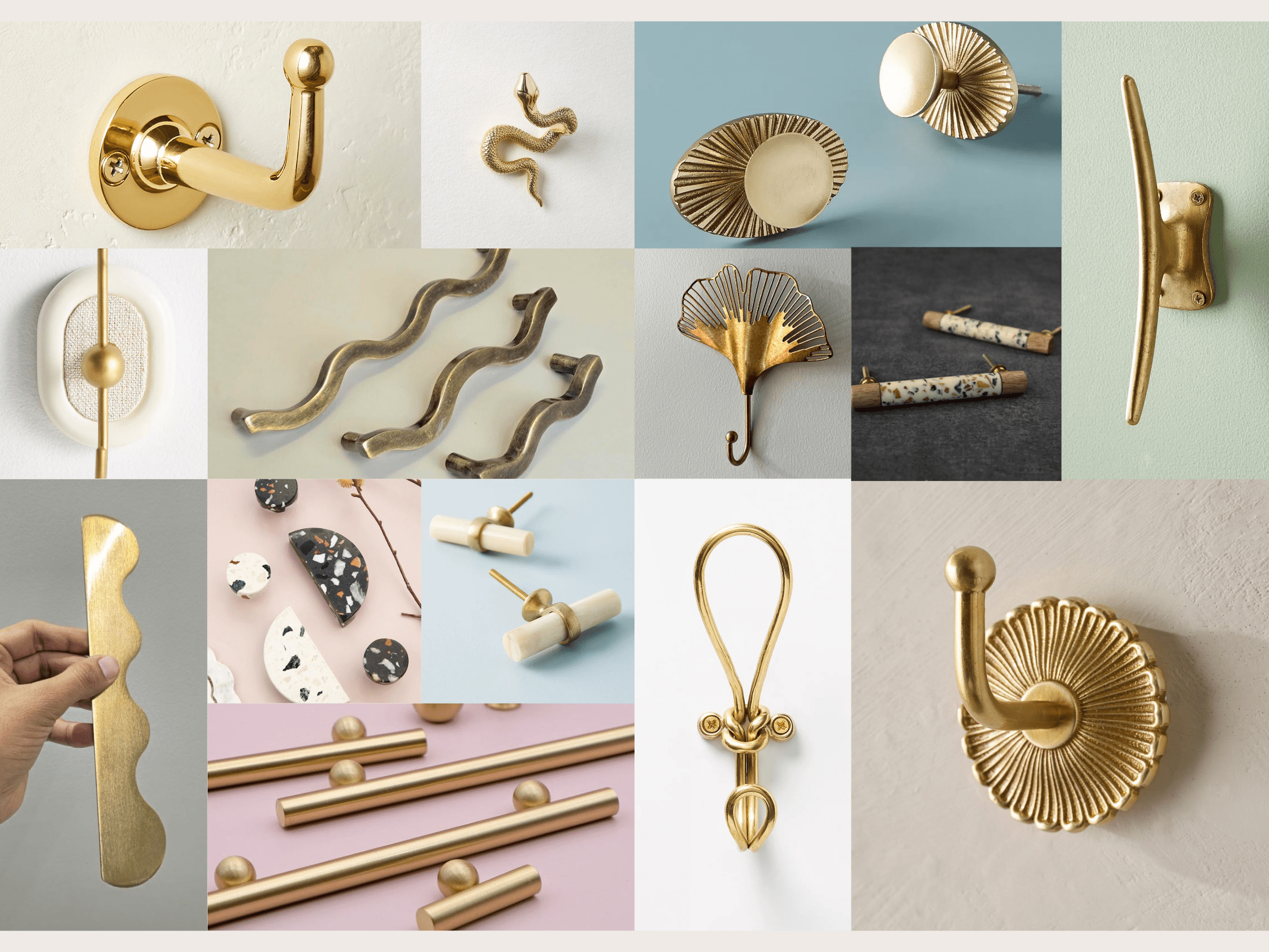
Of course, what’s a mudroom without hooks? I’m hunting for fun and unique coat hooks to line this space. Here are the options I’m currently obsessing over:
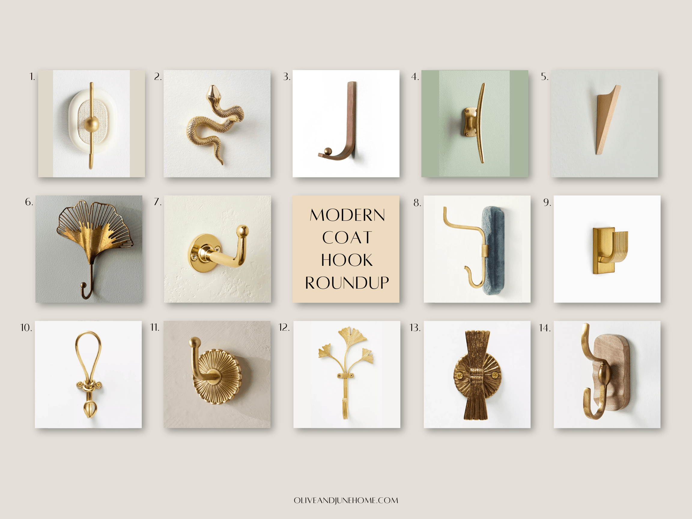
Cupboards, Cabinets & Inset Doors
Above the bench, I’m building four upper mudroom cabinets to echo the four shoe cubbies, because… who doesn’t love extra storage!? These cabinets will also be my first attempt at making inset cabinet doors!
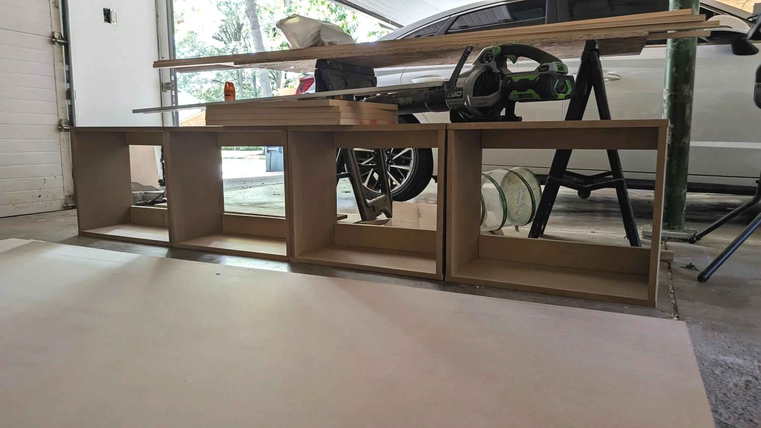
On the far left, I’m adding a tall skinny cabinet for coats we don’t use every day, plus a top shelf for overflow storage. This vertical element will help balance the space (here’s looking at you, storage room door) and pack in more functionality.
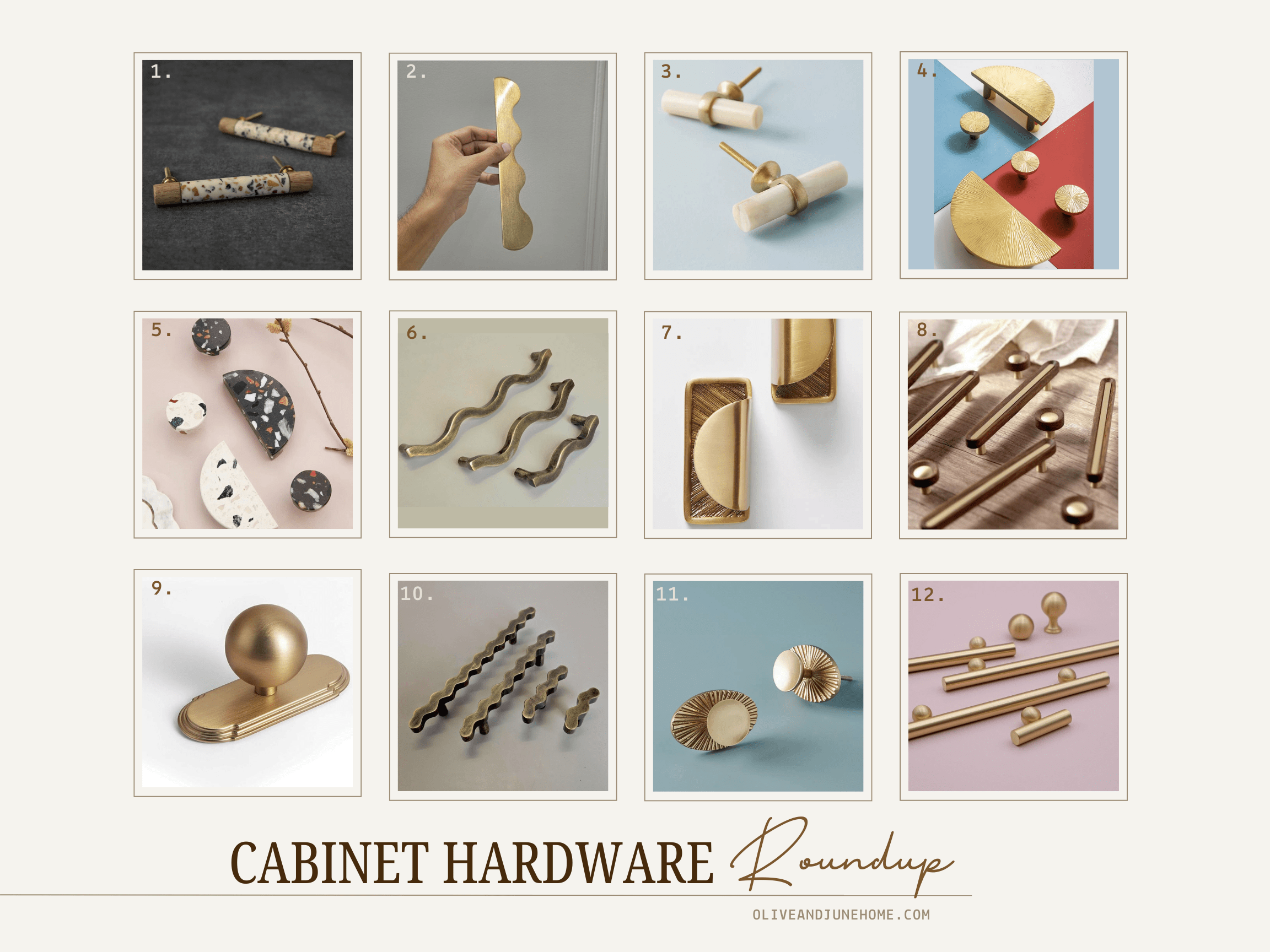
And if the hooks don’t end up being the statement moment, I’ll definitely play with unique cabinet hardware. Knobs and handles are such an easy way to add personality. Here are some that have caught my eye:
Construction Progress
It’s been wild to finally see this design take shape after dreaming about it for so long. MDF has a small learning curve, but so far, so good. Next up: tons and tons of finishing touches—trim, paint, hardware, and those little details that really make built-ins shine.
Stay tuned! There’s still SO much I have planned for this space.

Catch up on the full mudroom renovation with these posts:
A Fresh Take on Mudroom Design: Color, Storage, and Modern Touches
Mudroom Makeover in Progress: Bold Paint, Spiral Staircases & Custom Swinging Doors
Hooks, Hardware & Storage: DIY Mudroom Locker Plans
Color Drenching Tips for Open Floor Plans
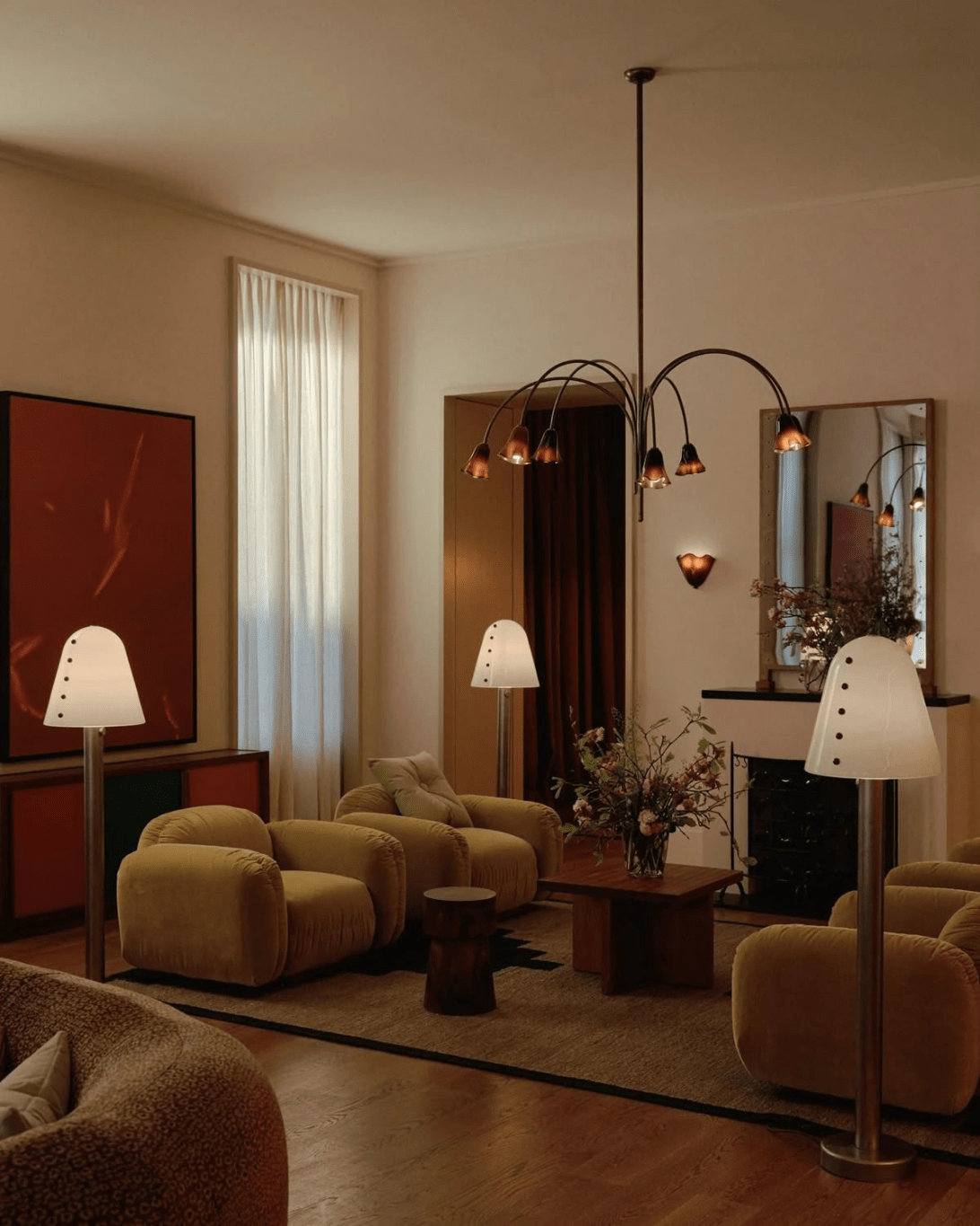
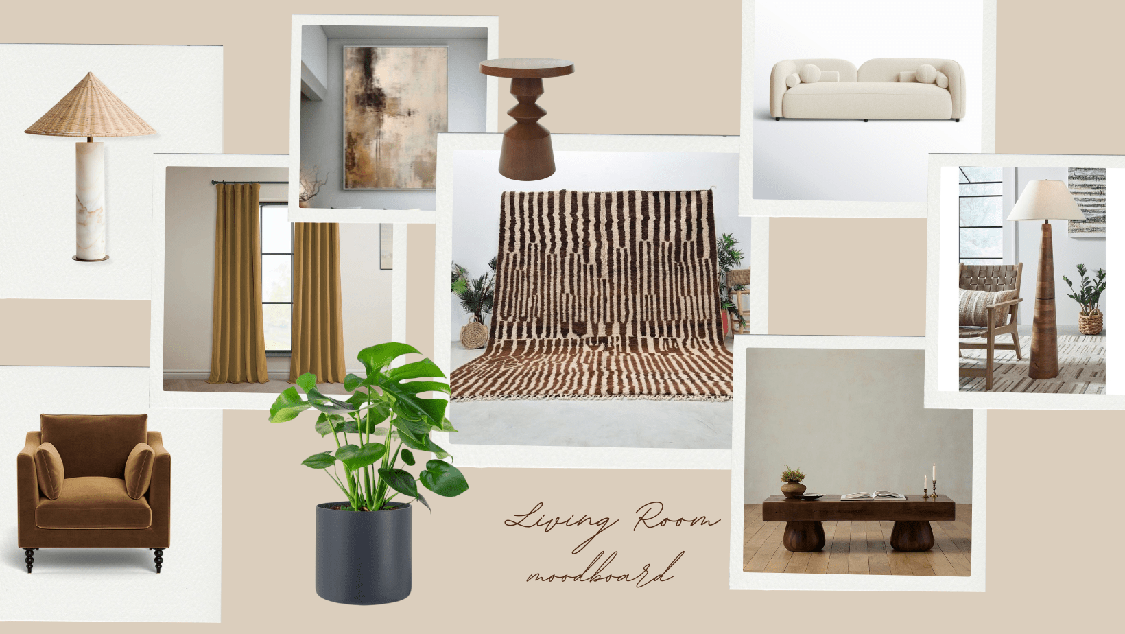
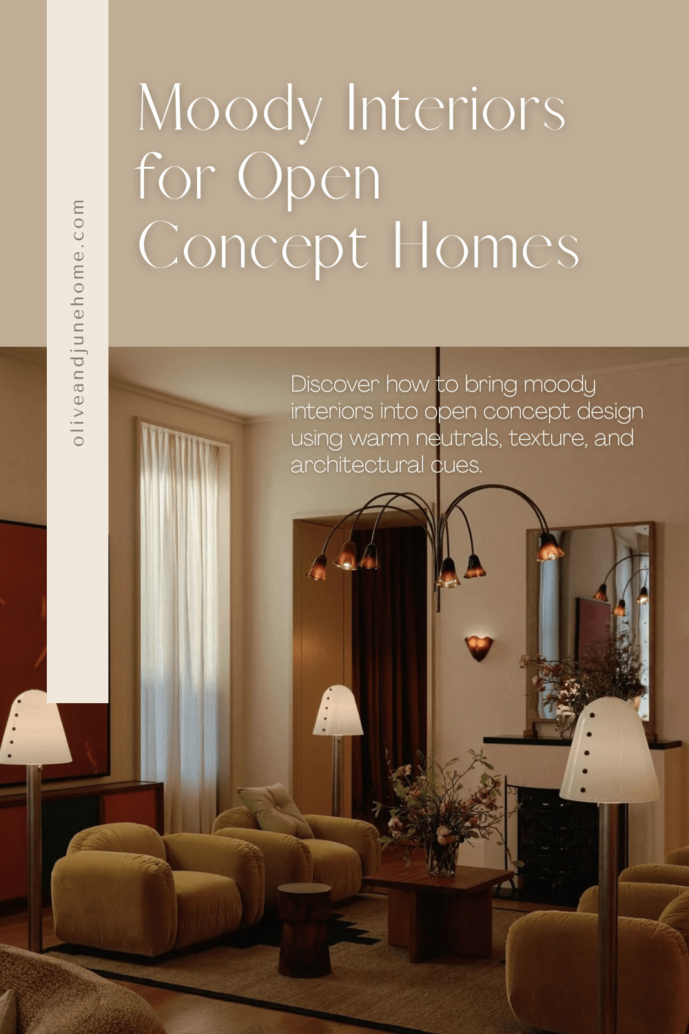
If you’re dreaming of a moody color drenched space but you’ve got an open concept floor plan, I hear you. It’s a common conundrum—especially with how popular open layouts have become. One of my readers recently asked this same question. Here’s my take.
The Smart Way to Drench an Open Concept in Color
If you’re dreaming of a moody color drenched space but you’ve got an open concept floor plan, I hear you. It’s a common conundrum—especially with how popular open layouts have become. One of my readers recently asked this same question. Here’s my take:
Reader Question
I just purchased my first home with my fiancé and I want it to have a traditional/moody color drench feel to it. The only issue is that it’s an open concept plan and I’m having a hard time visualizing how to do that without the color becoming overbearing. Do you have any tips?
My Answer
The easy answer here is to say, “Go bold and go all in!” But even I know how scary that can be—especially when it means painting every wall and ceiling the same color. You’re justified in your hesitation.
In an open floor plan, color drenching can walk a fine line between dramatic and overwhelming. But there are ways to pull it off without feeling like you’re living inside a paint swatch. Let’s break it down.
Create Visual Breaks with Architectural Transitions
One strategy? Add visual or physical breaks between zones.
Image Source: Unknown
Think framed openings, built-ins, ceiling beams, or even subtle shifts in floor height. These create definition without closing off the space, and give you the flexibility to only color drench one area at a time. Bonus: these tricks also support that traditional moody home style you love.
That said, if your space has wide sightlines (which yours does), actual framing might be expensive and maybe more than you want to tackle right now.
The Warm Neutral Hero Option
My favorite (and let’s be honest, most practical) solution for a moody open concept space is to use a warm, rich neutral paint color throughout.
I know, I know. “Neutral” doesn’t sound exciting. But hear me out.
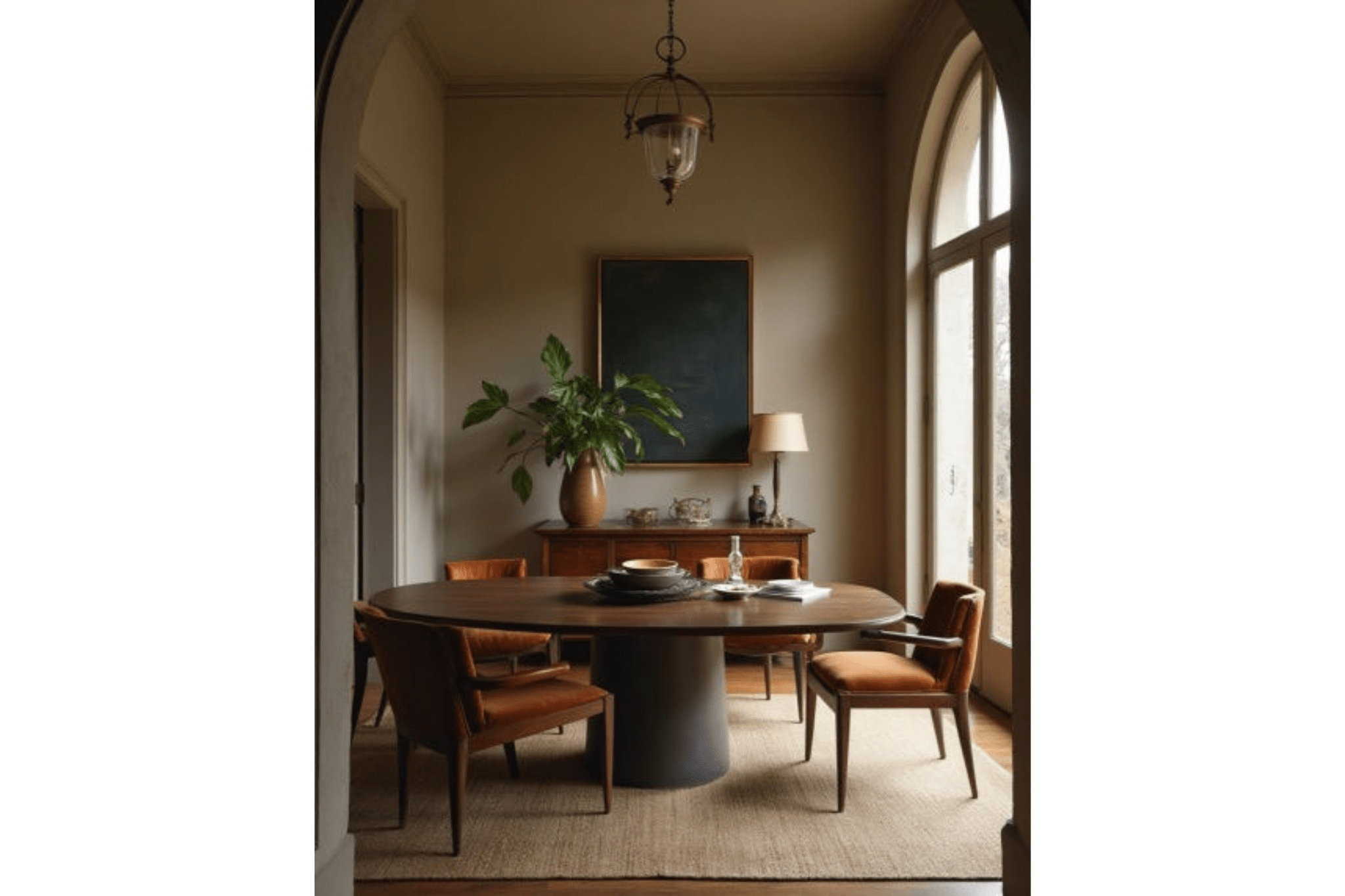
Image Source: Unknown
Choosing a neutral doesn’t mean boring. It means longevity. It means comfort. It means you won’t get sick of it two months after painting your walls, ceiling, and trim. Warm neutrals—think mushroom, taupe, oatmeal, or muddy greige—give you that cozy, cocooned vibe without sensory overload.
They’re soft enough to live across multiple “rooms” in an open concept, but still moody enough to set the tone and act as the perfect backdrop to layer in other pieces.
Below are a few colors I recommend to get you started. And no, you won't find any stark whites on this list. Bright white is the absence of color, which is the opposite of what we’re going for here. We're talking inviting, layered, vibey neutrals.
Warm Neutral Paint Colors for Moody Interiors
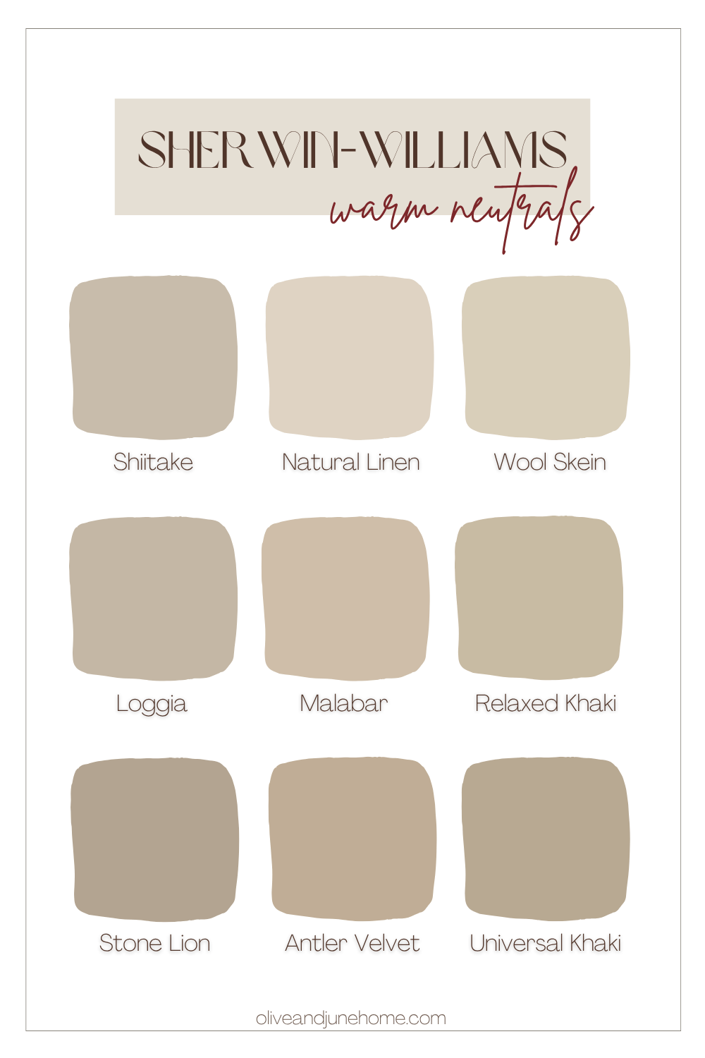
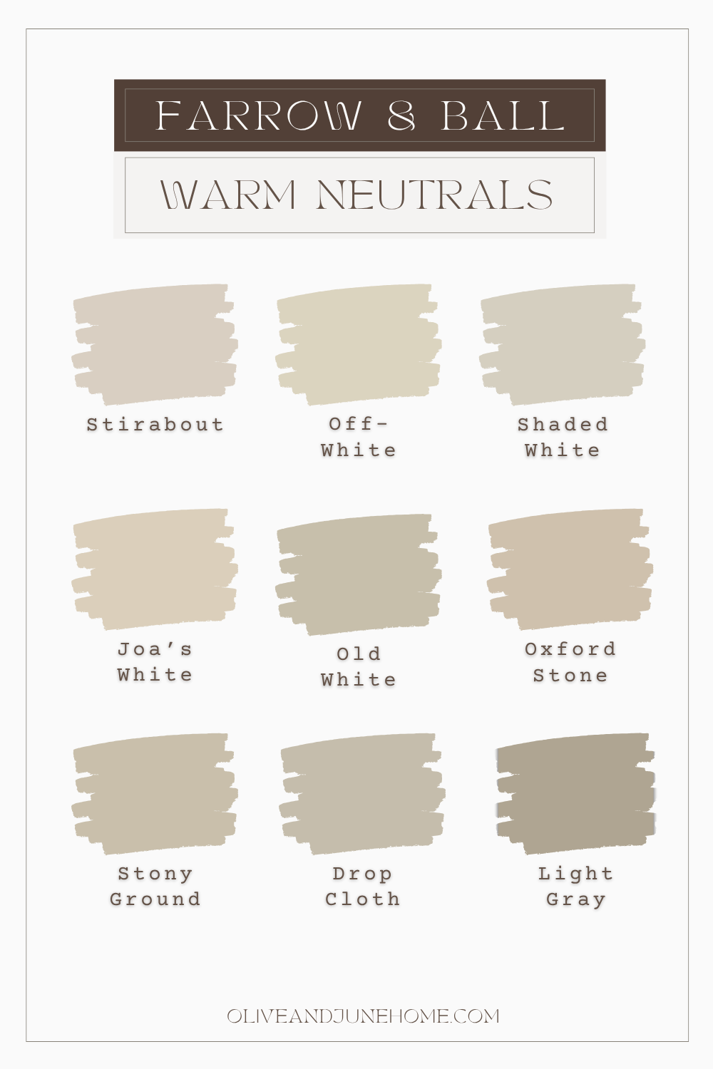
Tip: Always sample! These colors can read very differently depending on your light.
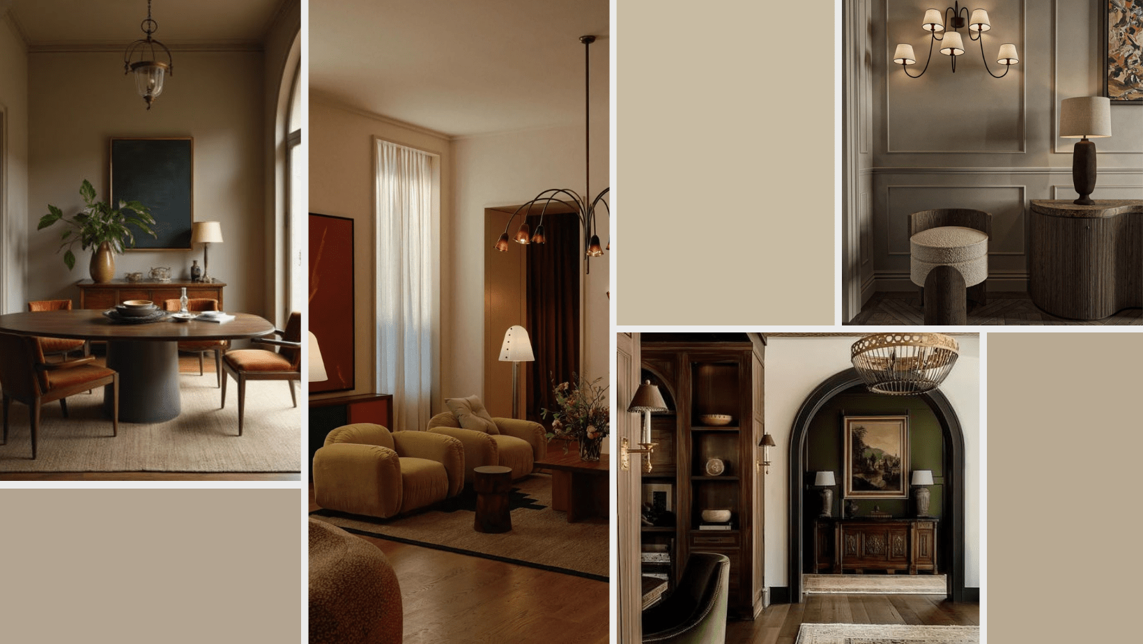
Build the Mood Beyond Paint
Moody interior design doesn’t start and end with a paint can. Texture and materials do so much of the heavy lifting. So even if you go with a more subdued paint color, you can still crank the drama with finishes and textiles.
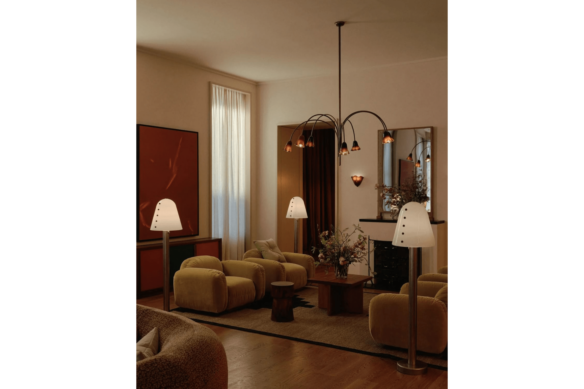
Image Source: In Common WIth
As an Amazon Associate, and partner with other brands, I earn from qualifying purchases. This post may contain affiliate links, meaning I receive commissions for purchases made through those links at no cost to you.
Try layering in:
Velvet or linen drapes pooling on the floor
Bouclé or leather upholstery
Vintage or black-stained wood
Statement lighting with brass or patina finishes
Deep, plush rugs with rich patterns
These tactile elements create visual weight and contrast, which makes the space feel layered and intentional—even if the walls are neutral.
Here are a few pieces I’m loving right now:
Tone-on-Tone Architectural Details
Want to go next level? Add character with architectural details, like wainscoting, beadboard, or picture-frame molding, and paint them in the same color as your walls.
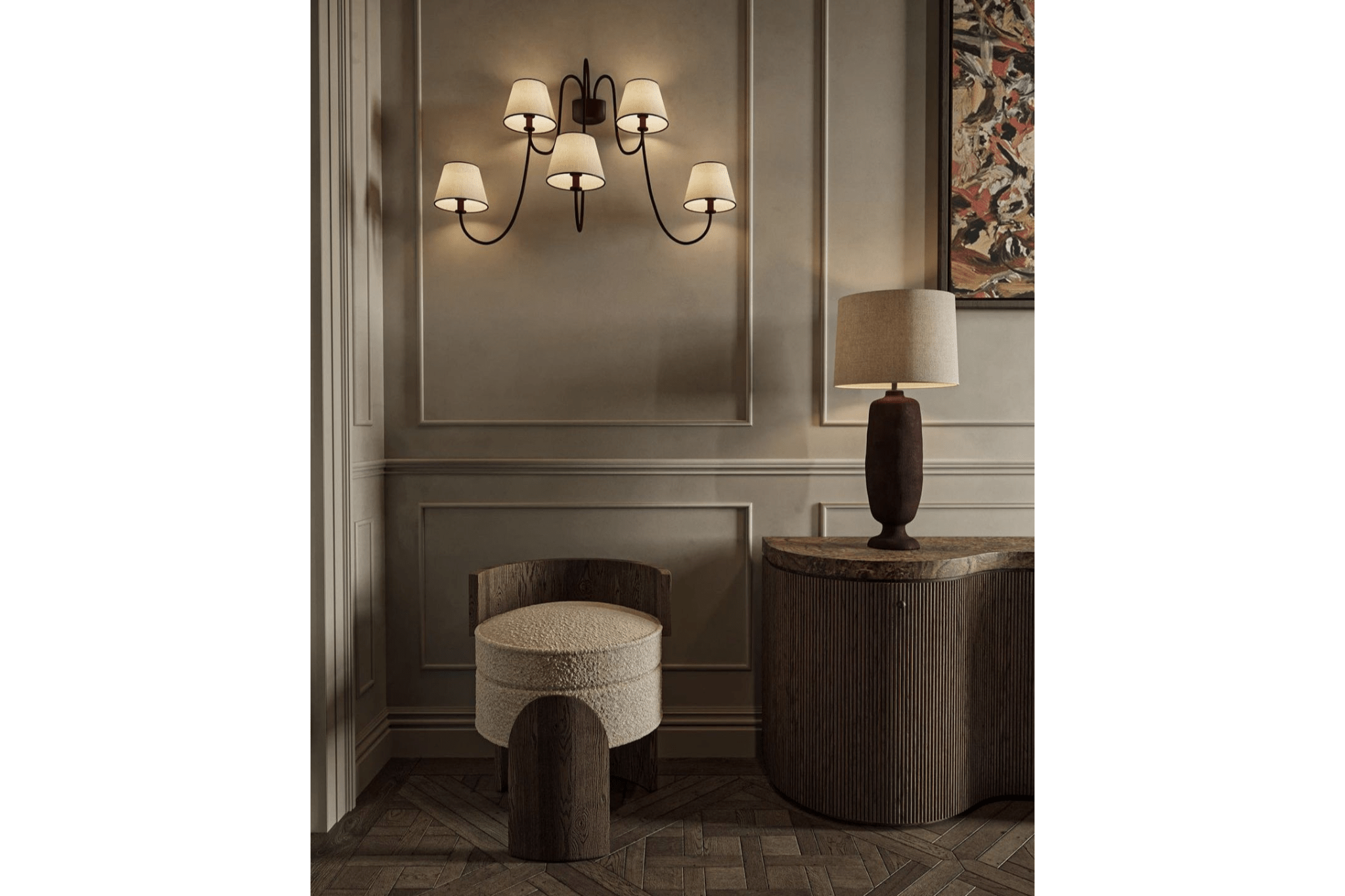
Image Source: Unknown
These details add depth and sophistication without introducing visual clutter.
Play With Paint Finishes
Last but not least: don’t be afraid to mix up your sheens. Just because you’re using one color doesn’t mean it has to be the same finish on every surface.
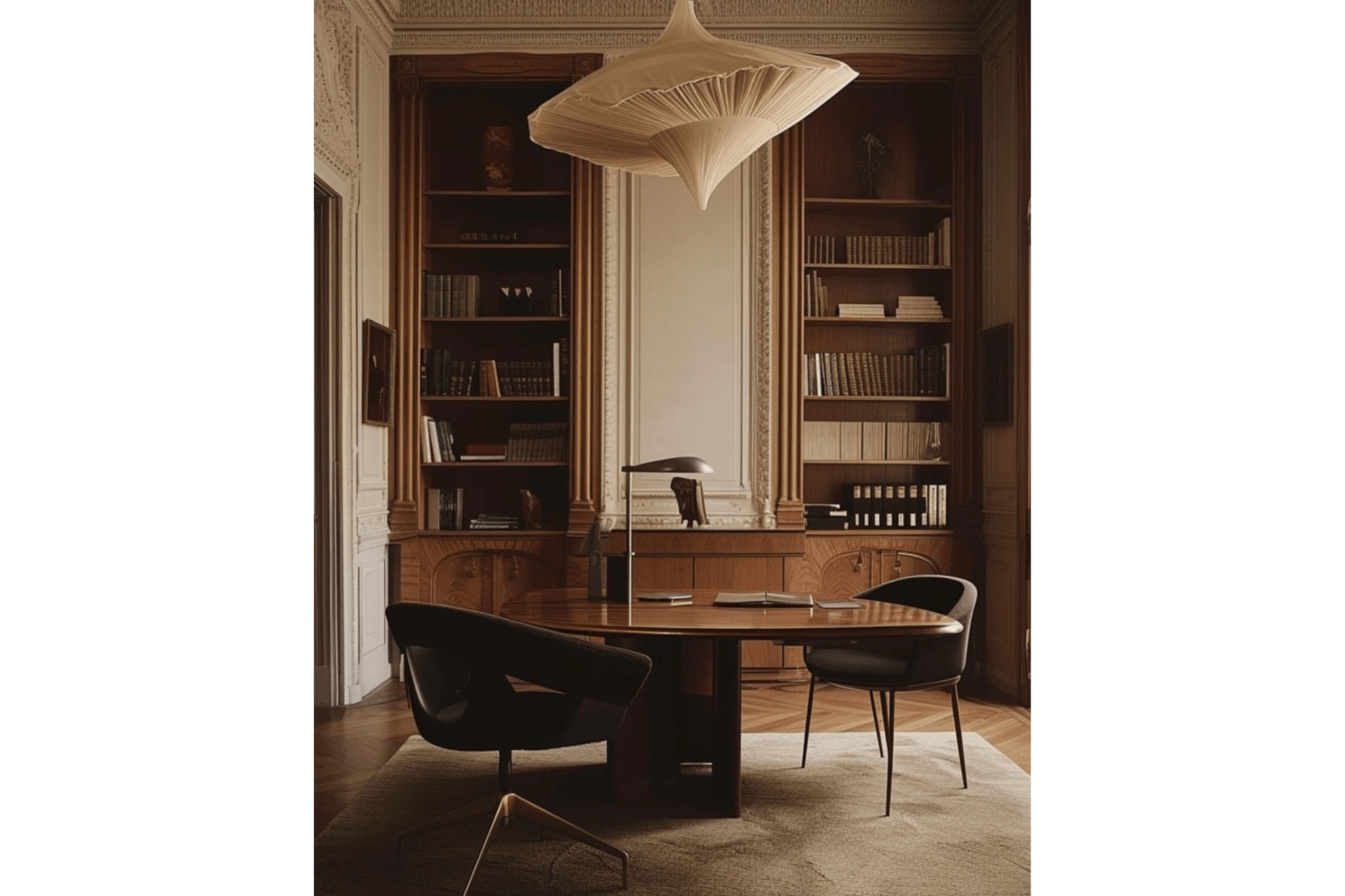
Image Source: Unknown
I like to use:
Eggshell for walls (easy to clean, low-sheen)
Satin or semi-gloss for trim and doors (adds just enough reflectivity to make them stand out subtly)
This tiny shift in sheen catches the light differently and gives your eye something to rest on—without disrupting the tone-on-tone look.
Final Thoughts
You don’t need to color drench every surface in a deep navy to achieve a moody vibe. Open concept spaces can still feel intimate and layered—it just takes a little more intention.
Focus on cohesiveness over contrast. Let the architecture, lighting, and materials work together to create visual zones and balance. And above all, don’t feel like you need to rush into a decision. Sometimes living in the space for a little while is the best way to know what it needs.

Want more guidance?
Dive into my Color Drenching Design Guide for examples and tips on getting it right in any space.
Color Drenching Without Overwhelming Your Space

DIY Light Fixture Dupe: Get a $340 AllModern Look for Just $140
Want the look of a designer light fixture without the price tag? I DIYed a $140 version of a $340 AllModern fixture using a tube of Rub ‘n Buff—and it turned out so good.
Rub n’ Buff Light Fixture DIY
Want the look of a designer light fixture without the price tag? I DIYed a $140 version of a $340 AllModern fixture using a tube of Rub ‘n Buff—and it turned out so good.
The best part? It only took a few basic tools, no fancy equipment, and zero prior experience. If you’ve got an outdated fixture (or anything that could use a luxe little glow-up), keep reading—this DIY is easier than you think.

As an Amazon Associate, and partner with other brands, I earn from qualifying purchases. This post may contain affiliate links, meaning I receive commissions for purchases made through those links at no cost to you.
Don’t you hate it when you find the perfect thing, but it’s wildly more money than you want to spend? That was exactly the case with the flush-mount light fixture for our mudroom. I had the vision. I found THE light fixture. I wanted it. But... I’m also overly practical and budget-conscious.
Lo and behold, I found this Amazon light fixture dupe for $113. Same size, same silhouette, same vibe. The only real difference? The AllModern version had a warm gold interior, and the Amazon one did not.

Did that stop me? Absolutely not.
Cue me dramatically setting down my coffee and declaring, “I can DIY that.”
Enter: Rub ‘n Buff
I briefly considered spray paint for the gold finish, but I wanted something with a little more richness and dimension. Then I remembered Rub ‘n Buff had always been on my “things I’d like to try” list. So, I gave it a whirl!
If you’ve never heard of Rub ‘n Buff, here’s the quick and sparkly rundown:
Rub ‘n Buff is a metallic wax-based finish that comes in a variety of shades—gold, silver, bronze, pewter, copper—you name it. It’s highly pigmented, easy to use, and magically turns plain objects into pieces that look like they were plucked from a boutique. Think of it as makeup for home decor. Plus, it's only $26 for a 5-pack!

I’d known about Rub ‘n Buff for years, but this was my first time actually using it. Spoiler alert: It was ridiculously easy and turned out even better than I imagined.
Here’s how I got the look—and how you can, too.
Tools & Materials
- Light Fixture (or whatever object you're zhuzhing up)
- Black Spray Paint (if your base isn’t already black)
- Rub ‘n Buff (I used Gold Leaf, but more on that below)
- Stiff Makeup Brush (you want something dense, not your fluffy powder brush! And definitely not one you’ll ever want to use on your face again)
- Optional: Spray Primer (for slick or high-touch surfaces)
- Optional: Clear Spray Sealant (for extra protection)
- Optional: Painter’s Tape (unless you love chaos)
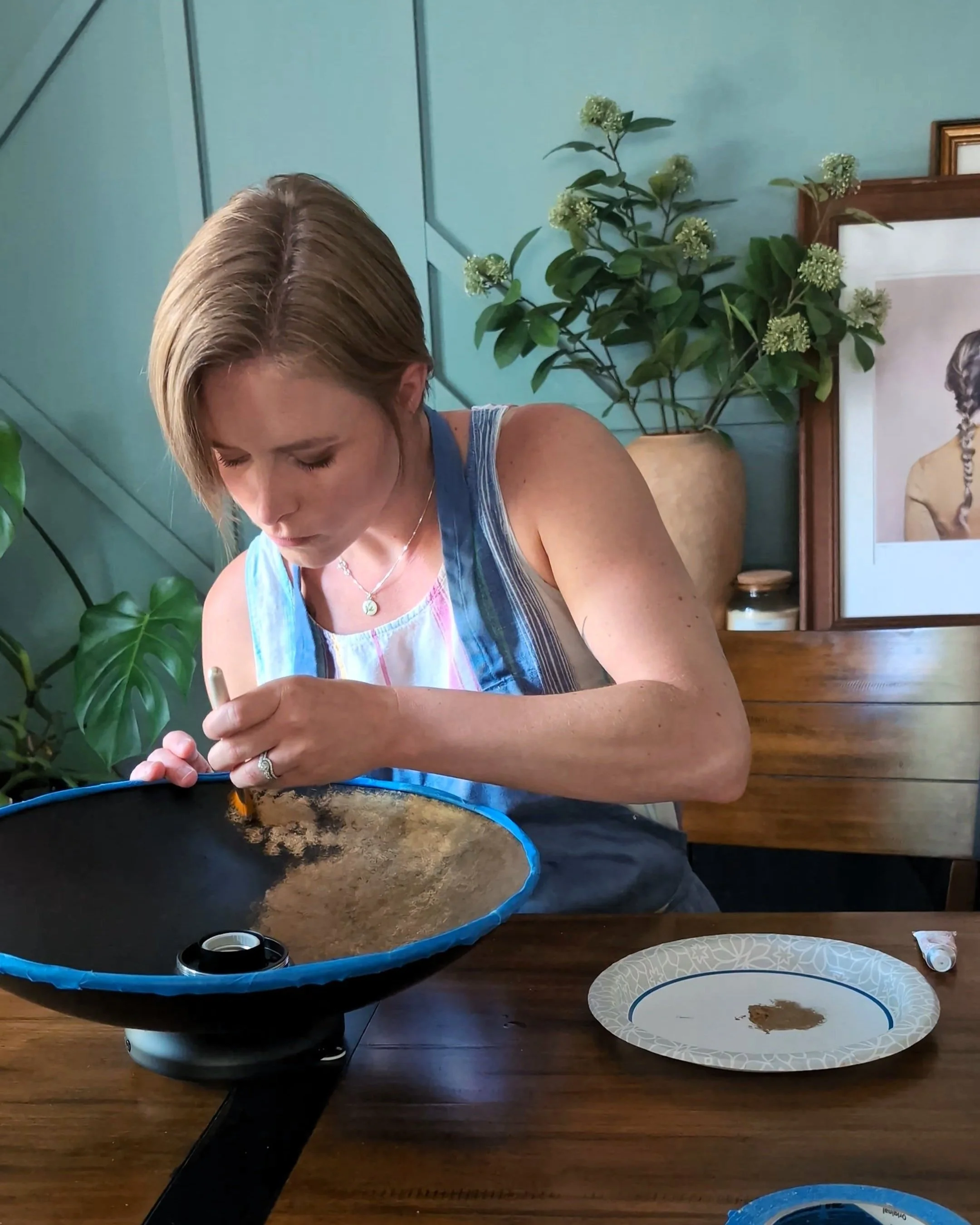
Step 1: Find Your Perfect Shade
Rub ‘n Buff comes in more finishes than you'd think, but be wary of the color on the outside of the package as it doesn’t always match what’s inside.

To figure out which finish I liked best, I made a quick and dirty swatch board. I painted a scrap of cardboard with black acrylic paint (because the product really shines against a dark base) and applied a little dab of each color. Pro tip: If you’re doing this for real, use black spray paint on your actual project for durability.
The swatch board let me see how the colors looked IRL and in the actual lighting of the mudroom, because as we all know (say it with me now!), LIGHTING CHANGES EVERYTHING.
Bonus: this also gave me a practice run to get a feel for how Rub ‘n Buff applies. Heads up, it does not go on like regular paint. It’s waxy. It dries fast. It’s a little weird. But once you get the hang of it? Easy as pie.
Step 2: Prep Your Surface
If your fixture is super slick or will be touched often (think doorknobs or drawer pulls), it’s a good idea to lightly sand and prime before painting. A coat of black spray paint will give the Rub ‘n Buff depth and something to cling to.
My light fixture was already black, so I skipped the sanding and painting. I just used painter’s tape to mask off the parts I didn’t want to Rub ‘n Buff (which, by the way, sounds more inappropriate every time I say it).
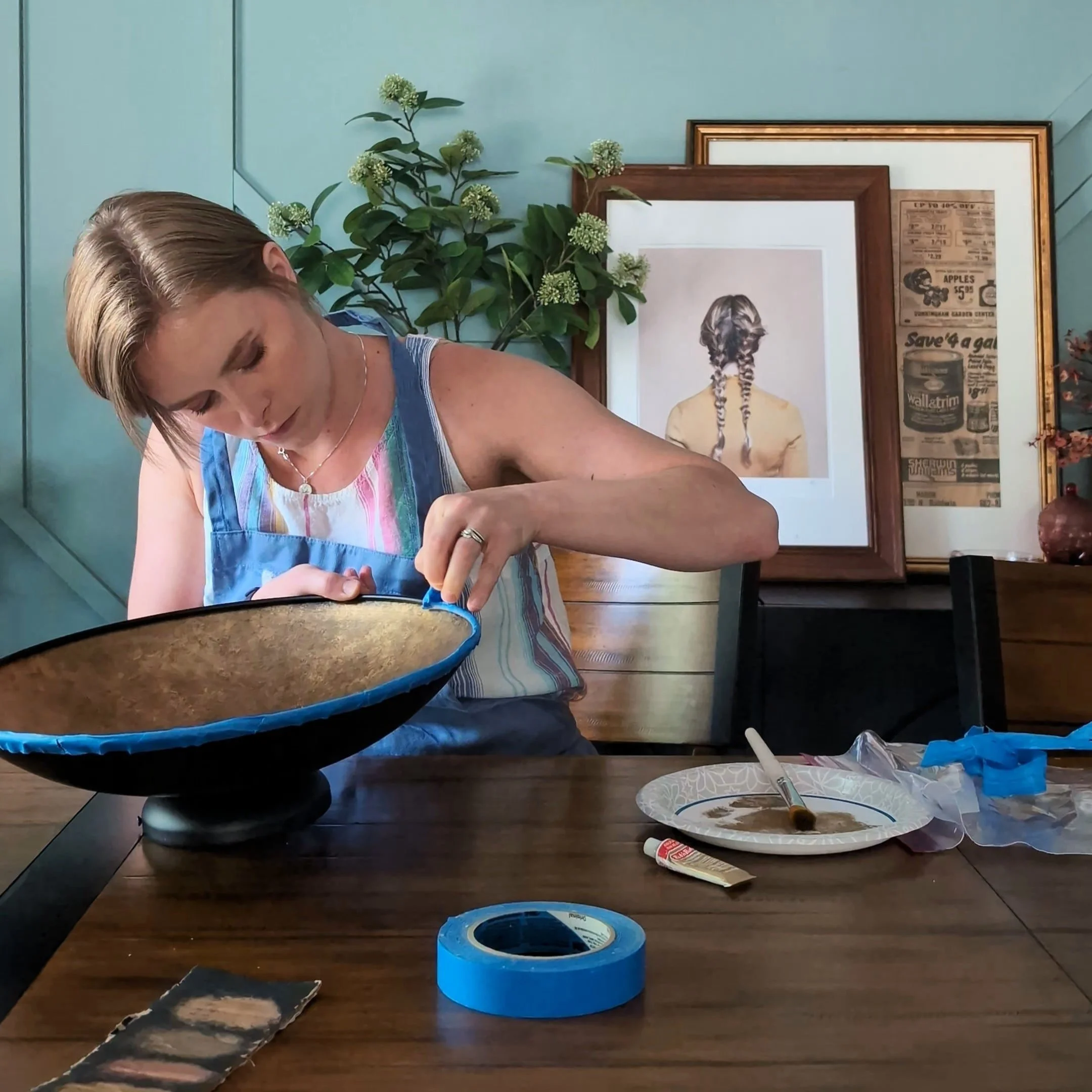
Step 3: Apply Rub ‘n Buff (Rub ‘n Buff Tutorial)
Now on to the fun part!
Squeeze a teeny bit of Rub ‘n Buff onto a paper plate (or foil, or whatever you’ve got). I loved the medium warmth of Gold Leaf against my Dark Auburn mudroom, so that’s the color I went with.
Dip your makeup brush in it, then offload the excess on a clean spot.
Apply to your surface using a dabbing or swirling motion—whichever gives you the texture you like.
Build up layers if needed. You can even use multiple colors. But be wary: once it dries, it’s dry. There’s no erasing.
I chose to dab the wax on the interior of the light fixture, which gave it nice movement and subtle texture.
Step 4: Seal It (Optional)
Once everything is dry, you can leave it as-is or top it with a clear spray sealer for extra protection. I skipped the sealer because the inside of the light fixture isn’t exactly a high-touch zone.
Then I pulled off the painter’s tape, did a little happy dance, and installed the fixture. Okay, Lucius installed the light fixture. Electrical freaks me out!
And That’s a Wrap
It might seem like a small detail in our mudroom project, but adding this light fixture made a huge difference.


Bonus: We finally added the globes to the pendant fixture in the lofted area of the mudroom—the same ones we bought three years ago and have been sitting in my closet in their original styrofoam packaging until now. (Please clap.)
Final Thoughts
This light fixture DIY took less than an hour and barely made a dent in my Rub ‘n Buff tube. I’m now actively looking for other things to gild—mirror frames, candlesticks, doorknobs, one of the kids… (Kidding. Mostly.)
If you're on the fence about trying Rub ‘n Buff, this is your sign. It's a small project with a big payoff—budget-friendly, beginner-friendly, and just the right amount of bougie.
Love the Look?
Here are a few other options that caught my eye:


Want more budget-friendly DIYs? Look no further!
DIY Light Fixture Makeover: Budget-Friendly Dupe Using Rub 'n Buff

Mudroom Makeover in Progress: Bold Paint, Spiral Staircases & Custom Swinging Doors
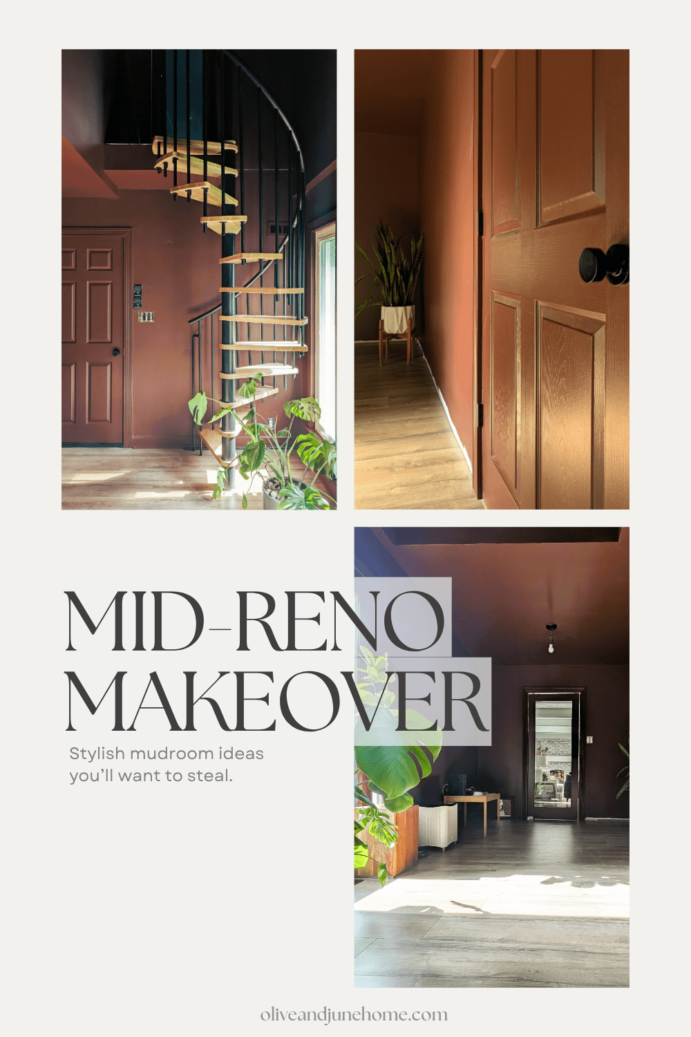
My once “meh” mudroom is starting to give serious main character energy. Let’s dive into the three big updates that changed everything.
One of the best parts about interior design is when a project finally turns the corner. After months (or, in this case, years) of chaos and drywall dust, you finally start to see the vision in your head actually exist in real life. And now? My once “meh” mudroom is starting to give serious main character energy. Let’s dive into the three big updates that changed everything.
The Moody Paint
I will always be completely head over heels for the instantaneous transformation paint can have on a room. Was this color a bold choice? Absolutely. And, of course, it's not going to be everyone's cup of tea. But I love how unapologetic it feels.

The choice to color drench every inch of this mudroom in the same rich, moody tone takes it from "just a pass-through" to "take your shoes off and stay a while." The shift between the eggshell walls and satin trim adds subtle contrast that creates dramatic little moments in the way light and shadows play at every turn. In short, this deep, saturated color (Dark Auburn by Sherwin Williams) is such a vibe.
One of the views that truly makes this room come to life? The bold transition from the light and airy living room into this cozy, color-drenched cocoon of a mudroom. The contrast is eye-catching and makes both spaces feel more intentional.

As an Amazon Associate, and partner with other brands, I earn from qualifying purchases. This post may contain affiliate links, meaning I receive commissions for purchases made through those links at no cost to you.
The Spiral Staircase
I just know the spiral staircase in the last picture caught your eye. I mean, how could it not?
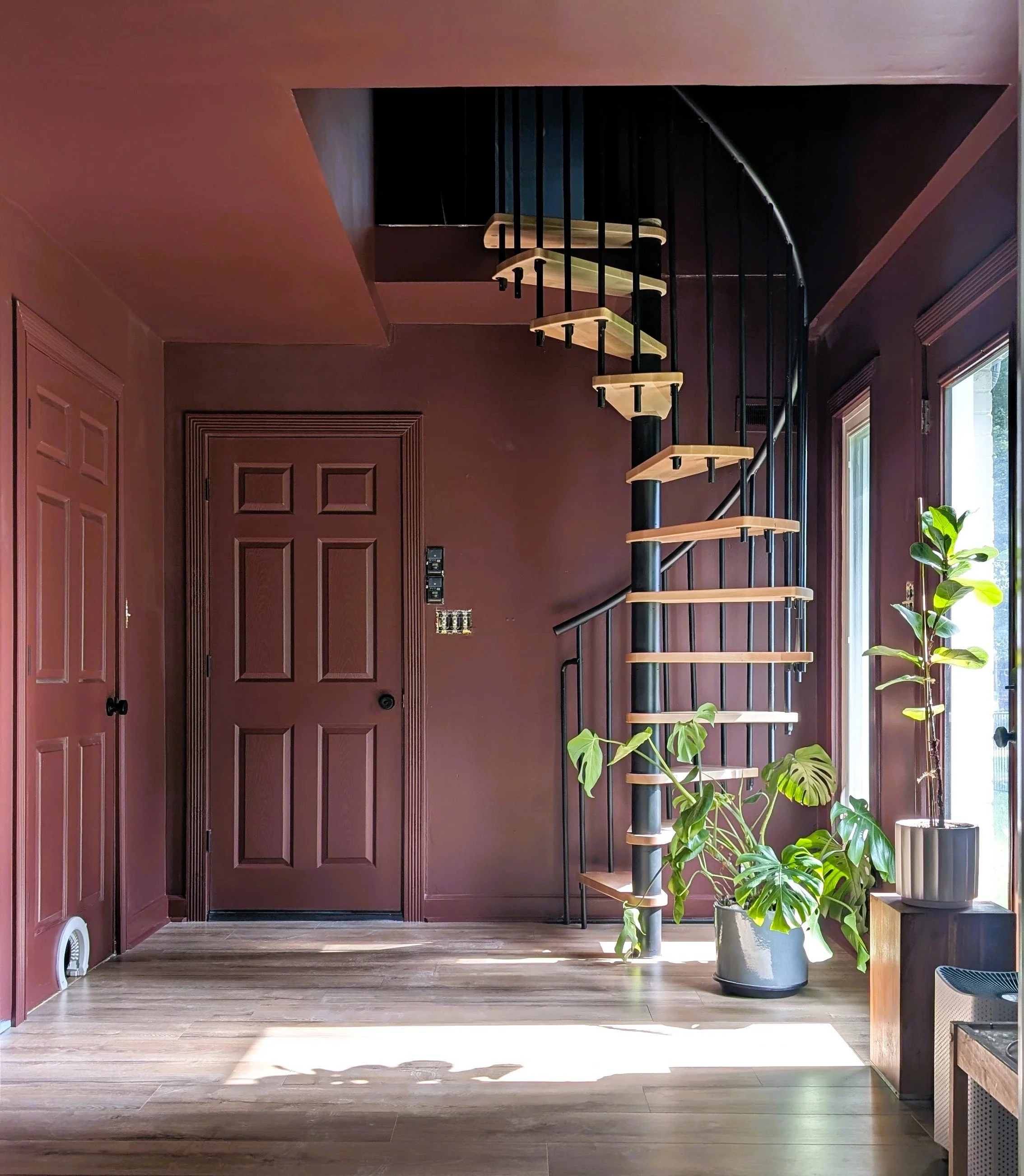
It's been so long since we've had a staircase here that I can hardly believe it's real (pinch me!)
The new spiral staircase is sleek, modern, and has just the right amount of statement. I love how the natural wood treads soften the black metal, making it feel both industrial and warm. Bonus: the spindles are nice and tight, which means no worries about the kids doing any accidental acrobatics off the side.

Fun fact: We actually installed this staircase TWICE!
Originally, we installed the staircase a bit to the left. It made sense in theory because it lined up with the door at the top, but once we saw it in action, it felt way too close to the door at the bottom. So we moved it, which meant pulling up some of the flooring, replacing a chunk of baseboard, and uttering a few curse words. Worth it? Absolutely.
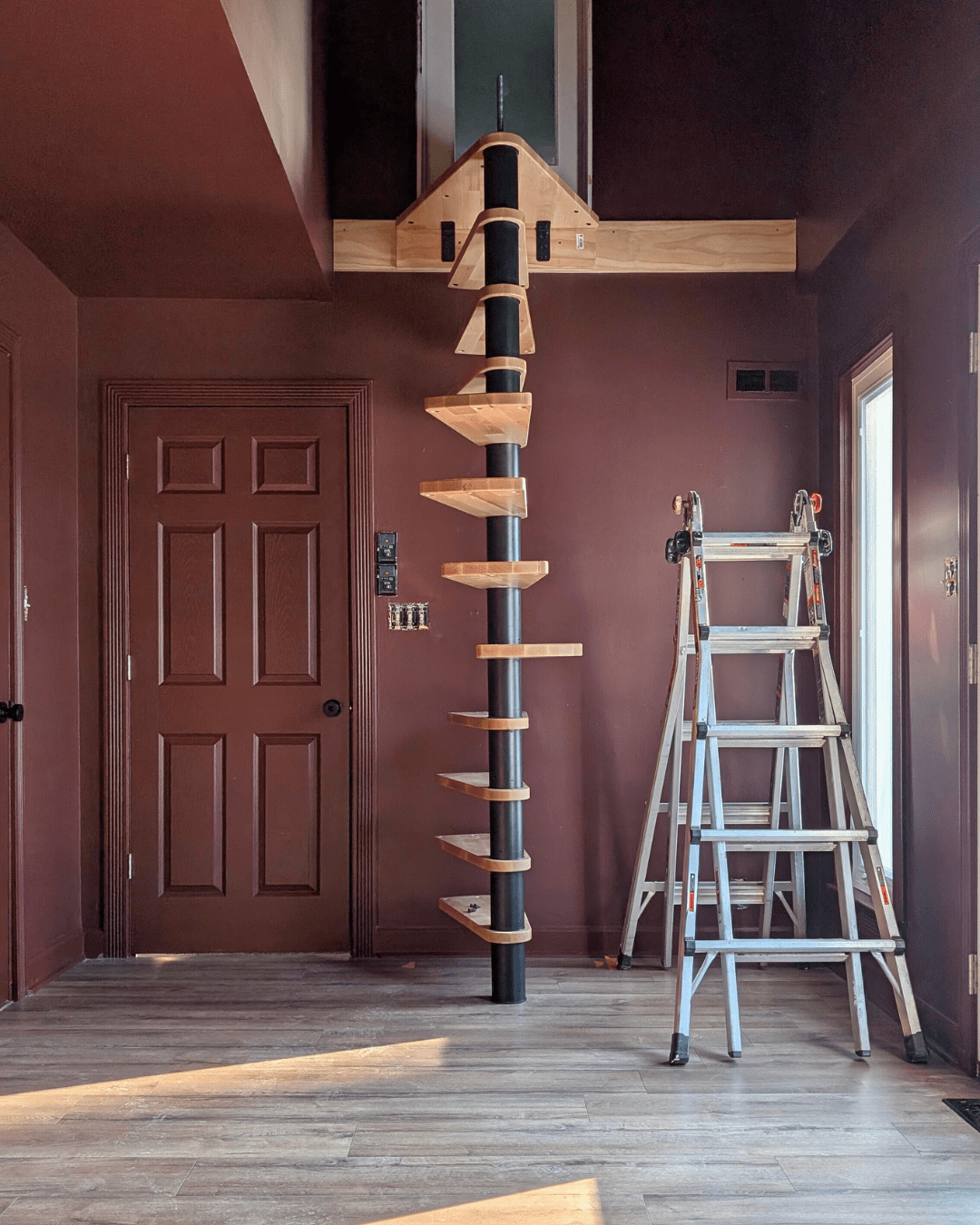
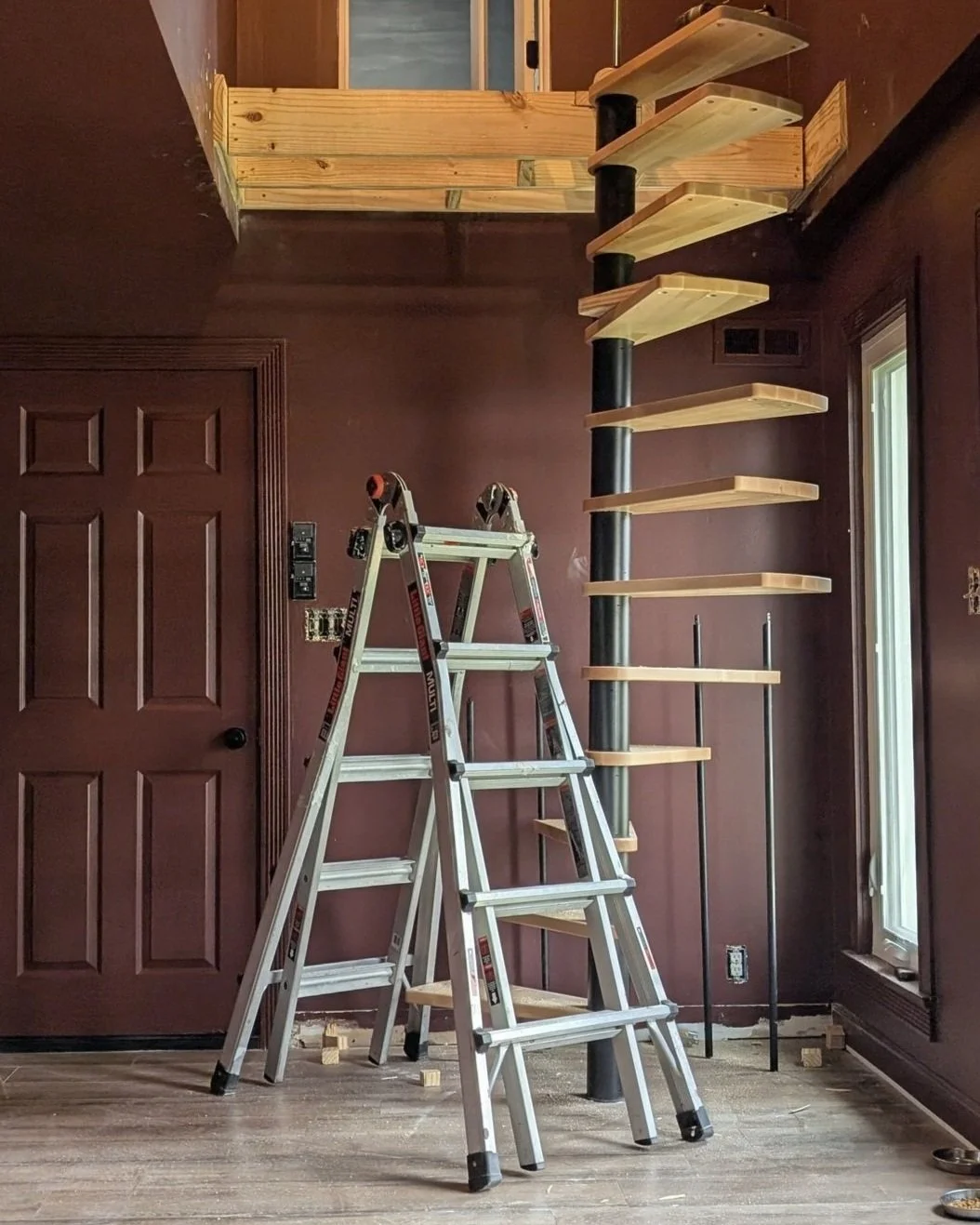
Once we scooted the staircase over, it no longer worked with the small, triangular platform provided with the kit. In the end, building a custom spiral staircase platform gave us more flexibility on which way the staircase could twist and where the bottom stair stopped. I'm really happy with how natural, and inviting the placement feels, though I wouldn’t recommend doing drywall after you’ve painted your room a dark color (if you know, you know).
The Swinging Glass Door
The final upgrade that most recently took this mudroom to a new level? Adding a swinging glass door.
Why swinging?

One of my biggest pet peeves is when my purse and/or coat smells like last night’s dinner. This room always had a door, but we rarely remembered to close it. By turning it into a swinging door, it does it on its own! No more stinky outerwear!
It took a surprising amount of troubleshooting to turn this standard glass door into a swinging door. After trying multiple types of hinges, we finally found a hinge that worked, and it’s been perfect ever since.
Why glass?
The mudroom gets incredible afternoon sun. Since the door will always be closed, we didn’t want to lose the natural light. Besides, now that this room has gotten quite the glow-up, it’d be a shame to only see it on occasion. Glass doors must be our thing since this is the third one we’ve installed in our house!
Yes, I have to clean fingerprints off it on the regular. But it’s worth it.
What’s Next?
Funny how months of chipping away at these three elements brought us to what looks like a blank slate. But here we are! While we still have a to-do list longer than my new staircase is tall, hitting these milestones is huge.
Next up is lighting, a bench, storage, artwork, a console table, and… a ton of other little details. Now if you’ll excuse me, I have approximately 43 Pinterest tabs open for lighting options and an unhealthy number of mudroom locker inspo bookmarked…


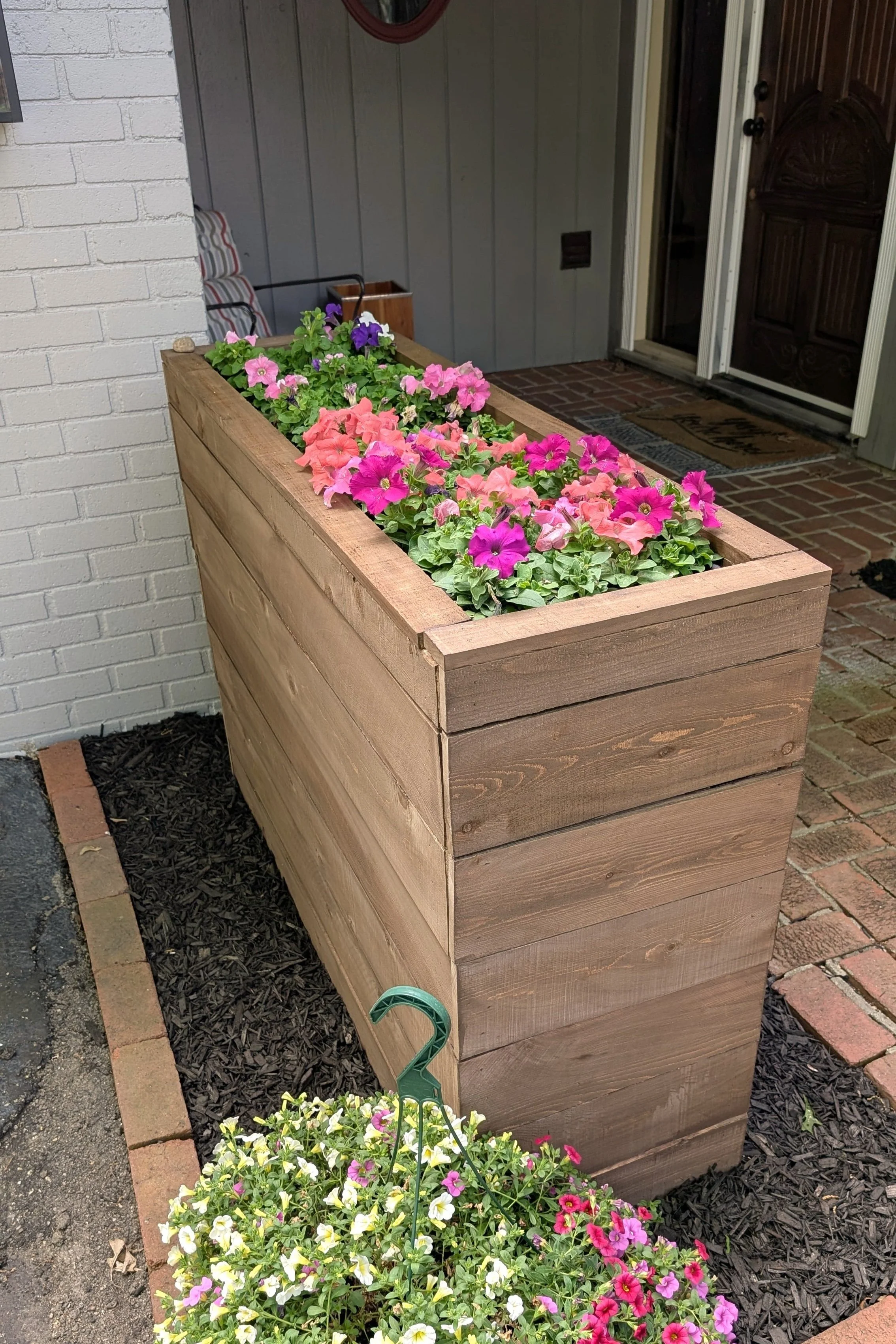
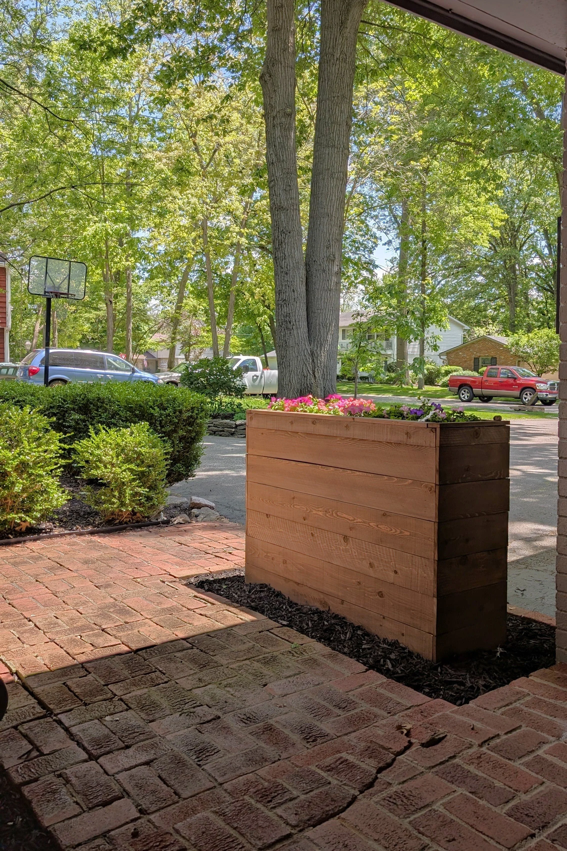
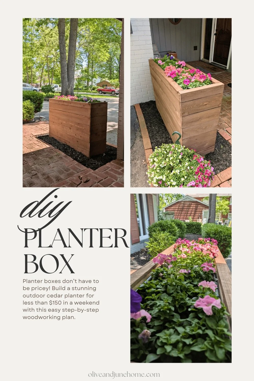
Customizable DIY Planter Box
Let’s be real—planter boxes are expensive. And the bigger they get, the pricier they are. And of course, I needed a large one, but couldn’t dropping big bucks on something I could build myself. So I rolled up my sleeves and took on this DIY planter box project.
DIY Planter Box with Cedar Fence Pickets
Let’s be real—planter boxes are expensive. And the bigger they get, the pricier they are. And of course, I needed a large one, but couldn’t justify dropping big bucks on something I could build myself. So, I rolled up my sleeves and took on this DIY planter box project.
In this tutorial, I’ll show you how to build a customizable, budget-friendly planter box that adds serious curb appeal without wrecking your wallet. Whether you’re new to woodworking or just want a stylish way to display your spring flowers, this beginner-friendly project is for you. Plus, I’ve included a full budget breakdown and tips I learned along the way.
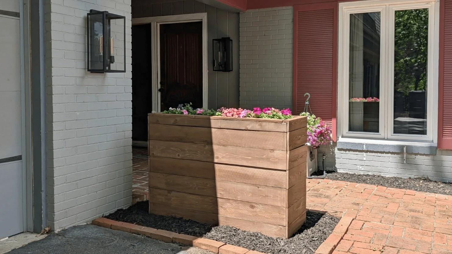
Spring is hands-down my favorite season. Longer days, plants blooming, warmer temps—yes, please. But with that fresh spring energy also comes a long list of projects. One of those? Finally dealing with the awkward empty rectangle by our front door.
Even though I’m knee-deep in the mudroom renovation, I didn’t want to put this project off another year. Plus, with the upcoming locker build for the mudroom on the horizon, I wanted to dip my toes back into a smaller woodworking project to rebuild my confidence.
Confession time: I get nervous before every. single. woodworking project. I always doubt whether I can actually pull it off, or if this is the time I accidentally lose a finger. The last big carpentry project I took on was the playroom built-ins... over a year ago. So I figured this would be the perfect project to dust off my skills and prove I haven’t lost my woodworking mojo.
Spoiler: it was way easier than I made it out to be in my head.
A Quick Heads-Up About Wood
You’ll want to buy pretreated lumber for this build—it holds up better outdoors. But here’s the catch: it’s usually soaked with moisture and needs time to dry before you can work with it. I had to wait two full weeks. Yes, it’s annoying. Yes, it’s worth it. Don't skip this step unless you want warped wood and regrets.
Disclaimer: I’m providing the measurements I used in my design throughout this post, but your measurements may vary based on different factors. That’s the great thing about this project though - you can customize it to fit your space perfectly!
As an Amazon Associate, and partner with other brands, I earn from qualifying purchases. This post may contain affiliate links, meaning I receive commissions for purchases made through those links at no cost to you.
Tools & Materials
Tools
- Tape Measure
- Miter saw (or circular saw)
- Kreg pocket hole jig
- Drill
- Clamps (corner clamps are a bonus)
- Square
- Finish nailer
- 1” finish nails
- Optional: table saw (for trimming the top planks)
Materials
- (2) 2x4x8 pretreated lumber
- (3) 2x3x8 pretreated lumber
- (13) Cedar fence pickets
- (2) Plastic planter boxes (mine were 24”x12”x9”)
- Kreg 2 ½” pocket hole screws
- Exterior stain/sealant
Step-by-Step Instructions
Step 1: Cut Your Wood
Once your wood is dry, it’s time to cut. Here are the main cut sizes I used for the frame:
(4) 2x4s @ 36” for the vertical legs - 2
(4) 2x3s @ 43 ¼” for the long horizontal sides - 2
(7) 2x3s @ 12” for the short sides and internal supports - 1
(2) 2x2s @ 50 ¾” for the planter box supports - 2
If you’re a visual learner (hi, same), here’s a quick-cut diagram I created:
Step 2: Build the Frame
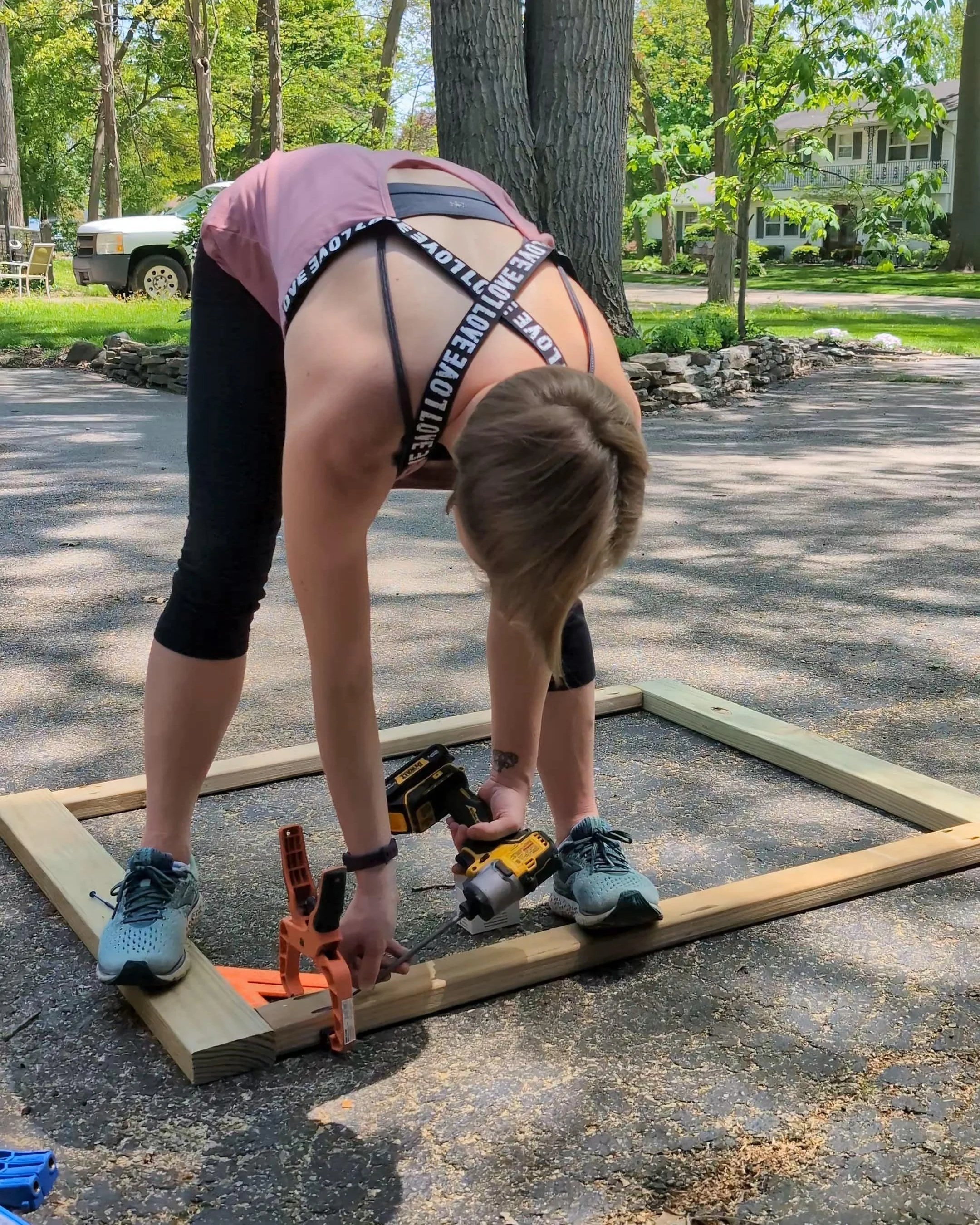
Drill two pocket holes into each end of the 43 1/4” and 12” pieces using the Kreg Jig (aka the MVP of DIY joinery).
Start by assembling the two side panels. Each panel uses two 36” 2x4s as the vertical legs and two 43 1/4” 2x3s as the top and bottom connectors. These create the long sides of the planter box.
Use clamps to keep everything square. If you, like me, don’t have corner clamps, you can fake it with a speed square, basic clamps, and sheer determination.
Once both sides are assembled, connect them using the 12” 2x3s across on the sides —two at the top and two near the bottom.
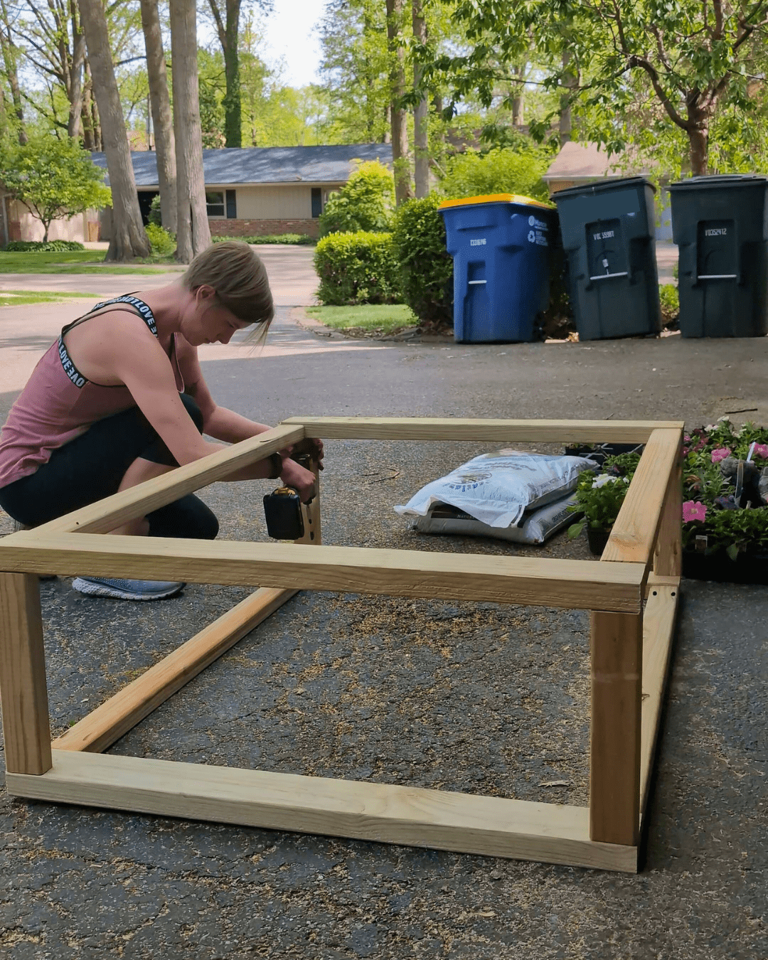
Add a fifth 12” piece in the middle of the bottom for extra support.
Step 3: Add Planter Supports
The last two 12” pieces will be used for the planter support sides.
Measure how far from the top your plastic planters will sit. Take the height of your planters and add 1½” (to account for the support boards they’ll sit on). My planters are 9” tall, so I installed the supports 10½” down from the top.
Then screw in the 50 3/4” side supports across the width. I originally used 2x2s, but they cracked—so I recommend sticking with 2x3s here for more strength.
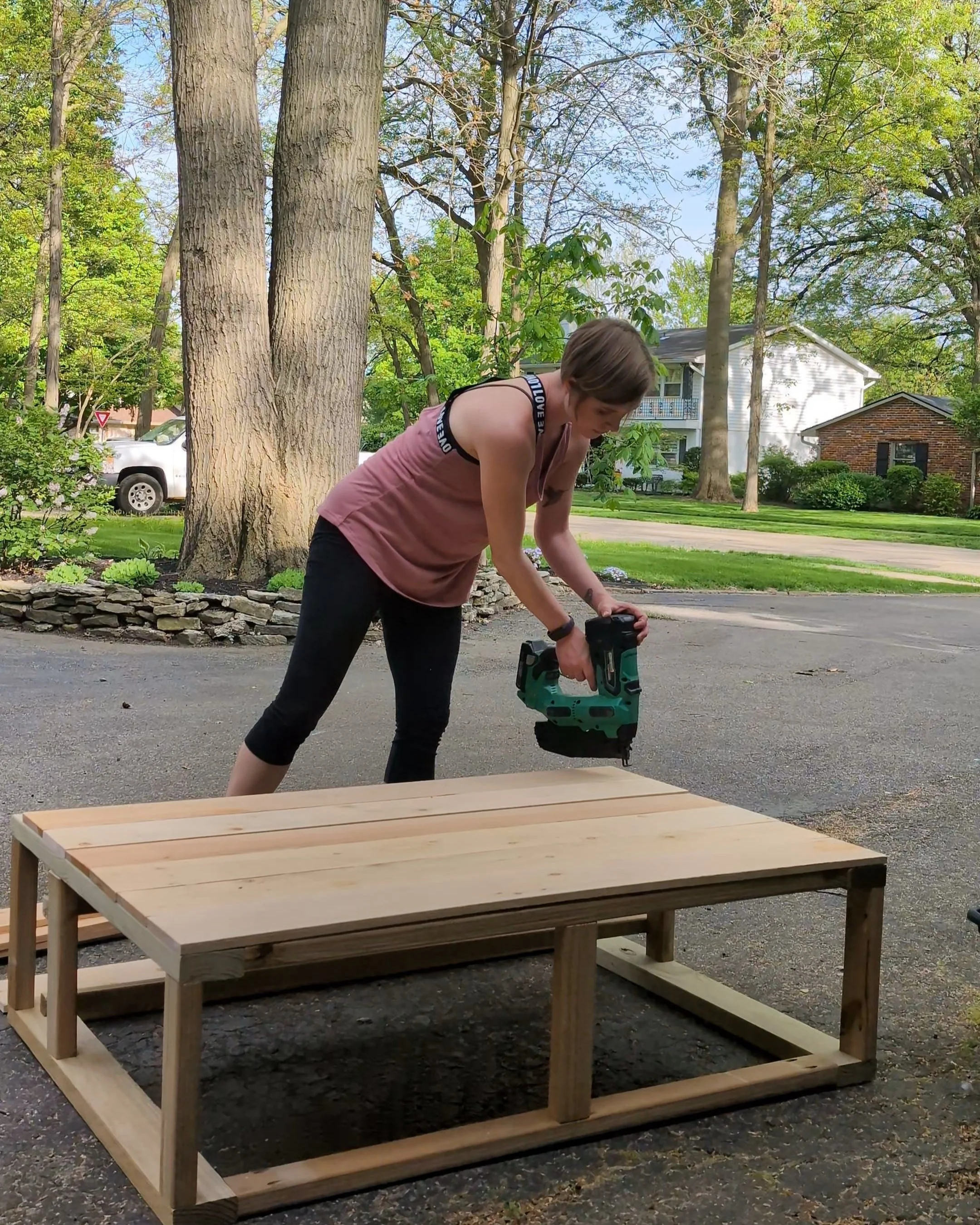
Step 4: Add the Exterior Sides
Now that the frame’s done, it’s time to make it look pretty.
Cut off the dog-ear detail on the fence pickets. Then measure the sides of the planter and cut the cedar fence pickets down to size. I was able to get one long side and one short side out of each picket.
Starting at the bottom, nail each plank in place using a finish nailer. Make sure to keep that first plank level!
You can leave small gaps between boards for a more rustic vibe, but I went for a seamless look to better match my house’s style.
Once I got to the top, I ran a couple of pickets through the table saw to cut them down to the right width for the remaining spots.
For a more finished edge, I ripped a couple more pickets to create a top trim and nailed them around the top edge for a polished look.
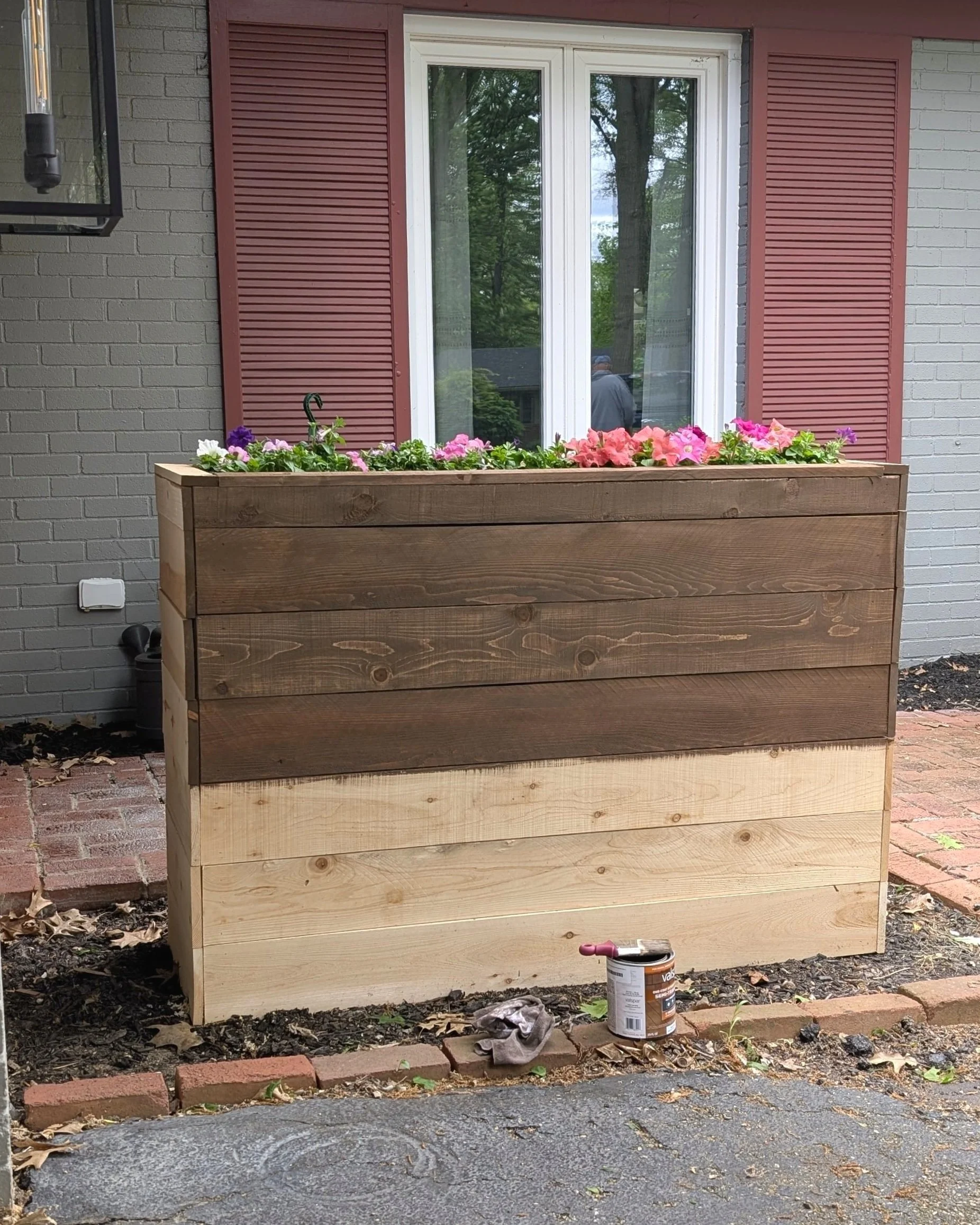
Step 5: Stain & Seal
To protect my planter from the elements and tone down the color, I used this semi-transparent stain by Valspar in Chocolate Chip. It was a little more opaque than I wanted, so I brushed it on in small sections and immediately wiped it off with a rag. This gave me exactly the look I was going for (which was lucky since I didn’t sample any other options!)
This was my first time using this stain, and I really liked it. Not only was only one coat recommended, but it’s water-based, so it didn’t completely destroy my paintbrush and was easy to clean up!
Step 6: Add Plants!
It’s time to finally fill your planter! But first, make sure you drill holes in the bottoms of your pots.
This year, I planted petunias. And because my neighborhood is overrun with squirrels, I make sure I spray my plants with deterrent spray a couple times a week.
To finish it off I spread a bag of mulch around the base.
Planter Budget Breakdown
Now, the question you’ve probably been asking: “Okay, this looks cool, but how much is it going to set me back?” Well, you’ve come to the right place!
*Note - I already had all my tools on hand, so that may be an additional cost if you need to purchase any.
Wood: $38.29
Cedar Fence Planks: $33.53 (13 @ $2.58/each)
Screws: $12.48 (box of 50)
Flower boxes: $23.98 (2 @ $11.99/each)
Stain: $21.98 (1 quart)
Total: $130.26
Not bad, eh?
Final Thoughts
Turns out, building a raised planter box for your porch or garden isn’t nearly as intimidating—or expensive—as it sounds. With a few cedar fence pickets, some basic tools, and a bit of DIY determination, you can create a gorgeous, oversized planter that’s totally customized to your space.
Ready to get started? Grab the plans, hit the hardware store, and bring your porch or patio to life with this easy outdoor planter box project. Your front yard (and your budget) will thank you.

Looking for more plant projects?
Easy DIY Trellis (perfect for Clematis!)
Step-by-Step Planter Box Instructions

Designing a Stylish and Functional Mudroom
We’ll, we’ve lived in our house for over 5 years now, and the mudroom STILL hasn’t been renovated. Now it’s time for that to change. Join me as I share my design plans for creating a gorgeous and functional mudroom.
A Fresh Take on Mudroom Design: Color, Storage, and Modern Touches
When we were house hunting, we landed on two that we particularly liked. The determining factor? The one we chose had an AWESOME mudroom! And while it wasn’t our style, we realized it was full of potential.
We’ll, we’ve lived in our house for over 5 years now, and the mudroom STILL hasn’t been renovated. Now it’s time for that to change. Join me as I share my design plans for creating a gorgeous and functional mudroom.

As an Amazon Associate, and partner with other brands, I earn from qualifying purchases. This post may contain affiliate links, meaning I receive commissions for purchases made through those links at no cost to you.
The Slowest Renovation Ever
Before I get too far ahead of myself, I’d like to point out that we had intentions of renovating this room early on. But then so many other spaces became the priority. That’s not to say we haven’t done ANY work in here. Let me catch you up.
We used the mudroom, more or less, in the same state we bought it in for a couple of years but never put much effort into beautifying it because we knew a larger makeover was just around the corner… or so we thought.


A few years ago, we started our renovations by removing the closet that jutted into the room, the overly ornate light fixtures, and even the rickety staircase - and then we got distracted with other areas of the house.


About a year later, we got around to patching the drywall.


Eventually, I primed the walls. And last winter, when we replaced the flooring throughout the first floor, this room got an upgrade, too!


Finally, it’s time to kick this renovation into overdrive and get. it. done! And, as usual, I’m bursting with ideas.
Inspiration
I took inspiration from countless sources - in some, I was drawn to the structure of the lockers, others took me down a bold color journey, and quite a few made me seriously consider installing a bold patterned tile floor.

One thing was clear: I knew I wanted to make a statement. Though this room is just off the living room, it’s separate enough to be its own “moment”—so why not lean in?
Initially, I considered the mid-tone and dark blue-gray shades I’d seen in countless other mudrooms. But since our main floor color palette already leans cool, I wanted contrast. That’s when I realized what a perfect callback it would be to echo the deep red vanity from our half-bath renovation.
Then I stumbled upon this design by Banda Studio, and it solidified I was on the right track…

Seeing this rich hue against flooring similar in tone to my own reassured me they’d work together. I also love how the rubber tree’s green leaves and the green upholstery on the chairs add depth, while the cane chairs and abstract artwork create contrast.
Beyond color, the balance of modern and traditional elements really drew me in. The ornate molding playing against the geometric light fixture over the dining table is that perfect mix of old and new that makes a space feel dynamic.
So how do all these elements translate to my space? I’m glad you asked!
Mudroom Design Plans

As noted above, the wall color will reflect the inspo image—you can even spot my paint samples in the last mudroom photo. As for the exact color: I’ve landed on Dark Auburn by Sherwin Williams, and I’m not just painting the walls—I’m painting everything. Hard to believe this will be my first fully color-drenched room!

To address the elephant in the room, yes, we’re replacing the staircase! We’ve lived here longer without one than with one (definitely removed it too soon—whoops).
The new design introduces matte black elements, which you’ll see repeated throughout the room, has much smaller baluster gaps (huge win for my anxious mom brain), and the contrast of black, wood treads, and auburn walls? Chef’s kiss.
Another large design element in this room is building out shoe, coat, and backpack storage. To be honest, I’ve been dreaming this part up for years. The long, empty wall on the left is exactly where that will go.

I know my family—and how messy they are. My goal is to make this space the epitome of easy organization, and this inspo image by blancmarineliving hits all the right notes:

- Shoe cubbies for each of us, with a shelf for double the storage. I’m even planning to make the bottom level with the floor for easy “kick your shoes right into the cubby” accessibility.
- Plenty of hooks on an open-backed panel. No individually divided lockers for us! (Let’s be real, we both know they’ll always be left open.)
- Cabinets or cubbies above for extra storage - because who doesn’t need extra storage?
As for the finish, I’m torn between painting it or leaving the wood exposed. I’d love to keep the wood, but I’m not sure my craftsmanship is quite there. Then again, I thought the same about the playroom built-ins, and those turned out great!
On the opposite wall, I’m beyond ready to replace the tiny kid’s table that’s been holding our internet gear for years. I’m on the hunt for an Art Deco buffet with waterfall edges to add some traditional charm—or maybe a burlwood or tiled console table for extra visual interest. But I could also be swayed toward an even more modern look like this or this.

The wall above the buffet/console table is the perfect (and only) spot in this room for a fun statement piece. I’m considering one of these two paintings in a large-scale format.


I love the quirkiness of the print on the left, and the colors would go amazingly well with the wall color. But the picture on the right would be unexpected and could brighten up the room slightly.
As for lighting, several years ago, we replaced the pendant light in the lofted portion of the mudroom with the light fixture on the left. For the other part of the mudroom, I’ve been swooning over the modern light fixture on the right for this space for quite a while.


As for the green accents, I already have a few plants in this room and I fully plan on keeping them in here. The mudroom actually gets really great light so not only will the plants add a fantastic pop of color, they’ll continue to thrive in this space.
Final Thoughts
This is already quite the lengthy post so I’ll stop here - but just know there are even more details rolling around in my head that I haven’t even shared yet. Keep following along to see how this mudroom renovation unfolds!


For more room designs, check out these posts:
Mudroom Makeover: Bold Colors, Smart Storage & Design Plans

From Kid to Tween: Girl’s Bedroom Makeover Reveal
I love a reveal, and this one is especially sweet because I designed this room with my daughter’s help - because it’s hers! She’s entering her tween years and wanted something a little more mature. My response? “Say less.”
DIY Tween Girl’s Bedroom Reveal - Bold Colors & Vintage Touches
I love a reveal, and this one is especially sweet because I designed this room with my daughter’s help - because it’s hers!

Photography by: Hannah Thorneycroft
My daughter’s room was actually the first one I renovated in this house when we moved in. But that was 5 years ago. And, as we know, kids grow up fast. In this case, my daughter is entering her tween years and wanted something a little more mature. My response? “Say less.”
Before we dive into the new design, let’s travel back in time (because I love this part!).
The Before

The previous resident of my daughter’s room was a teenage boy. No girly colors or frills in sight. Her room was an unfortunate light-sucking shade of blue/gray that wasn’t doing this space any favors.

I loved the result the first time I made over this room. It fit my little girl to a T. But it was time for a change, and now I might love it even more!
As an Amazon Associate, and partner with other brands, I earn from qualifying purchases. This post may contain affiliate links, meaning I receive commissions for purchases made through those links at no cost to you.
The After

Photography by: Hannah Thorneycroft
Out with the pink, teal, and unicorns and in with green, mustard yellow, and checkers. This room is now a perfect haven for my slightly hormonal pre-teen.
Here’s what it took to make over this space:

Photography by: Hannah Thorneycroft
Tone-on-Tone Paint
Ah yes, the catalyst for this entire makeover: green walls. While my daughter initially requested a fresh coat of paint (specifically an earthy green color - to my pleasant surprise!), of course, I couldn’t stop there.
This was the perfect opportunity to experiment with tone-on-tone paint, so we introduced a darker shade of the wall color on the doors and trim, which turned out fantastic.
I love the added dimension and unexpected surprise the tone-on-tone paint adds to this room. And while green can be a tricky color to pull off, the shades we chose (Sherwin-Williams Recycled Glass on the walls & Cucuzza Verde on the trim) are perfectly balanced between earthy, but not too gray and fun, but not too bright.
Statement Headboard
While the bold wall and trim color combo already make a striking impression, the headboard steals the show.
Its yellow ochre fabric pops brilliantly against the soft green walls, instantly drawing your eye. Then comes the playful, wavy silhouette—unexpected and full of character. Finally, the sheer scale of it sinks in, making it clear this isn’t just a headboard—it’s a statement, a centerpiece, a conversation starter. Simply put, it’s a showstopper. And the best part? It’s a DIY!
Checkered Area Rug
I remember when I was younger and there seemed to be a new-age 70’s fashion resurgence - I’m talking bell bottoms, peace signs, smiley faces, bucket hats (anyone remember Delia’s catalog!?). And, I kid you not, it seems to be making a comeback AGAIN! So it was a no-brainer that my daughter was WAY into the idea of a checkered rug. And I couldn’t be happier with the one we chose for her room.

Photography by: Hannah Thorneycroft
Not only is the pattern on point, but the rust color in the rug is perfect with the 70s-esque color palette. I also love the addition of the border in this particular rug, and I’m blown away by how soft it is. On top of that, I feel like the rigid geometric pattern against the soft green walls, smooth curves of the headboard, and overall feminine touches in this room strike a perfect balance.
Refreshed Nightstands and Dresser
While we replaced many items in my daughter’s room, it wasn’t necessary to replace everything. Her nightstands and dresser, for instance, are still in great shape (thank you, vintage pieces with ROCK SOLID construction) - they just needed a little refreshing.

Photography by: Hannah Thorneycroft
A fresh coat of white paint and switching out the hardware did WONDERS to update these pieces and help them coordinate with the rest of the room.
It’s All In The Details
And, of course, what really makes any design shine is the details, like these adorable green lamps with wavy woven shades. Since there’s already plenty to catch your eye in this room, we kept the comforter neutral, but chose one with a cute tassel detail on the border!

Photography by: Hannah Thorneycroft
Above the bed, my daughter chose this artwork herself. I had them printed and hung them in natural-toned wood frames to match the legs of the sleek acrylic chair my daughter also picked out - a girl after my own heart!
And every girl needs a mirror in their room - especially a tween who is starting to lean into fashion and find her own style. This gold mirror ties in perfectly with the other gold accents (hello, nightstand knobs), while the curved top softens the bold geometric rug and echoes the waves of the headboard.

Photography by: Hannah Thorneycroft
Finally, to help keep the floor somewhat tidy (an ongoing battle), I added a stuffed animal net and some cute hooks —fingers crossed they actually get used!

Photography by: Hannah Thorneycroft

Final Thoughts
This makeover was more than just a room update—it was about giving my daughter a space that reflects who she is now, while still being functional for the years to come. But let’s be real, we all know she’s going to ask for another makeover before too long. And when she does, I’ll be ready with my paintbrush.


Photography by: Hannah Thorneycroft
Follow the whole room makeover!
Tween Girl’s Room Makeover: Before & After

DIY Upholstered Wavy Headboard
Wavy upholstered headboards are having a moment, and it’s easy to see why—they’re bold, fun, and full of personality. When I couldn’t find one that fit my budget, I decided to make my own, and guess what? It’s easier than you think!
How to Make a Wavy Headboard
Wavy upholstered headboards are having a moment, and it’s easy to see why—they’re bold, fun, and full of personality. When I couldn’t find one that fit my budget, I decided to make my own, and guess what? It’s easier than you think!

Photography by: hannah thorneycroft
A statement headboard can be an absolute showstopper. While planning my tween daughter’s room makeover, I fell in love with wavy headboards—the playful shape, the splash of color and texture they bring, and how they command attention as a focal point. It was everything I wanted, but the price tags gave me pause. So, I decided to try my hand at making one myself, and to my surprise, it was totally doable!
If you’re as smitten with this trend as I am but aren’t sure about the DIY route, don’t worry—I’ll also share a few gorgeous options at different price points you can buy to get the look without breaking a sweat. Let’s dive in!
As an Amazon Associate, and partner with other brands, I earn from qualifying purchases. This post may contain affiliate links, meaning I receive commissions for purchases made through those links at no cost to you.
Tools & Materials
- Fabric
- Plywood or MDF (I used 1/2” plywood)
- Jigsaw
- Upholstery Foam
- Batting
- Spray Adhesive
- Staple Gun & Staples
- Tape Measure
- Pencil
- Graph Paper (optional)
- Scissors
- Pliers (optional)
- French Cleat
- Drill
- Stud Finder
- Orbital Sander or Sandpaper
What struck me most about the headboards I loved was their grand scale, especially those wide enough to include the nightstands. Since we used a twin bed in my daughter’s room, a 4x8’ sheet of plywood was the perfect fit for this concept.
Determine Wave Spacing
Start by determining the spacing of your waves. I found it easiest to sketch the design on graph paper, which helped me visualize the full layout and experiment with lamp sizes. Every four boxes equals one foot.
This method also allowed me to figure out an aesthetic way to end the waves on the edges of the headboard.
Transfer Your Headboard Design to Plywood

Since I already had measurements from my drawing, I was easily able to mark on the plywood where the waves would begin and end.
I started by drawing a line across the length of the plywood where the bottom of the waves would hit. I originally planned for my waves to be 6” deep but changed them to 8” at the last minute because I was afraid some of the detail would be lost once I added upholstery. I’ll explain later why I would recommend shallower waves for this project.
Then I drew another line between that and the top of the plywood, showing approximately where the middle of the waves would land (4” from the top). From here, I made marks along those lines exactly where the top, middle, and bottom of each wave should be.
To make sure that the waves were uniform, I referenced my drawing to make a wave template out of paper. Then, I simply traced my template making sure it was consistent with the guidelines I left myself.
Once my design was drawn, it was easy to cut it out with a jigsaw. Just follow the lines and voila! I recommend a light sanding to smooth out any rough or inconsistent spots.


Upholster Your Wavy Headboard
Now it’s time to add some fluff to this bad boy!
You’ll begin by gluing foam to the plywood. I used 1” medium-density upholstery foam, but anything from 1/2”-2” will work. I laid it out flat on my plywood to make sure the plywood was covered. Then I lifted the foam, sprayed adhesive underneath, and laid it back down. Finally, I cut the excess off with a pair of scissors.

Next up is batting. I rolled out the first layer and began pulling it around the edges and stapling it to the underside with my staple gun. On the bottoms of the waves, I cut little pizza slices (for lack of a better term) so they wouldn’t bunch up. Then, I repeated these steps with another layer of batting for extra floof.


And here comes the most exciting part: adding the fabric! I laid my fabric face down on the floor and put the headboard on top. If your fabric is patterned, make sure it’s perfectly aligned. Then I began wrapping the fabric around the edges and stapling every couple of inches. It’s important to pull it taut as you work your way around - pliers came in handy here!


Everything was going well until I got to the bottom of the waves and REALLY started to struggle to get the fabric pulled smoothly. I have a hunch that shallower waves would have made this part easier. Similar to the batting in these sections, I cut “pizza slices”, which helped somewhat but it took a lot of finagling to get my fabric just right.
Mount Your Headboard to the Wall
The last step in this project is to attach your headboard to the wall. I chose to use French cleats for this part and they worked like a charm! You could absolutely make your own French cleat by cutting a piece of wood straight down the middle with a table saw at a 45-degree angle. Or, you could buy some like I did. Either way, the following steps apply:
Mark the center of the back of the item you want to hang, and use that as a guide to mark a level line for the top of the cleat.
Mount the cleat to the item.
Mark a level line on the wall where you want to hang the item.
Drill pilot holes and hammer in wall anchors.
Install the wall cleat.
Place the item against the wall, slightly above the wall cleat, and slide it down to interlock the cleats.
Enjoy!

Photography by: Hannah Thorneycroft
Although there were a couple of things I would have done differently, I’m really pleased with how my daughter’s wavy headboard turned out - and she is too! She loves having the extra cushion to lean against and fully approves of the color and soft fabric. Plus, it creates an awesome focal point in the room in scale and accent color.
What are your plans for creating a headboard of your own? Let me know in the comments!
FAQ
What’s the best kind of fabric for an upholstered headboard?
I’m no seamstress or upholsterer, but I’ve learned a thing or two over the years. First, I made sure I searched specifically for upholstery fabric. This is typically thicker and doesn’t have much elasticity. Secondly, because I know my upholstery skills are very young, I made sure to avoid anything with a geometric or clearly repetitive pattern. Unless you’re a skilled upholsterer, you’ll have a very difficult time keeping the pattern lined up and IT WILL SHOW.
How can I make this headboard for a larger bed?
Yes! But you’ll need to connect two pieces of plywood (which is pretty simple!). Then just follow the steps outlined in this tutorial.
How much did it cost to make your headboard?
The total cost of my headboard came down to around $250, not including the tools I already had (jigsaw, staple gun, drill). Considering how much a nice headboard can cost, I’d say that’s not bad!
Wavy Headboard & Bed Frame Roundup
I recognize that DIY isn’t everyone’s jam. That’s why I’ve rounded up some wavy headboards that make me swoon below.


Follow the whole room makeover!
Looking for more easy upholstery projects?
Step-by-Step Guide for Building a Custom Headboard

Why I'm Obsessed with Tone-on-Tone Design
You may have heard the phrase “tone-on-tone”. But what does it mean and how do you implement it in interior design? I’m answering all that and more in this comprehensive blog post!
Mastering Tone-on-Tone Design
You may have heard the phrase “tone-on-tone.” But what does it mean and how do you implement it in interior design? I’m answering all that and more in this comprehensive blog post!

Image Source: Therese Jahnson
What is Tone-on-Tone Design?
Let’s dive right in - what the heck is tone-on-tone design?
Tone-on-tone is all about playing with different shades and tints of the same color, from super light to really dark. It’s a simple way to create a space that feels pulled together but still has some depth and personality.
When I started searching for inspiration for my daughter’s room makeover, I came across this picture and was immediately inspired.

Image Source: The House on dolphin Street
I love a color-drenched room, but using the same color that’s on the walls on the trim in a darker shade seems like such a playful way to add depth and dimension. And lots of other people seem to agree!
Why Is Tone-on-Tone Design Trending?
So, what makes this design style so popular? Beyond being undeniably gorgeous, tone-on-tone design offers a slew of other perks:
Effortless Calm, Cohesive Spaces

IMage Source: Unknown
By sticking to one color family, you create a space that feels calm and harmonious while still being visually interesting. It’s an easy way to make your home look polished without overcomplicating the design.
Timeless Appeal
Although it sticks to one main color, tone-on-tone design gives you endless options for mixing things up with different shades, finishes, and textures. This makes it super flexible and easy to keep looking fresh and tailored to your style - whether it’s traditional, contemporary, or anything in between.
Beginner-Friendly with a High-End Look
Tone-on-tone design is SO EASY. If you can paint a room, you can embrace this design trend. And if you want to take it a step further, layering in more elements in the same color family (like pillows, curtains, artwork, etc.) is simple.
Tone-on-Tone vs Monochromatic Design
It’s easy to confuse tone-on-tone and monochromatic design, but they’re not quite the same. While the differences are subtle, their slight variations make a big impact on how a room can look and feel. Here’s the simplest way to wrap your head around it:
Monochromatic design: Uses slight variations of one color for a clean, cohesive vibe.
Tone-on-tone design: Mixes in different shades (darker tones) and tints (lighter tones) of one color to add depth and variety.
Take the two pictures below, for example.

Monochromatic
Tone-on-tone
While the image on the left has a little bit of contrast, the majority of the room is the same shade of light blue, creating a calm, monochromatic look.
In the image on the right-hand side, you’ll notice more variety in shades and tints of the same blue, which creates a more dimensional, dynamic space.
Both rooms are beautiful - it just depends on the style you’re going for!
How To Pull Off Tone-on-Tone Design
Now that we’ve covered the what and why, let’s dive into the how. Here’s how to pull it off without your design looking flat.
Contrast Is Key
As you’ve probably noticed, contrast is one of the key elements of tone-on-tone design. By adding darker shades and lighter tints of the main color, you’ll seamlessly add depth and visual appeal to your space. However, there are numerous other ways to bring more character and intrigue to your tone-on-tone room.

Image Source: KAGU interiors
Embrace Texture
Texture is a fantastic way to add depth and interest to a tone-on-tone space, making it visually dynamic and inviting. Take this image, for example:
First off—how stunning is that deep purple!? I’ve been obsessed with this color lately.
Now, if you take a closer look at the image, you’ll notice the variety of textures woven throughout the room. The smooth walls, the luxurious velvet footstool, the purple details in the area rug, and the tightly woven fabric of the couch all bring a unique tactile element to the space. Even though all these pieces stay within the same color family, the room feels thoughtfully designed and far from monotonous due to the rich layering of textures. It’s a perfect example of how texture alone can elevate a tone-on-tone room.

Image Source: Turner Pocock
Incorporate Patterns
Here’s another design element that can really pump up your tone-on-tone design: pattern.
Incorporating patterns into your design subtly enhances visual interest by introducing movement and breaking up large swaths of blank space.
In this example, you’ll notice patterns in the headboard, bedspread, pillow, and even the carpet. The key to utilizing multiple patterns is to stick with a consistent color palette, vary pattern size, and incorporate both organic and geometric patterns.
Add Accents
Adding accents to a tone-on-tone room brings contrast and vibrancy while maintaining the overall harmony of the design.
For example, a bold pop of orange in the room at the end of the hall adds a striking, modern touch to an otherwise traditional space.
While a contrasting color is an excellent way to introduce an accent, accents can also take the form of metallic finishes, natural materials, or subtle complementary neutral tones, such as wood, stone, or glass. These details can be integrated in various ways, such as through artwork, decorative pillows, or standout furniture pieces.

Image Source: Unknown

Image Source: Margate House
Layer Upon Layer
What truly makes a tone-on-tone room stand out is the use of layers created through contrast, texture, pattern, and accents. If you look closely, all the images in this post feature these elements, which is why they’re so visually striking.
Layering adds depth, warmth, and richness, transforming a space into something both inviting and well-curated. By combining textures, patterns, and finishes within the same color palette, you create visual interest and complexity. Thoughtful layering prevents the room from feeling flat, enhancing its cohesive tone-on-tone style with a polished, lived-in charm.
Ready to Try Tone-on-Tone Design?
Now that you’ve got the tools to master tone-on-tone design, it’s time to bring this trend into your own home! Start with a color you love, and play with shades, textures, and accents to create a space that feels both stylish and personal. With these tips in mind, you’re well on your way to designing a room that’s equal parts timeless and dynamic.
As for me, I’m taking this trend and running with it in my daughter’s room makeover. Her request for green walls has evolved into a full tone-on-tone adventure. Follow along to see how it turns out!


Looking for more interior design trends? Look no further!
Tone-on-Tone Design Guide

Tween Girl Bedroom Mood Board
How do you even design a tween bedroom during that odd stage of life when your child isn’t a little kid anymore, but isn’t an adult? In this post, I’m sharing the design plans for my latest project: making over a tween girl’s bedroom.
Pre-teen Bedroom Makeover
How do you even design a tween bedroom during that odd stage of life when your child isn’t a little kid anymore, but isn’t an adult? In this post, I’m sharing the design plans for my latest project: making over a tween girl’s bedroom.

When I first started this blog, one of the initial projects I shared was a makeover of my oldest daughter's room. She was 4 then, so I went with fun, bright colors—lots of pink, teal, and plenty of unicorns. I even painted an ombre wall, which was easier than it sounds!
Now, she's outgrown the little kid vibe and wants a more mature bedroom. And who am I to turn down a room makeover?
Current Bedroom
To be clear, her current bedroom is great as-is. If I weren't so passionate about design, I wouldn’t even consider redoing it.

However, she loves having her own personalized space and is becoming quite interested in interior design herself. She knows it's not typical to get a room makeover every few years, so she asked for this as her birthday gift.
Tween Bedroom Inspiration
To be honest, my daughter didn’t exactly ask for a full-on makeover. Her initial request was simply to repaint her room… and as projects tend to do, it crept into a total re-do. <insert sarcastic “darn!” here>
And to my surprise, when she asked me to repaint it, she didn’t ask for some crazy in-your-face color. She asked for a green color like on this shirt of hers:

Granted, this shirt is looking much more blue/gray in the picture than it does in real life.
With that information, I began my search for inspiration. And boy, did I find some awesome inspiration. Here are just a few of my favorites.


The first design element that drew me in was the tone-on-tone in the image with the blue walls and even bluer trim. Then I noticed the wavy, extra wide velvet upholstered headboards and my heart started to pitter-patter. How perfect would that be in a tween’s bedroom!?
I also really loved the pop of color against the green in the image with the yellow ochre curtain. Lastly, the addition of a checkered board pattern like in the picture with the checkered pillow was especially intriguing - especially in another warm color.
Tween Bedroom Design Plans
As an Amazon Associate, and partner with other brands, I earn from qualifying purchases. This post may contain affiliate links, meaning I receive commissions for purchases made through those links at no cost to you.
My interpretation of all the elements that captured my attention, and some adjustments from the boss (aka, my daughter), led me to this design:

Let’s break it down.
Green walls are a must since they were the catalyst for this entire makeover. But to add additional interest I would love to paint all the doors and trim a darker shade of the wall color like in my inspo picture above. We’ve narrowed it down to two Sherwin-Williams colors: Recycled Glass for the walls and Cucuzza Verde for the trim.


Obviously, given my prior reaction to the wavy headboards, I had to incorporate that as the focal point. While there are tons of beautiful ones on the market, this is a DIY account - watch for the post on this in the near future! Update! - you can find it here.

I plan on using a textured fabric, like this gorgeous velvet yellow ochre fabric from Fabric Wholesale Direct, which I think will really pop against the wall color. A basic platform bed frame will replace the current bed frame to make way for the headboard.
The other stunner in this room will obviously be the area rug. The orangey-brown tones in this area rug are perfect for the color scheme of the room, and I especially love the added detail of the border.
To add a neutral spot to rest your eyes, I’ve chosen an off-white comforter. But the tassels along the edges add a little kid-like flair that neither my daughter nor I can resist. I’d love to add a pop of color with some cute patterned sheets too.


To save some money, I’ll be reusing my daughter’s dresser and the nightstands that used to be in this room. However, I’ll update them with a fresh coat of paint and new brass knobs and handles, which will tie into the new mirror and floor lamp I plan on adding to the space.
Speaking of lamps, these lamps that will live on the nightstands will perfectly echo the wall color and the wavy detail in the headboard. Aren’t they so cute!?
Lastly, she already has this desk but no desk chair. She picked out this fun clear acrylic chair that I think is such a great addition.
Add in some tween-approved handpicked artwork and we’re well on our way to having a sophisticated, yet playful tween-girl bedroom!
Final Thoughts
Did this small project of repainting my daughter’s room get a little out of hand? 100%… but I don’t care! I’ve really enjoyed working alongside her to design a more mature bedroom that incorporates her current style and tastes. Now it’s time to make it come to life. Follow along as I tackle this project!


For more mood boards, check out these posts:
Tween Bedroom Design for Girls

D&D Dungeon Reveal
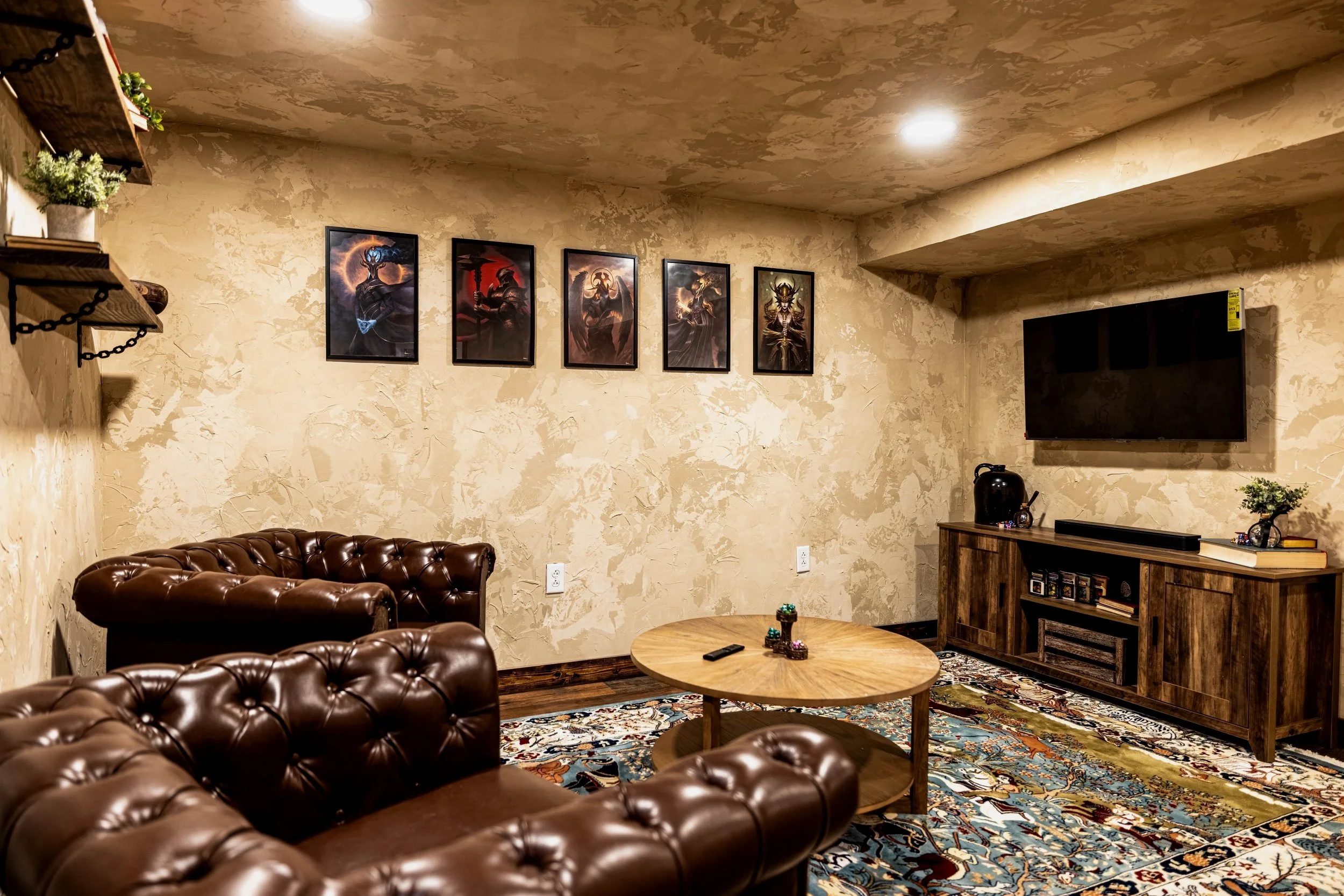
What would make your next D&D session even better? If you had an awesome venue to play in, of course! In this post, I’m very excited to present to you the reveal of the D20 Dungeon - a fully immersive event space now available to rent for your own gaming adventures!
The D20 Dungeon is Open!
What would make your next Dungeons and Dragons session even better? If you had an awesome venue to play in, of course! In this post, I’m very excited to present to you the reveal of the D20 Dungeon - a fully immersive event space now available to rent for your own gaming adventures!

Several months ago, I shared that my husband and I were renovating the basement of our office building into a D&D dungeon… After a summer full of dust, sweat, and so much mortar, it’s finally complete and available for booking! I can’t wait to show you around, but first…
Where We Started

This basement used to be exactly as you’d expect: damp, dirty, drafty, and just plain gross… and this was AFTER we cleaned it out and started framing! But after some imagination (and sweat equity) it’s been transformed into an epic gaming space. Can you even believe this is the same view as the first picture in this post!?
As an Amazon Associate, and partner with other brands, I earn from qualifying purchases. This post may contain affiliate links, meaning I receive commissions for purchases made through those links at no cost to you.
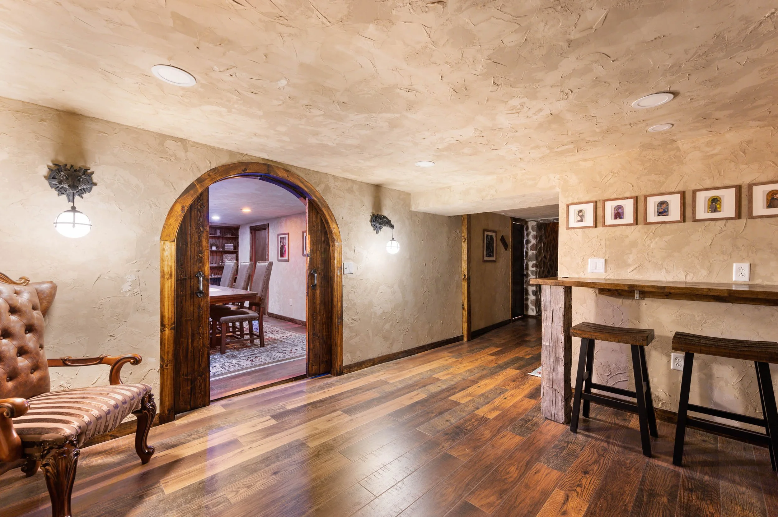
The Lobby

Upon entering The Dungeon, you’ll make your way down a stone-clad stairwell complete with flaming torches and a quirky sign telling you to watch your head. I literally wore my fingertips raw while installing this stone but in the end, it was so, so worth it.

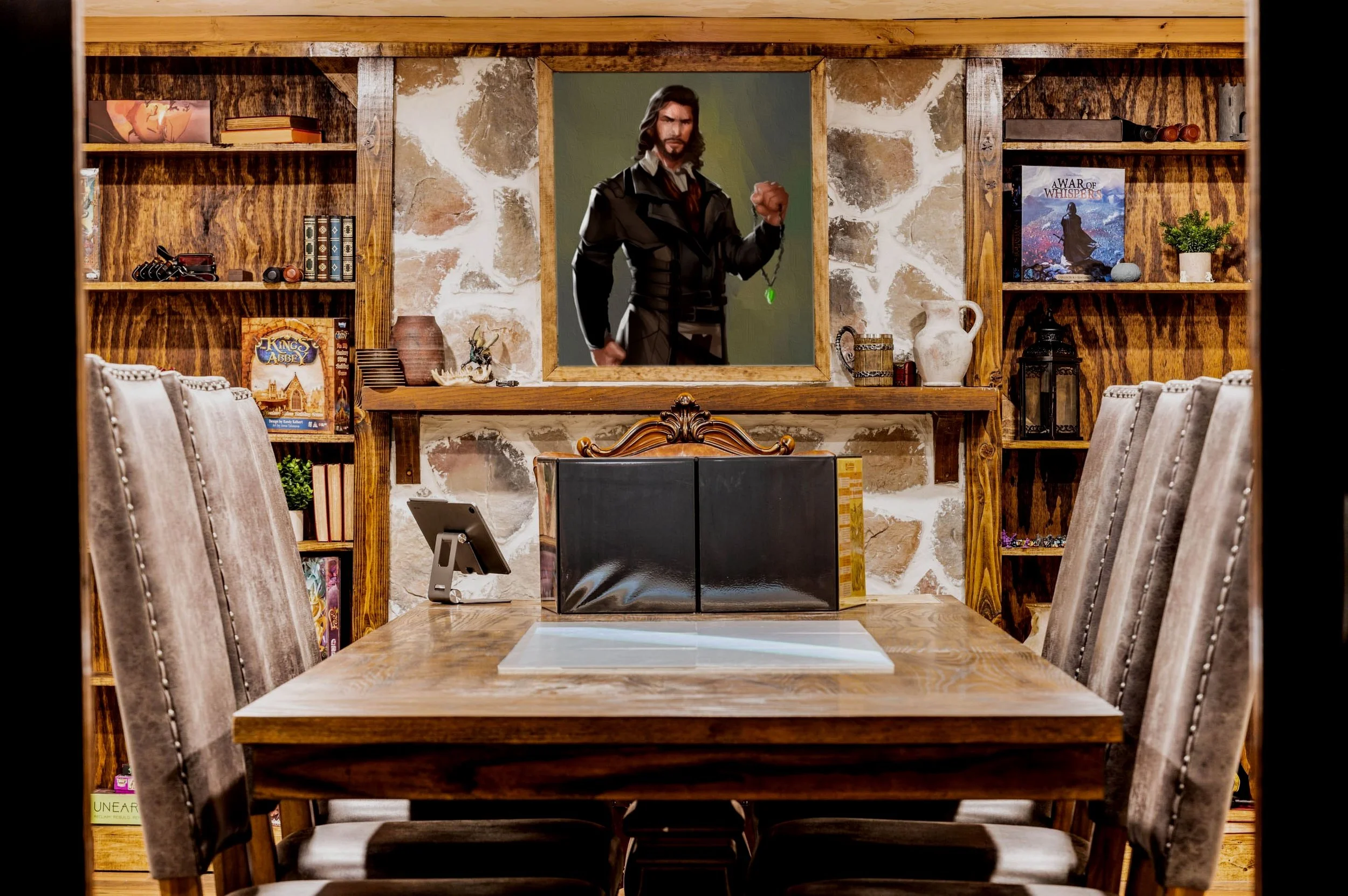
Craft Room
Past the lobby, you’ll enter the craft room - created specifically for you to paint your miniatures or sets. Complete with focused lighting, a bar-height counter, and some pretty cool inspiration in the form of illustrations of Critical Role characters. What more could you ask for?

While the Dungeon is equipped with everything it needs to print and design all your sets and characters, it's best if you leave the manufacturing up to the professionals. We even included a window so you can watch your designs come to life on our 3D printer!

The Game Room
And, of course, I had to save the best for last… the game room!
Upon opening the doors, you’ll be greeted by an inviting room with a large gaming table ready for action.
Your Dungeon Master has their own captain’s chair while players will enjoy leather-wrapped high back seats where they can comfortably spread out across our 10-foot table.

The DM will be able to control all aspects of your adventure, including the lighting , brightness, color, sound effects, music, ambiance, and volume from one simple control panel to ensure that you are submersed in your adventure.
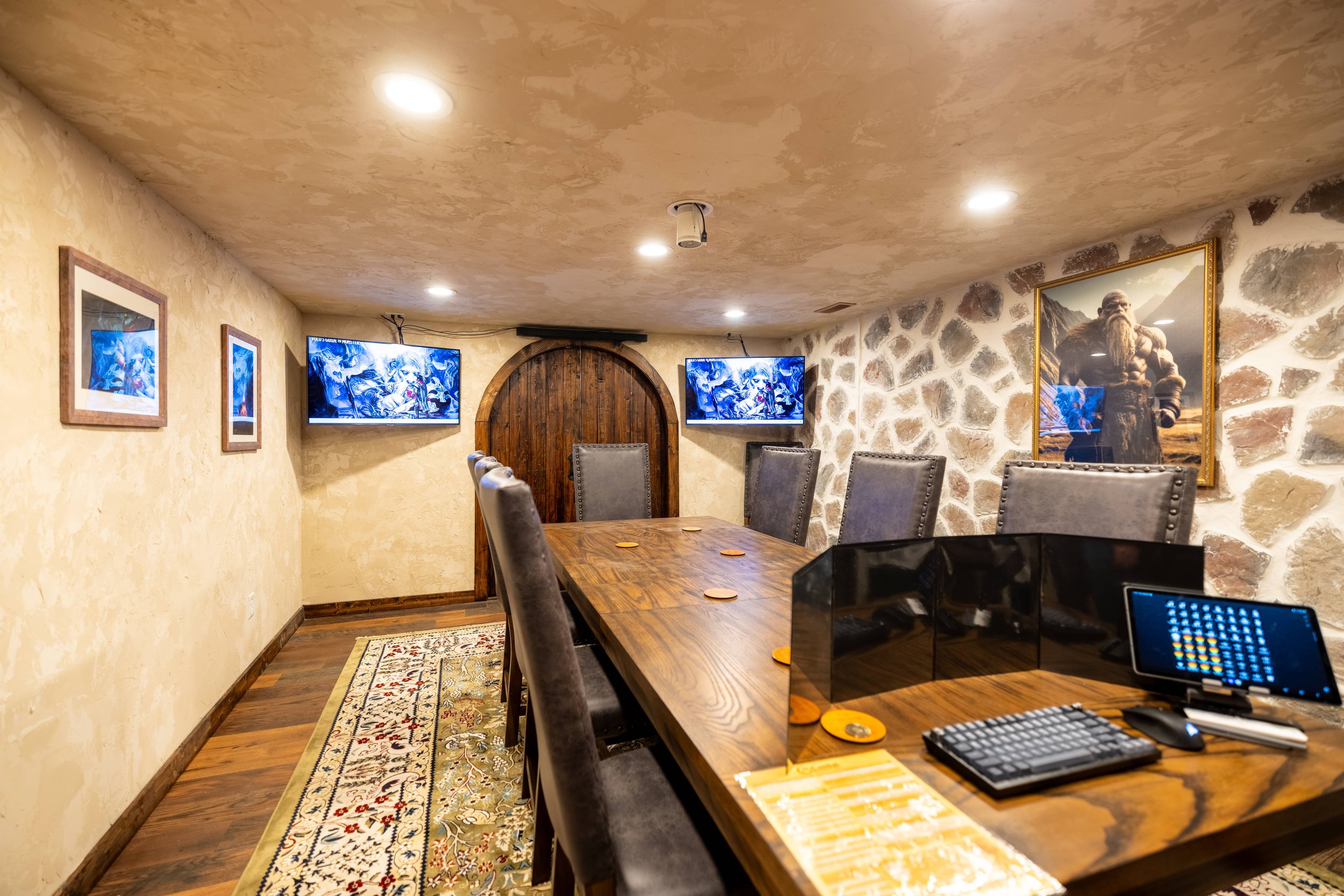
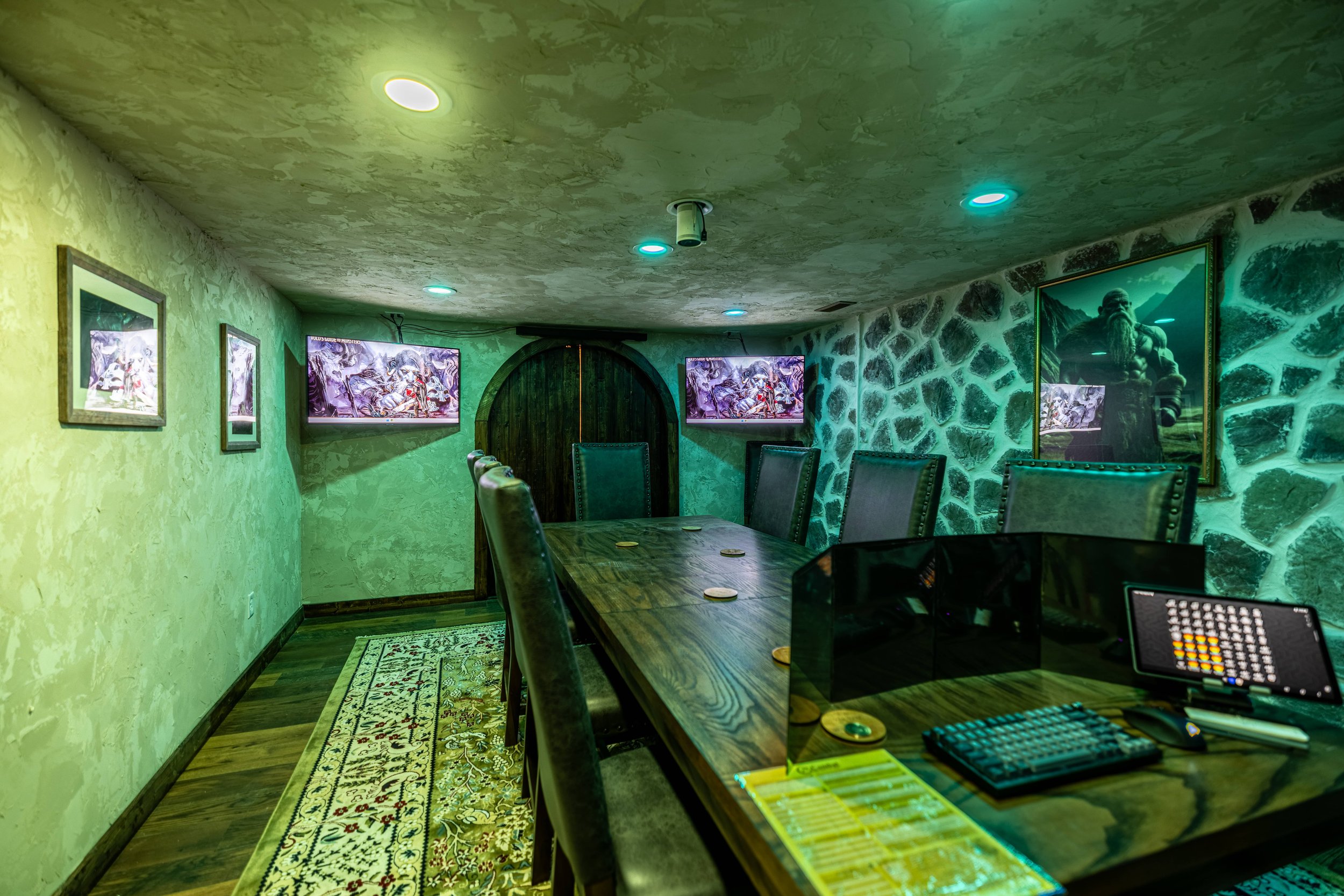
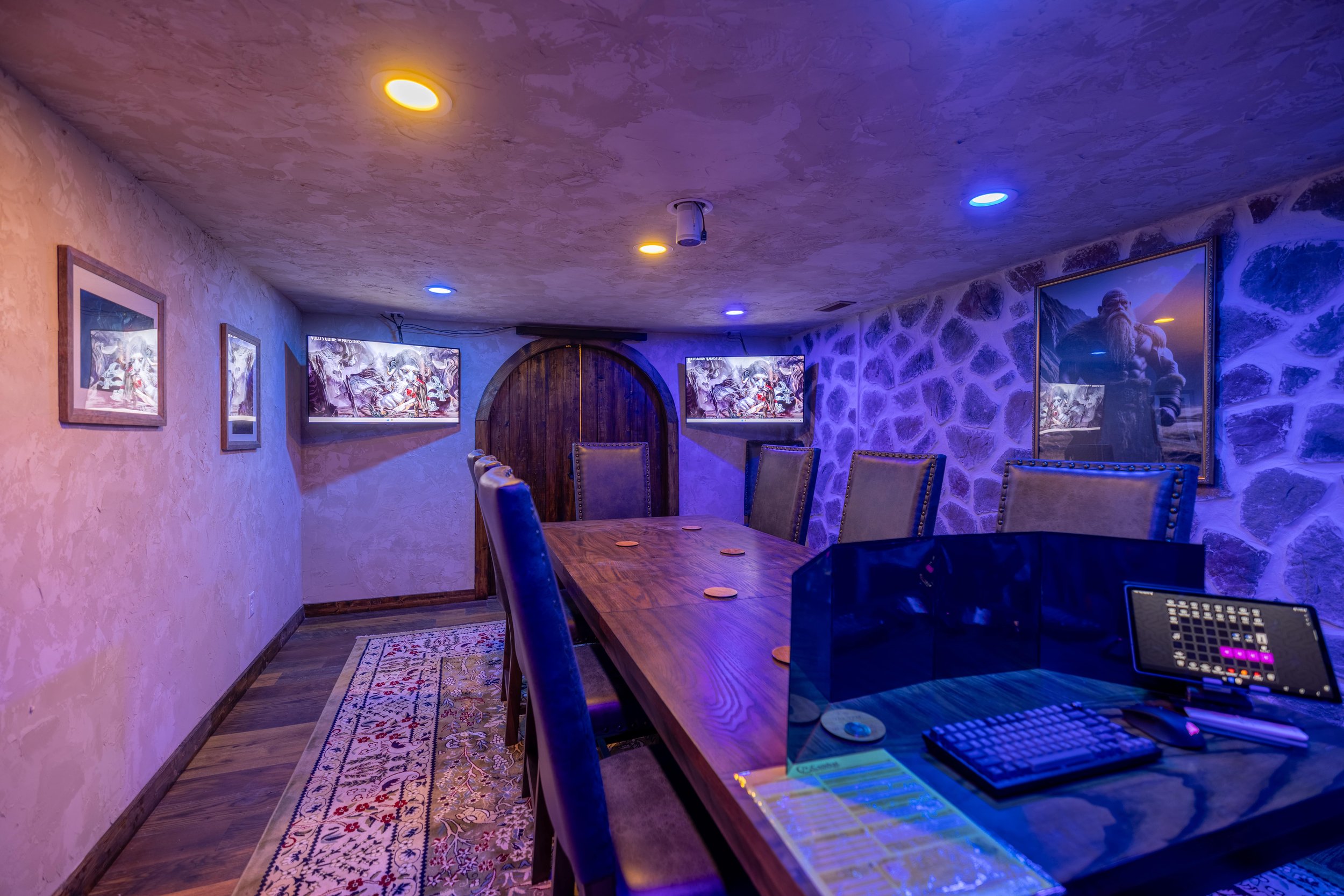
DMs will also have access to a PC with three total monitors to easily display what they wish: maps, photographs, content, and more! Two monitors are mounted on the wall opposite the DM, while the third is a down-firing projector that you can use to display your maps directly onto the table.

Don’t have a map? No problem! We have 15,000 available for you to choose from!
Ready To Play?
The most exciting part about this entire project is that you can experience it yourself! For $50 you’ll be able to dive into your campaign with your group for the entire day at the D20 Dungeon.
Heck, I might even try D&D for myself after tackling this project…


Wanna see what else we’ve been working on in this building? Check out these posts!
Fully-Immersive Table Top Gaming Space

Storage Closet With DIY Floating Shelves
Who in their right mind would give up their laundry room for a storage closet!? In this post, I’m covering our latest renovation: turning our old laundry room into a functional (and much-needed) storage closet with DIY shelving - and why we did it.
Why We Turned Our Laundry Room Into A Storage Closet
Who in their right mind would give up their laundry room for a storage closet!? In this post, I’m covering our latest renovation: turning our old laundry room into a functional (and much-needed) storage closet with DIY shelving - and why we did it.

Although our house lacks an attic, a basement, or really much storage space at all, you didn’t actually think I gave up our laundry room for a storage closet - did you!? If you’ve been here for a while, you know I relocated our laundry room upstairs a couple years ago - which has been AMAZING.

However, that left this space as a sad, haphazard, poorly utilized storage closet of doom. It’s a fairly large space (about 5x7 feet), so the underutilization of this space was really nagging me.

So I took matters into my own hands and decided that this was the year I would remedy that problem! As for the official “before,” just imagine the washer and dryer side-by-side where all those totes are stacked up, mkay?
Turning this room into the storage closet of my dreams (shoot for the stars, and all that) took more than simply removing the cabinets you see above…
As an Amazon Associate, and partner with other brands, I earn from qualifying purchases. This post may contain affiliate links, meaning I receive commissions for purchases made through those links at no cost to you.
Laundry Room Demo & Storage Closet Prep


These are in-progress photos, but when it was all said and done I actually ended up removing all the drywall except the ceiling. I also took off the trim around the window and removed the bulkhead.
My husband (Lucius) then rerouted the waterline running along the floor in the picture above so it runs through the walls… but not before it caused a leak and did a little bit of damage to the half bathroom on the other side of the wall. (That’s future Erika’s problem.)
Once the leak was under control and everything dried, I hung and finished the drywall. I tried wet-sanding for the first time and OMG the lack of dusty drywall mess was incredible! (Highly recommend!)


I then primed and painted the walls and ceiling Egret White by Sherwin Williams. I used this color because I already had it left over from another project, and I’m so happy with it. It’s a lovely creamy white and a perfect neutral backdrop for a fun element I wanted to add in here.
After that, Lucius installed the flooring we laid throughout the rest of the house last winter and then it was time to build the shelves!
DIY Storage Closet Shelves
For this project, we used 2x4s as the frame of our shelves and OSB for the shelves. The designer in me would have preferred prettier shelves made of plywood and a nice finished piece of wood for the face (like these). But Lucius’s practical mind talked me out of it since this is literally a storage closet. Can’t win ‘em all!
Materials
- 2x4s
- 3/4” MDF, Plywood, or OSB
- 3” wood screws
- Drill
- Level
- Stud finder (this is my favorite)
- Miter saw
- Circular or Table saw
- Tape measure
- Framing nailer (optional)
I started by marking the studs with my Stud Buddy. Then I cut the 2x4s to length on my miter saw for the fronts and sides of my frames.
Using 3” wood screws (and a level), I attached the back and sides of the frames to the wall by drilling into the studs.


I used a framing nailer to attach the front piece of the frame, but screws would work as well.
I cut the OSB down to size using my circular saw and slid them onto the frames. I then put a couple of screws through the shelves into the frame and voila!

I wasted absolutely no time organizing and filling this closet up… and there’s still room for more! My little type-A heart could hardly handle it. I mean, LOOK AT ALL THAT STORAGE!
I was stoked at this point, but there were still a couple of things I needed to do to finish this space off: trim and lighting.
Zhuzhing Up The Storage Closet
I started by reinstalling the original window trim and hanging new door trim and baseboards. Then I painted the trim and the door Dark Auburn by Sherwin Williams using my favorite paintbrush.


I’ve always wanted to try contrast trim and this felt like the perfect opportunity. It needed to be painted anyway, so why not have some fun with it!? Plus, the color may or may not be a gigantic hint at my plans for the mudroom.
As for lighting, I went with a super simple and inexpensive light fixture that I’ve actually used in several places in our house already (i.e. the laundry room, closets, the hallway).
Storage Closet Reveal
And here’s the finished product!

Here’s a quick little before and after side-by-side (because those are always so much fun!)

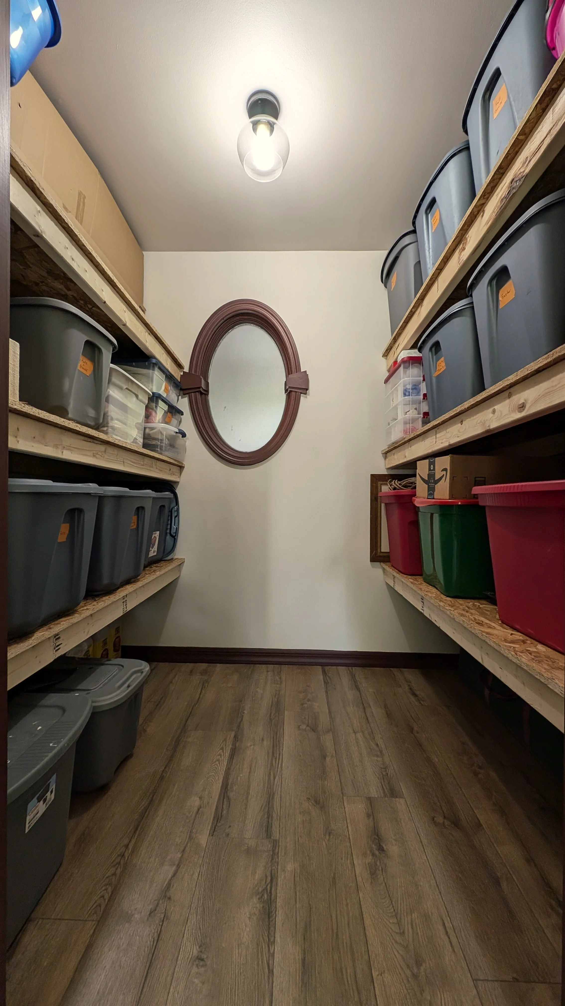
Before this renovation, this room always felt messy. Regardless of how much I tried to organize it, I knew it could be utilized so much better. I’m over the moon with the functionality of this room now. I was even able to clear everything out of our coat closet and store it here instead!
As for the shelves… there’s a chance I’ll paint them down the line to make them a little nicer, but for now, I’m happy soaking in all that sweet sweet storage.


Want more before and afters? Check out these renovations!
Cheap and Easy Storage Closet Shelves

DIY Stone Veneer Installation Guide
Stone veneer is an excellent way to add texture, dimension, and rustic charm to a room. Plus, it’s budget-friendly, makes a big visual impact, and is totally DIY-able! Stick around for my step-by-step guide on how to install stone veneer yourself.
Over-grouted Stone Veneer Tutorial
Stone veneer is an excellent way to add texture, dimension, and rustic charm to a room. Plus, it’s budget-friendly, makes a big visual impact, and is totally DIY-able! Stick around for my step-by-step guide on how to install stone veneer yourself.

As an Amazon Associate, and partner with other brands, I earn from qualifying purchases. This post may contain affiliate links, meaning I receive commissions for purchases made through those links at no cost to you.
I never set out to become a stone veneer expert. Yet, here I am, after what feels like slapping up 20,000 pieces of the stuff, ready to share everything I’ve learned in one beefy burrito of a post.
I first tried stone veneer in our office lobby, tackling walls, a fireplace, and a hearth. Despite some hiccups, it turned out great.

Next, I added veneer to the conference room kitchenette, which turned out even better.

Just when I thought I was done, Lucius pitched his vision for the D&D dungeon. Now, I’ve been busy for the past couple of months installing stone veneer on concrete walls, another brick fireplace, drywall, wood stair risers, and even the ceiling.
So yeah, I’d say I've learned a thing or two. Here’s how you can get the look too.
Materials
- Stone Veneer (flat and corner pieces, if necessary)
- Square Notched Trowel
- Type 1 Mastic Adhesive
- Drill (corded is recommended)
- Mixing Paddle
- 3 5-Gallon Buckets
- Waterproof Gloves
- Painters Tape
- Plastic Drop Cloth or Rosin Paper
- Grout Sponges (buy plenty!)
- Large Stone Mortar
*Quick note: I’ve used the veneer linked above for all our applications. Other types of veneer may have different requirements. Be sure to read the installation directions beforehand if you choose a different type of stone.
Prep Your Surfaces
Start by prepping whatever surface you’re applying the veneer to. On raw drywall, you’ll want to prime first. If your drywall is painted with glossy paint, lightly sand beforehand. Brush off any debris on brick or concrete before starting.
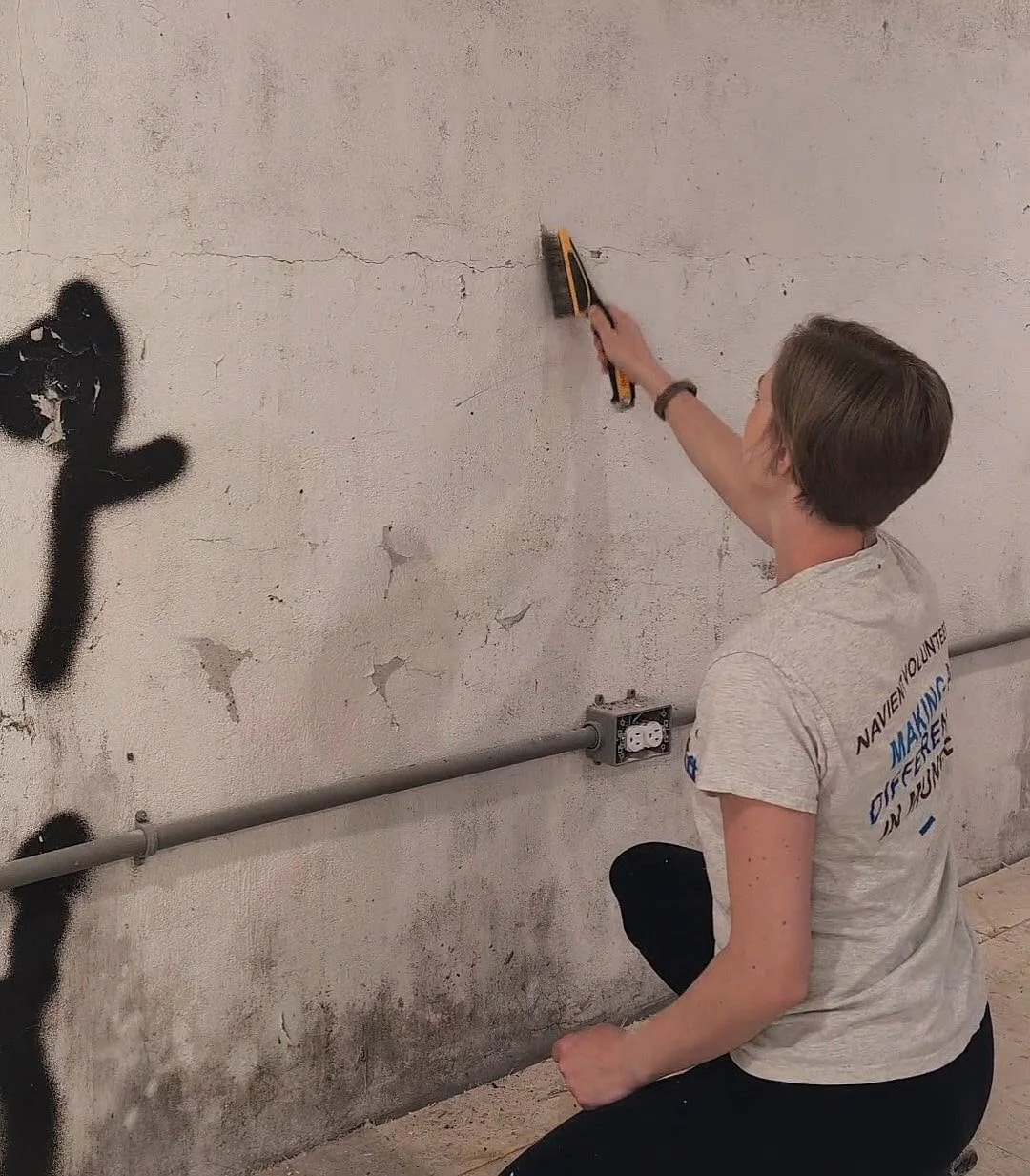
If your stone will terminate into an adjacent wall, the floor, or the ceiling, lay down a couple pieces of painters tape the depth of your stone.
And don’t forget to protect your floors with rosin paper or a drop cloth!
Apply Stone Veneer Adhesive
The great thing about this type of stone veneer is that it sticks to the wall with just type-1 mastic adhesive. This comes pre-mixed in a bucket and couldn’t be easier to apply.

I simply scoop some adhesive onto the flat part of my trowel and skim it across the surface to which the veneer would be applied. Aim to get it 1/8” to 1/4” thick. Then, using the notched side of your trowel, drag it across the mastic to make grooves.
Let the mastic set up for a little while, or dry completely before moving on. This helps keep the veneer from slipping.
Installing Stone Veneer
Using the notched side of your trowel, apply the adhesive to the backside of the veneer.

Then, smoosh it on the wall and twist it slightly to help it adhere. I aimed to keep about an inch between each stone, but it definitely doesn’t need to be exact.

The best part about this DIY is that the more imperfect it is, the better. Try to vary your stones so you’re not using too many of the same shape side-by-side and mix up the directions you’re applying them, too.
Mixing Up Mortar
Once the mastic has dried (I usually give it 24 hours), grab your three 5-gallon buckets and get to work!
Fill one bucket at least halfway with water. This will be used to wash your mixing paddle. Fill the second bucket with as much water as you can carry (you’ll use this to smooth the mortar between the stones). The third bucket will be used to mix the mortar.


Mixing up mortar can seem intimidating, but if you go slowly you’ll be fine. Avoid mixing more than you can handle before it dries - for me, this was about 1/4 to 1/3 of a bucket.
It’s better to mix a little at a time than to try to mix it all at once or you’ll end up with a bunch of unmixed powder at the bottom. Start by pouring a little mortar in the bucket then add a little water and mix with your drill and mixing paddle. You’re aiming for a thick cake batter consistency, so add more water or mortar as needed.
Follow these steps until you have your desired amount.
Applying Mortar to Stone Veneer
Traditionally, I believe the mortar is applied with a grout bag. However, after my experience trying to use one of those on the brick veneer in our loft, I never want to do it again. Because the spaces between the stones are fairly large, I’ve actually found it easiest to apply the mortar with my hands.

I tried to use latex gloves for this, but the mortar is so heavy it pulls them off. While I’ve applied most of the mortar with my bare hands, I definitely don’t recommend it. Recently I bought some snug waterproof gloves and they’re working out really well!
To get the over-grouted look you’ll want to fill the spaces between the stones up completely to the point where some of the mortar is on the edges of the stones. Repeat until all of your mortar mix is gone.
Softening the Mortar Finish
Dip your grout sponge in water and wring it out so it's damp - not dripping wet. Then begin wiping the excess mortar off the surface of the stones. Rinse your sponge frequently and replace it if it begins to flake apart.
I never remove all the mortar from the face of the stones because I like the soft edges it creates. I think this also adds to the over-grouted look. Once the excess is removed, I rinse the sponge and wipe off any leftover haze.

Then, I smooth out the mortar between the stones to even out any obvious finger marks. Repeat until all the mortar is smoothed out.
Lastly, remove any painters tape while the mortar is still wet for a clean edge on your adjacent surfaces.
Stone Veneer FAQs

Is stone veneer easy to install?
YES! I’ve found the installation process incredibly simple. The hardest part is wiping the excess mortar off the stones before it dries - but if you mix small batches and work quickly you’ll be just fine.
Can you put stone veneer on drywall/concrete/brick/cement board/plywood?
I’ve applied veneer to all the surfaces above except cement board, but I think even that would accept it with no problem! As stated above, raw drywall needs to be primed, any surface with glossy paint would need a light sanding beforehand, and brick/concrete just needs any loose debris brushed off first.
Can you cut stone veneer?
YES! We used a wet saw with a carbide blade to cut the stone veneer on the stair risers in the D&D dungeon.

However, sometimes while applying the veneer to a wall you’ll end up with an awkward space between stones - too small for a full stone but too big for mortar. In these cases, I just smacked a stone on the edge of a hard surface (like the corner of the fireplace), used a screwdriver and hammer to break the stone, or simply dropped it on the sidewalk to break it into smaller, irregular pieces.
How do you install stone veneer around outlets?
I’m still figuring this one out, honestly. In the conference room and lobby of the office, I mortared up to the outlets. However, I got a little close with the stone in some places and we had to chip it away so the outlet cover could fit on. I back-filled these spots with mortar and they look fine.
A better solution might be to use an electrical box extender.
What colors of mortar are available?
Mortar basically only comes in white or grey - but you can add concrete dye. However, I don’t recommend it.
I dyed my mortar during my first stone veneer excursion because I was afraid the white mortar would be too stark - and I made it pink. Not ideal. (Don’t worry - I was able to fix it, but it definitely wasted some time.)
It’s really tricky to tell what color the dry mortar will end up and if you're mixing more than one batch it’s hard to get the color exactly the same over and over again. (Also, the white actually dries to a lovely soft white tone.)
Why is my stone veneer not sticking?
There could be a few reasons your stones are slipping.

The mastic is too wet. Let the mastic on the wall dry before you begin attaching your stones.
You’re using too much mastic, causing the stones to slip. Wipe a little off, recreate the notches with the trowel, and try again.
You’re not using enough mastic. Add some more and give it another shot.
If you’re still having trouble getting your stones to stay, depending on your surface, you can use drywall screws to keep the stones in place until they dry. I’ve even used painters tape to keep them stable in a pinch! (see below)
Do you need corners for stone veneer?
If you’re covering a corner, then yes!

I used corner pieces on the stairwell in the D&D dungeon and the process is exactly the same as the flat stones. Using these pieces creates a much more natural look than butting two flat pieces against one another.
How do you finish stone veneer by the floor?
It doesn’t seem like painters tape should work to get a clean line with stone veneer and mortar - but it actually does!

In all the instances where I’ve dealt with a transition from stone veneer to the floor, ceiling, or an adjacent wall, I just lay down a couple of pieces of painters tape. Once I’m done mortaring (and while the mortar is still wet), I pull it up, and voila! You’ll be left with a fairly clean line.
What Are You Waiting For!?
Now that I’ve brain-dumped all my stone veneer knowledge on you, I hope you feel confident enough to tackle this project. It really does add a great visual impact to any space at a fairly budget-friendly price.
Is there anything I forgot to cover? Let me know in the comments below!


Looking for more impactful and budget-friendly DIYs? Look no further!
How to Stone Veneer an Interior Wall

Playroom Makeover Reveal
What do you do when you have a formal living room, but you’re not exactly formal living room people? You turn it into a playroom! Dive in to see how I reimagined this space to work for our family.
Living Room Turned Playroom
What do you do when you have a formal living room, but you’re not exactly formal living room people? You turn it into a playroom! Dive in to see how I reimagined this space to work for our family.

The Playroom Before
The playroom renovation has been a long time coming - 4.5 years, to be exact!
Before jumping into the reveal, let’s go into the way way back machine and check out how it looked when we first toured the house.


As you can see, the previous owners used this room as a formal living room. We’re fortunate to already have two other living spaces in this house, so a third space to be used as a formal living room just didn’t make sense for us.
With two young kids, we knew this room would be better suited as a playroom. But until we could get around to renovating, it was a hodge podge of the previous owner’s style and “toddler-chic”.


As an Amazon Associate, and partner with other brands, I earn from qualifying purchases. This post may contain affiliate links, meaning I receive commissions for purchases made through those links at no cost to you.
The Playroom After
But after 3.5 years of living here, we got the renovation itch. After an entirely new wall of built-ins, an updated fireplace surround, some new furniture, new flooring (one of our big projects for the year!), and a lot of rearranging, this is what it looks like today:


I love how much more modern this room is now and that it finally fits in with the rest of our house - which means I purposely spend time here instead of avoiding it. Here’s what it took to update this space:
A Fresh Coat of Paint
I started this renovation with the intention of just doing a quick refresh and painting the walls. The gold color we inherited didn’t work with anything else in our home and needed to go. Since this room is very open to the rest of the first floor, I went with one of my favorite neutrals: White Heron by Sherwin Williams.
Hanging Spunky New Artwork

With the new neutral paint color, the room seemed like it needed a little more. I interpreted that to mean more artwork.
I began by wrapping the frames and mats of a couple of paintings I made in fabric to add more interest.

Then, I moved a painting I had been working on for quite some time (inspired by the painting linked below) into the room.
Finally, I created these frames with clips for my kids to switch out their artwork as they please. I never wrote a tutorial on how to make these, but I’ve linked a similar type below!
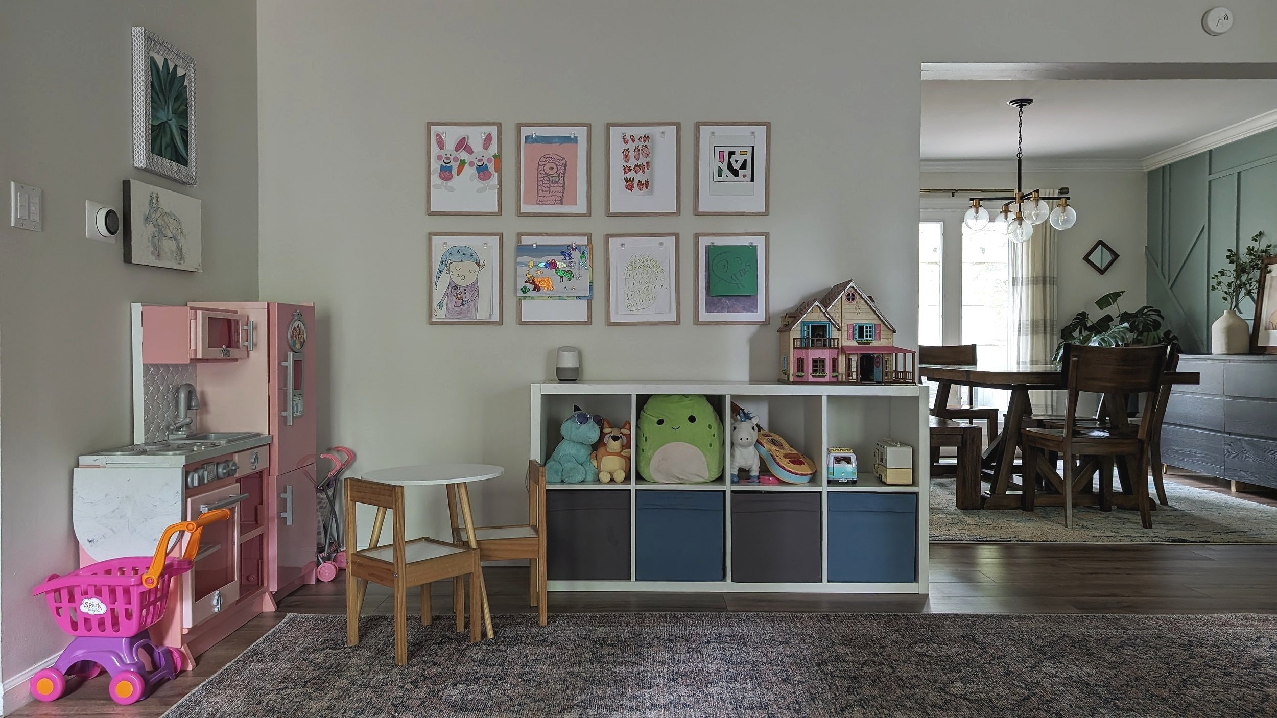
Rebuilding the Built-ins
This is where my little refresh turned into a full-on renovation.

While I initially went into this part of the project thinking I could simply modify the existing elements as a “phase 1” reno, Lucius quickly talked me into ripping it all out and starting from scratch. And I’m so happy I did!

We tore everything on this wall down to the studs, reframed, and ran electrical for the new picture lights. Then I drywalled, built fluted cabinets and shelves, and applied Roman clay to the fireplace. I learned a ton from this project and I’m so proud to say that I did so much of it myself. It’s even better that I was able to make it into exactly what I pictured it could always be.
New Rug & Beanbag
With the new overall look and feel of the room, I was ready to update the area rug to fit the style (and size) better. I went with this 10’ x 14’ Amber Lewis area rug. The larger size fits this room so much better and actually makes it look bigger.

Then Lucius ordered the absolute biggest beanbag he could find. It doesn’t necessarily fit my overall vision for the room, but it’s undeniably fitting for a playroom. The kids love playing on it, and it’s actually really comfortable.
More Lighting
The last piece of the puzzle was adding two recessed lights. This room initially only had two spotlights on the far side of the room near the fireplace. We quickly turned them into recessed lighting, however, half of the room was always a little dark.

As we updated the subfloor and flooring in the bedrooms directly above, we took the opportunity to add two more lights to the opposite end of the playroom.
It’s Never Really Over…

I have to admit, I was hesitant to write this post because a “reveal” feels so final… and there’s still a lot I’d like to do to this room. We’ve discussed turning the right-hand corner in the picture above into a reading nook like this example.
And adding a chair with a lamp in the left-hand corner of th picture above.
And creating a sitting area in front of the fireplace with a couple of chairs and a table.
However, for the stage of life we’re in right now - with two young kids who use this space to practice their gymnastics skills on the giant bean bag, have tea parties, and build castles with Magnatiles, among other things, and where I like to do my at-home work-outs - this set-up works just fine.


Want more reveals? Check out these posts!
Modern Transitional Playroom

Airbnb, but make it D&D
I’m gonna go out on a limb and assume you’ve heard of DND before. Or, more widely known as Dungeons & Dragons. But why in the world would I be talking about it? Well, that would be because my husband has roped me into designing a fully immersive Dungeons & Dragons space in the basement of our office building.
Dungeons & Dragons Venue
I’m gonna go out on a limb and assume you’ve heard of D&D before. Or, more widely known as Dungeons & Dragons. But why in the world would I be talking about it? Well, that would be because my husband has roped me into designing a Dungeons & Dragons venue in the basement of our office building that D&D fans can rent for a fully immersive experience.

I know, I know, I STILL haven’t fully shared everything we’ve renovated in the rest of the office. There are so many finishing touches I want to get my hands on first! But Lucius, my nerdy, nerdy husband has a vision. And who am I to say no?
As an Amazon Associate, and partner with other brands, I earn from qualifying purchases. This post may contain affiliate links, meaning I receive commissions for purchases made through those links at no cost to you.
Where It Started
We've actually been working on this space for a couple of months. So before I share the design, I want to take a step back and show you what we started with… sort of.
This basement was certainly nothing to write home about when we began this project. It was unfinished, damp, and, frankly, a little scary. In fact, we didn’t even bother to take any pictures of the “before”. I did, however, snap a few photos once framing was completed and I realized “Hey - you might want to write about this later!” And here I am trying to backtrack and capture everything before it gets too far along.

From this photo, it's definitely tricky to get a feel for the space. So let's walk through it together!
The Design
Whether or not you're familiar with D&D, I’m sure you can imagine that the finished space will be dungeon-esque. In his excitement, Lucius even drew me a sketch to help relay his vision.

He mentioned that he'd like it to have a medieval tavern feel, which was enough to get me started. In my research, I found a few images that sparked some inspiration.


In a nutshell, we need highly textured walls with rough wood elements. We'll also be adding stone veneer in some areas and installing new flooring with a rustic look.
Corridor and Lobby
Picture this: You'll enter the space through a stone-clad stairwell flanked on either side by theme-appropriate sconces. (This view is what Lucius’ sketch is representing.)

The first room you enter will be a lobby of sorts - a place for gamers to take a break between turns or for parents of the younger crowds to hang out. The wall in the picture above will have a cozy couch and coffee table. The picture below shows where we’ll hang a TV.
As you can see, I've already tackled the walls in these first two rooms and we're working on the floors. But first, we had to install these nifty subfloor tiles that will allow the little bit of water that still sneaks in a pathway to the drain.

I originally wanted Roman Clay on the walls, but it would have cost over $1,000. After some research, I decided to experiment with joint compound and paint. My version has a lot more variation than traditional Roman Clay, but you could easily make it more subtle. I'll write up a tutorial to share exactly how I got the look soon, but for now, I'll tell you it was MUCH less expensive.
D&D Miniatures Painting Studio
The next room will have countertops and bar stools around the left-hand side of the room where patrons can paint miniatures of their characters and sets.

In the small room you see in the back we'll have 3D printers where we'll print the miniatures ahead of time that will be ready when the party arrives. I don't think I've ever written a nerdier sentence in my life, but apparently painting miniatures is pretty popular.
Game Room
To the right is the piece de resistance: the game room.

You'll open these chunky, arched wooden doors (which will be stained and will have these epic sconces on either side) to reveal an epic game space.

This room will have a large game table in the center and comfy armchairs. We’ll also be installing interactive lighting that can be adjusted according to the scene.
I'll carry the stone veneer to the left-hand side wall and up the fireplace. On either side of the fireplace, we’ll build bookcases. The other walls and the ceiling will get the same joint compound/paint treatment I used elsewhere. We'll have rustic wood baseboards, but I'd also love to install some wood accents on the walls like in the inspo pictures above.
On the opposite side of the room, we’ll mount a TV on either side of the opening to display maps, background scenery, puzzles, pertinent information, etc.

Details, details…
There are a few things I didn’t mention, like:
Will people have to walk through the office to get to the dungeon?
Nope! The basement (aka "the dungeon") has a separate entrance where customers will be prompted to enter a passcode to unlock the door for the day - much like many Airbnbs work today.
What about the bathroom situation?
We’ve framed out a space for a bathroom off the game room, but haven’t gotten too in the weeds with the design in there yet. What I can tell you is that it may or may not be accessed via a hidden door…
Final Thoughts

I know this design is out of the norm for what I normally put together. And honestly, it took some time for me to get excited about it. But now that I’ve gotten my hands dirty (literally) with this project, I look forward to seeing it come to fruition. Tell all your nerd friends what’s coming!

Check out the latest D&D Dungeon progress!
Looking for more inspo? You might enjoy these posts!
In-Person D&D Event Space

Fluted Cabinet Door DIY
If you’re anything like me, you’ve taken notice of the fluted furniture trend and you LOVE it… but not the price tag that comes with it. Don’t worry - I gotchu! In this post, I’m sharing how I created fluted cabinet doors for my built-ins with just some plywood and a table saw!
How to Make a Fluted Cabinet Door
If you’re anything like me, you’ve taken notice of the fluted furniture trend, and you LOVE it… but not the price tag that comes with it. Don’t worry - I gotchu! In this post, I’m sharing how I created fluted cabinet doors for my built-ins with just some plywood and a table saw!

As an Amazon Associate, and partner with other brands, I earn from qualifying purchases. This post may contain affiliate links, meaning I receive commissions for purchases made through those links at no cost to you.
I previously shared that I’ve been renovating the built-ins in the playroom for quite a while now and gave a high-level recap of how they got to their current state. In that post mentioned that I fell in love with the fluted cabinet doors in this inspiration picture:

When I realized I had an opportunity to incorporate the fluted detail into my built-ins I was all for it! There are several ways to create this stylish texture by using half-dowels or pole wrap, but I was disappointed to find that both of those options would cost way more than I was willing to spend.
I think I calculated that I would need at least $300 worth of pole wrap or an equally outrageous amount worth of half-round dowels. No, thank you!
So I started brainstorming and came up with an idea that worked really well for way cheaper: using my table saw to cut flutes directly on the doors! This DIY is as simple as running slabs of plywood through the table saw at consistent intervals until all your flutes are created.
Here’s the step-by-step process:
Materials
- Circular Saw
- Table Saw
- Drill
- Concealed Hinge Jig
- Concealed Hinges - mine are full overlay
- 3/4” Plywood or MDF
- Edge Banding
- Edge Band Trimmer
- Iron
- Sandpaper
- Optional:
- Cabinet pulls
- Paint or stain and sealer
Cut Your Doors
Because I wanted to utilize as much space available, my cabinet boxes needed to be custom-made, but that’s not always necessary! You can absolutely buy stock cabinets and save yourself time by only making the doors for this project.

Measure the length and width of all your doors and cut them out of your material. I used a circular saw to cut my plywood down to size, but you could also ask the hardware store to rip your wood down for you.
I made my doors out of red oak plywood because I knew I wanted the final product to be stained. If you plan on painting your doors, you can definitely use a cheaper grade wood (like birch) or MDF.
Drill Holes for Concealed Hinges
Next, I drilled holes for my hinges using my Kreg Concealed Hinge Jig, which is a lifesaver!

I never realized how many types of hinges there were until I decided to make my own doors. Make sure to do your research before buying hinges so you get the right kind - there are quite a few options out there, and it’s definitely more complicated than I can cover in this blog post.
Check Door Placement
Before you get too far along, take a beat and (temporarily!) install your doors to make sure they fit.

You can see that my doors look really wonky here. Luckily, most concealed hinges are adjustable, so before you do something that can’t be undone (like trimming your doors), play with the hinges to see if you can make them fit.
I had to trim a couple of my doors the tiniest bit, but I got them looking much more even after adjusting my hinges some.
Attach Edge Banding
You probably know the edges of plywood aren’t the prettiest. My next task was to figure out how to make them look nice. Enter: edge banding.

Edge banding is a thin wood veneer that comes in different widths and wood types that you iron onto the edge of plywood to make it look like one solid piece. Since I kept my doors wood, I made sure to buy red oak edge banding so it would match once I stained the finished product.
To make my edge banding look seamless, I ironed a continuous piece on all 4 edges of my doors. When I got to the end, I cut it with scissors, then lightly sanded the edges of the edge banding and the corners smooth. Using a trimmer, cut off any excess edge banding.
Cut Your Flutes
Now it’s time for the game-changer… well, almost…
Before I jumped into making the fluted pattern on my doors, there were a few things I needed to figure out, and that I advise you to test out as well to figure out what you like best:
How deep to cut my flutes;
How far apart to cut my flutes

To test this, I ran a scrap piece of plywood through the table saw with the blade at different heights and the fence set to different intervals. Because you have to scoot the fence of your table saw over after each flute, I’d advise you to use intervals that are easy to keep track of. I cut my flutes at intervals of 1/4”, 1/2”, 3/4”, and 1” to test the widths.
While I don’t have the exact measurements I used for the depth, it’s safe to say to make sure you don’t set your blade so high that you cut through the plywood or weaken its structure.
Once you test a few different options, take a look at your test piece in the space to see how it looks from afar. In the example below I’ve already decided on 3/4” flutes but wanted to test different depths.

NOW it’s time to start cutting the flutes on your actual doors! There’s definitely room for error here, so TAKE IT SLOW and check your measurements as you go. One mismeasurement and your door will be ruined (take a guess how I know!).

Paint or Stain Your Doors and Install
Once all the flutes are cut, you can paint or stain your doors to your liking and officially install them!

I used 220-grit sandpaper and lightly sanded them smooth before staining. It took a lot of testing and different combinations of stain to get the color just right, but eventually (and with a little bit of panic) I got there! Then, I sealed everything with two coats of matte Polycrylic to finish them off.
One last thing: while the very first picture in this post shows the doors with handles, I decided I liked the look of my cabinets without them more (though they're still beautiful!) Instead, I installed these push-openers that have been working out perfectly.
Final Thoughts

I’m so excited I found a place to incorporate fluted furniture into my home. I love how much modern character it adds to these built-ins - and I especially love that I saved a bunch of money by making them this way. What do you think? Would you take on this DIY? Let me know in the comments!


Check out these DIYs if you’re looking to add more character to your home!
Have you been following this renovation? Here’s the reveal!
Inexpensive Fluted Detail Hack

Yearly Project Pulse Check - 2023
It’s that time of year again to step back and take a look at what we actually worked on all year long. And maybe even share some loose plans for next year, too!
4 Big Projects We Tackled This Year
It’s that time of year again to step back and take a look at what we actually worked on all year long. And maybe even share some loose plans for next year, too!
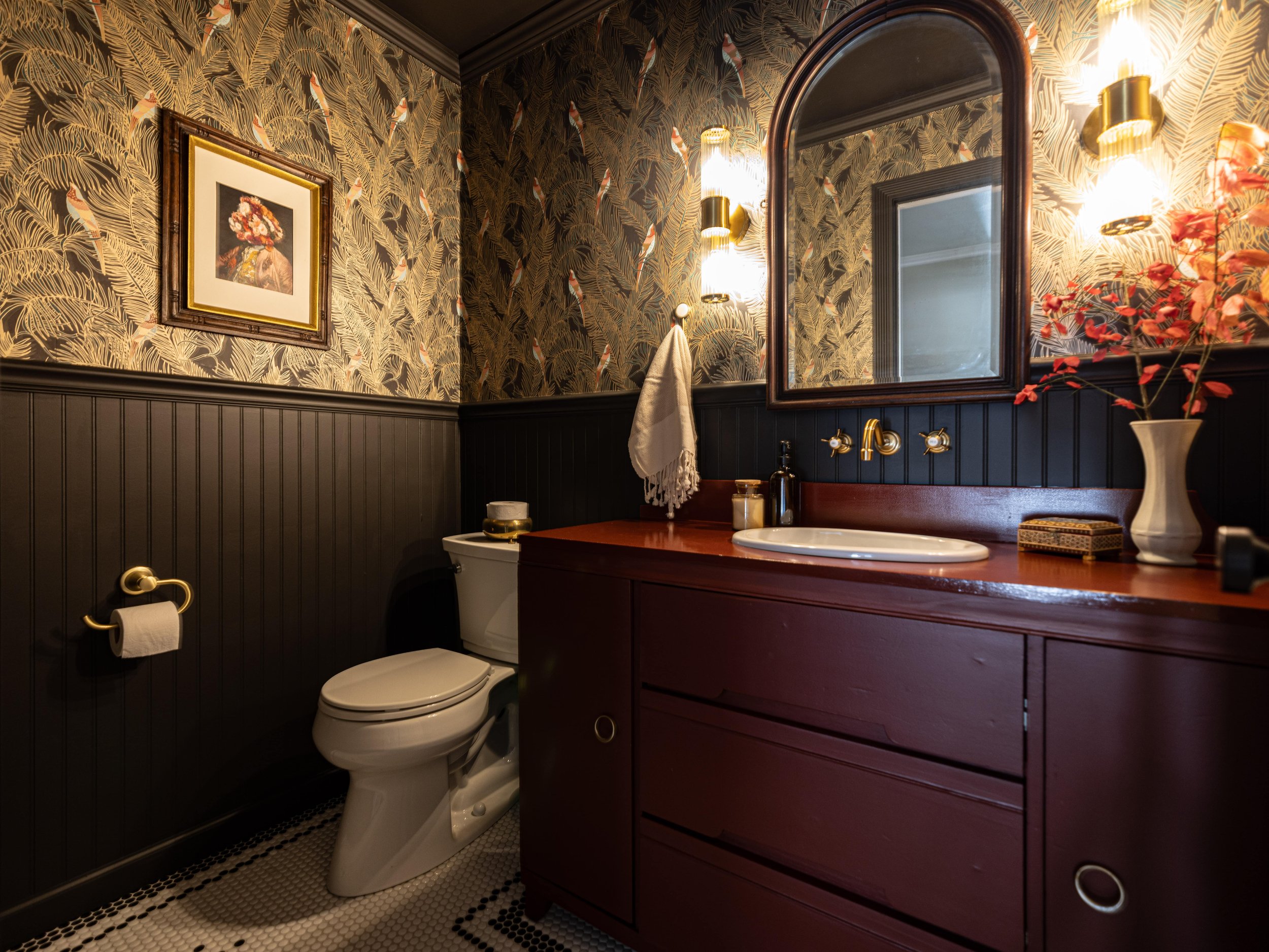
The Office
At the end of last year, my husband, Lucius, had a vision to turn an old local hair salon into his real estate office. So we got to work! We spent the first quarter of the year demoing and rebuilding. Then I spent another couple of months with finishing work - like painting and laying tile and stone.
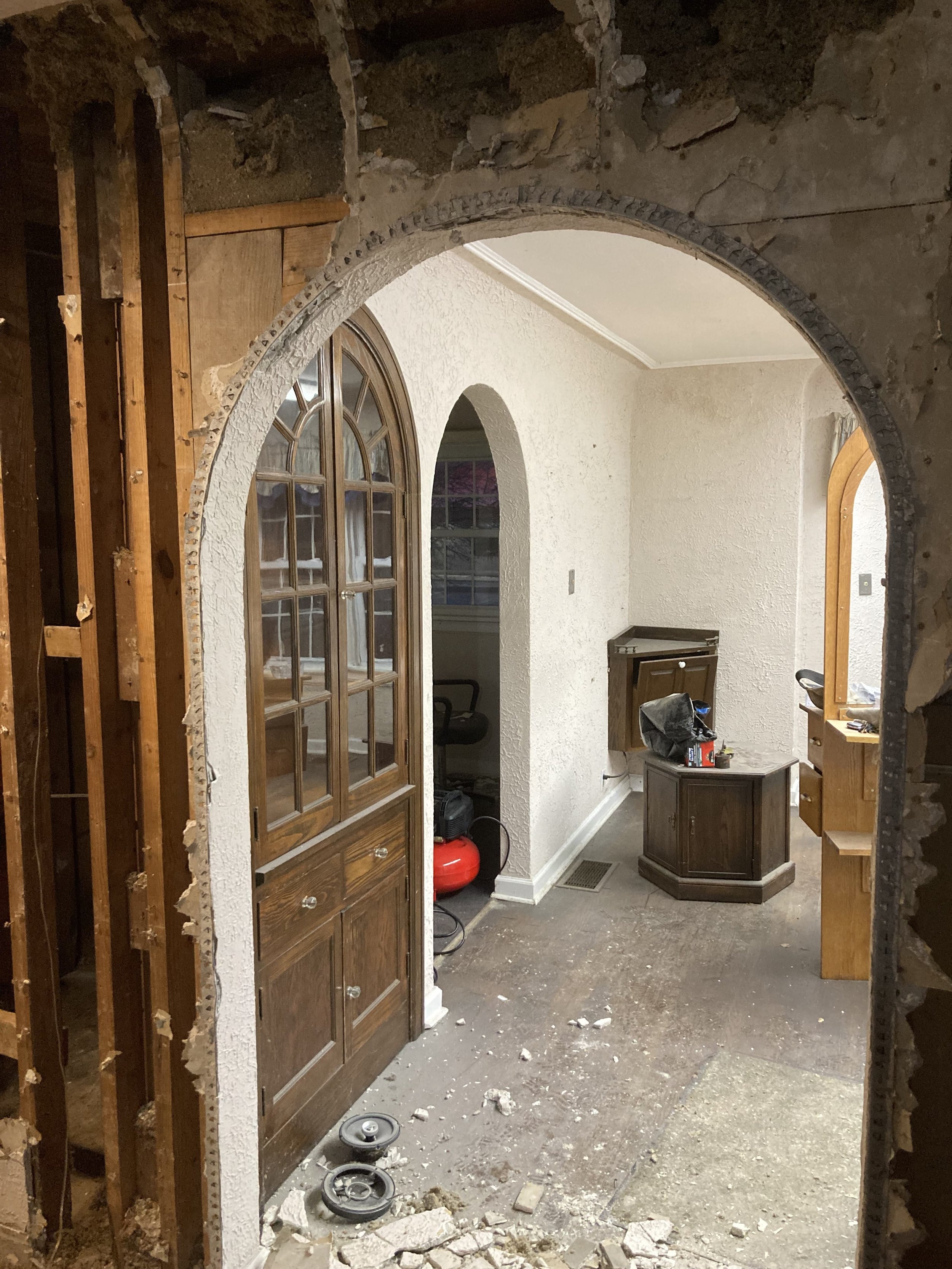

It was an incredibly challenging project. By the summertime, we were able to actually begin using the building. There are still tons of little things I’d like to finish up before I begin to officially share the spaces, but don’t worry! Reveals are coming!
Related Office Posts
Charlie Foursquare
While working on the office, Lucius also decided to purchase an investment property that we hoped to turn into an Airbnb. The house was beautiful, but it took a lot of work to clear it out.

So, on the days I wasn’t at the office tearing down drywall, I spent my time at Charlie Foursquare cleaning up the huge amounts of junk the previous owners left. Then, I moved on to ripping up the gross carpet that covered every room.

Much to my sadness, we ultimately decided it wasn’t the right time to move forward with the Airbnb and are currently in the process of selling the property. I was really excited about the design challenge this property presented and am pretty bummed I don’t get to follow through with our plans. But that’s investing for ya!
Related Charlie Foursquare Posts
Powder Room
After I renovated our laundry room for last year’s One Room Challenge, I was excited to take part in it again. This year, I tackled our powder room.

I had a blast shooting for the moon with my design and finding ways to see it through (on a budget!) I’m thrilled with how this space turned out, and I gained so much confidence with all the new projects I got to try to make it happen.

Related Powder Room Posts
Playroom
Several months before I began the powder room renovation, on a whim I decided to start renovating the playroom. I planned on doing some simple updates to make it more aesthetically pleasing until we were ready to take on the big renovation. But with some egging on from Lucius, we jumped right in a completely demoed the built-ins.
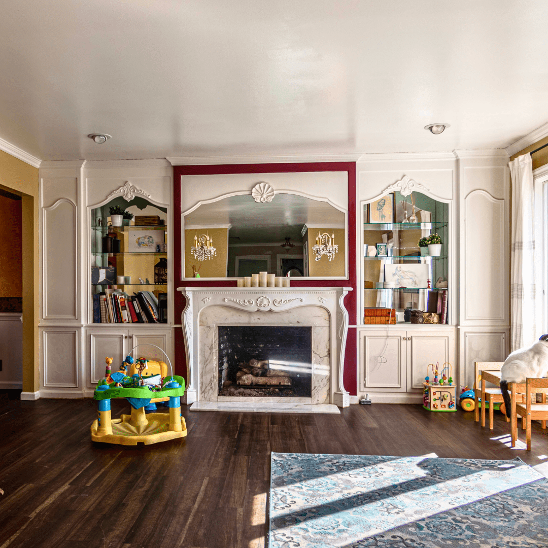

I spent the next several months slowly rebuilding everything until the One Room Challenge devoured all my time. Now that the half-bathroom is complete, I’m turning my attention back towards this room. I’m excited to finish the built-ins and fireplace, and I have several more ideas to make the best use of this space. Make sure you follow this project in 2024!
Related Playroom Posts:
What’s Next?
I used to write really thorough lists of exactly which projects I wanted to accomplish each year. But after renovating properties for a while, you learn that you can’t plan that far in advance.
As you can probably glean from the above projects we worked on this year, sometimes an investment pops up when the time is right, or you decide you just can’t take looking at <insert room here> anymore and pick up a hammer.
That being said, here are the spaces that are bothering me enough to be high on my to-do list currently.
The Mudroom
Our mudroom has felt like the slowest renovation in the world… probably because we’ve never actively said, “Okay, this is what we’re renovating next!” But I think I’m to the point where I’m ready to say just that.
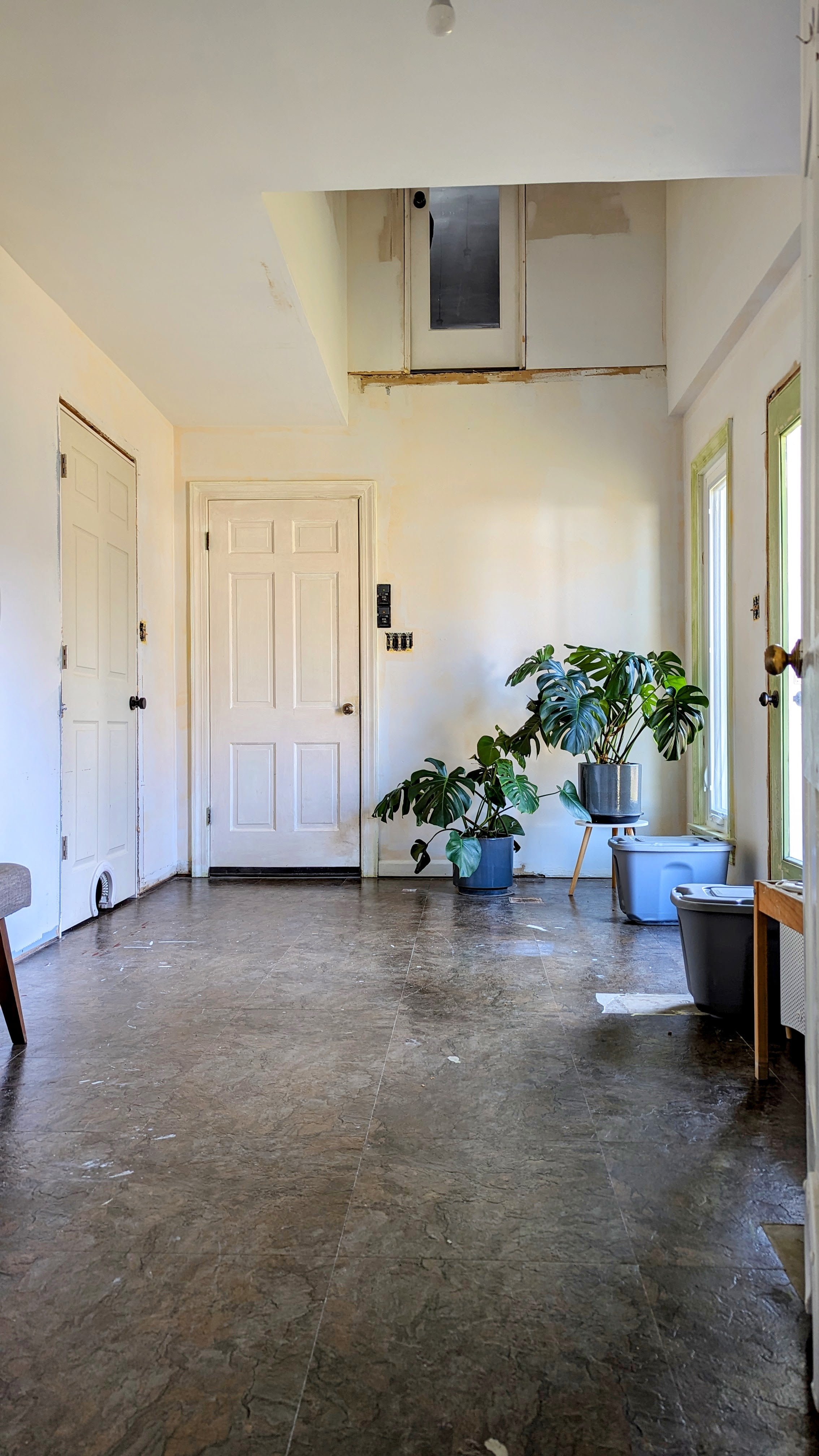
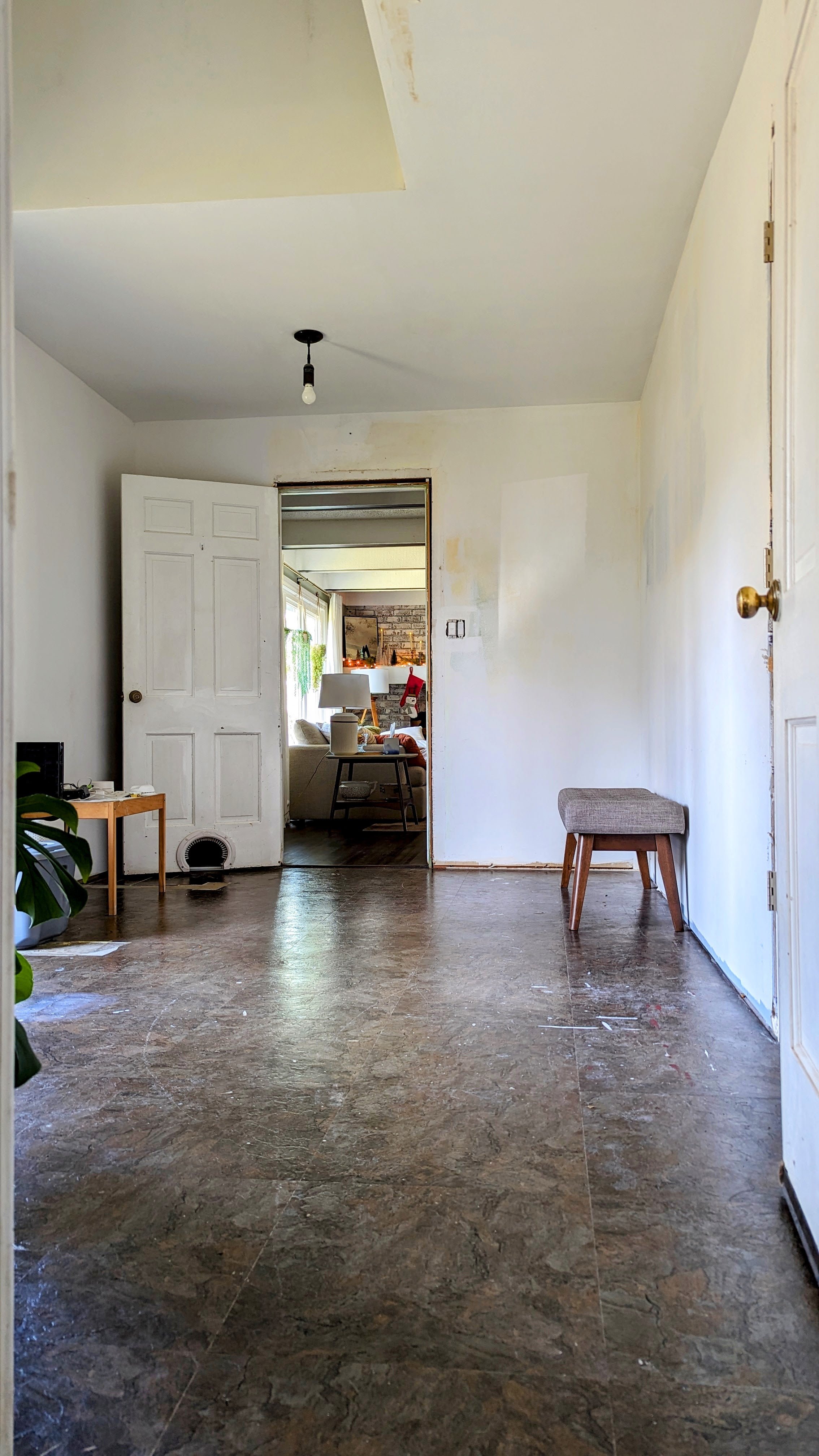
It’s been bumming me out a lot lately that this room has the potential to be incredible, but it’s just been used as a passthrough since we’ve lived here. There have been two major things that have kept me from tackling this room so far:
One - I wasn’t sure I could build the cabinets and bench I envisioned in this space. But now that I’ve proved myself with the built-ins in the playroom, I feel a lot more confident in my abilities.
Reason number two is…
New Flooring
We’ve never liked the flooring on our main floor. Not only does it look and feel cheap, it’s really dark. You might think that would be good for hiding crumbs and dirt, but in reality, it shows everything! For a long time, we’ve discussed replacing it. And I think this is the year!
Here’s a good view of the current floors:
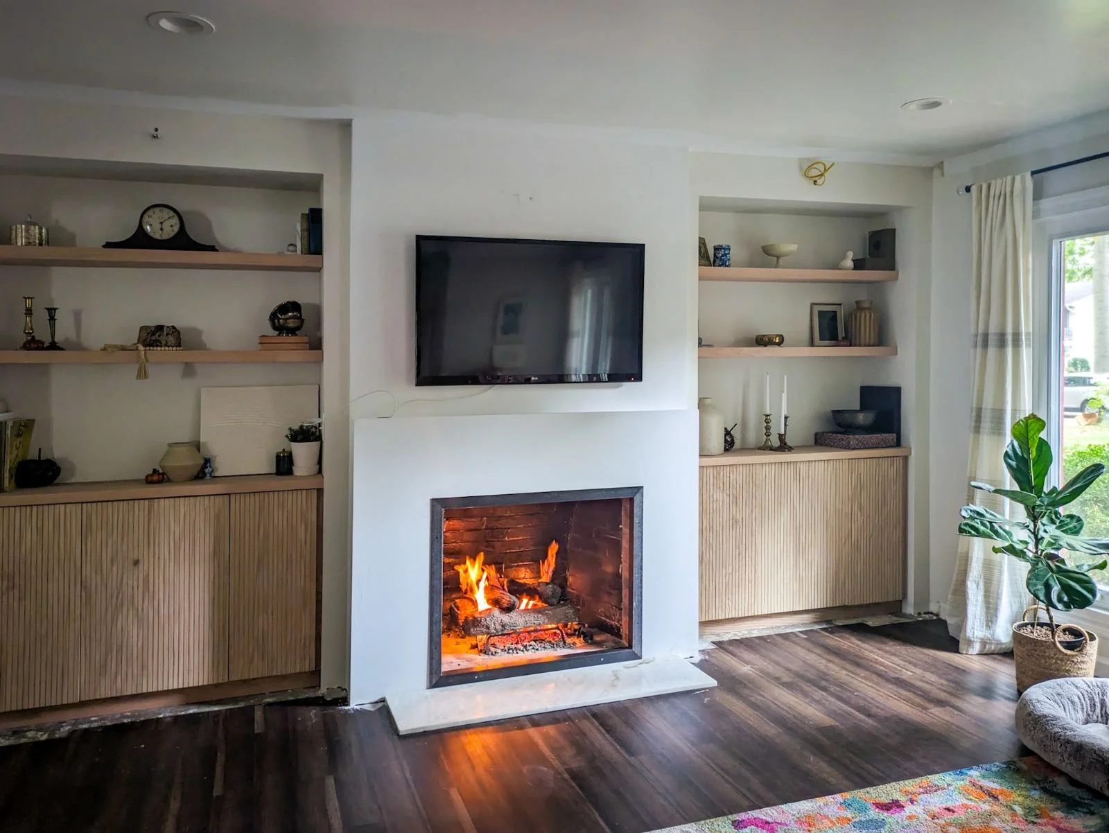
It would be ideal to carry the new flooring into the mudroom for a more cohesive feel, hence why I’ve been holding off on that renovation. But at this point, if I get to the mudroom before we get new flooring, I might just have to pivot and come up with a new plan (tile, maybe!?)
Storage Closet
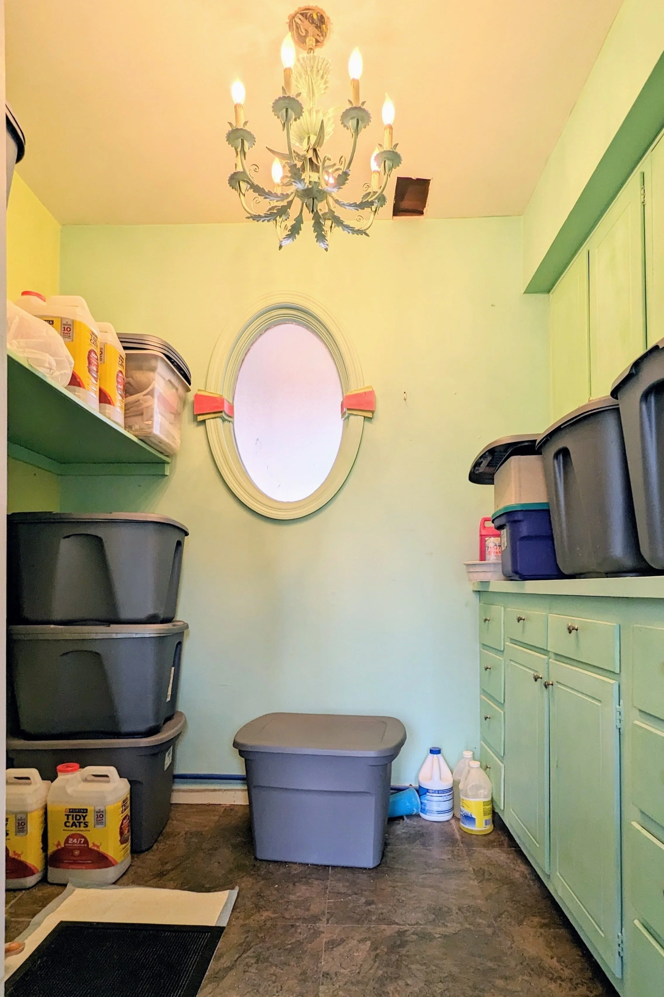
Before we moved our laundry room upstairs, it used to be its own room in the mudroom. However, since then, that room has become a poorly designed catch-all storage closet. This is the year I’d like to change that!
We don’t have an attic or a basement in our house, so a large, functional storage closet would go a long way. And this is the perfect room!
I would start by removing everything that’s currently in here, repairing drywall, repainting, and building/installing floor-to-ceiling shelving on both sides of the room.
Of course, I’m also trying to think of some way to insert an exciting design element into the space.
Final Thoughts
It’s hard to say whether my list is ambitious or not ambitious enough. Either way, I’m excited to jump in and start transforming these spaces. Keep following along to see how they turn out!


Surprise! I've Been Renovating the Playroom!
With the powder room renovation complete, you may be wondering what project is next on my list. And the answer isn’t necessarily what’s next. It’s what’s already been happening…
Built-in Bookshelf DIY
With the powder room renovation complete, you may be wondering what project is next on my list. And the answer isn’t necessarily what’s next. It’s what’s already been happening…

Last spring, while I was in the midst of helping out with the office renovation and cleaning out Charlie Foursquare, I decided it was the perfect time to also start work on our playroom! Admittedly, it wasn’t actually the ideal time to jump into another project. But, it was also a low-risk project that I could easily work on in the background at my own pace.
While I shared real-time updates on Instagram stories and the occasional update via Instagram reels, I never had the opportunity to write a blog post about it. So, for my blog audience… this post is for you. And we have a lot of catching up to do!
Where It Started
This was the playroom when we moved in. I think it’s actually intended to be a formal sitting room, but with young kids, using it as a playroom makes more sense.

Aside from swapping out the rug and some toys, we didn’t make any changes for the first 3.5 years we lived here. However, from the first time we stepped foot in our house, we knew we didn’t want to keep the built-ins as-is. For our taste, the mirrored backs, glass shelves, and swirly trim were way too ornate.
Inspiration for the Built-Ins
It didn’t take me long to start saving inspiration for the makeover of the focal point and main eyesore of this room: the built-ins. I quickly noticed a few similarities between my inspo pictures.
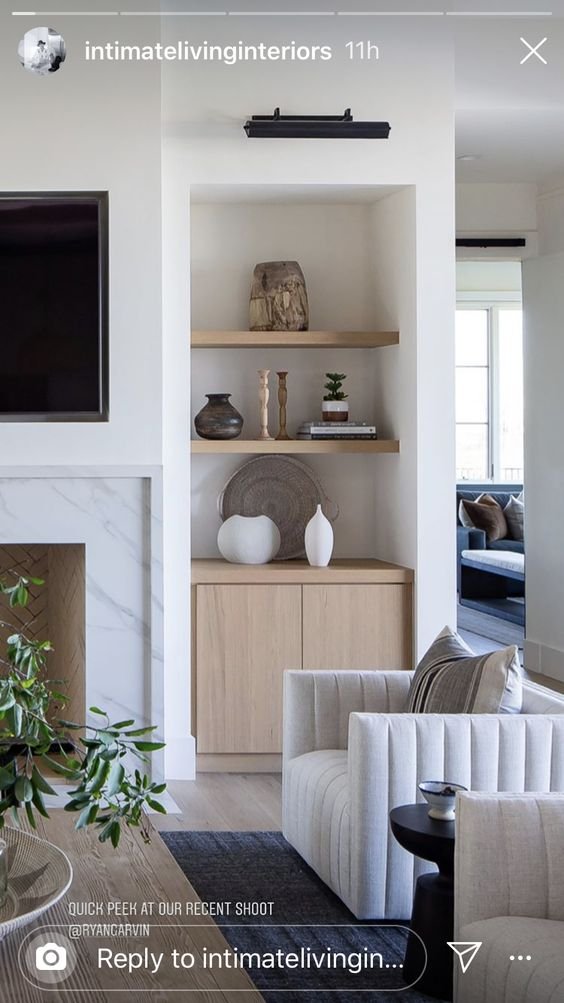
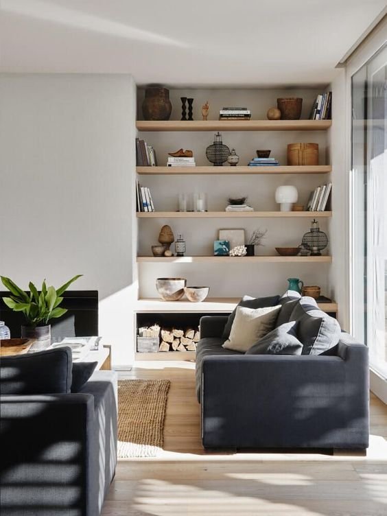
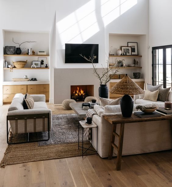
Okay… a LOT of similarities.
Although we’re currently using this space as a playroom, I didn’t want it to lean too childish for two reasons: 1) Eventually, our kids will grow up and probably start locking themselves in their rooms as they become moody teenagers. And 2) this room is open to the rest of the first floor, and I didn’t want it to stand out like a sore thumb.
Design Plans for the Built-ins
Once my design direction was clear, I picked the pieces that resonated most with me and sketched them to fit my space.
I was really drawn to the modern aspects of the inspiration pictures - like the squared-off edges on the built-ins and fireplace, as well as the slab doors of the cabinetry.

Because this is such an open room, I really loved the idea of painting it off-white so it can flow from one room to the next. I also like how the shadows in the architecture of the built-ins can play when everything is a lighter color.
You’ll notice all my inspiration pictures also have wood shelves and/or cabinetry. I loved the look but didn’t think I could make that happen since I planned to build my cabinets, and I was concerned with my woodworking skills. In the image below, I mocked up the room with taupe cabinetry instead.
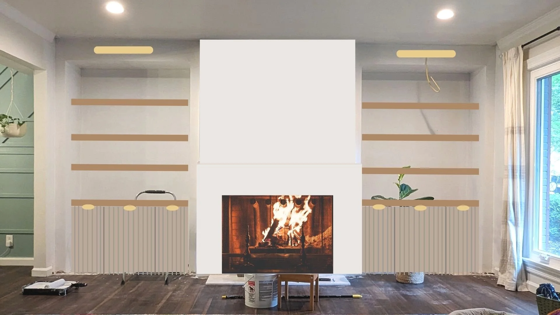
Scratching that Renovation Itch
Last spring, I just couldn’t take this “pocket of ugly” (how I like to refer to the unfinished spaces in our home) anymore. I tried doing a phase 1 update by painting the walls and modifying the built-ins, but that quickly spiraled into tearing them out completely.

I love learning, honing my skills, and looking for new ways to push myself, so I took on as much of this project myself as I could - including drywalling everything. It’s not perfect by any means, but I learned a ton, and it actually turned out pretty good.


Once the drywall was complete, I started building the cabinets. I must have gained some confidence along the way because I decided to keep them wood rather than paint them. I even created hinge pin holes so I can adjust the shelves!
Then, it was on to building the countertops out of a couple of pieces of thick red oak and building the doors out of red oak plywood.
In one of the inspiration pictures, the cabinet doors are fluted. I absolutely fell in love with them. So, I figured out a way to cost-effectively recreate that look (find the tutorial here!). Lastly, I built floating shelves for each side.
And here we are!

Final Thoughts
I love the decorations in this room right now (check out how I made the garland here!), so I’m waiting until after Christmas to resume this project, but I’m so excited!

For the built-ins alone I still need to fill all the nail holes, stain, and seal them. As for the rest of the room… I have plans. But you’ll have to stay tuned to see what else I have up my sleeve!
Make sure to follow along on Instagram to catch all my real-time project updates!

Looking for more? Check out these project reveals!
Family Room Makeover
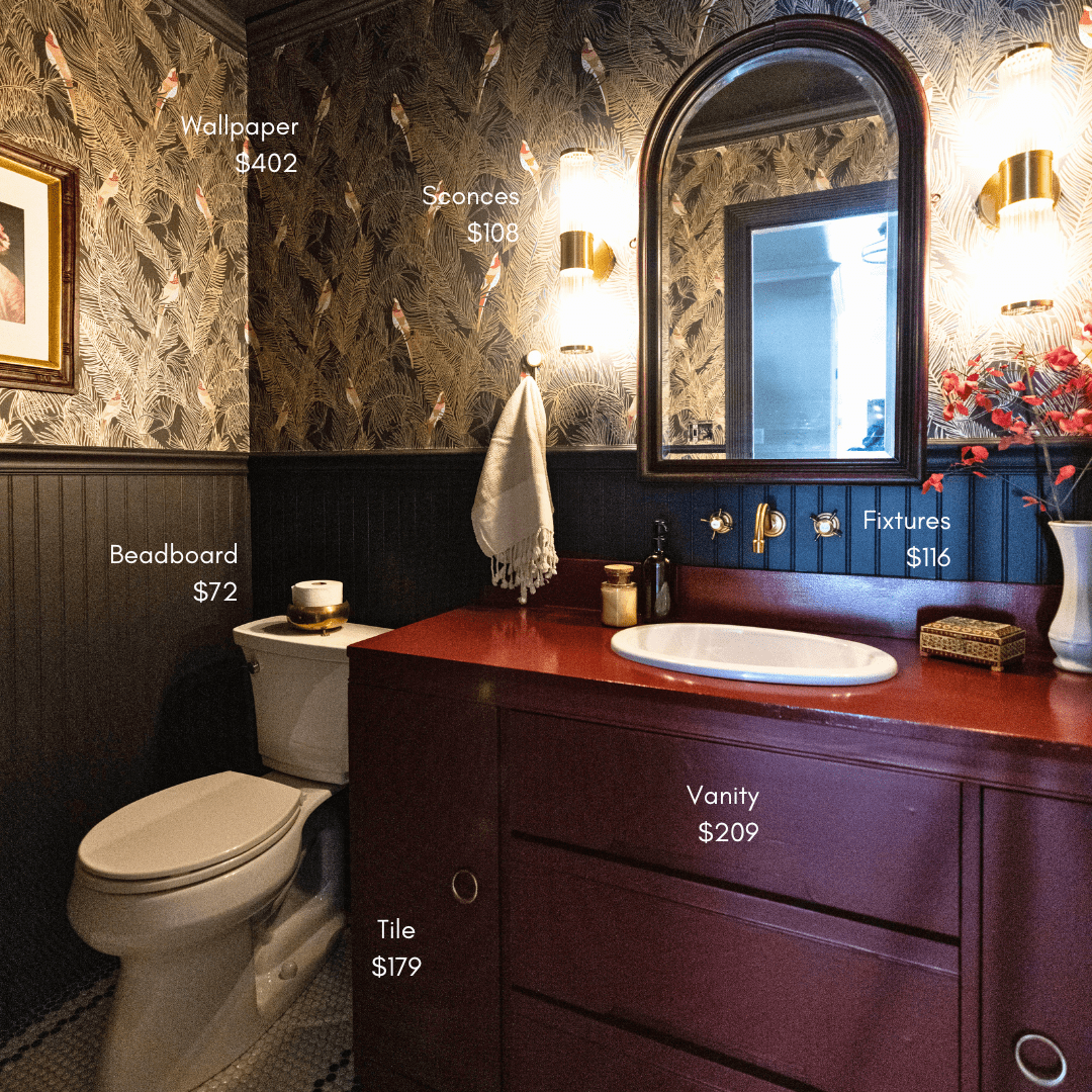
Half-Bathroom Budget Breakdown
Wanna know how much it really cost to completely renovate my half-bathroom? Find it here with an itemized breakdown!
My Tips for Renovating on a Budget
Wanna know how much it really cost to completely renovate my half-bathroom? Find it here with an itemized breakdown!

Budgets are so subjective. What may seem super expensive to one person could be nothing to the next person. In fact, a quick Google search varies in estimates for a half-bath remodel from $2,500 all the way up to $15,000! That's a pretty gigantic range.
I’m an insanely budget-conscious person. Truth be told, I’m actually kind of terrible at spending money. So, naturally, I aimed to renovate my bathroom on the absolute lowest end of the range without sacrificing the overall style I wanted.
My goal was to renovate this bathroom for $2,000. Do you think I stuck to my budget?
As an Amazon Associate, and partner with other brands, I earn from qualifying purchases. This post may contain affiliate links, meaning I receive commissions for purchases made through those links at no cost to you.
Itemized Half-Bath Cost Breakdown

- Drywall: $21.96
- Misc Materials (Spackle, Adhesive, etc): $45.46
- Black & White Penny Tile: $178.46
- Grout & Sponges: $46.95
- Schluter Edging: $18.99
- Thinset: $26.98
- Beadboard: $71.97
- Wall/Trim Paint: $52.94
- Console Table (aka Vanity) & Backsplash: $104.62
- Vanity Paint/Sealer: $78.87
- Vanity Hinges: $25.17
- Sink: $110.85
- Faucet: $115.99
- Plumbing: $43.39
- Misc (Decor, Toilet Paper Holder, Trash Can): $32.21
- Electrical: $93.40
- Door: $112.35
- Door Trim: $74.95

- Door Hinges/Stop/Knob: $46.23
- Toilet: $179.00
- Wallpaper: $402.00
- Wallpaper Smoother: $1.99
- Wallpaper Paste: $24.98
- Wallpaper Primer: $29.98
- Baseboard: $31.52
- Chair Rail: $34.16
- Crown Molding: $44.97
- Sconces: $107.58
- 7% Tax: $149.52
- Total: $2,285.48
Okay, so I didn’t quite hit my goal of keeping my half-bathroom renovation to $2,000. But, considering I replaced everything in this bathroom aside from a few sheets of drywall, I’d say I came pretty darn close!
Here’s how I renovated my bathroom for less than $2,500:

DIY vs. Hired Labor
Bottom line, the biggest reason I was able to keep my budget so low with this renovation is because I didn’t hire out any of the labor. The labor alone for this renovation would have likely blown my budget before I got started. Lucky for me, I really enjoy DIY, so doing it all myself didn’t feel like a chore in the least!
I Didn’t Buy Any New Tools
If you notice, in the budget breakdown, I didn’t include the cost of any tools. That’s because I already owned most of the tools I needed. And I borrowed the few tools I didn’t have from a friend.
I realize this isn’t a reality for everyone. Buying new tools would definitely increase your project cost. However, keep in mind that once you buy a tool, you get to use it over and over again on future projects!
Related: 10 Best Tools for DIY Beginners
Compare Prices

Whenever I’m sourcing items for a room, I spend an excessive amount of time looking for the best deals without sacrificing quality. The penny tile in this room is the perfect example.
It was really tricky to find a resource that sold both black and white penny tile at a reasonable price (black penny tile was surprisingly hard to track down!) I was close to buying mine from Tile Bar because they sell both colors for a fair price, but the shipping added 1/3 of the cost!
I found tiles at Floor and Decor, but I was nervous about how they’d look next to each other since they were from different brands. Luckily, I had a chance to stop by a store to see them side-by-side, and they looked great together.
Know When to Splurge and When to Save
I knew wallpaper would be a huge part of my bathroom design. But I also know that wallpaper can get really expensive really fast.

Although I definitely splurged by using wallpaper in my bathroom (it was over $400 for just the wallpaper), I saved a lot of money by installing beadboard on the bottom half of the room. Not only is beadboard really inexpensive (only $72 for all the sheets I needed), but it adds so much character!
Buy Secondhand
Buying secondhand items is not only a great way to add character to a space, but it is also a big cost-saver. The mirror and almost all of the decor are secondhand, but the biggest secondhand item in this bathroom is the vanity.
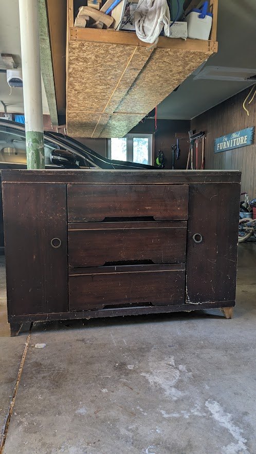
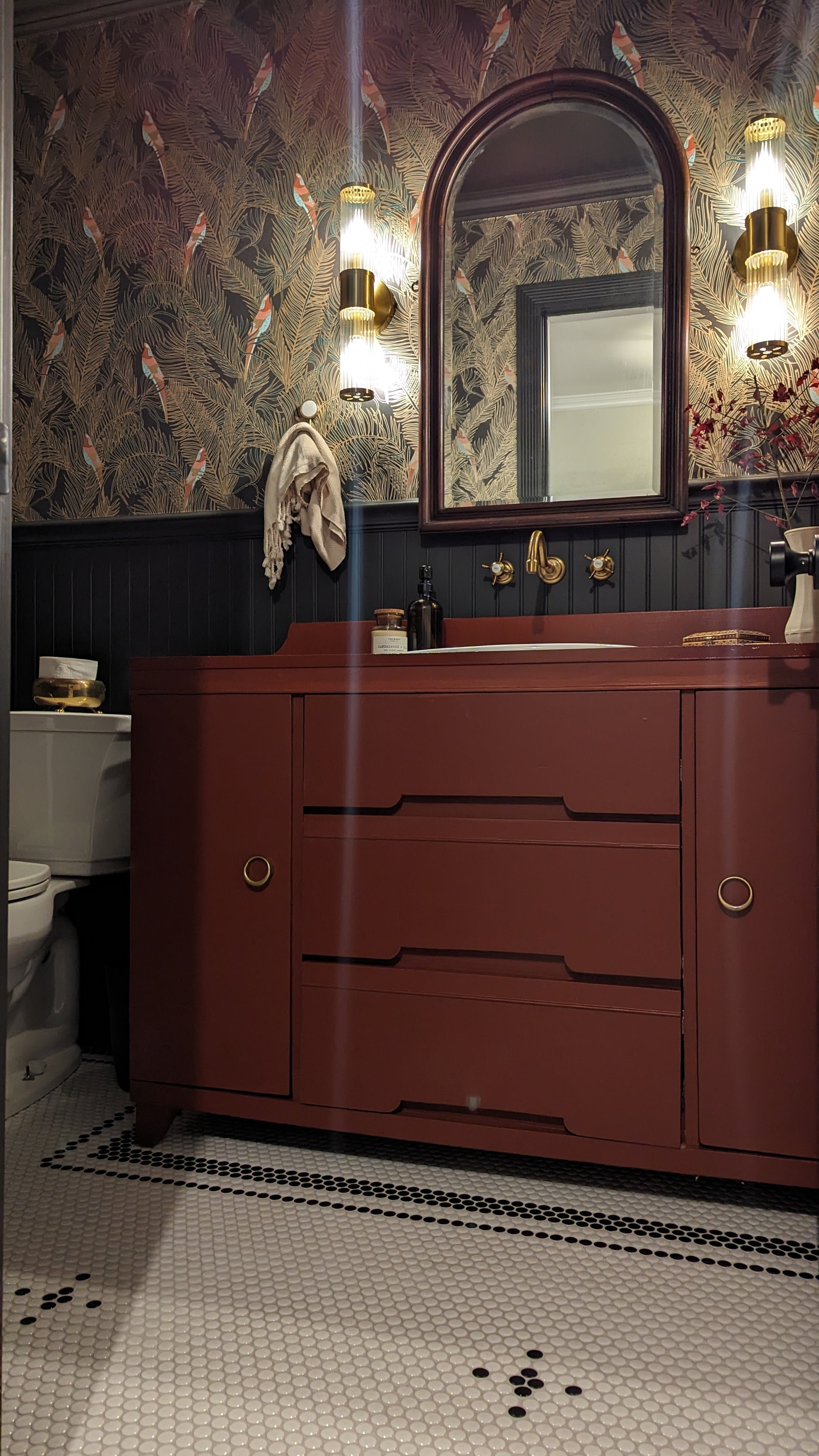
While I sacrificed a stone top for the vanity (which would have significantly added to the cost), a few coats of Polycrylic easily made the top waterproof. In addition, I never would have been able to find a store-bought vanity in the color I wanted, and I know I would’ve been hesitant to paint something new.
Final Thoughts
It’s easy to watch people transform their homes in what looks like an instant (hello, Instagram transitions) and with infinite funds. I hope this blog post, as well as following along during this entire renovation, helps give you insight into some of the behind-the-scenes work that makes these projects possible.
Don’t forget to save this post to reference during your next renovation!

