

Choose the Best Paint Finish for Every Room
Sometimes I forget that not everyone has painted several houses worth of rooms and may not know what to say when the person at the paint counter asks, “what finish do you want that in?”. So this week, I’d like to bring back the basics and break down how to choose the best paint finish for every room in your house.
Ahhh… I remember the first time I painted a room. cue the “going back in time” squiggles I was a junior in high school and we had just moved into a new house. I was ecstatic because my parents let me paint my room however I wanted. I chose a soft, minty green color in a satin finish and flat black trim.
The color of the room was actually pretty classy and surprisingly the finish wasn’t too off-base either, unlike my mom who painted the rest of the house in semi-gloss even though I told her it would look weird (and it did).
But although I got lucky and made a couple of good decisions, they weren’t educated. And I certainly didn’t get lucky with all my painting decisions in my room, considering I painted the trim in a flat finish and painted the ENTIRE room (ceiling too) with the same paint I used on the walls. I’ve learned a lot since then.
My point is, we all have to start somewhere. Sometimes I forget that not everyone has painted several houses worth of rooms and may not know what to say when the person at the paint counter asks, “what finish do you want that in?”. So this week, I’d like to bring back the basics and break down how to choose the best paint finish for every room in your house.
How to choose a paint finish
When choosing a paint finish, you can most definitely just choose what you think would look good (it’s your house, after all). But there are different finishes for a reason. It’s important to know what the purpose of each finish is before committing if you want a nice looking end product.
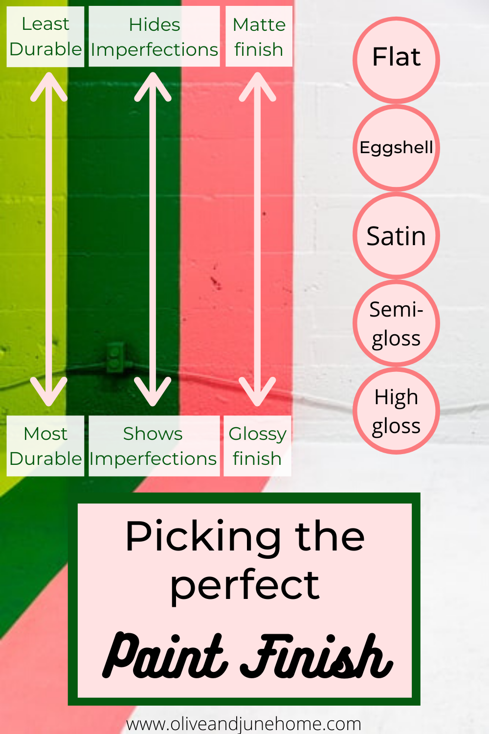
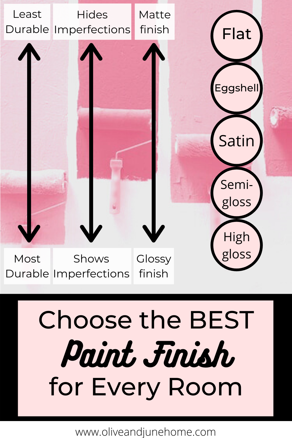
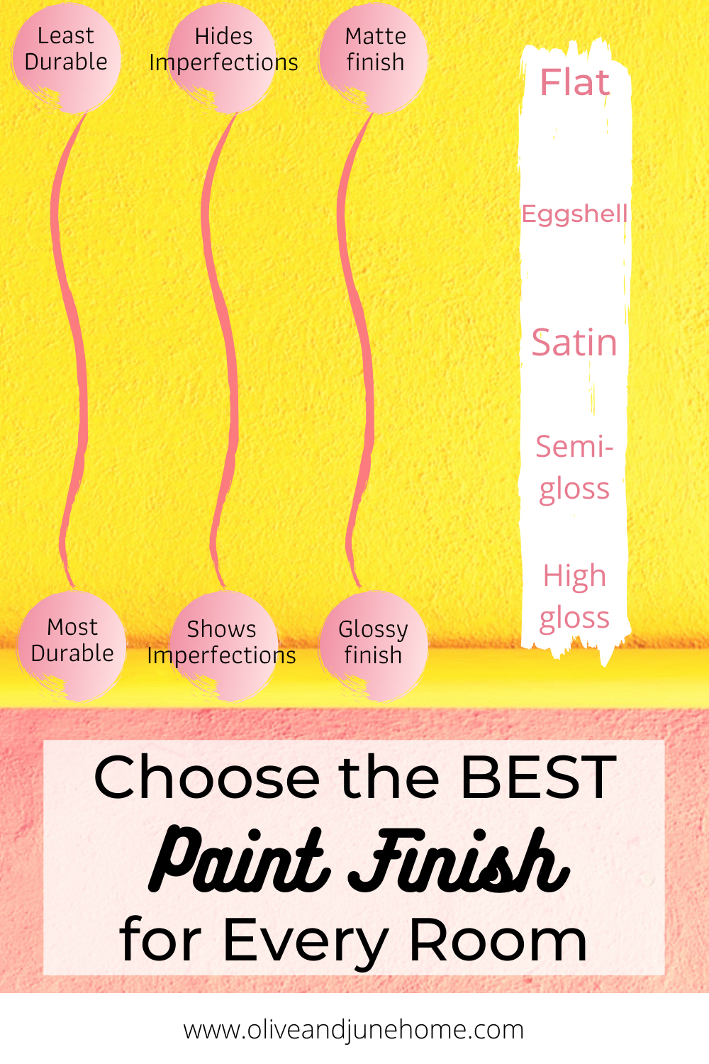
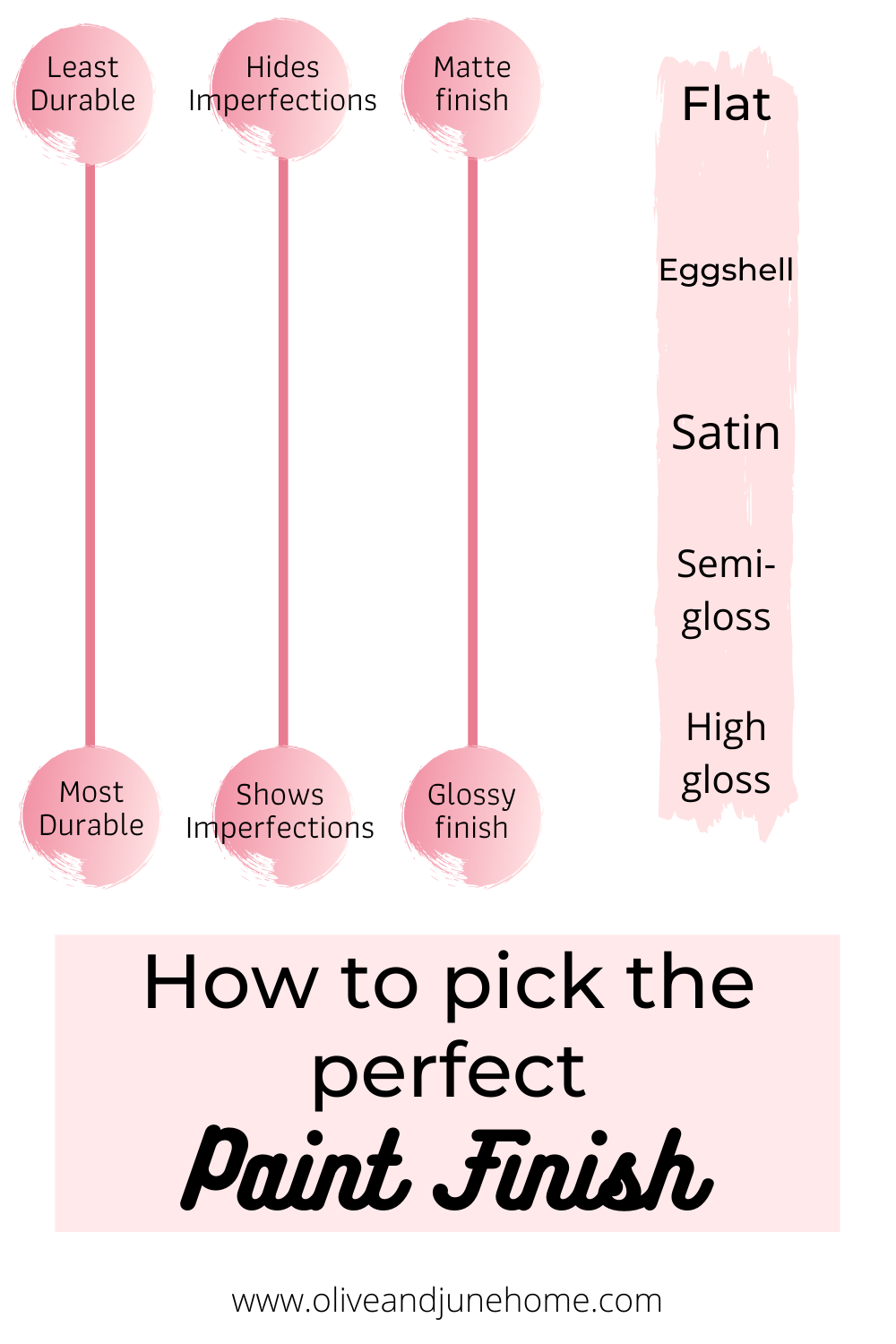
There are 5 main finishes: flat, eggshell, satin, semi-gloss, and high gloss, and 3 main aspects of each paint finish: sheen, imperfections, and durability. Below I break down how each finish stacks up and where in your home they should be used.
Flat
Sheen: Flat paint is… well, flat. Pretty self-explanatory. It’s a matte finish and doesn’t reflect light.
Imperfections: Because of its matte finish, flat paint is very good at hiding imperfections.
Durability: Flat paint tends to hold on to dirt and is difficult to clean and wipe down.
Where to use it: Low traffic areas, ceilings, or on walls with lots of imperfections (like old plaster walls)
Eggshell
Sheen: Low sheen, like an eggshell. Also pretty self-explanatory.
Imperfections: Still pretty good at hiding imperfections.
Durability: Slightly easier to clean than flat paint.
Where to use it: Low to moderate traffic areas - living rooms, dining rooms, adult bedrooms
Satin
Sheen: Moderate sheen
Imperfections: Less good at hiding imperfections
Durability: Easier to clean
Where to use it: Moderate traffic areas, like kids’ bedrooms and hallways or in areas with moisture, like kitchens and bathrooms.
Semi-gloss
Sheen: Moderate to high sheen, slightly glossy and reflective
Imperfections: Not good at hiding imperfections
Durability: Easy to clean
Where to use it: Moderate to high traffic areas like on trim, doors, and cabinets or in areas with moisture like kitchens and baths.
High gloss
Sheen: High sheen, very glossy and reflective
Imperfections: Bad at hiding imperfections
Durability: Easy to clean
Where to use it: High traffic areas, like on trim and doors
If you’re still not quite sure what these finishes look and feel like, just ask the associate at the paint counter if you can see a sample of the different finishes. A lot of times they’ll have a little sample with each of the finishes displayed to better help you make your decision.

Now that you know the “rules” of choosing a paint finish, you can have some fun with it and throw those rules out the window!… with caution.
A great example of this is painting a design on a wall using the same color in two different paint finishes.

Or painting an entire room - walls, trim, molding - with the same color and finish.
Or even painting the whole room (including the ceiling) the same color in a high gloss finish.

At the end of the day, it’s your house so do what speaks to you and makes you swoon. But at least now I’ve taken the guesswork out of it for you, so the next time you order a gallon of paint you won’t be caught off guard. Happy painting!


Picking Exterior Paint Colors
I posted last week about how we majorly changed the appearance of the exterior of the flip house by limewashing it. While the outcome is a huge improvement from what we started with, it left the house pretty monochromatic and kinda blah. Well, now it’s time to shake things up by adding some color!
The Easy, No Mess Way to Choose Exterior Paint Colors
I posted last week about how we majorly changed the appearance of the exterior of the flip house by limewashing it. While the outcome is a huge improvement from what we started with, it left the house pretty monochromatic and kinda blah. Well, now it’s time to shake things up by adding some color!
In this week’s post I’ll walk you through the different color options and combinations we considered, how we tried them out without actually painting a thing, and what we decided on in the end!

Testing paint colors without painting anything
Let me tell you, picking exterior paint colors is intimidating.
With interior paint you can at least limit the number of people that see if you pick a hideous color, but exterior paint isn’t so easy to hide.
Painting a flip added another layer of complexity because I couldn’t follow my normal loooooooong paint color choosing process of trying several different samples and staring at them at different times of the day. I work full-time and have two little kids so finding time to go to the flip can be tricky. Not only that, but we’re in the home stretch of wrapping this flip up and are trying to stay on schedule, so I didn’t have my normal “ho hum” thinking time.
All these factors got me to thinking, “How can I test colors without actually testing colors?” The answer was simple - photo editing software!
I haven’t used Photoshop in years and my skillz are definitely lacking. I didn’t want to waste time relearning how to use it, so I researched some other resources. One option I considered was the Sherwin-Williams Visualizer, which allows you to upload a photo and outline certain areas that you want to test colors on. It’s a good concept, but it was a little clunky. What I ended up using was Canva, which is a free graphic design software platform that I was already familiar with - yay!
To test different colors I simply took the “final” picture I posted last week of the limewashed house and pulled it into Canva. I then drew blocks over the areas we plan on painting, resized them, and went to town picking out tons of different color combinations.
The great big world of color possibilities
Before I jump into showing you all the colors we tried out, let’s refresh our memories of what the house looked like before and after the limewash…

Pretty big improvement, but as you can see, the house was looking a little flat so adding color was a MUST.
Here’s what the house looked like with our different tests:
My initial idea was to paint the front door coral, but painting the shutters to match was too intense. To tone it down I changed the colors to charcoal gray in one example and white in another. When Lucius saw the gray and the white options with the coral door he thought the house was still looking too monochrome. What a buzzkill.
But mark my words, I WILL get my coral door one day! You just wait….


Before I share the next color combo, let’s just take a moment to laugh at those ridiculous bushes. If you squint a little they look real-ish… right? This method of picking paint cracks me up with the combination of color blocking on top of real-life photos, but hey, it served its purpose and saved us time and money! Plus, it gave me some laughs.
In the next example, the pink door with blue was kinda fun, but I just wasn’t feeling it 100% for this house. I could see it working on a different house though!

I was pretty drawn to the red door below, but again, Lucius thought the white was too monochrome. Seriously guys. Buzz. Kill. I’m tellin’ ya.
Side note, in case you didn’t notice, I tested out some different, and equally realistic looking, landscaping below.

I actually really liked black/yellow/white combination in this picture, but I felt like it was a little busy with the other factors going on on the exterior of this house (the texture of the brick, the 3 different types of windows that unfortunately aren’t in the budget to replace) so I kept on testing!

I love teal so I couldn’t help but try a few combos with a couple of different shades of teal in the next few pictures.


So many options, and I didn’t even share all of them!
At this point I felt like I had enough examples so I ran them past Lucius and there was one mock-up that stood out from the rest for both of us.
And the winner is….
…..the example in the very last picture! But before we set anything in stone we continued to bounce some ideas off each other and made a few tweaks to get it juuuuuust right. Or, as right as it could be with color blocking.
First off, we decided to paint the door white and the things next to it (they’re not really sidelights - just pieces of wood) teal instead of the other way around. We also color blocked the window sills and liked how much it made them pop, so we’ll be painting those.
To make take it a step further and get it as close to the real thing as possible (plus, let’s get real, I was having fun playing around), I added some makeshift lights on either side of the door and updated the address numbers to something more modern.
Lastly, I made the doorknob and knocker oil rubbed bronze because apparently I didn’t get the memo that the doorknob wasn’t going to stay brass. The disgusted face Lucius gave me when I thought he was going to leave the brass doorknob was priceless though.

Testing the paint colors in this way wouldn’t work for every scenario. For instance, if you were using a picture with a bunch of stuff in the way or needed to color block a ton of areas it’d be a bit of a pain. But for this project it was the perfect way to sample lots of options.
Because I only had a few areas I’m painting and they’re simple shapes to outline, this method was really simple and it gave me the ability to let my mind run wild and try out tons of different possibilities that I would never have considered if I were testing the paint old school style.
I’ve actually started painting it already and IT LOOKS AMAZING!!! I want to share a sneak peek SO BAD, but I’m not going to juuuuuuuust yet.
We’re crazy close to being done with this property and when it’s complete (we’re shooting for a couple of weeks from now) I’ll be sure to post tons of pictures of the inside and out and even throw in a budget breakdown of what it all cost. Until then, I’m gonna go find something else to color block…
