

Modern Dining Room Reveal
It’s done! It’s done! The dining room makeover is done!
If you’ve been following along, you saw last’s week post where I shared the accent wall we installed in our dining room. Well, as I was writing that post, I was working on putting the dining room back together for the grand reveal. It took a TON of restraint to not share a million sneak peeks, but I kept my trap shut and now I’m so excited that I can share it with the world!
Dining Room Makeover - Before and After
It’s done! It’s done! The dining room makeover is done!
If you’ve been following along, you saw last’s week post where I shared the accent wall we installed in our dining room.
Well, as I was writing that post, I was working on putting the dining room back together for the grand reveal. It took a TON of restraint to not share a million sneak peeks, but I kept my trap shut and now I’m so excited that I can share it with the world!

If you recall, our dining room looked quite a bit different when we bought our house last year.

Here’s a shot from the other doorway.

And here’s how it looks today.

When we moved in, the dining room was definitely not our style. In fact, it didn’t even seem like it was a part of the rest of the house! It had a mind of its own, with its bright yellow faux finish walls and deep red and gold border. Not to mention the ornate chandelier you see in the pictures above.
The doorway leading to the kitchen definitely wasn’t doing this room any favors either. It was the size of an average doorway but made the dining room feel needlessly closed off from the kitchen, so we took matters into our own hands.
We removed just about everything from this room and started from scratch - including stripping wallpaper, replacing the trim and crown molding, and widening that doorway (on a whim!) so it now spans 8 feet!


Then, after much deliberation, I finally chose a paint color and we installed our accent wall.
But of course, those steps were just the big pieces of the makeover. The icing on the cake and what makes a room really come together is the decor!
I made a whole bunch of mood boards during this overhaul to help get an idea of the direction I wanted to go with the decor (and because I just couldn’t help myself and wanted to see ALL the options). We ended up going with this design:

As a side note, I’m really just getting my feet wet with making mood boards, and I’M OBSESSED. They’re a fantastic and no-risk way to visualize a space in a ton of different ways. Why has it taken me so long to start making these!?
Plus, seeing the out of proportion design above compared to the real-life example below cracks me up. 10/10 would do again.

As an Amazon Associate, I earn from qualifying purchases. This post may contain affiliate links, meaning I receive commissions for purchases made through those links, at no cost to you.
Now… back to the decor! Let’s take a little tour, shall we?
Obviously, our dining room table made it back into the room… that was a no-brainer since it’s pretty new. But honestly, the table and the curtains are the only things that didn’t change!
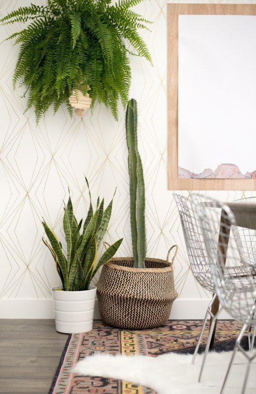
One of the biggest changes was adding our new area rug. Since the table and chairs are a darkish color and the flooring is super dark, the rug really helped brighten things up. Plus, it added some more interest to the room with the blues, greens, and orange going on in the design.

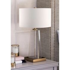
Another big change is the new light fixture. We switched out the fancy pants chandelier with something more modern and in line with the style we were going for. It took about 3 tries to get the right light bulbs, but now that it’s completely installed I’m in love!

I mentioned at the start of this makeover that I planned on switching out the old buffet table with my IKEA Malm dresser… and I’m happy to report that I followed through and am pleased with how it’s working in the space. The only downside is that now all my clothes are hanging out on the floor of my office until we build my new closet in the master bedroom, ha!

Other changes you’ll notice in our new and improved dining room is artwork! Two of the pictures are simply pages from newspapers we found in the attic of our last house.
This one is from when the first Star Wars was in theaters.

And I’m fascinated by this one because of how cheap paint was!

Plus, it has this little section that makes me laugh.

We also threw some watercolors I painted in here. The colors tie in nicely with the accent wall and the direction I’m going with the rest of the house. I painted these before I got brave and started buying real plants. Perhaps I was living vicariously through my paintings, hoping that they could replace having real plants before I was brave enough to start buying real plants? (Answer: they couldn’t)


Anywho - that’s the dining room!
A complete 180 from where this room started and I am so happy for that fact.

There are still a few finishing touches I want to add because really, is a room EVER completely done? (No, it’s not.) But the finishing touches are minor - like adding leather pulls to the dresser, maybe switching out the white picture frames for something gold or brass, changing the pot of the hanging plant, and possibly adding another largish plant in one of the empty corners.
In the meantime, I’m thrilled with how this room turned out. Unfortunately, a lot of the rest of the house is still a hot mess at the moment. I shared on Instagram not too long ago that I removed all the cabinet doors in the kitchen so I can start painting those, obviously we’re deep in our master suite reno and therefore have been displaced to the loft, and half of my office still needs furniture, along with so many other incomplete spaces in the house.
That being said, we’re taking solace in the fact that even though the dining room is upstaging the rest of the house, at least we don’t have anything pressing left to do in there to make it functional and beautiful. Now we can pivot back to some of our other unfinished spaces - stay tuned!

Related Dining Room Renovation Posts
Modern Dining Room Makeover

Chandelier and Area Rug Roundup + Dining Room Mood Boards!
Now that the DIY Sharpie wall in my office is complete, and while we’re waiting for materials for the master suite to arrive so we can start rebuilding, I feel like I can finally turn my focus back to the dining room.
I’ve developed a pretty good vision of how I want it to look, but, as I’ve mentioned before, I’m very indecisive. So, I put together some mood boards of the dining room with different lighting and area rug combinations to help quell my indecisiveness. And MAN, did I get nerdy with it.
This post may contain affiliate links, meaning I receive commissions for purchases made through those links, at no cost to you.
Now that the DIY Sharpie wall in my office is complete, and while we’re waiting for materials for the master suite remodel to arrive, I feel like I can finally turn my focus back to the dining room.
I’ve developed a pretty good vision of how I want it to look, but, as I’ve mentioned before, I’m very indecisive. So, I put together some mood boards of the dining room with different lighting and area rug combinations to help quell my indecisiveness. And MAN, did I get nerdy with it.
But before I jump into the mood boards, I wanted to share with you a roundup of affordable chandeliers and rugs that I’ve considered for this room - and that you might enjoy too!
RELATED: If you want to see how this room started, visit these posts HERE and HERE.
Chandelier Roundup
All of these chandeliers are below $250 except for numbers 11 and 13, which are just a hair over $250, but they’re so beautiful so I had to include them - plus, number 11 is a steal since it’s 40% off right now!


1 / 2 / 3 / 4 / 5 / 6 / 7 / 8 / 9 / 10 / 11 / 12
I feel like I need to state that although I love all the light fixtures and rugs above, Lucius does not. He’s really not a fan of Sputnik light fixtures, so numbers 2 and 4 were an immediate no-go, and I’m still trying to win him over on Oriental rugs. That’s one of the challenges of decorating with a significant other - you have to think of their style too.
As with most projects, including this one, I tend to narrow down my favorite items using Pinterest and then show them to Lucius so he can tell me which ones he hates the least. Using that process, most of the time we can come to an agreement pretty easily! #winwin
A couple of quick notes before I share the mood boards:
The dining room set I have in these mood boards isn’t our exact set, but it is similar in style and color, so I figured it was a good placeholder.
I’m using a paint color similar to what was used in my inspiration picture, so I just used that image as the background in my mood boards.
I have specific requirements for dining room rugs - mainly that they can help hide stains because kids + food = alllll the stains. That being said, I mostly went for patterned and/or colorful rugs that would hide/camouflage some of those inevitable stains.
And lastly, I didn’t create a mood board for all the light fixtures and area rugs - that would be crazy. But I was tempted! Instead, I created them for just some of the combinations until I felt like I was getting a clearer picture of how I want the room to look.
Okay? Okay! And now for the fun part…
Dining Room Mood Boards
Option 1 - Oriental Rug/Industrial Chandelier

Pros: Although incorporating oriental rugs into our house is one of the design struggles I have with Lucius, even he agreed that he didn’t hate this one. Even though it has some geometric shapes, it’s a softer, distressed finish and I think that allows it to work with the lines in the accent wall, rather than compete against them. I also like how modern and contemporary the chandelier is and how it ties the different design elements together.
Cons: The carpet is on the dark side, which makes me nervous since the dining table and the laminate in the rest of the room are pretty dark. I’d like to lighten the space up some.
Option 2 - Oriental Rug/Farmhouse Chandelier

Pros: I think the farmhouse style can be done really beautifully, but it’s just not my jam. However, I’m really drawn to this light fixture. And of course, I love me an Oriental rug.
Cons: There’s a LOT going on with this combination. The pattern on the rug is too defined and definitely competes with the wall. Also, it’s still darker than I’d like. Additionally, I think the lines in the chandelier compete with the lines in the wall as well.
Option 3 - Abstract Rug/Geometric Chandelier

Pros: Although I’m really trying to find a way to get an Oriental rug to work in this room, this abstract rug makes me really happy. I think it’s the bright pop of gold/yellow that seems like it really brightens up the room. Plus, that light fixture is gorgeous!
Cons: I’m concerned that the rug will have too much blue in it in real life and will clash with the call color. I also have some hesitations about the light fixture being a little too geometric for the space.
Option 4 - Oriental Rug/Farmhouse Chandelier

Pros: I’ve been swooning over this rug forever, but just haven’t found a place in our home that it makes sense. I love the colors and design. And I actually think the pink/orange color in it goes nicely with the green accent wall. The chandelier I think helps pull out some of the curved lines in the rug and the color ties in nicely with the dining set.
Cons: Lucius hates both the rug and the chandelier - but sometimes I like to throw ideas out there even if I think he’ll hate them - sometimes he doesn’t! (Most the time he still does.) And honestly? This combination just doesn’t catch my eye as much as I thought it would.
Option 5 - Oriental Rug/Brass Chandelier

Pros: I’m loving the contrast that the bright rug and brass chandelier bring to this space. And I actually think the pattern of the rug and the curves of the chandelier work nicely against the straight lines in the accent wall.
Cons: I’m still trying to win Lucius over as far as incorporating brass into our house goes. I’m not quite there yet (don’t worry - I’ll wear him down), so this light fixture was definitely a no-go. Besides that, we currently have very little orange in our house decor so bringing in such a bold rug would be tricky without adding more orange throughout the house.
Option 6 - Oriental Rug/Brass Wagon Wheel Chandelier

Pros: I LOVE this light fixture. The more I look at it the more I like it. I love how the curves in the chandelier break up the straight lines in the wall and brass/oil rubbed bronze finish adds some more dimension. The rug is pretty but…
Cons: I actually don’t like the rug in this space at all. I’m not fond of the purple in the rug next to the green in the walls and I think there are way too many areas without a pattern that would definitely not hide food stains.
Option 7 - Abstract Rug/Industrial Chandelier

Pros: I had to try out another abstract rug, and I’m actually liking this one quite a bit too! It’s a lot brighter than a lot of the other rugs I’ve looked at, which would be great in our dining room since it can be pretty dark sometimes. The chandelier is also pretty great. I love the curved lines and the brass/oil rubbed bronze combination.
Cons: I worry a little that this rug has more blue than green, which could look weird against the accent wall. As for the chandelier, I’m not sure I can convince Lucius to go with it.
Final Thoughts
There are ENDLESS combinations that I could have put together, but I know eventually I have to just make a decision and run with it. We’re still working on reinstalling the trim and installing the accent wall so I have a little time, but while I continue thinking it over, I’d love to hear which option or combination you like most! Let me know if the comments! Who knows? Maybe you can sway my opinion.
Related Dining Room Renovation Posts

Master Suite Remodel - A Change in (Floor) Plans
I posted two weeks ago about our master suite remodel, including what we had demoed and the new floor plan. After that post, we were finally able to take some time and officially tape off the floor to REALLY get a feel for how the space would work. Unfortunately, we quickly realized there were some issues that we had to solve for.
Master Bedroom Renovation
Well, that was a quick change in plans…
I posted two weeks ago about our master suite remodel, including what we had demoed and the new floor plan. After that post, we were finally able to take some time and officially tape off the floor to REALLY get a feel for how the space would work. Unfortunately, we quickly realized there were some issues that we had to solve for.

Before we get into the problems we encountered and how we’re working with and around them, as a quick refresher, this is what our master looked like before demo.
This was the floor plan we originally mocked up for our renovation.

And this is our NEW new floor plan.
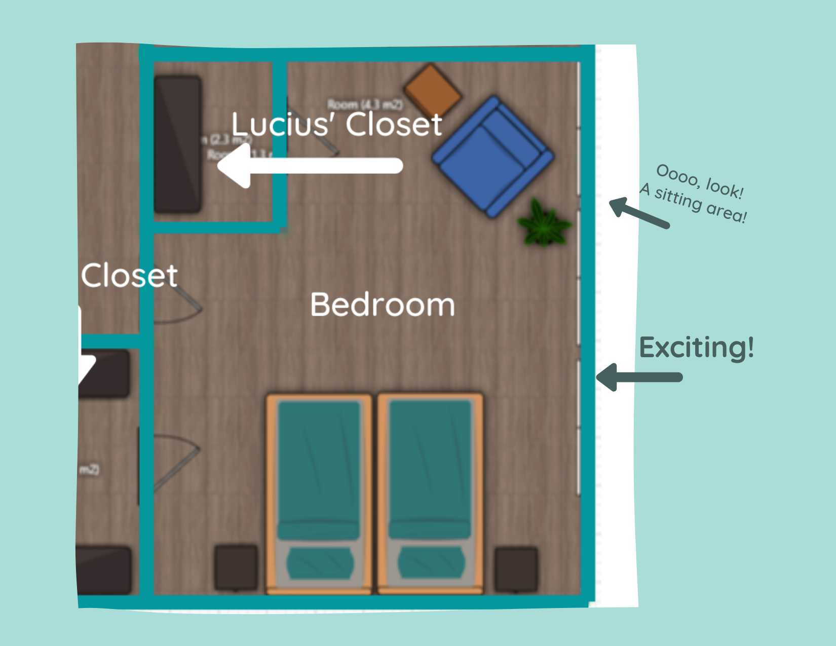
The biggest change is that the large, walk-through closet is being moved and split into two smaller closets. My closet will be where we were planning on moving the laundry room and Lucius’ closet will be separated and placed in the same vicinity that we originally planned to put our big joint master closet.
All caught up? Okay, now let’s get into the why we’re making this change!
I Suck at Measuring
Cut me some slack here - the floor planner I used had me converting meters to feet for every measurement!
Anywho, once we taped it out, I noticed that the space I envisioned as a laundry room would have been much smaller than what I was originally thinking. I could still make it work with the amount of space we would ACTUALLY have available to us, but I wouldn’t have been able to include the counter space I was hoping for, and that was definitely part of the appeal!

Not only that, but I mentioned in my previous post about this remodel that we didn’t know what we’d do with the current laundry room once we moved it upstairs. We could turn it into storage, but it would be a somewhat awkward space. Besides, Lucius didn’t seem too pumped up about the thought of moving the laundry room upstairs anyway.
While it’s a little bit of a bummer for me to have to lug the laundry up the stairs when it’s done (or, more realistically, continue to listen to Lucius complain about having to do it), we’re compromising by putting in a laundry chute!
Lucky for us, the current laundry room is right below our master suite area, so it shouldn’t be a big deal to install while we have all the walls opened up anyway. We had a laundry chute at our last house and LOVED it. Plus, the kids get a kick out of it too. Now, if only we could figure out where to install a dumbwaiter….
Window Placement
I love natural light, and this space has FIVE generously sized double windows.

Because the original layout was so weird with that sunroom/loggia built into the house, we were never able to really take advantage of the windows before. While we would have had access to more of the windows with our first layout design, we would have had to remove some of them to put up the walls for the closet.
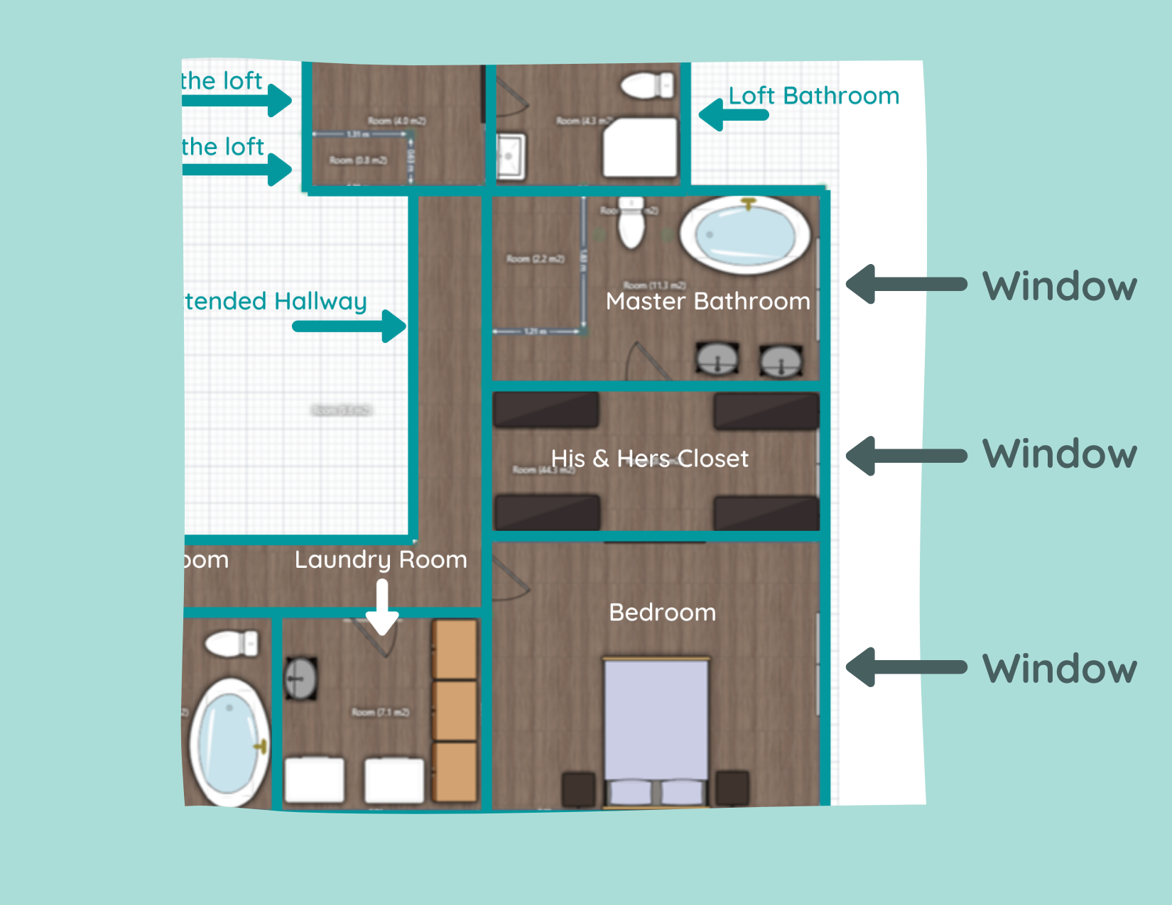
This concerned me for more than one reason: 1) I didn’t want to lose the natural light! and 2) the cost and all the unknowns about removing windows had me a little nervous.
But our new layout allows us to keep ALL the windows! Both Lucius and I are pretty happy about that. Especially me. I can just picture myself curled up on the floor with the cats in a big patch of sunlight. Mmm… livin’ the dream.

“Blah” Master Bedroom Floor Plan
With the previous floor plan, the only furniture in the bedroom would have been our bed and nightstands. While we were originally planning on having a large doorway to the walk-through closet to make it feel more integrated with the bedroom, it still seemed like it was going to be pretty boring.
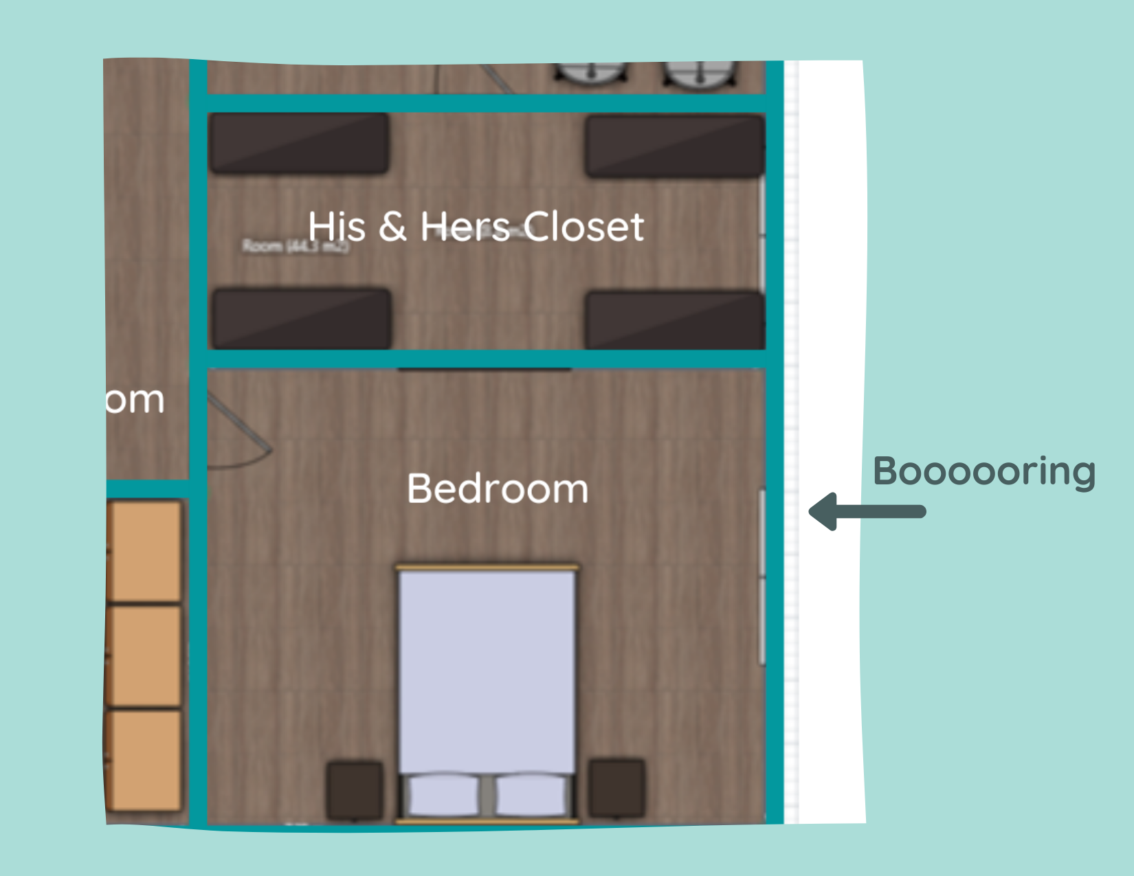
In the new floor plan, we’re able to expand the space to create a nice little sitting area right next to the windows that I’m really excited about. I think this is a good move to make the bedroom more inviting and another opportunity to really take advantage of those windows. Also, plants. Do you know how many plants I’ll be able to put in front of those windows!? SO MANY.
While our new layout has a lot of silver lining, I have to admit I’m a little sad to see my big walk-in closet go. Not to complain - my new closet will still be plenty big! However, I was dreaming about a closet like this or this. But that’s definitely something I’m learning as we do more and more renovations - you have to expect the unexpected and be flexible when curveballs come your way.
With that being said, I’m not making any promises this will be our last edit to the floor plan. We have a ways to go before anything is permanent and who knows what other game changers we’ll encounter. Now excuse me while I go find new inspo pictures for my closet…
Related Master Suite Renovation Posts:
Master Suite Floor Plans

Master Suite Remodel - Demo and Floor Plans, Oh My!
We have officially demoed our bedroom, bathroom, and closets!
Yes, it looks absolutely nuts. Yes, I’ve had more than a few “ohhhh noooo whatdidwedo!?” moments. But every time I walk into this space I get a jolt of excitement that easily puts those fears at bay. Also, LOOK AT ALL THAT NATURAL LIGHT!
Master Bedroom with Floor Plans
Several months ago, before we put our renovation shoes on, I shared a tour of the interior of our house. In that post, I talked about (and tried to show) how utterly weird the layout of our master suite was.
In fact, one of my hesitations with buying this house was that I knew we would want to reconfigure that space and it honestly intimated me. I mean, what if we couldn’t do it? What if we pulled up the floor and found termite damage? What if we got in over our heads!?
Enter Lucius, with his big dreams and dripping with confidence, who was quick to tell me exactly what I wanted to hear: that we could knock down this wall and that. That we could create a walk-in closet and the master bathroom of our dreams. Annnd as per usual I was hypnotized by the picture he painted.
Even several months ago, during the house tour, you could see pictures of where Lucius just couldn’t help himself and started tearing paneling off the wall in the sunroom (which I have learned is actually called a “loggia”). He’s been hinting at wanting to rip into the master suite more and more recently and finally, I caved. A few weeks later and our master looks like this:


We have officially demoed our bedroom, bathroom, and closets!
Yes, it looks absolutely nuts. Yes, I’ve had more than a few “ohhhh noooo whatdidwedo!?” moments. But every time I walk into this space I get a jolt of excitement that easily puts those fears at bay. Also, LOOK AT ALL THAT NATURAL LIGHT!
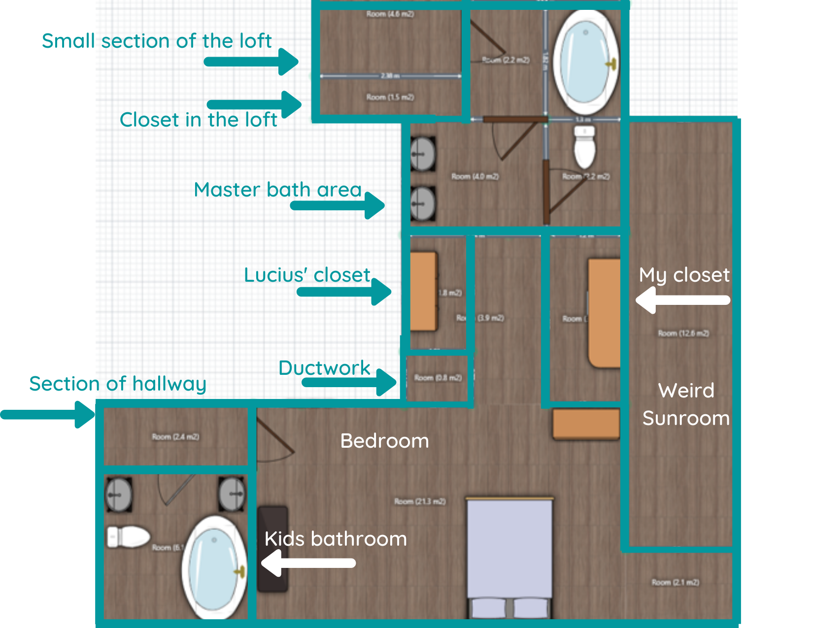
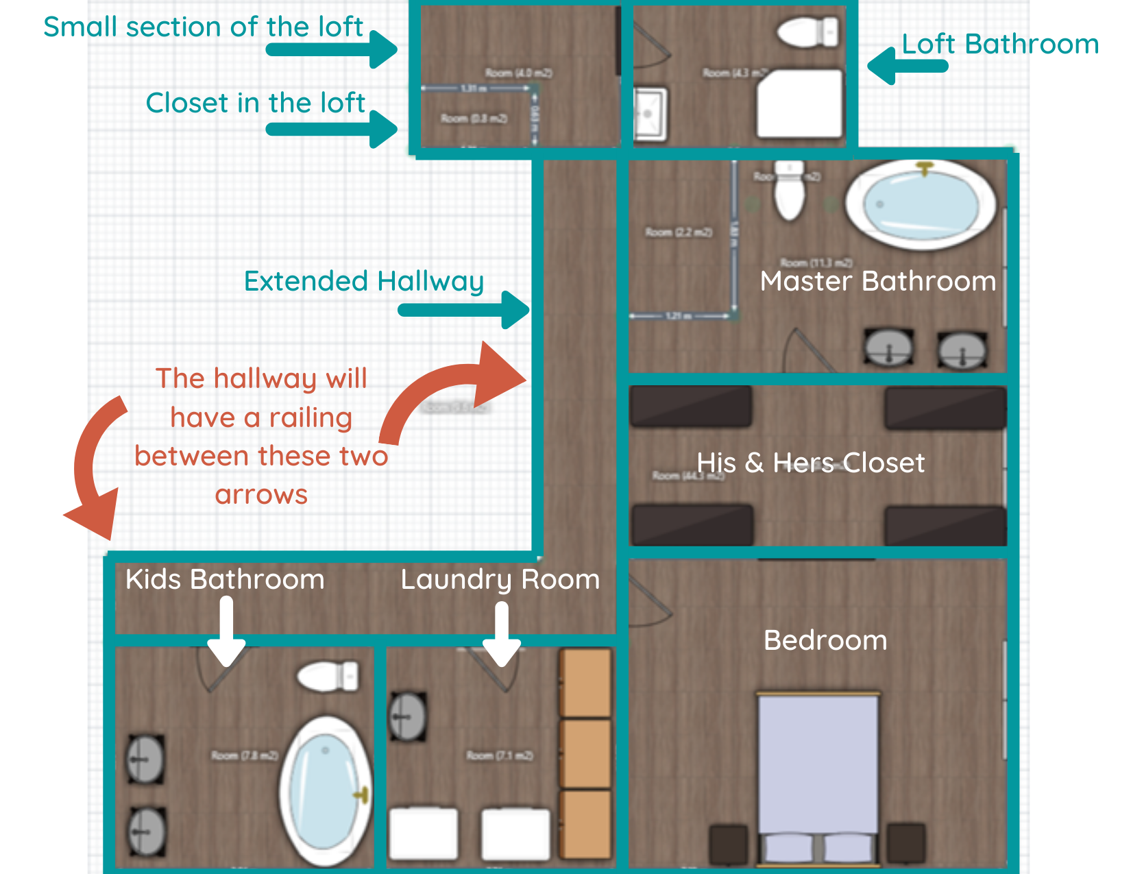
Since the pictures in the house tour are probably a little hard to follow (there’s a video in there too that explains the layout better, but still not perfectly), I’ve created a floor plan of what it looked like before demo, and how we’re thinking it’ll look when we’re done.
Before the Remodel

I’ve tried to outline each “room” to help it make more sense. Certain objects (vanities, the bed) aren’t to scale but are good placeholders to get the point across.
There are a couple of things that I want to point out before we get this “future plans” party started though.
First of all, you can now see how INSANELY DUMB this layout was. The “loggia” was the only source of natural light in the whole suite and it really wasn’t an inviting space - super long and skinny. I’d LOVE to talk to the architect and figure out whyyyyy they built the loggia at all. And then flick them in the forehead. Also, that little alcove at the end of the loggia in the corner of the room. What even is that!?
Secondly, the bathroom situation was all sorts of broken up craziness. Not only that, but we hated that the only way to get to the loft from this side of the house was to walk through our shower room. (Also, the fact that we had a shower room.)
Lastly, the floor plan doesn’t include our entire second story, but since this remodel actually impacts more than just the master suite, I’ve included snippets of the adjacent impacted areas. For instance, at the top of the layout, you’ll notice I labeled a small section of the loft. The loft is actually MUCH larger than that (it spans the entirety of our 3-car garage), but we’re only modifying a small corner of it for this project. You’ll also notice on the bottom left that I’ve labeled the hallway and kids’ bath. You’ll see why in the “after”.
Get excited! (I know I am!)
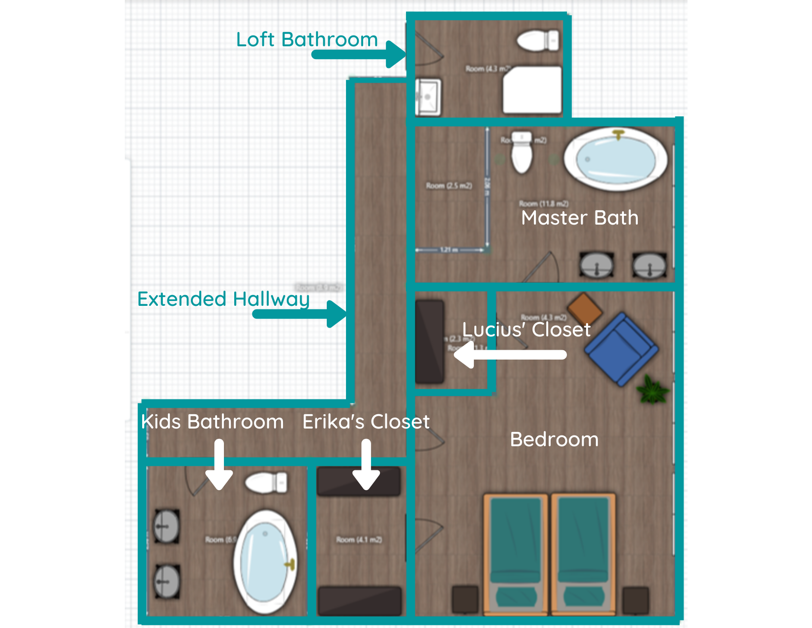
After the Remodel

Allow me to walk you through the changes because there are a lot!
Loggia Removal and Hallway Layout
One of the biggest improvements in the new layout is that we completely removed the loggia and pushed the master suite to the right. Now we’ll not only get to enjoy all the windows along this wall, but it’ll allow us to extend our current hallway so it runs past (rather than through) the master suite to the loft.
But don’t worry, the hallway won’t be a dark, closed-in tunnel. It will actually wrap around the staircase. We plan on putting up a railing, or at the very least a pony wall, all the way from where it starts on the left of the floor plan to the wall between our closet and bathroom. The orange arrows below should help you visualize.
Master Bedroom and Closet
Other significant changes - you’ll notice that the master bedroom is MUCH smaller in the new layout. Considering we’re gaining a decent amount of functional closet space (we plan on installing an IKEA PAX system with TONS of storage), and the only things we really need in the bedroom are the bed and a couple of nightstands, we weren’t concerned about losing the square footage.
Even if we wanted to expand the room some, we’d be limited since the wall between the bedroom and closet is a support wall. But we’re not concerned. Even with the reduction in size, our bedroom will still be about 12x15 feet!
Kids’ Bathroom and Laundry Room
A big chunk of the space off to the left of the bedroom will instead become a new laundry room. We have a laundry room downstairs currently, but with all the bedrooms being upstairs, and the fact that we have the space to do it, why not move it? We haven’t decided what we’ll use the current laundry room for just yet. Probably a storage closet of some sort.
You may also notice that the kids’ bathroom will get a little bigger. For being such a big house, this bathroom is oddly cramped! While the kids' bathroom and the laundry room are in the plan, they’re definitely a phase II project. The priority is getting our master suite back in order.
Master Bathroom and Loft Bathroom
Lastly, a brand-spankin’ new master bathroom is on the horizon! And it’ll all be in one room! (We’re innovators like that) Because we’ll have a decent amount of space, we hope to install a nice large vanity and a soaker tub. Oh, and that rectangle in the top left-hand corner of the bathroom? That’s a 4x6 walk-in shower!
And if you’ll notice, there’s no more shower room! That’s because we’re closing off that doorway and turning what was once the shower room into a bathroom for folks who are hanging out in the loft. I honestly don’t want another full bath, but that room might be so large it’ll look weird as a half-bath, so we’re going to have to play that by ear. Because that area isn’t an immediate concern, much like the kid’s bath and laundry room, it will also be a phase II type of deal.
Final Thoughts
At this point, demo is just about done. Once everything is cleared out, we can tape off the floor and REALLY get a feel for how the spaces will work. I’m so excited for that step! It’s difficult to visualize how each space will look and feel with walls and clutter in the way. Even looking at the floor plans, the scale can be off or not quite what you’re expecting in real life. With that being said, I’m keeping an open mind and am fully prepared to have to tweak our plan.
Once we determine our final layout, then comes the hard part: putting everything back together. We plan on starting with the master bedroom first as we’ve been displaced to the loft for the foreseeable future. Since our clothes have been relocated to the spare room, we’ll likely start on the closet next. Lastly, we’ll tackle the most challenging (and expensive room): the bathroom.
I love sitting in my office every day listening to the sweet, sweet sounds of demo as Lucius rips apart that side of the house, but it’ll be even more exciting to listen to it being put back together. Soon I’ll be able to really dig into the design and I can’t wait to share it with all of you! But there’s still quite of work to be done before I can get to that point.

Related Master Suite Remodel Posts:
Master Suite Floor Plans

How to: Paint a Room Top to Bottom Efficiently
Remember back in math class when they taught you the order of operations - PEDMAS (or, Please Excuse My Dear Aunt Sally, as I like to remember it)? I've never been good at math, but I do know that the order of operations is an integral part of it. Well, I believe there’s an order of operations to painting a room that makes it easier and faster to complete. And I’m here to break it down for you!
The Best Way to Paint a Room
Remember back in math class when they taught you the order of operations - PEDMAS (or, Please Excuse My Dear Aunt Sally, as I like to remember it)? I've never been good at math, but I do know that the order of operations is an integral part of it. Well, I believe there’s an order of operations to painting a room that makes it easier and faster to complete. And I’m here to break it down for you!
Not all of these steps apply to every room, but you can skip any unnecessary steps for your specific project and just hop on over to the next applicable one.
And just for fun, here’s the acronym for the steps and some weird phrases to help you remember it (because I clearly have too much time on my hands): Prep work, Prime, Caulk, Trim, Ceiling, Walls - PPCTCW
Pretty People Call Tom Cruise Weekly
Punk Princesses Create Tortured Comic Worlds
Philosophical Penguins Cry To Callous Wombats
Okay, I’ll get to the post now… (but feel free to send me any phrases you come up with because they make me laugh).
As an Amazon Associate, I earn from qualifying purchases. This post may contain affiliate links, meaning I receive commissions for purchases made through those links, at no cost to you.
Prep work
First thing’s first - to get a great-looking finished product, you have to put in the time and effort of creating a solid foundation. That means prepping your walls (and ceiling if you’re painting that too) by patching any holes. Once your holes are patched, make sure to sand them smooth. If you’re patching a large hole and it isn’t smooth on the first go-round, slap another layer of spackle on it and sand again once it’s dry.
I get it, it’s frustrating not to be able to just jump into painting your room, but that uneven spot will drive you nuts if you don’t fix it now.

Once everything is sanded, vacuum/wipe down surfaces to remove any dust build-up, especially on the tops of door frames, window frames and sills, and your trim. And don’t forget to remove any outlet or light switch covers!
Prime
This is where you get to have a little bit of fun if you’re repainting the whole room because you can go nuts and you don’t have to be careful at all.
In my office, for example, I knew I was getting rid of the red trim and blue walls. So I slapped a coat of primer on everything. And because I had to patch a few areas on the ceiling anyway and I was therefore going to have to repaint that too, other than making sure I wasn’t getting any paint on the floor, there was no need to carefully edge around anything. It was kind of liberating, in a way.


If you’re not painting everything in a room, you’ll obviously need to be more careful in how you apply your primer. Or, you may not even need primer at all if you aren’t drastically changing the paint color. In my office, I plan on using white paint on the walls and trim, so primer was a must to cover up the bold colors it was painted when we moved in.
On the flip side, if you are drastically changing the color in a room but you’re going from a light to a dark paint or from a bold to a more muted paint (like we did in our loft) save yourself some time and money by having your primer tinted.


Bonus: primer is a great way to highlight any nail holes you may have missed initially. If you find any stragglers, just spackle over them, sand, and call it a day!
Caulk
To create a nice, seamless look, caulk any gaps between your trim and your walls. I like this kind.
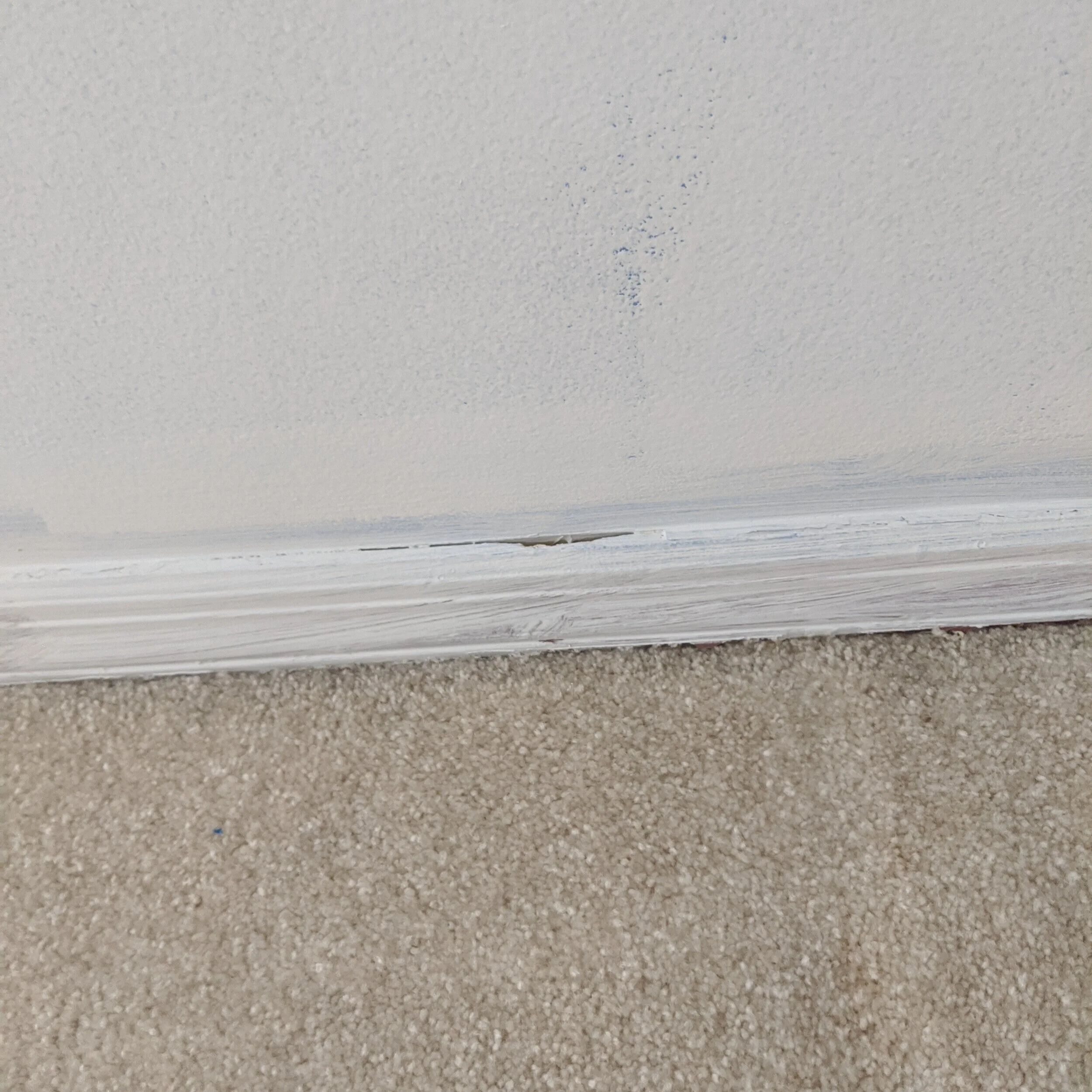
I’m coming for you, gap.
Caulking is simple. Just cut the tip at an angle, run a bead along where the wall and trim meet and smooth it with your finger. I like to keep an old rag handy to wipe off my hands, and it’s helpful if you wet the tip of your finger before you smooth it out.
Trim
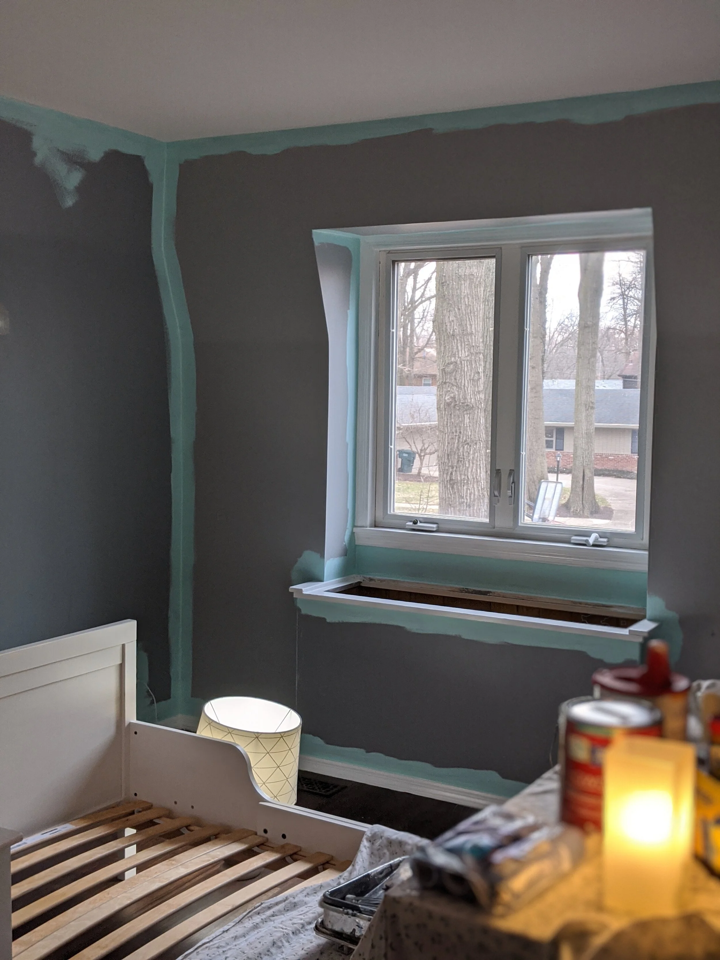
As with primer, if you’re painting the whole room, you really don’t have to be careful to cleanly cut in your edges. If you’re painting your walls, paint the trim first and go to town.
I love to paint, but painting trim is one of my least favorite things. What makes it even worse is that the trim in our current house is small and thin and it’s really hard to not get any on the walls. At least when I use this order of operations it makes the chore of painting trim a little easier. Since I’ll be painting the walls once the trim is complete anyway, when I paint the trim I don’t worry about using tape to keep any paint from getting on the walls.
Here’s a picture of our daughter’s room in progress. The wall color wasn’t changing drastically so I didn’t worry about primer. Because I knew I was going to paint the walls later, I painted the trim first and didn’t worry about “staying in the lines” while doing it!

You do, however, want to make sure you’re not going so crazy that you paint your floor. You can put some painter’s tape on the floor to protect your surface, or even use a large putty knife to block your brush from touching the floor as you paint your trim.
Ceiling
Unless you have crown molding (that would have already been painted in the last step), or you’re only painting the ceiling (and not touching the walls), you don’t need to worry about carefully cutting in your edges in this step either!
Walls
FINALLY, the moment you’ve been waiting for that will make all the difference in your room and straight up blow your socks off: you can now paint your walls! At this point, you’ll definitely want to be careful when cutting in because you just spent all that time painting your ceiling and trim.
I like to start by cutting in my edges, but some people prefer to roll their paint first and that’s totally okay! I prefer to use a short 2” angled brush. Definitely feel free to use painter’s tape if you don’t have a steady hand.
Then use a roller to roll the rest of the paint on your walls.
I don’t care what the paint companies say: I will never believe that “one-coat coverage” is a thing. Yes, the paint may cover well with one coat, but I guarantee there will be areas where you may have left the paint a little thin or didn’t quite get into the texture of the wall enough. Do your walls a solid and just paint two darn coats.
Sit back and enjoy
Now that you just put a ton of work into your room, ENJOY IT! You earned it!
For more painting-related posts, check out the articles below:
Tips and Tricks for Painting a Room Quickly

The Flip is Complete!
I’m so excited I’m not even gonna try to think of a formal introduction for this post… THE FLIP IS DONE!!! We put it up for sale 4 days ago and as of yesterday, it’s officially under contract!!! Picture me (and Lucius) with all the jazz hands!
Okay, now that that’s out of my system, I’ll take a step back and think of a more formal introduction… Oh yeah, here we go….
We finished the flip! (and have the pictures to show for it)
I’m so excited I’m not even gonna try to think of a formal introduction for this post… THE FLIP IS DONE!!! We put it up for sale 4 days ago and as of yesterday, it’s officially under contract!!! Picture me (and Lucius) with all the jazz hands!
Okay, now that that’s out of my system, I’ll take a step back and think of a more formal introduction… Oh yeah, here we go….
In early March, Lucius and I took the leap we’d been talking about for years and bought a house to flip! We had invested in flips previously and weren’t completely flying solo on this flip either, but this is the first flip that we took on as the primary party. From project management to design, it was all us, with a little financial backing from just one other investor.
It was definitely scary, but we’re so happy with how everything came together! I’m insanely excited to share the finished product with you all, so without further ado, welcome to our finished flip:
As an Amazon Associate I earn from qualifying purchases. This post may contain affiliate links, meaning I receive commissions for purchases made through those links, at no cost to you.
The Exterior
When we bought this house it was… sad. That’s the best word I can think of to describe it. It came across as an afterthought - a house that you would drive right by and never even notice was there.
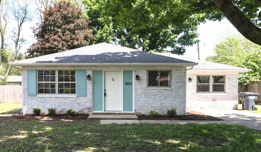
Well, look at her now! I think I’ll call her Claire.
Now you drive by this gorgeous girl and do a double-take because she looks THAT good.
Here’s a little comparison to remind you what we started with.


The changes to the exterior are pretty obvious, and that was the point! I’m so happy we put all the manpower we did into amping up the curb appeal because I think it makes a huge (and much needed) improvement!

Here’s a rundown of what changed: I limewashed the brick, painted the shutters and wood on either side of the door (and wrote a post about how I chose the perfect paint color scheme), replaced the light fixtures, address numbers, and the front and side doors, threw a door knocker on the front door, and added some landscaping.
Oh, we also took out that tree in the “before” picture that had half of it being held together with a tow rope! The neighbors were very appreciative.
That seems like a ton of stuff, but it pales in comparison to what we changed inside.
The Living Room/Dining Room

Now I know an empty house isn’t crazy exciting to look at, but this isn’t HGTV, and staging an empty house isn’t always practical (though I would have loved to do it anyway!). But take a look at how far this space has come!
To start, we completely removed the wall you see in the picture below. This isn’t a big house so keeping the main living areas all chopped up just wasn’t a good use of the space. Plus, when you walked in the front door before, you ran right into a closet. This is what it looked like when we bought it.


What we changed: One of the major things we did throughout the house was replace the flooring. The previous renter put laminate on top of carpet padding… then there was a leak in the kitchen. When we bought the house the floors squished as you walked on them. So out they came!
We also replaced all the trim and doors, painted, and updated the light fixtures. Here’s the light fixture in the living room - and I love this light fixture so much it’s not the first time I’ve used it. I actually put it in the kitchen of our 1927 American Foursquare!
The paint color in the main living area is Smoke Infusion by Valspar. I ended up using colors from the same swatch throughout the house (except for the bedrooms) and I think I’m in love with it. It’s sort of a blue/green/gray color. It’s definitely more blue than green overall, but in certain lighting, it does take on more of a green hue.

The Kitchen
Aside from the exterior, the kitchen definitely underwent the most dramatic changes. I can’t stop looking at this before and after comparison.


I mean… is this even the same house!?
And that’s not even the best representation of the kitchen.

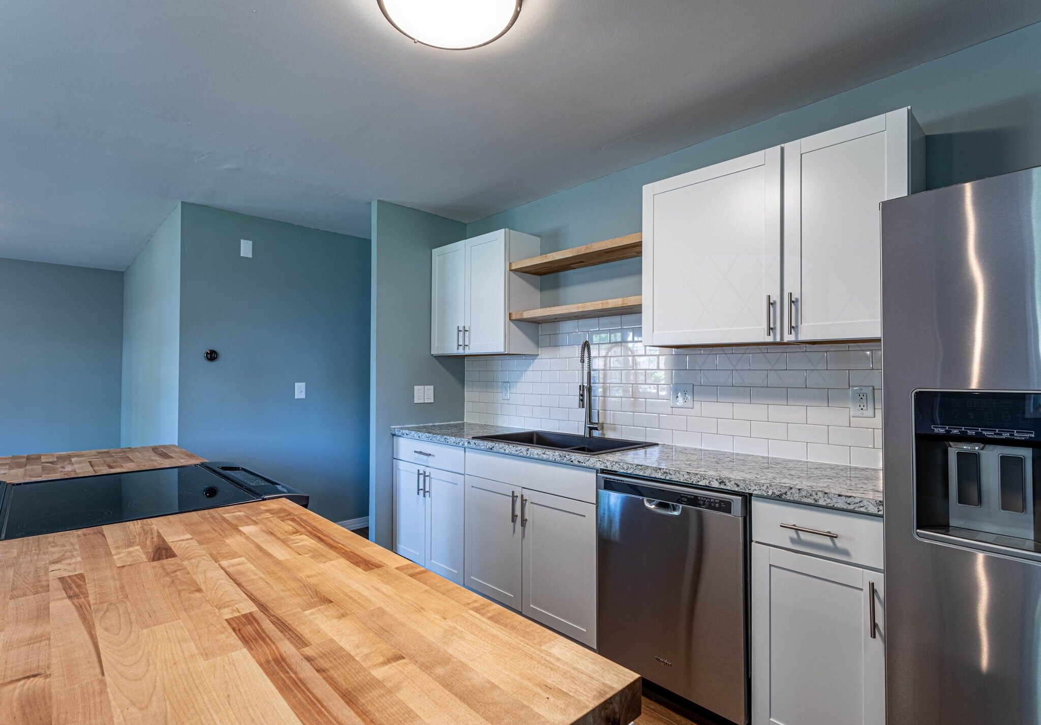

I wish I personally could take more credit for this amazing space, but honestly, Lucius came up with most of the ideas for it (who knew he had so much design acumen!?). I’m definitely the more risk-averse one between us (he comes up with the crazy ideas and I reel him back in. It’s a good balance). So when Lucius suggested removing a wall and changing the entire layout of the kitchen my alarm bells started ringing. But I have to admit that he was right and now this kitchen is so much more functional than it was when we bought the house.
The new layout adds way more counter space than was previously there and even increased the number of cabinets! Not only that, but it flows so nicely with the rest of the main living area and creates a much more conversational space.
The Bathroom
This house is tiny (around 1,100 square feet) and only has one small bathroom (which is tricky to photograph!), but it needed to be completely gutted. We carried the same laminate we used in the rest of the house into the bathroom as well.


The Bedrooms
This house has 3 bedrooms that are all pretty similar in size and style so I’ll just share one of the pictures. We put new carpeting in all the bedrooms and painted them a nice cool gray color - Tempered Gray by Valspar.
Side note: I feel like I should mention that I’m not sponsored by Valspar or Lowe’s since I mention them a lot. I would LOVE to try Benjamin Moore or BEHR paint but we only have Lowe’s and they only carry Valspar and Sherwin Williams. Therefore, those are the brands you’ll see me reference in a lot of my posts.

We also have new closet doors on the way but I couldn’t wait to share this post so they aren’t installed yet in this picture.
The Bonus Room
This house had a garage once upon a time, but at one point it was turned into a bonus room. It started out (like the rest of the house) in pretty rough shape.


But MAN does she clean up nice!


I love how the flooring brings some warmth to this house and I think it pairs really nicely with the calming paint tones. In this room, I used Paris in Winter everywhere except for the accent wall, which has Seafoam Storm, both by Valspar.

I wasn’t able to find a digital swatch of SeafoAm storm :(
We also replaced the french doors with a new sliding glass door. Normally I love french doors, but the ones in this room were failing and the sliding glass door brings in so much more light!
Lastly, we turned the closet back into a closet (it seemed like it was previously used as an entertainment center). This house has very little storage so we figured a closet would be more functional.
All the other things
Now that you’ve seen all the pretty stuff, I think it’s important to note that there are definitely parts to flipping a house that need attention that don’t have that “WOW!” factor but still gotta get done.
Water Heater
The biggest “hidden” item that we replaced was the water heater. We switched the old at-the-end-of-its-life traditional water heater to a tankless water heater. We installed one in our last house and we loved it! They’re not only much more energy efficient because they’re heating the water up as it’s being used (rather than continuously heating a tank full of water), but you don’t have to worry about running out of hot water AND they’re about the same price as a traditional water heater. Win-win-win!
Light Switches
First of all, I think one of the most simple and inexpensive ways to update a space is to switch out those old off-white light switches, outlets, and covers to white. Of course, we made that change throughout the house, but Lucius took it a step further. He’s a technology nerd and is really jumping on the “smart switch” train. He’s been changing all the light switches in our house to smart switches and was really excited to put them in the flip too!
In both our house and the flip we used Lutron Caseta switches and I have to admit they’re pretty cool. I think the best part is that they work with Google and Alexa so they’re great when you have little kids who a) leave the lights on all the time or b) can’t reach the lights yet to turn them on/off. Instead of walking around the house flipping switches all the time, you can just tell Google/Alexa to do it and you don’t even have to leave your seat.
Thermostat
Lastly, Lucius the technology nerd just HAD to replace the thermostat with a NEST thermostat. We’ve actually put one of these in our last three houses because we love them so much. As with the smart switches, I love that I can change the thermostat from wherever I’m at (I think technology is making me lazy…), but it’s also great because they learn your habits and recognize when you’re typically at home or away and adjusts the temperature so you’re not unnecessarily heating or cooling your house. Yay for energy efficiency!
And there you have it, the crisp, clean, COMPLETE tour of the flip!

Our goal during this flip (and what we will continue to strive for during future flips because, come on, there will definitely be future flips) wasn’t to earn the most profit. Our primary goal was to take a sad, neglected house and show its full potential. We of course still had a budget to stick to, but we weren’t concerned with using cheap flooring and finishes just to make a profit. We made sure we chose items that looked and felt good - like laminate with some padding, nice bathroom fixtures, and sweet, homey details like a door knocker.
Obviously, we wanted the end product to be beautiful, but it was also so important for us to make sure it was safe and didn’t have any hidden issues. That seems like a no-brainer, but you’d be surprised how many people flip houses and just touch the cosmetic stuff. Overall, we wanted this house to do the neighborhood (and the neighbors) justice.
I think best of all is that we had FUN doing it! The real estate market is a little nuts right now and there isn’t much inventory, but once we get our hands on another one of these babies you better believe I’ll be writing all about it! In the meantime, I guess I have some time to work on my own house. I have a dining room that has had three different paint samples up for a few weeks now that is calling my name….


The flip is now officially complete!

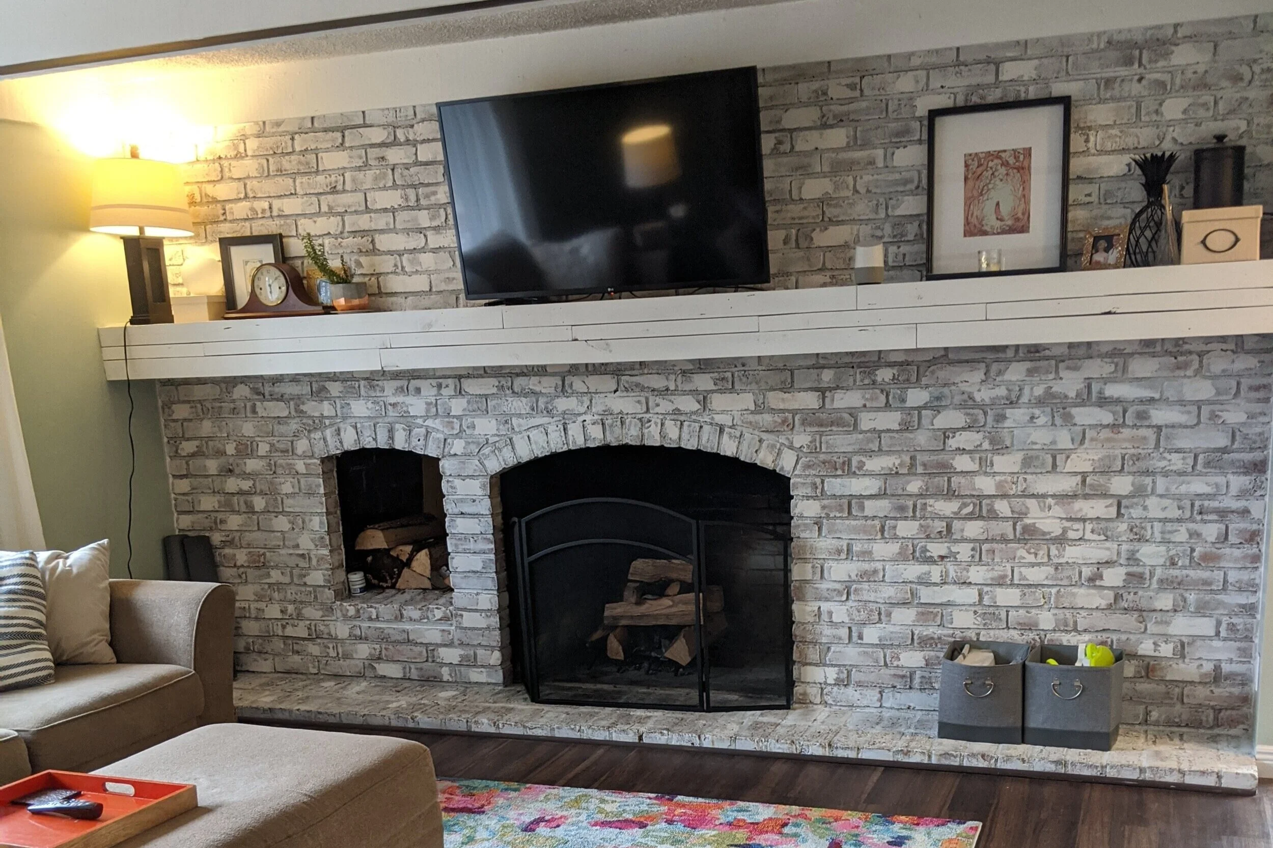
Mini mantel makeover
By now you’ve seen the lay of the land and you’ve probably noticed the massive mantel we have on the brick wall in the living room. What you may have not noticed is that since we’ve moved in, we’ve actually made some updates to it…

By now you’ve seen the lay of the land house and you’ve probably noticed the massive mantel we have on the brick wall in the living room. What you may have not noticed is that since we’ve moved in, we’ve actually made some updates to it.
When we moved in, we were greeted with this:

The picture above is from the listing so the furniture wasn’t actually there when we moved in, but it’s the only one I have with the shelves still there since we knocked them out the next day. I considered keeping them for about 5 seconds, then I thought about having to dust them and about little kids taking everything and anything off them and decided that taking them out would be better for our family, and for my sanity.
If there’s anything I’ve learned renovating our past houses, it’s that our family certainly favors function over form. There are tons of great décor ideas out there, and I can certainly appreciate the aesthetic, but if it’s going to require me to dust more stuff or constantly worry that a kid is going to destroy it, it’s not for me. These shelves just weren’t functional for us, so out they came! Not only that, but I also felt like they were pretty busy considering they were in front of a brick wall.
Once we removed the shelves, we realized there was a charming little wood storage area built into the brick that was previously boarded up. WHO IN THEIR RIGHT MIND WOULD COVER THAT UP!?
Once we got settled, we lived with the mantel as shown above for a few months, but during that time Lucius was spending most of his freetime walking around the room convinced he could feel a draft. Seriously, he would be in the middle of talking, stop, and run his hands over the mantel and exclaim, “Come here, don’t you feel a draft!?” I thought he was a little nuts.
Okay, I might have felt a little draft too, but he still looked crazy.
To stop the insanity, I went along with Lucius’ plan to take the mantel apart and try to seal whatever was letting in a draft. And what we found when we popped the front of the mantel off was…

…another mantel!
It’s hard to tell in the picture above, but the mantel underneath was a little rough and definitely uneven. It also wasn’t as deep as the old mantel, so putting things on it would have been tricky. Therefore, once we filled the gaps (yes, there were actually some gaps seeping cold air), we opted to put the mantel back together.
However, if you scroll up a couple of photos you’ll notice the narrow strips of wood on the old mantel facade. I felt like these were a little busy (like the shelves), unnecessary, and more farmhouse chic than I could handle, so I was happy to take them off for good.
Sidenote, in the picture above you’ll also notice that the previous owners didn’t carry the German smear to the brick behind their TV! I’m not quite sure how to update that area so it blends nicely yet, but it haunts me daily.
Once we put the solid piece of wood back on the face of the mantel, I had to fill nail holes, prime and paint. Then I put all my decor back.

After living with the mantel as seen above for several months it was starting to feel a little busy, like all the decor items from the ends of the mantel were creeping towards the TV. Plus, I really needed to dust up there so that was good incentive by itself to pull everything down.
I started by taking everything I could off the mantel - but there were a couple of items that had to stay. The Google Home lives up there and luckily is inconspicuous enough for me not to mind too much. The lamp unfortunately also has to stay on the mantel for now. I plan to replace it with a floor lamp when I start focusing more on this room but we have (many) other areas of the house we’re working on at the moment.
Next, I shopped around my own house and gathered all my decor items from the mantel and the haphazardly designed bookshelves in the playroom.

I call this look: Unpack all the boxes and put stuff wherever it fits
Actually, that’s a good tip - if you ever want to refresh your decor, shopping around your own house is a great way to start. Sometimes taking something from one room and putting it in another can completely transform how the space/the item looks or feels. Also, it’s a good activity to keep yourself busy during quarantine that doesn’t involve spending any money or leaving the house! #winwin
Since I knew I had to keep the lamp on the mantel, I needed to find a way to balance it on the opposite end with something with the same visual height and weight. Here was my first attempt:

I felt like I was on the right track, but it still seemed a little more cluttered than what I was hoping for. I did, however, really like the introduction of the plants on either end of the mantel so I knew I wanted to work those into the end product. One note - if you don’t have identical items to put on either end of your mantel, don’t stress! It’s certainly not a requirement for each end to be symmetrical and would actually be kind of boring.

I realize the change from the previous set up is pretty subtle, and that’s because I didn’t change a whole lot. Really this is just an experiment in seeing what works and what feels the best to you. I was still feeling a little bit of that creep going on with this set up, so I tweaked it one more time.

And this is the set-up I ultimately landed on, except I switched the tan colored items at a day or so later. I like this one the most in how the larger picture echoes the height and the contrasting colors of the lamp. Obviously I have my little plants up there and then I threw in a rock and a box in a similar tone/shape to mirror one another. Lastly, I put a small candle on the left-hand side of the mantel to balance out the Google Home.


As for the leftover decor items…

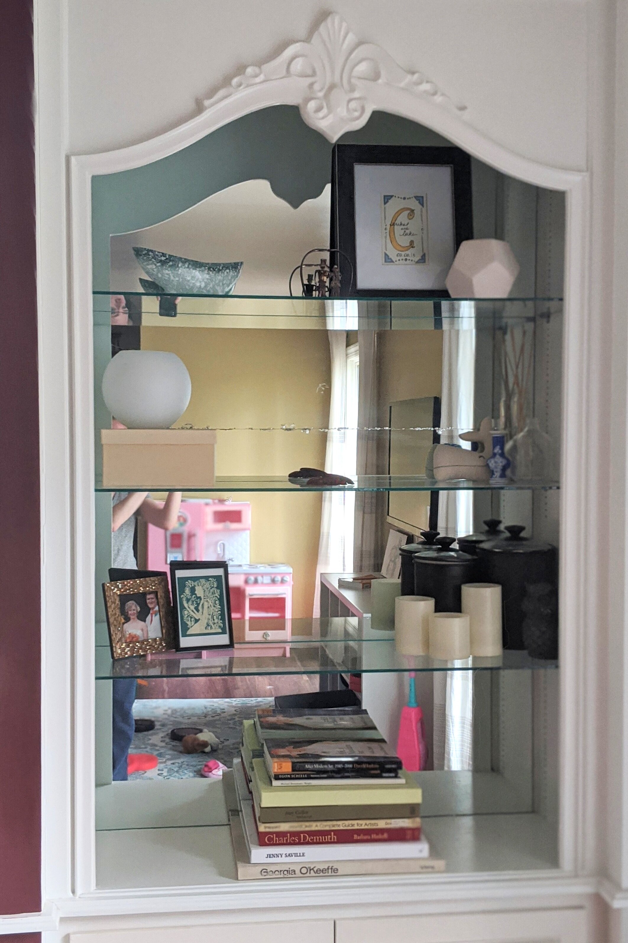
The bookshelves in the playroom got a little makeover too!
Admittedly, these bookshelves don’t look how I would ideally want them to, but I’m definitely restricted with how much I can put on each shelf since they’re glass. Plus, there’s still those stupid mirrors on the back that make them look busier than they are. Once we update the built-ins and remove the glass I’ll be able to add some books and really style these the way I’d like. But at least for now they’re looking better than they did before.
So here we are, after a pretty quick, easy, inexpensive update we have our updated and, more importantly, SIMPLIFIED mantel so we can focus more on all that glorious, glorious brick and that amazing fireplace.
Related Mantel Decor Posts

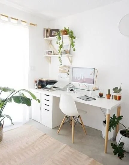
Designing a Home Office
I never really thought I’d need a home office, so until recently I hadn’t given much consideration as to how I would want it to look if I were to create one. But now that it was actually happening, my mind was buzzing with possibilities. In this post (and subsequent posts on this subject, since I’m just in the beginning stages of this room makeover) I’ll give you a sense of how I tackle a room and walk you through my overall design thought process start to finish.
How I Designed My Home Office

I mentioned in our house tour that I, like many people these days, have been working from home. During this time, the living room has been my office. (Picture me sitting on the couch in my sweatpants with a cozy blanket and my laptop.)
Well, before COVID-19 when I was only working from home a couple days a week, the couch worked just fine. But once I got the call that I’d be working from home consistently for who knows how long, Lucius suggested I get a desk and set up an office in our previously empty spare room. I was on board right away. Not only because by the end of the day working from the couch I usually feel pretty gross and lazy, but Lucius telling me to buy house stuff? Okay!
I’m the type of person who likes to do lots of research before I commit to anything. I like to know what I’m getting myself into and I like to avoid the unexpected when at all possible. So I figured since I’m starting at ground zero for this project, why not take you guys along as I plan out my home office?
In this post (and subsequent posts on this subject, since I’m just in the beginning stages of this room makeover) I’ll give you a sense of how I tackle a room and walk you through my overall design thought process start to finish.

As an Amazon Associate I earn from qualifying purchases. This post may contain affiliate links, meaning I receive commissions for purchases made through those links, at no cost to you.
Finding your inspiration
I never really thought I’d need a home office, so until recently I hadn’t given much consideration as to how I would want it to look if I were to create one. But now that it was actually happening, my mind was buzzing with possibilities.
One of the biggest pieces of advice I can give is when you’re starting to design a room, don’t overthink it. This can be hard advice to follow, especially if you’re like me and tend to overthink just about everything. But when designing a room I try to force myself to let one thing be my inspiration and build on that, otherwise you can get really overwhelmed really fast.
For this room, the biggest necessity was of course a desk and a chair, so that’s where I started, but really ANYTHING can be your inspiration - it doesn’t have to be a big piece of furniture or the color you plan to paint your room. It CAN be those things, but your inspiration could also be something as simple as a vase or a painting that you like.
Since this room was empty to begin with, using the immediate necessities as my inspiration was the most logical choice for me.

I knew my minimum requirements were to have a desk that fit my computer and all my stuff and a chair that I could comfortably curl up in. (Even when I work in the office at work I tend to sit cross-legged in my chair, so I certainly wouldn’t expect anything different at home.)
Being the cheap budget-conscious person that I am, I started looking at desks and chairs on Facebook Marketplace. I use Marketplace a lot like I use Pinterest to organize my thoughts. I saved everything that was intriguing and then looked at them as a group. This helped me figure out the style I was most attracted to for these staple items and I highly recommend using this technique to figure out your style, too.
Here’s how you do it: hop on Pinterest, search for the item you’re after, and pin anything that looks even remotely interesting to the same board. Once you’re done pinning, look at your board as a whole and you should start to notice some recurring themes/trends. You can take it a step further and either delete anything that doesn’t fit into the general theme or create a second board and pin your favorite items to that. Then go searching in real life for items similar to what you were most drawn to!
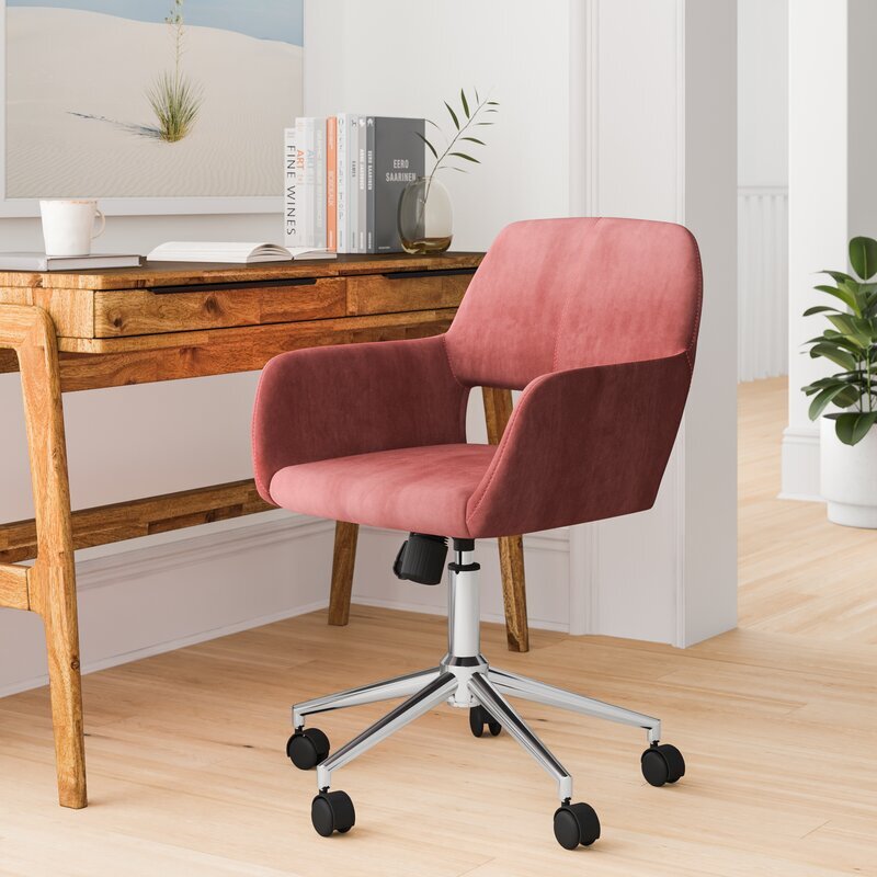
When I looked at all my saved items, I noticed I was saving a lot of light colored desks and velvet jewel-toned desk chairs so I figured that was where my head was at and I ran with it.
Because I have commitment issues, I continued to brainstorm options to make sure I was buying exactly what I wanted. We ended up taking a trip to IKEA to see what they had available too. This trip was a great way to also figure out what size desk felt best by sitting down and “testing” out several options.
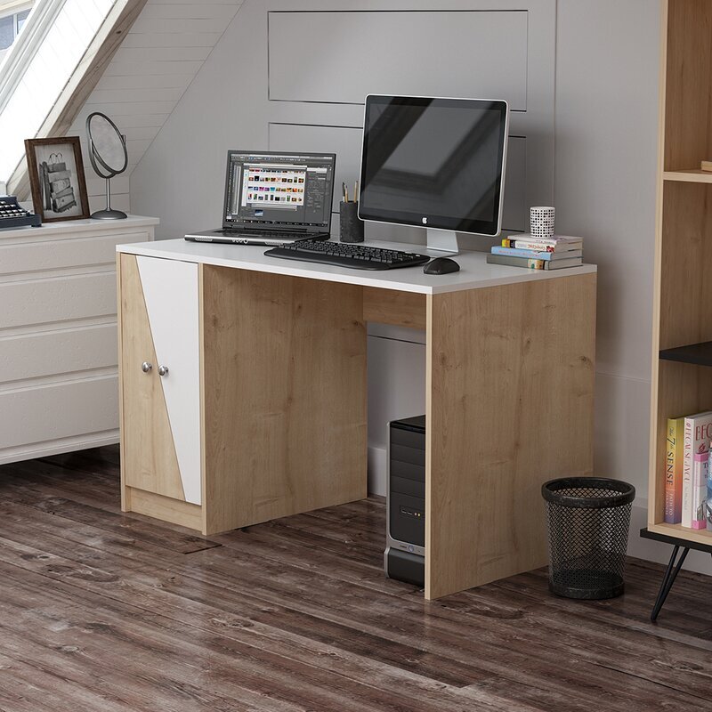
I was most drawn to the Hilver desk and I was really considering pairing it with the Ekero armchair.


We almost bought them, except we didn’t have enough room in the car with both kids. We figured Lucius would just have to take a quick trip back the next day.
This was actually a blessing in disguise because I wasn’t 100% sold on either of those items. The desk felt a little too much like a table and I was concerned with the chair being difficult to move in and out since it didn’t have wheels. There were actual desk chairs at IKEA, but I wasn’t really in love with the look of any of them.
As an Amazon Associate, I earn from qualifying purchases. This post may contain affiliate links, meaning I receive commissions for purchases made through those links, at no cost to you.

One of the most exciting things about designing this room is that the only person I have to think of is myself! Normally I’m trying to design a room with Lucius in mind too so I have to be a little more thoughtful in some of my choices. It’s not very often that I get to run uninhibited with my ideas. With that being said, I totally bought a pink velvet chair AND I LOVE HOW IT LOOKS!

Building on your inspiration
For the past month or so (I’m losing track of my days at this point so it could be longer) I’ve been working in my new office. It’s still lacking quite a bit considering all I’ve done so far is bought the necessary furniture, stole a lamp from our bedroom, threw down an area rug, and hung a mirror I had lying around.

But of course I’ve been daydreaming and planning like crazy! Now that I have my staple items, my wheels are really turning.
My next tip: once you have your main source of inspiration, use that to drive your design. You can pull colors or patterns from your inspiration piece and use them elsewhere in the room. You can look on Pinterest for rooms with similar items as your inspiration piece(s) and create a board to pin images that get you excited and pull ideas from there. You might even realize that what you thought was your original inspiration shifts to something else once you start building up some reference images.
Here are my thoughts for this room…
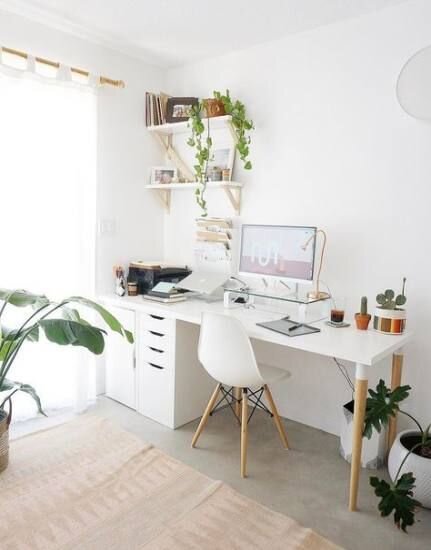
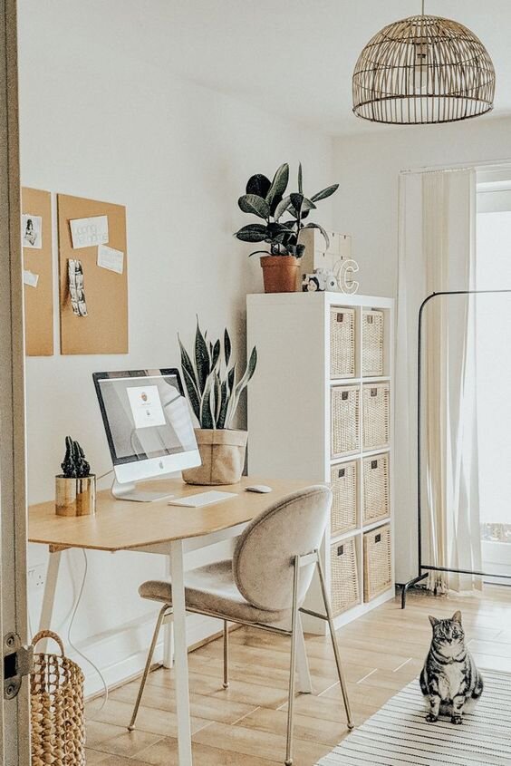
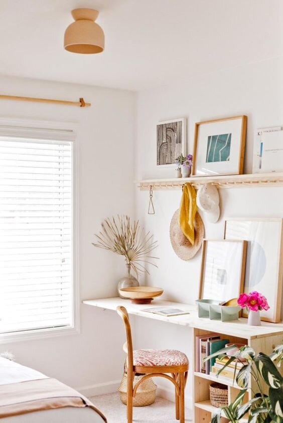
Maybe it was the trip to IKEA, but I picture this room being somewhat Scandinavian design inspired: bright and airy, small bursts of color, natural wood tones, clean lines. I already had the desk with wood tones and the chair with my burst of color, so I was on the right track. Below are examples of some inspiration photos.


But I also want a little more dimension and excitement in the room than what you see above. I considered doing wallpaper in here but I’d like to save that for the nursery once I get to updating that room. And if you haven’t noticed, I really like trying new/different wall treatments so in this room I’m going to draw a pattern with Sharpie paint pens!
I’ve been obsessed with the pattern below lately. It’s a little bit art-deco but I think I can make it work with the Scandinavian-inspired elements.

My plan as of right now is to paint the walls a light gray/off-white color and draw the pattern on the wall that my desk is facing using a gold paint pen. The design could end up being too in your face if it were black or high contrast compared to the wall color, so I think the gold paint pen with the light colored paint will help make the pattern more subtle.
Below is an awesome example of a Sharpie paint pen wall using the gold pen and a really cool design.

I have a strange addiction to mindless, tedious tasks (painting rooms, peeling wallpaper), so this undertaking doesn’t scare me in the least. In college I even created a conceptual art piece where I made a tally on a piece of wood for every dollar I owed in student loans!

This represents one student loan. I actually made one for each of my loans! Apologies for the terrible photo. And yes, it currently lives in my garage because I graduated college years ago and don’t know what to do with it but can’t seem to throw it away.
The point being, if I’m feeling really crazy I might even draw on all the walls! We’ll see how difficult it is and how much I like the design.
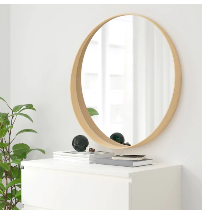
Since the desk has some strong lines in it and the wall pattern is very geometric, I’d like to switch out the current mirror with a simple round mirror. I’ve been stalking this one at IKEA for a while now.

I whisper sweet nothings to it every time I pass it in the store.
I think the circular shape of the mirror will really help soften up some of those hard lines and tie in nicely with the softness of the chair. Plus, it has more of the wood that I’d like to pull into the room.
I’ll also need a new desk lamp so I can put the one I’m currently using back in our bedroom. Here I might introduce some more natural materials like stone or at least go with a softer, rounder silhouette for the lamp. Here are a few ideas:


Rounding out the room
Now that I have my office space somewhat planned out, there’s a whole other two-thirds of the room to consider! We planned on turning this into a guest room originally and I’m confident this space can still serve that purpose. It’s just a matter of working it into the overall design.
Obviously to make this into a guest room we’ll need a bed.
The natural wall where you’d place the bed is actually where I’m setting up my desk area. I could put my desk elsewhere in the room, but I figured since this will primarily be used as my office I should make it the most inviting space possible for me - and this wall gets the most light and has the best view. With that being determined, I have to rethink the bedroom portion of the room.
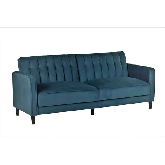
I think a normal bed might be a little awkward in the space available, but a daybed or stylish sofa bed could work! Apparently I’m pretty into jewel-toned velvet right now in general, because I’m really feeling this sofa bed:

I’ll also likely bring some end tables, maybe a footstool, and a dresser into this room. I’ve been thinking about stealing the dresser from the nursery and putting it in this room instead too.

I picked this dresser up from a thrift store years ago and refurbished it. I love it, but it can be difficult to open and I figure once our younger daughter will want to start dressing herself she’s going to have a heck of a time getting to her clothes. Plus, I think this dresser will fit nicely in the spare room both in style and function.
In a perfect world this room would have hardwood floors and I would have an awesome area rug in place of the carpet that’s in there currently. Replacing the flooring in the house is pretty far down the line, so for now I’ll just keep dreaming of what’s to come. I’m picturing a natural fiber rug, but I could be swayed for something with a design…. don’t even get me started on rugs. I’ll go down a rabbit hole I might never come out of.
Finishing touches
Of course the room wouldn’t be complete without some artwork on the walls and just some general decor items so I’ll be sure to add those once I get to that point. In the meantime, I have one last piece of advice: be comfortable changing your plans.
I find that a lot of times when I’m updating a room I’ll think I’m in love with an item I’m planning on buying or an idea I’d like to run with but once I make other updates it just doesn’t make sense in the space anymore. And that’s okay!
We’re not perfect and you can’t expect to get it right on the first try. I’m sure some of the things I’ve shared in this post won’t make it in the final room. Flexibility is key to winding up with an end product that flows. And at the end of the day, the point is to make yourself happy and to create a space that you love.
Related Office Design Posts
How I Designed My Home Office
We bought another house...
You’re probably thinking, “But didn’t you just move into your house?” Well, yes, but this new house isn’t one we’ll be living in. We bought a flip!
You’re probably thinking, “But didn’t you just move into your house?” Well, yes, but this new house isn’t one we’ll be living in. We bought a flip!

We’ve been a part of a few flips in the past, but this is the first time we’ve taken the leap to be the primary owner. Flipping houses is something we’ve dreamed about for years, so it was only a matter of time before we pulled the trigger.
The flip house is a cute (beauty is in the eye of the beholder here) little 3-bedroom one-bath starter home in a great location. It’s not much to look at right now (and definitely something you don’t want to smell), but boy do we have plans.
Let’s start with the exterior. We closed a couple of weeks ago and obviously the weather isn’t the greatest this time of year, so everything is looking pretty sad right now. First off, the whole exterior and driveway/walkway need power washed. (I love power washing, so sign me up!) And the yard needs some basic maintenance.
Now picture this house looking something along the lines of these beauties:


I love brick, but not all brick is created equal. The brick on this house isn’t anything special, and I think the house would look amazing if it were painted white. We still have to figure out if painting the brick is in the budget, but man oh man do I hope it is because I think it would look INCREDIBLE. I also plan to paint the front door a bright color and add a fun and unique knocker. Below is some of my current inspiration.


Obviously I haven’t narrowed down the color of the door yet.
Adding a little bit of landscaping out front will also help brighten it up and increase the curb appeal. I’m thinking that some boxwood bushes would be perfect. If you aren’t sure what boxwoods are, let me tell you that they’re amazing. From someone who doesn’t have the greenest thumb, these bushes are easy to maintain and look great! I’m sure you’ve seen them before but probably didn’t even realize it. Here’s an example of what they look like:

Look familiar? I thought so…
Now, on to the interior!
At this point, we’ve already completed most of the demo, but here are a few pictures of what we started with.

Living room. Free couch! woo! (Just kidding)

Dining Room on the left/Kitchen on the Right

Kitchen

Bathroom

Bedroom

Bedroom

Bonus Room

Opposite end of the bonus room
And below is what it looks like all cleared out. You can take the virtual tour if you want to walk through the place yourself. Just use your cursor to navigate by clicking on the little circles on the floor. I’ve also taken some snapshots to help explain some of the ideas swirling around in my head - there’s a lot going on up there.
To get us started, picture the whole house in shades of a blue/green/gray color with rich medium tone laminate flooring and crisp white trim.

Living Room
In the picture above, before we demoed it there used to be a wall right where I’m standing. There was a doorway between the dining and living rooms and a coat closet a few feet in front of the front door.
In the picture below, if you look at the ceiling you can see where we knocked out the wall separating the dining room and kitchen from the living room. You can also see the giant hole in the ceiling where the coat closet used to be. To save you from scrolling, I posted one of the pictures from before we took out the wall from a similar angle below.

Living Room on the left/Kitchen on the right

This house is pretty tiny, so taking out that wall felt like a good decision to really open the space up and make it feel bigger and create some good sight lines across the living areas.

Kitchen on the left/Dining Room on the right
Now that the wall is gone, you can see from the living room into the dining room and kitchen. Open concept for the win!

Kitchen
Doing the demo work and clearing out a flip to make a blank slate is pretty exciting in itself, but unless you’re staging, the transformation of a lot of the rooms is pretty limited to paint and flooring. I know, I know. On HGTV everything is so glamorous and there’s a huge reveal with tons of special details throughout the house. That’s simply not real life. Now the kitchen is where you get to put in a little of that HGTV flair and make things more exciting.
The previous kitchen left a lot to be desired. The layout wasn’t functional, there was very little counter space, and it was pretty dark. Now that the wall is gone, we’re able to reconfigure the space to provide more storage, counter space, better flow, and let in some light! Lucius put together a little mockup of the kitchen layout to get a sense of how the space will feel once it’s put back together.

Obviously the wall on the left-hand side won’t be there and there is a doorway on the right-hand side to get to the bonus room, laundry room, and side door. We’re thinking of putting some open shelving above the sink area and adding a tile backsplash. The doors on the cabinets in the island will be facing the other direction so the side of the island that you see now will actually be flat.
I’m picturing white shaker cabinets and maybe a lighter countertop with stainless steel appliances, natural wood (or maybe white) for the open shelving, and some clean and simple subway tile for the backsplash. The picture below is a good example of what I’m imagining, though maybe a little higher end than what we are willing to put in a flip. It’s all about balance, guys!

Below is the bathroom. It’s in pretty rough shape so we’re gutting it and starting over. It’s tiny, so we plan to put a medicine cabinet back in and I’m searching for a vanity with as much storage as possible. To add a little surprise I would love to tile the floor with something fun and unexpected, but we’ll see how everything pans out.

Aside from ripping up the carpet, the bedrooms look more or less the same as the pictures above, so I haven’t included pictures. The bonus room hasn’t undergone any huge renovations yet either, though we did replace the failing french doors with a sliding glass door and already it’s getting a ton more light!

So as you can see, things are moving right along (and pretty quickly!) with the flip. I’ll be sure to keep posting as we continue to renovate and beautify this cute little house!

A room makeover for a unicorn-loving 4-year-old
Our oldest daughter is all girl. She loves pink, hair bows, rainbows, dresses, nail polish, all of it! I had a blast putting together her nursery when I was pregnant (with both our daughters we didn’t know the gender… gender neutral nurseries for the win!). When we moved into our last house, I got the opportunity to design a room more specific to her interests. And now that she’s getting a little older and is able to tell us her likes and dislikes, and since we’ve moved yet again, I had so many ideas for her new room - but where to start?
Our oldest daughter is all girl. She loves pink, hair bows, rainbows, dresses, nail polish, all of it! I had a blast putting together her nursery when I was pregnant (we didn’t find out the gender of either of our daughters… gender neutral nurseries for the win!):

When we moved into our last house, I had the opportunity to design a room more specific to her interests:

And now that she’s getting a little older and is able to tell us her likes and dislikes, and since we’ve moved yet again, I had so many ideas for her new room - but where to start?
We started off with a dark blue/grey room. The picture below is from the house listing and as you can see it’s certainly not the room a little girl dreams of.

I thought of doing an accent wall with a stencil, or maybe with wallpaper. I considered painting the ceiling a bold color and leaving the walls white - like this, or painting the ceiling a softer tone - like this. I even considered decals (this one here was especially tempting). Then I got lost on Pinterest looking at ombre walls and I fell in love.
Now that I had my general design idea, I needed to figure out a color scheme. While she’s getting more opinionated, when I asked my daughter what color she wanted her room to be she promptly told me every single color she could think of. So I had to scratch that idea.
I knew I wanted to steer away from all pink since that was the color of her room at our old house, but I still wanted something bright to keep it fun. I’ve always loved coral and teal together so after mulling it over I landed on that combination. I decided to paint the whole room in teal and use the coral as a transition color for the ombre wall. (Don’t worry, I’ll write a post about painting an ombre wall soon enough.)

Once her walls were complete, I could move on to decorating and pulling the whole room together.
I knew I wanted the ombre wall to be the focal point and would therefore be the wall her bed was on. We saw the canopy over her bed at Target before Christmas and she got so excited we thought she was going to burst into kittens, so we picked it up as a Christmas gift. It’s also ombre, (hard to tell in photos, but the bottom is pink and it transitions to white) so that may have played into the overall design a bit! The nightstands were a second-hand find on Facebook Marketplace and were conveniently already painted pink and white.
Although I’m very hesitant to hang anything on the ombre wall (I don’t see patching holes going very smoothly), I think it needs something more, so I’ll likely hang some pictures on either side of her bed once I get the confidence to drill into the wall.

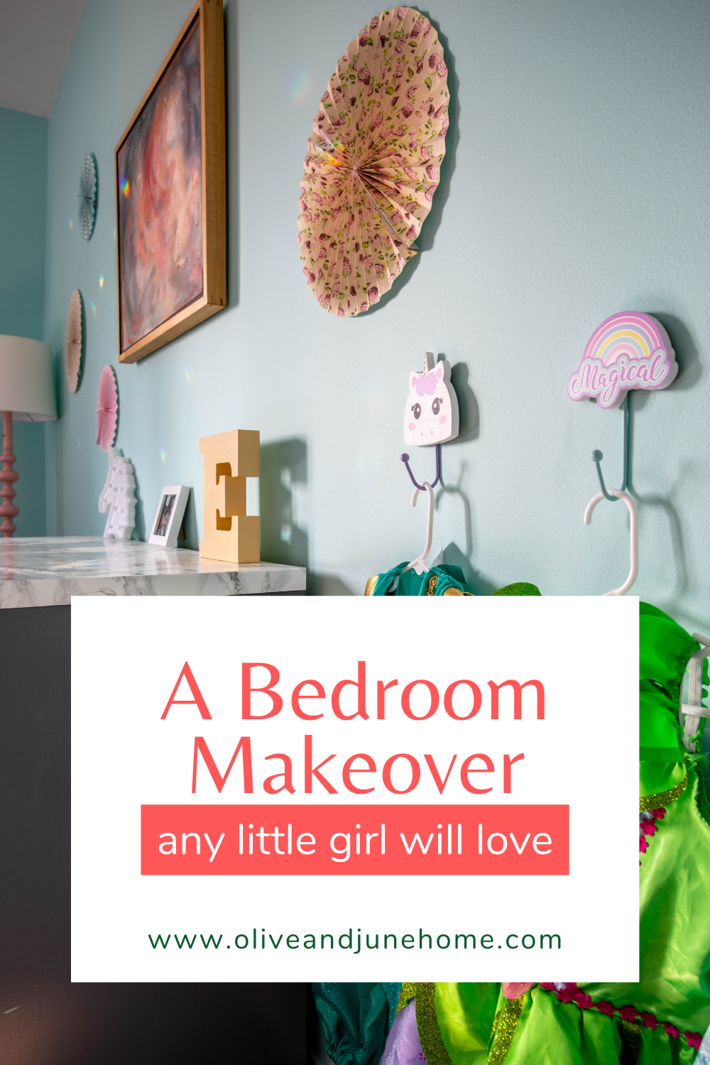
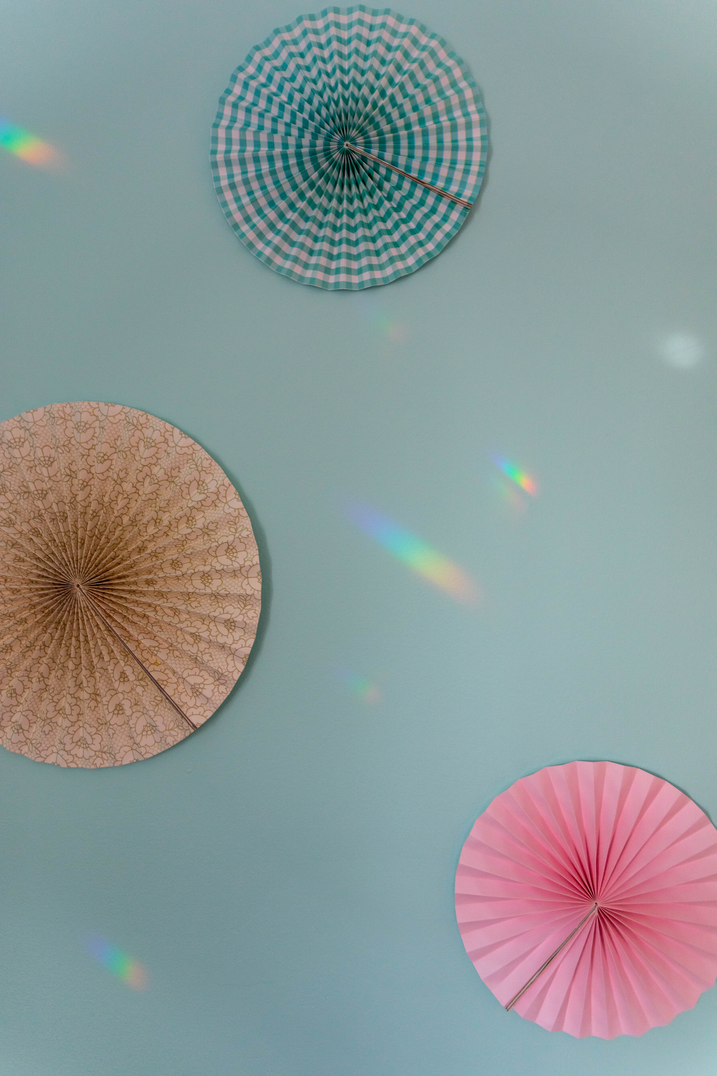
For Christmas this year we were definitely less focused on buying toys that she’d get bored with in 5 minutes and more focused on buying things she’d enjoy for longer, so I picked up this unicorn lamp, this unicorn laundry hamper, and some unicorn hooks (I can’t find the original link, but these are similar) knowing that I would incorporate them into her new room. Above her dresser is a painting that I made several years ago that I think goes well with the color scheme. Surrounding the painting are some fan decorations that I bought for a friend’s bachelorette party a few years ago. I’m glad I kept them, because now they get a second life living on my daughter’s wall! I just opened them all the way and attached one side of the fan to the other with a Command strip, then used another Command strip to stick them to the wall. They’re lightweight and so far they seem to be staying up pretty securely.
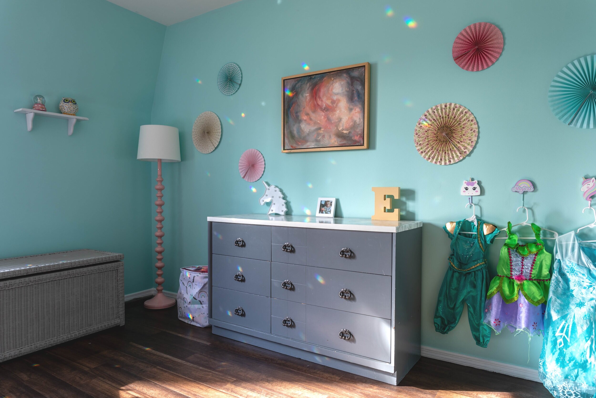

On the wall with her window is an (admittedly undersized) shelf with a couple of her more breakable items, like this unicorn globe and her owl piggy bank. I plan to either get a larger shelf or balance out the wall with pictures on either side. Also, we need to replace the blinds in her window, so I didn’t bother to hang the old ones up.

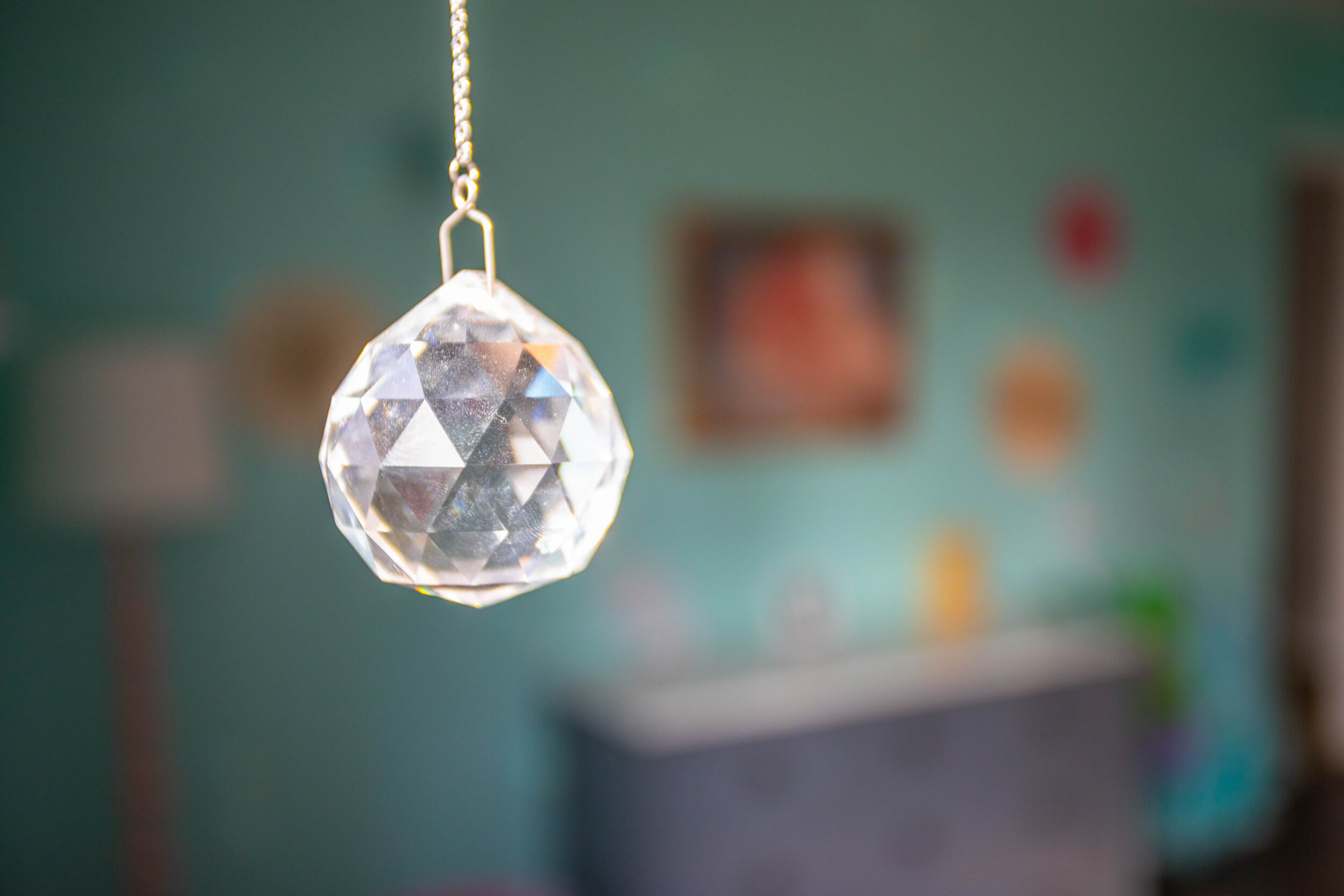
In the meantime, she can enjoy the rainbows that the prisms I hung in her windows cast all over her room whenever the sun shines in.
I was also PUMPED to find that pink lamp in the corner at a thrift store for $30!! I was eyeballing this guy at Target for quite a while, but I tend to put things in my online cart and let them sit there for months before I click the “checkout” button. What can I say? I have commitment issues.
I usually shy away from buying lamps at thrift stores - the potential fire hazard scares me and having them rewired is kind of an inconvenience. But this one was listed as new and even had the plastic on the lampshade and styrofoam bits stuck to it. It’s not the same one from Target, but you really can’t tell unless you put them side-by-side. And it was $50 cheaper!

This room is definitely still a work in progress, but I have big plans to round it out.
I mentioned previously all the pictures I need to hang and the fact that I need to replace the blinds. I also have some work to do on the closet doors. If you’ll notice below, two of them are missing. We have the doors in the spare bedroom, but after the flooring was replaced by the previous homeowners, the doors get caught on the floor in the middle of the door frame and won’t slide. We’re not quite sure how to fix that yet. I’m thinking we’ll need to cut a sliver off the bottom of each of them. Aside from that little hiccup, painting the trim bright white has made it glaringly obvious how dull the closet doors are, so those will be getting a fresh coat of paint before long.

Another thing to tackle is painting the dresser (again). I bought this dresser and the tall counterpart (currently living in the master bedroom) at a thrift store years ago and refinished them. The color I chose conveniently worked for a long time, and it’s not terrible in this room either, but I think a crisp white would be better. Plus, I’m itching to change the drawer pulls out for something fun and quirky.
Lastly, this room is screaming for an area rug, and I’m ready to deliver. Honestly, if I could spend a couple of hours a day shopping for area rugs I’d be so happy. I’ve been pining over oriental rugs for years but I’m having a hard time convincing Lucius that they can look great. I think our daughter’s room would be a great place to start incorporating them, and I have my eye on several:


So, obviously there’s still lots to do here but I’ll keep chipping away and one day it’ll be complete… just in time for us to move again for me to update her room for the next stage of her life. We’ll see!