

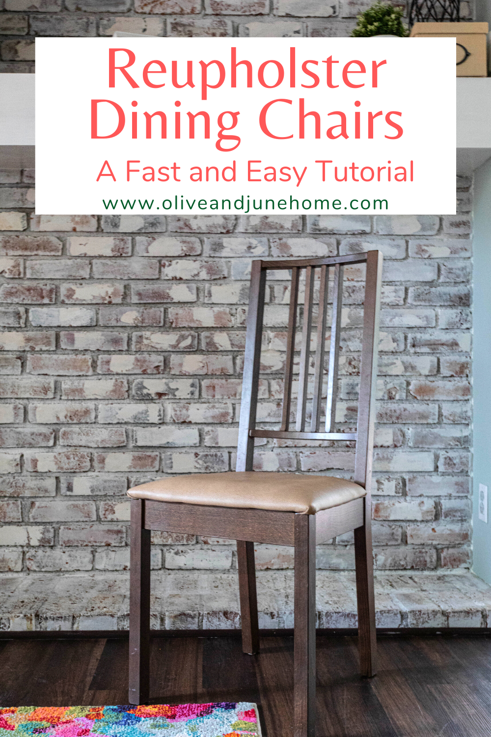
How to Reupholster Dining Chair Seats
I recently took a little break from the current projects around the house I’ve been working on to reupholster the chairs in our eat-in kitchen - and wrote a little tutorial so you can do it too! This is a quick and easy upgrade that seriously anyone can do!
Easy DIY - Recover Your Chairs
I recently took a little break from the current projects around the house I’ve been working on, like redesigning my home office (HERE and HERE), updating the dining room (HERE and HERE), and remodeling our master suite (HERE and HERE), to reupholster the chairs in our eat-in kitchen - and wrote a little tutorial so you can do it too! This is a quick and easy upgrade that seriously anyone can do!
We bought the table and chairs in our eat-in kitchen from IKEA about 8 years ago when we bought our first house… and they have served us well! Unfortunately, the white cloth covers the chairs came with have seen better days (i.e. days before we had kids). I considered sharing a picture, but they were so stained and kinda embarrassing, so I decided not to. Just imagine two little kids eating and you get the idea.
I actually soaked the covers in OxiClean not that long ago and was pleasantly surprised by how clean they got. Then I stupidly put them back on the chairs and our four-year-old immediately dropped steak on hers. The next day, our one-year-old pulled a bowl of cereal on another one. It was a lost cause. So I’ve decided to reupholster them in a kid-friendly, wipeable vinyl fabric. Here’s how I did it:
Materials

As an Amazon Associate, I earn from qualifying purchases. This post may contain affiliate links, meaning I receive commissions for purchases made through those links, at no cost to you.
- Needle nose pliers
- Upholstery foam
- Batting
- Fabric - my seats are about 16 x 17 inches and 2 yards of fabric was way more than enough
- Staple gun
- Staples (1/4 inch)
- Scissors
- Chair (obviously)
- Box cutter (optional)
Step 1 - Remove Existing Covers
Since these chairs came with removable covers for easy cleaning (#thanksIKEA), I just unscrewed the seats and took the covers off. More than likely though, you’ll need to remove the fabric of your chairs by pulling out the staples with your needle nose pliers.
Step 2 - Cut Your Foam, Batting, and/or Fabric
Next, if you’re replacing the foam, lay the seat on top of a piece of foam and trace around it. Then using your scissors or a box cutter, cut it out - taking care to NOT cut into your floor or table.
Now, you’ll need to cut your batting (if it needs to be replaced) and fabric. I don’t actually measure anything when I’m reupholstering a chair. I just take the seat, lay it face down, and make sure I can pull the batting/fabric over the edge so that I have enough available to staple.
You don’t want a TON of excess fabric. It’s unnecessary and will just get in your way. Don’t go nuts here - just cut as much as you need to staple.
Once I have an idea of how much fabric I need, I cut it out. You can use this first piece as a template for your other seats.

Tip: If you’re using a patterned fabric, make sure you’re cutting your fabric with the design lined up the direction you want it on your seats.
If you’re replacing the batting, you can do one or two layers to give your seat more cushion. I recommend cutting your first layer for all the seats, stapling those down, then cutting your second layer, and following the same steps. Once that’s complete, follow the same process with your fabric. This will ensure you’re giving yourself enough excess batting/fabric to staple to the underside of your seat.
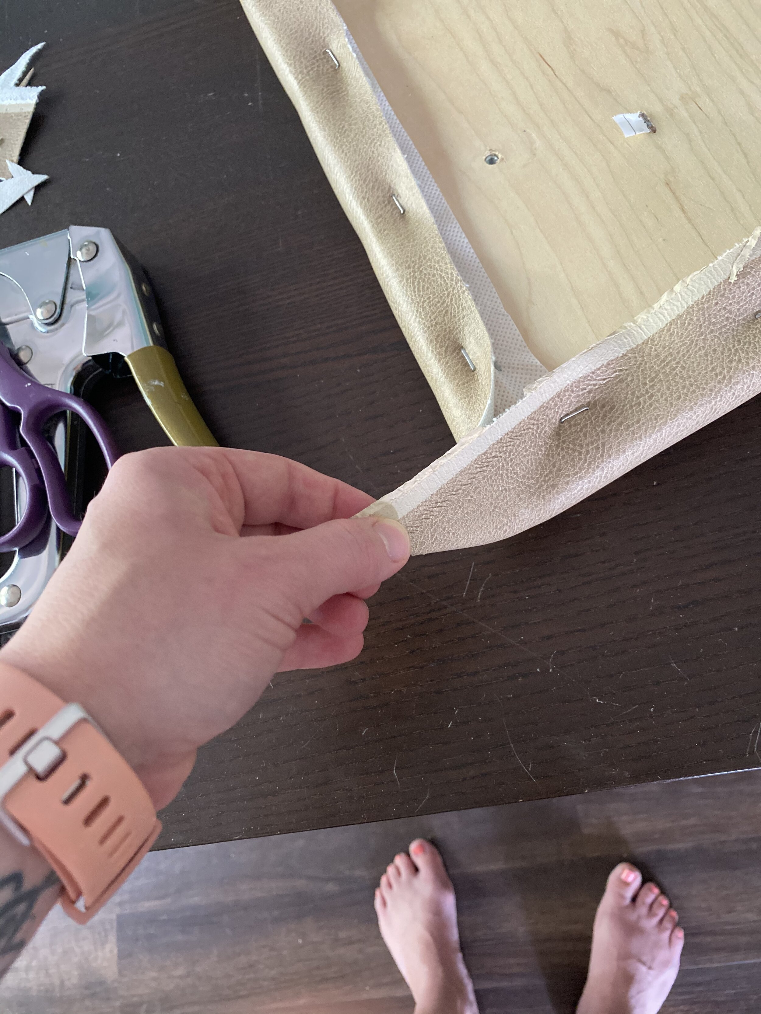
Step 3 - Staple
Now that you’ve cut your fabric, you can staple it to the seat. I’m going to share the process I use here that I was actually taught in college when I learned how to stretch canvas for my paintings. It helps ensure that your fabric is stretched equally all the way around the seat.
Tip: If you’re using a patterned fabric, you’ll need to be sure you’re pulling your fabric equally on each side as you staple so you don’t skew the design.
1. Start by placing one staple in the middle of one side of the seat (1). On the side opposite of that, put another staple (2). Then do one staple on each of the other two sides, rotating the seat as you go (3 & 4).

2. From here, to the far left of one of your staples, place another staple (1). On the opposite side of the seat, do that again (2). Then do the same on each of the other two sides (3 & 4).

3. Follow step 2 but starting on the far right of each side of your seat.

4. Follow step 2, but place a staple between the middle and far left staples on each side.
5. Follow step 3, but place a staple between the middle and far right staples on each side.

My seats were small enough that 5 staples on each side were sufficient. If your seats are larger, you’ll want to use more staples - shoot for 1 every couple of inches - using the same idea of the steps above.
You’ll likely see the fabric pucker as you add your staples - and that’s okay! It just means you’re pulling your fabric taut.

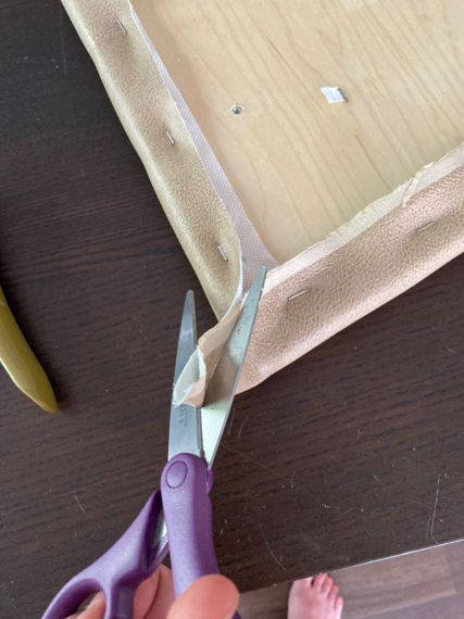
Step 4 - Corners
Once you have your edges stapled, you can work on the corners. I suggest gathering the fabric and trimming some of it off.
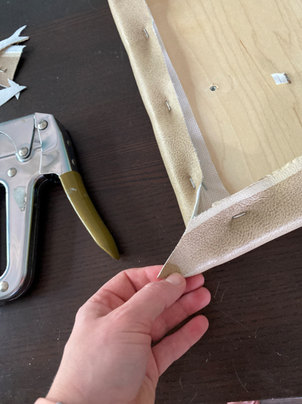
Then you can wrap your fabric around the corner and staple it down.
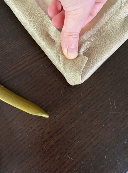
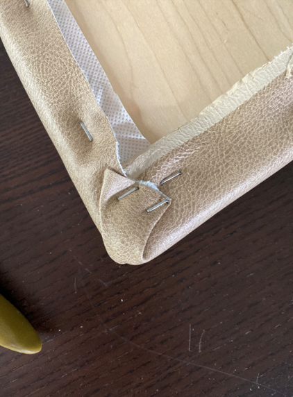
Tip: When you’re placing your fabric on the corner, keep in mind where you want the crease to hit. It doesn’t really matter if it’s on the front or the sides of your seat, but you want to be consistent.
Step 5 - Trim and Secure
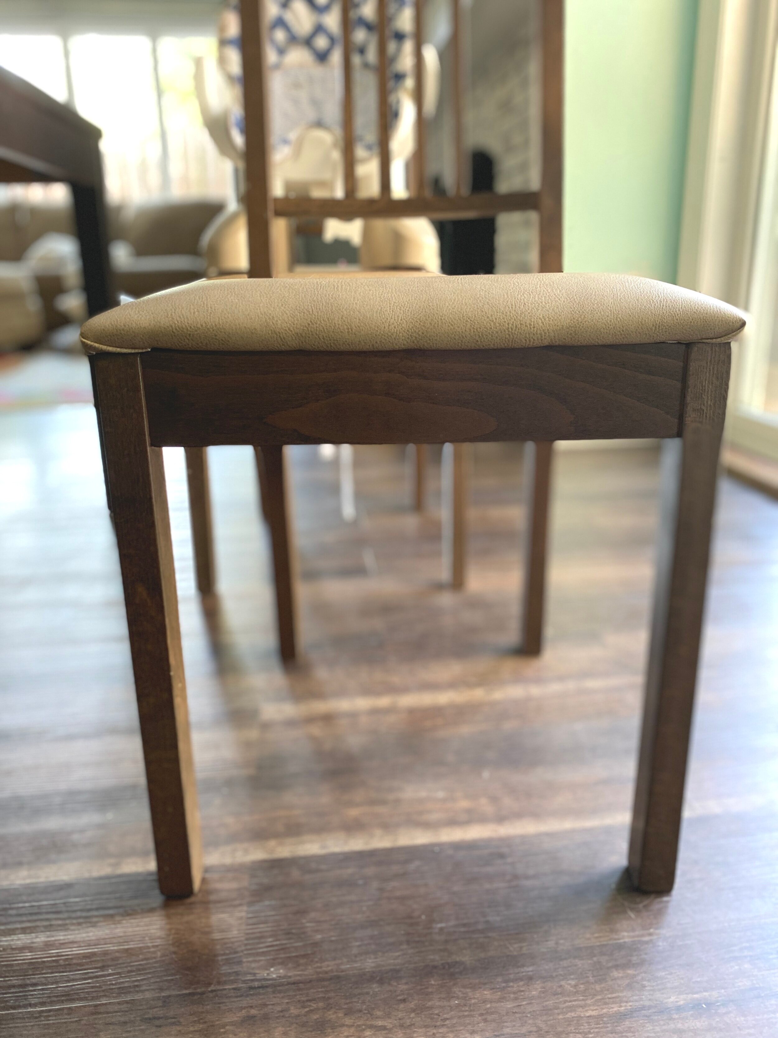
At this point, your seats should be reupholstered! But all that work is kind of pointless if you don’t actually attach them back on the chairs. If you find yourself with some excess fabric, especially if it’s covering the holes you’ll use to screw the seat back onto the chair, trim the excess off.

Then, all you have left to do is screw your seats back on and enjoy!

Just look how happy I am in my newly reupholstered chair!
I’m very happy with the wipeability of my new seat covers, although admittedly I don’t looove the color. I was hoping to find a white vinyl - something that would pop a little more - but unfortunately, this was the lightest color I could find. However, The fact that this dining set blends in with the flooring bothers me so much I’ve been considering painting the table and chairs anyway, so that project might be on the horizon!
In the meantime, I’ll continue to see the silver lining in being able to easily clean off the chairs. Hope this tutorial was helpful for you!
For more easy DIYs, check out the posts below:
Revamp Your Dining Chairs

Chandelier and Area Rug Roundup + Dining Room Mood Boards!
Now that the DIY Sharpie wall in my office is complete, and while we’re waiting for materials for the master suite to arrive so we can start rebuilding, I feel like I can finally turn my focus back to the dining room.
I’ve developed a pretty good vision of how I want it to look, but, as I’ve mentioned before, I’m very indecisive. So, I put together some mood boards of the dining room with different lighting and area rug combinations to help quell my indecisiveness. And MAN, did I get nerdy with it.
This post may contain affiliate links, meaning I receive commissions for purchases made through those links, at no cost to you.
Now that the DIY Sharpie wall in my office is complete, and while we’re waiting for materials for the master suite remodel to arrive, I feel like I can finally turn my focus back to the dining room.
I’ve developed a pretty good vision of how I want it to look, but, as I’ve mentioned before, I’m very indecisive. So, I put together some mood boards of the dining room with different lighting and area rug combinations to help quell my indecisiveness. And MAN, did I get nerdy with it.
But before I jump into the mood boards, I wanted to share with you a roundup of affordable chandeliers and rugs that I’ve considered for this room - and that you might enjoy too!
RELATED: If you want to see how this room started, visit these posts HERE and HERE.
Chandelier Roundup
All of these chandeliers are below $250 except for numbers 11 and 13, which are just a hair over $250, but they’re so beautiful so I had to include them - plus, number 11 is a steal since it’s 40% off right now!


1 / 2 / 3 / 4 / 5 / 6 / 7 / 8 / 9 / 10 / 11 / 12
I feel like I need to state that although I love all the light fixtures and rugs above, Lucius does not. He’s really not a fan of Sputnik light fixtures, so numbers 2 and 4 were an immediate no-go, and I’m still trying to win him over on Oriental rugs. That’s one of the challenges of decorating with a significant other - you have to think of their style too.
As with most projects, including this one, I tend to narrow down my favorite items using Pinterest and then show them to Lucius so he can tell me which ones he hates the least. Using that process, most of the time we can come to an agreement pretty easily! #winwin
A couple of quick notes before I share the mood boards:
The dining room set I have in these mood boards isn’t our exact set, but it is similar in style and color, so I figured it was a good placeholder.
I’m using a paint color similar to what was used in my inspiration picture, so I just used that image as the background in my mood boards.
I have specific requirements for dining room rugs - mainly that they can help hide stains because kids + food = alllll the stains. That being said, I mostly went for patterned and/or colorful rugs that would hide/camouflage some of those inevitable stains.
And lastly, I didn’t create a mood board for all the light fixtures and area rugs - that would be crazy. But I was tempted! Instead, I created them for just some of the combinations until I felt like I was getting a clearer picture of how I want the room to look.
Okay? Okay! And now for the fun part…
Dining Room Mood Boards
Option 1 - Oriental Rug/Industrial Chandelier

Pros: Although incorporating oriental rugs into our house is one of the design struggles I have with Lucius, even he agreed that he didn’t hate this one. Even though it has some geometric shapes, it’s a softer, distressed finish and I think that allows it to work with the lines in the accent wall, rather than compete against them. I also like how modern and contemporary the chandelier is and how it ties the different design elements together.
Cons: The carpet is on the dark side, which makes me nervous since the dining table and the laminate in the rest of the room are pretty dark. I’d like to lighten the space up some.
Option 2 - Oriental Rug/Farmhouse Chandelier

Pros: I think the farmhouse style can be done really beautifully, but it’s just not my jam. However, I’m really drawn to this light fixture. And of course, I love me an Oriental rug.
Cons: There’s a LOT going on with this combination. The pattern on the rug is too defined and definitely competes with the wall. Also, it’s still darker than I’d like. Additionally, I think the lines in the chandelier compete with the lines in the wall as well.
Option 3 - Abstract Rug/Geometric Chandelier

Pros: Although I’m really trying to find a way to get an Oriental rug to work in this room, this abstract rug makes me really happy. I think it’s the bright pop of gold/yellow that seems like it really brightens up the room. Plus, that light fixture is gorgeous!
Cons: I’m concerned that the rug will have too much blue in it in real life and will clash with the call color. I also have some hesitations about the light fixture being a little too geometric for the space.
Option 4 - Oriental Rug/Farmhouse Chandelier

Pros: I’ve been swooning over this rug forever, but just haven’t found a place in our home that it makes sense. I love the colors and design. And I actually think the pink/orange color in it goes nicely with the green accent wall. The chandelier I think helps pull out some of the curved lines in the rug and the color ties in nicely with the dining set.
Cons: Lucius hates both the rug and the chandelier - but sometimes I like to throw ideas out there even if I think he’ll hate them - sometimes he doesn’t! (Most the time he still does.) And honestly? This combination just doesn’t catch my eye as much as I thought it would.
Option 5 - Oriental Rug/Brass Chandelier

Pros: I’m loving the contrast that the bright rug and brass chandelier bring to this space. And I actually think the pattern of the rug and the curves of the chandelier work nicely against the straight lines in the accent wall.
Cons: I’m still trying to win Lucius over as far as incorporating brass into our house goes. I’m not quite there yet (don’t worry - I’ll wear him down), so this light fixture was definitely a no-go. Besides that, we currently have very little orange in our house decor so bringing in such a bold rug would be tricky without adding more orange throughout the house.
Option 6 - Oriental Rug/Brass Wagon Wheel Chandelier

Pros: I LOVE this light fixture. The more I look at it the more I like it. I love how the curves in the chandelier break up the straight lines in the wall and brass/oil rubbed bronze finish adds some more dimension. The rug is pretty but…
Cons: I actually don’t like the rug in this space at all. I’m not fond of the purple in the rug next to the green in the walls and I think there are way too many areas without a pattern that would definitely not hide food stains.
Option 7 - Abstract Rug/Industrial Chandelier

Pros: I had to try out another abstract rug, and I’m actually liking this one quite a bit too! It’s a lot brighter than a lot of the other rugs I’ve looked at, which would be great in our dining room since it can be pretty dark sometimes. The chandelier is also pretty great. I love the curved lines and the brass/oil rubbed bronze combination.
Cons: I worry a little that this rug has more blue than green, which could look weird against the accent wall. As for the chandelier, I’m not sure I can convince Lucius to go with it.
Final Thoughts
There are ENDLESS combinations that I could have put together, but I know eventually I have to just make a decision and run with it. We’re still working on reinstalling the trim and installing the accent wall so I have a little time, but while I continue thinking it over, I’d love to hear which option or combination you like most! Let me know if the comments! Who knows? Maybe you can sway my opinion.
Related Dining Room Renovation Posts

Master Suite Remodel - A Change in (Floor) Plans
I posted two weeks ago about our master suite remodel, including what we had demoed and the new floor plan. After that post, we were finally able to take some time and officially tape off the floor to REALLY get a feel for how the space would work. Unfortunately, we quickly realized there were some issues that we had to solve for.
Master Bedroom Renovation
Well, that was a quick change in plans…
I posted two weeks ago about our master suite remodel, including what we had demoed and the new floor plan. After that post, we were finally able to take some time and officially tape off the floor to REALLY get a feel for how the space would work. Unfortunately, we quickly realized there were some issues that we had to solve for.

Before we get into the problems we encountered and how we’re working with and around them, as a quick refresher, this is what our master looked like before demo.
This was the floor plan we originally mocked up for our renovation.

And this is our NEW new floor plan.
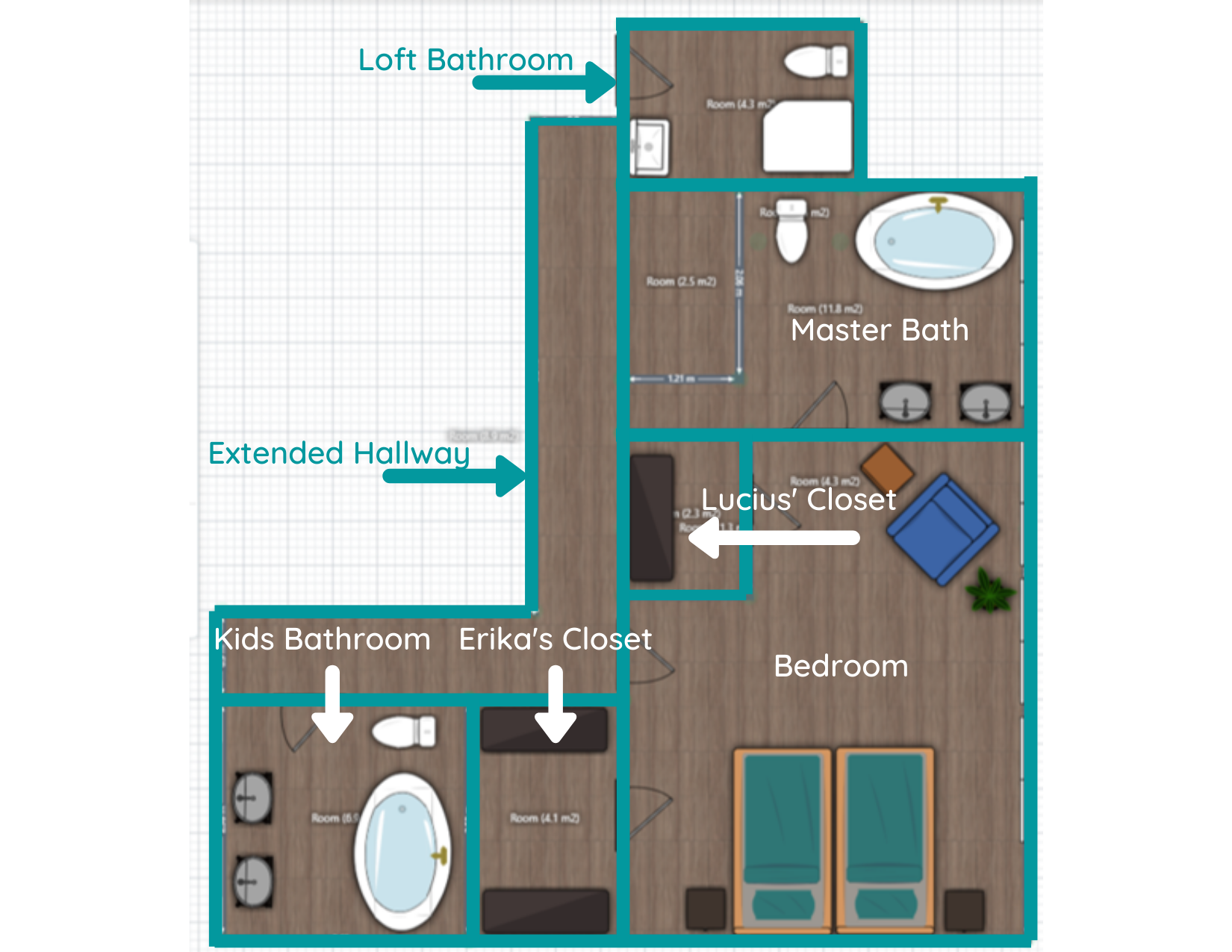
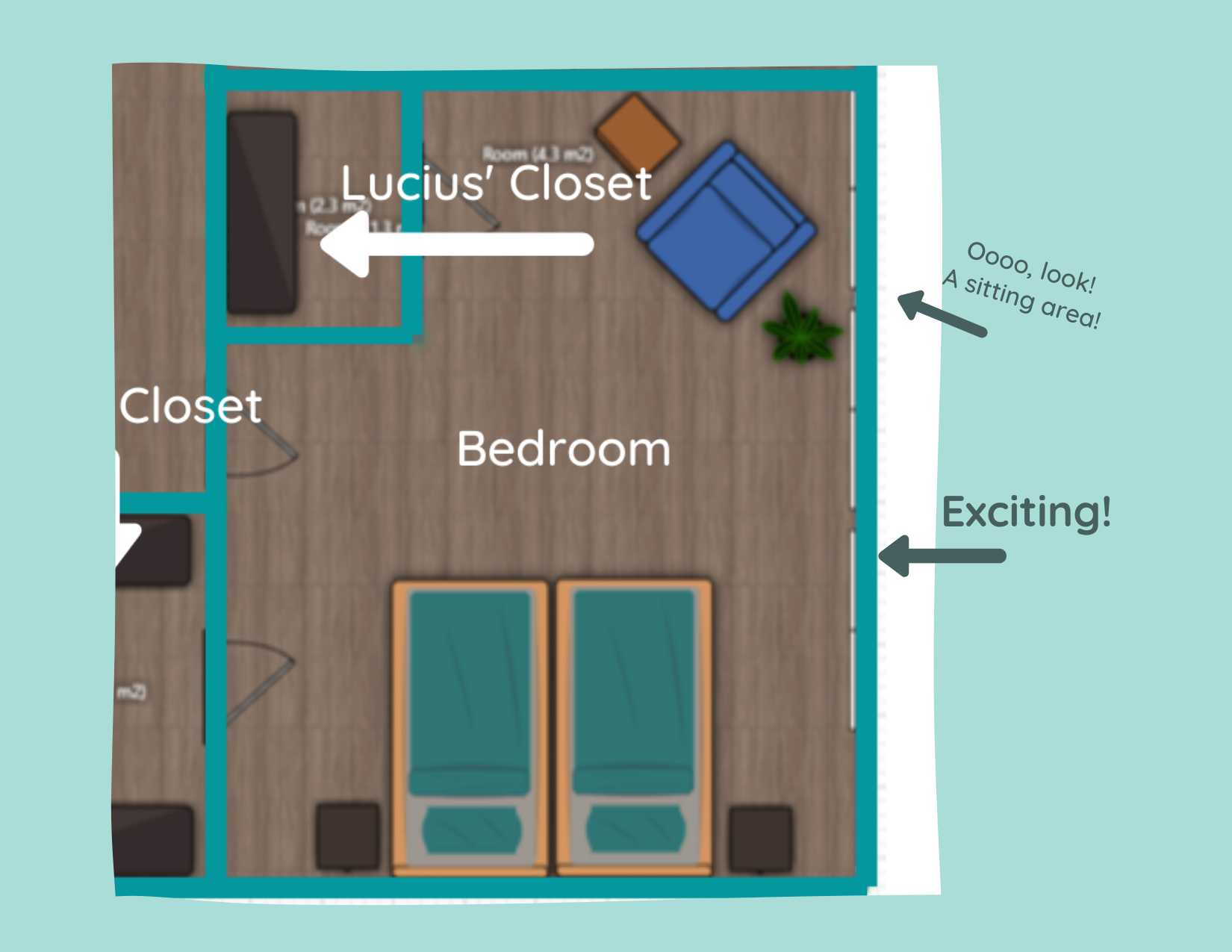
The biggest change is that the large, walk-through closet is being moved and split into two smaller closets. My closet will be where we were planning on moving the laundry room and Lucius’ closet will be separated and placed in the same vicinity that we originally planned to put our big joint master closet.
All caught up? Okay, now let’s get into the why we’re making this change!
I Suck at Measuring
Cut me some slack here - the floor planner I used had me converting meters to feet for every measurement!
Anywho, once we taped it out, I noticed that the space I envisioned as a laundry room would have been much smaller than what I was originally thinking. I could still make it work with the amount of space we would ACTUALLY have available to us, but I wouldn’t have been able to include the counter space I was hoping for, and that was definitely part of the appeal!

Not only that, but I mentioned in my previous post about this remodel that we didn’t know what we’d do with the current laundry room once we moved it upstairs. We could turn it into storage, but it would be a somewhat awkward space. Besides, Lucius didn’t seem too pumped up about the thought of moving the laundry room upstairs anyway.
While it’s a little bit of a bummer for me to have to lug the laundry up the stairs when it’s done (or, more realistically, continue to listen to Lucius complain about having to do it), we’re compromising by putting in a laundry chute!
Lucky for us, the current laundry room is right below our master suite area, so it shouldn’t be a big deal to install while we have all the walls opened up anyway. We had a laundry chute at our last house and LOVED it. Plus, the kids get a kick out of it too. Now, if only we could figure out where to install a dumbwaiter….
Window Placement
I love natural light, and this space has FIVE generously sized double windows.

Because the original layout was so weird with that sunroom/loggia built into the house, we were never able to really take advantage of the windows before. While we would have had access to more of the windows with our first layout design, we would have had to remove some of them to put up the walls for the closet.
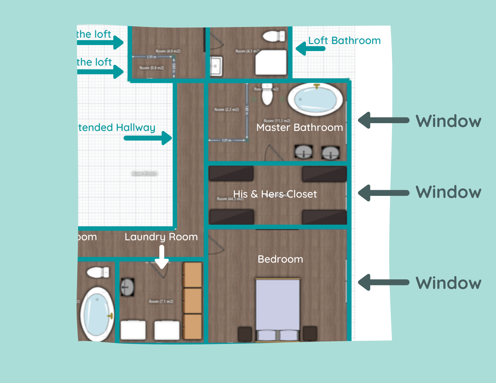
This concerned me for more than one reason: 1) I didn’t want to lose the natural light! and 2) the cost and all the unknowns about removing windows had me a little nervous.
But our new layout allows us to keep ALL the windows! Both Lucius and I are pretty happy about that. Especially me. I can just picture myself curled up on the floor with the cats in a big patch of sunlight. Mmm… livin’ the dream.

“Blah” Master Bedroom Floor Plan
With the previous floor plan, the only furniture in the bedroom would have been our bed and nightstands. While we were originally planning on having a large doorway to the walk-through closet to make it feel more integrated with the bedroom, it still seemed like it was going to be pretty boring.
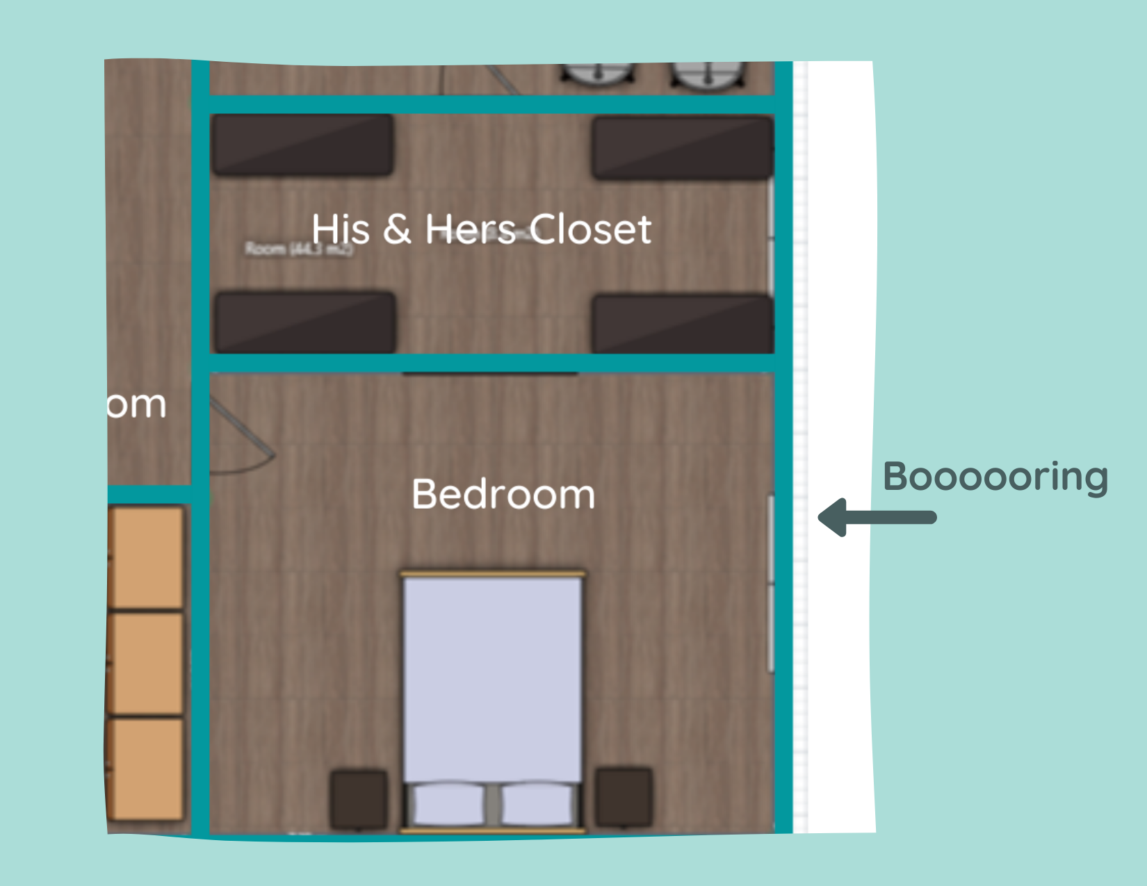
In the new floor plan, we’re able to expand the space to create a nice little sitting area right next to the windows that I’m really excited about. I think this is a good move to make the bedroom more inviting and another opportunity to really take advantage of those windows. Also, plants. Do you know how many plants I’ll be able to put in front of those windows!? SO MANY.
While our new layout has a lot of silver lining, I have to admit I’m a little sad to see my big walk-in closet go. Not to complain - my new closet will still be plenty big! However, I was dreaming about a closet like this or this. But that’s definitely something I’m learning as we do more and more renovations - you have to expect the unexpected and be flexible when curveballs come your way.
With that being said, I’m not making any promises this will be our last edit to the floor plan. We have a ways to go before anything is permanent and who knows what other game changers we’ll encounter. Now excuse me while I go find new inspo pictures for my closet…
Related Master Suite Renovation Posts:
Master Suite Floor Plans

DIY Sharpie Wall Tutorial
HOT DAMN, it’s been a minute since I shared an update about my home office redesign. Well, don’t you worry your pretty little head. That doesn’t mean I haven’t been working on it!
I’ve finally painted this room and created a killer DIY Sharpie wall that I can’t wait to share with you (including a tutorial)!
How to Make Faux Wallpaper with Sharpie
HOT DAMN, it’s been a minute since I shared an update about my home office redesign. Well, don’t you worry your pretty little head. That doesn’t mean I haven’t been working on it!
I’ve finally painted this room and created a killer DIY Sharpie wall that I can’t wait to share with you (including a tutorial)!

But first, a quick refresher:
There was a lot to do to get this room prepped. If you recall, I started with this beauty of a space.
In my kick-off post, I shared the beginning stages of my redesign and my design inspiration to ultimately round out the room. When all was said and done, I had purchased a desk and chair and shopped around my own house to find a few items to make this room at least a little more tolerable, especially since it’s become my office since COVID started.

Baby PhotoBomb and all
As an Amazon Associate, I earn from qualifying purchases. This post may contain affiliate links, meaning I receive commissions for purchases made through those links, at no cost to you.
Of course, that wasn’t my final design plan though! Over the last several months(!!!), as we’ve been working on the dining room renovation (HERE and HERE), the flip (HERE, HERE, and HERE), and the master suite remodel (HERE), I’ve been stealing any free time I can find to work on this room - and it’s finally coming together!
In the kick-off post for this room, I mentioned how I was loving the design below and I planned to use Sharpie Paint Pens to create an accent wall.

Well, I’ve done it! And of course, I’ll show you how I made it happen with a DIY Sharpie wall tutorial. Let’s go!
Materials
- Sharpie Paint Pens
- I ended up using 3 medium point oil-based gold metallic pens
- Make sure you’re using Sharpie Paint Pens and NOT a regular Sharpie or you’ll have a helluva time painting over it if you ever want to.
- Level
- Pencil
- Ruler
- Patience
- I’ll warn you, this project isn’t necessarily quick. But I think the end result is worth it for sure!
Step 1: Create a Template
I jumped into this project with a vision, but there were a few things I needed to do before I could get to the fun part. First things first, I needed to figure out the scale of my design. To do this, I simply drew one of the diamonds for the design in approximately the size I was imagining on a piece of paper and taped it up on the wall.

I’m glad I took this simple step, too, because the first diamond was larger than I wanted.
Once I figured out the sizing, I created a mocked-up design on some paper and taped that up as well. This helped me feel more confident to move forward.

Step 2 - Draw your Vertical Lines
Next, I worked on penciling my pattern onto the wall. I started by marking every 4 inches along the bottom of the wall by the baseboard.
I actually started in the middle of the room so I didn’t end up with a full diamond on one side of the wall and a partial diamond on the other. Now, both sides have partial diamonds and I think it flows nicely.
The mocked-up design was created out of 6x6 squares, but that doesn’t translate to 6 inches from corner to corner - it’s more like 8.5. To make it easier on myself, I didn’t fret over the diamonds being that EXACT dimension as long as they were close. I ended up making my diamonds 8x8 from corner to corner.
The image below hopefully helps show that the diamonds themselves are 8 inches, but because they all have a vertical line running through them as part of the design, I marked along the baseboard every 4 inches.

From here, I used a laser level that I hooked on to a laundry basket to lightly pencil in my vertical lines. This is the level we have. You could also use a traditional level for this step, though it’ll take you a little longer.
Pro tip: As you’re drawing your vertical lines, measure along the way every once in a while to make sure they’re still 4 inches from one another. I didn’t do this and had to fix quite a bit because of it (I think my level may have shifted a couple of times). I’ll show you what I mean a little further down.


Step 3 - Draw your Diagonal Lines
Once I drew my vertical lines, it was time to pencil in my diagonal lines. For this step, I measured up 4 inches from the bottom of every other vertical line and made a tick mark. Then, I went back and measured up 8 inches from the bottom of the remaining vertical lines and made a tick mark.

Once you’ve marked your vertical lines along the bottom accordingly, you can make a tick mark every 8 inches on each line until you hit the top of the line where it meets the ceiling.
When you’ve finished making all your tick marks, lightly (again, emphasis on the lightly part) connect your tick marks diagonally.
Step 4: Fix Your Mistakes
You will inevitably have measured a little off here and there. NOW IS YOUR CHANCE TO FIX THAT.
Remember how I said to check that your vertical lines were 4 inches apart all the way up the wall? Well, this is why I specifically called that out.

It’s super important to make sure that your vertical lines intersect with the points of your diamonds. Otherwise, when you add your remaining lines to each diamond, they’re going to look weird if the vertical line isn’t centered (or mostly centered. We’re not robots, after all).
So before you go gung-ho and bust out your paint pen, correct your lines or you’ll have to paint over a bunch of them like I did.

Bwomp Bwomp #DIYfail
Yeah, there were quite a few that didn’t line up as well as I wanted them to. It was a huge time suck that could have been avoided if I had corrected them before I traced over my pencil lines with Sharpie. Learn from my mistakes!
Once your lines are nice and centered, you can trace over them with your Sharpie Paint Pen. I recommend starting with your diagonal lines, as you can cheat the vertical lines here and there a little if needed. This design is so busy, it’s hard to tell if they don’t line up perfectly.
Step 5 - Add Lines to Each Diamond
This is where it starts to get more exciting (yet, also more time-consuming) because you can really see your design start to come together. To save my arms from falling off, I did this part in sections over several days.
Starting at the bottom tip of each diamond, make a tick mark at 2 inches and 4 inches along the bottom two sides.

Then, draw a line connecting the top point of your diamond to each of your tick marks.

It’s kind of an ugly little mock-up, but it gets the point across
Soon, you’ll see it start to come together. This is where I got a little excited and just HAD to see what a few of them looked like grouped together.

Eeeeeee, so exciting!
Step 6 - Finish the Edges
No matter how you plan out your design, you’re going to have pieces of the pattern that are incomplete where the design meets an adjacent wall. These sections are a little tricky to finish. Here’s what I did.
The bottom row: Because of how I started my design along the baseboard, there are half diamonds that needed to be finished. But since the bottom half of the diamond was missing, I had to figure out how to work around that.
To do so, I simply took a piece of paper, held it up in the middle (horizontally) of one of the completed diamonds, and marked where the lines were. I then used that to mark where those lines would be in the middle of each half diamond.

Then, I drew a line from the top of the diamond to each tick mark.

The top row: I followed similar steps on the top row. I took that same piece of paper and held it up in the middle of each diamond to identify where the line would intersect.

Then, I drew a line from the tick marks on the bottom edges of each diamond (remember how we made marks 2 inches apart in an earlier step?) to the tick marks I made in the middle of the diamond.

The sides: Along the sides of the wall where I only had a small section of a diamond to work with definitely took a little noodling to figure out. Since I didn’t have the rest of the diamond to use to make my tick marks or lines, I had to come up with another solution.
I ended up tracing one of my diamonds and cutting out a new template that I could wrap around the side of the wall. I made tick marks at the tip of the diamond and where any lines within the diamond would touch the bottom edge using the lines on the template as a guide.

Next, I used a piece of paper to wrap around the corner and connect my dots in pencil.

Then, I was able to use my ruler to trace my pencil line in Sharpie to the edge of the wall.

Step 7 - Touch-ups
There will most certainly be areas that you goofed up here and there (you can even catch some of my goof-ups in the pictures above!). Now that your design is complete, take a craft brush and touch up any lines that are a little wonky or any stray marks.
Bonus Step - Stand Back and Enjoy
Man, you just spent a lot of time creating an accent wall - relish in it because it looks AWESOME! I know I’ve spent a ridiculous amount of time admiring my handiwork. You should too!

Now, let’s be real. Would it have been easier to just use wallpaper? Probably! I found lots of similar wallpaper designs, but on many of them the design was way bigger than I wanted or the colors weren’t right. And don’t get me started on the cost! By DIYing my own design, I was able to completely customize it FOR CHEAP! Plus, I love a challenge and it feels good to know I created this wall with my own two hands.

This space has undergone such a huge transformation. It’s hard to believe it was once red and blue. Now it’s so much brighter and more inviting. I definitely don’t mind working in this office anymore and actually prefer to work in here now! Especially since I get to share my space with my sweet little plant babies all day long while I work.

I definitely don’t consider this room “complete” yet. Heck - I still have the whole other side of the room to furnish! But that’s a post for another day…

Related Home Office Design Posts:
How to Create a Sharpie Accent Wall

Master Suite Remodel - Demo and Floor Plans, Oh My!
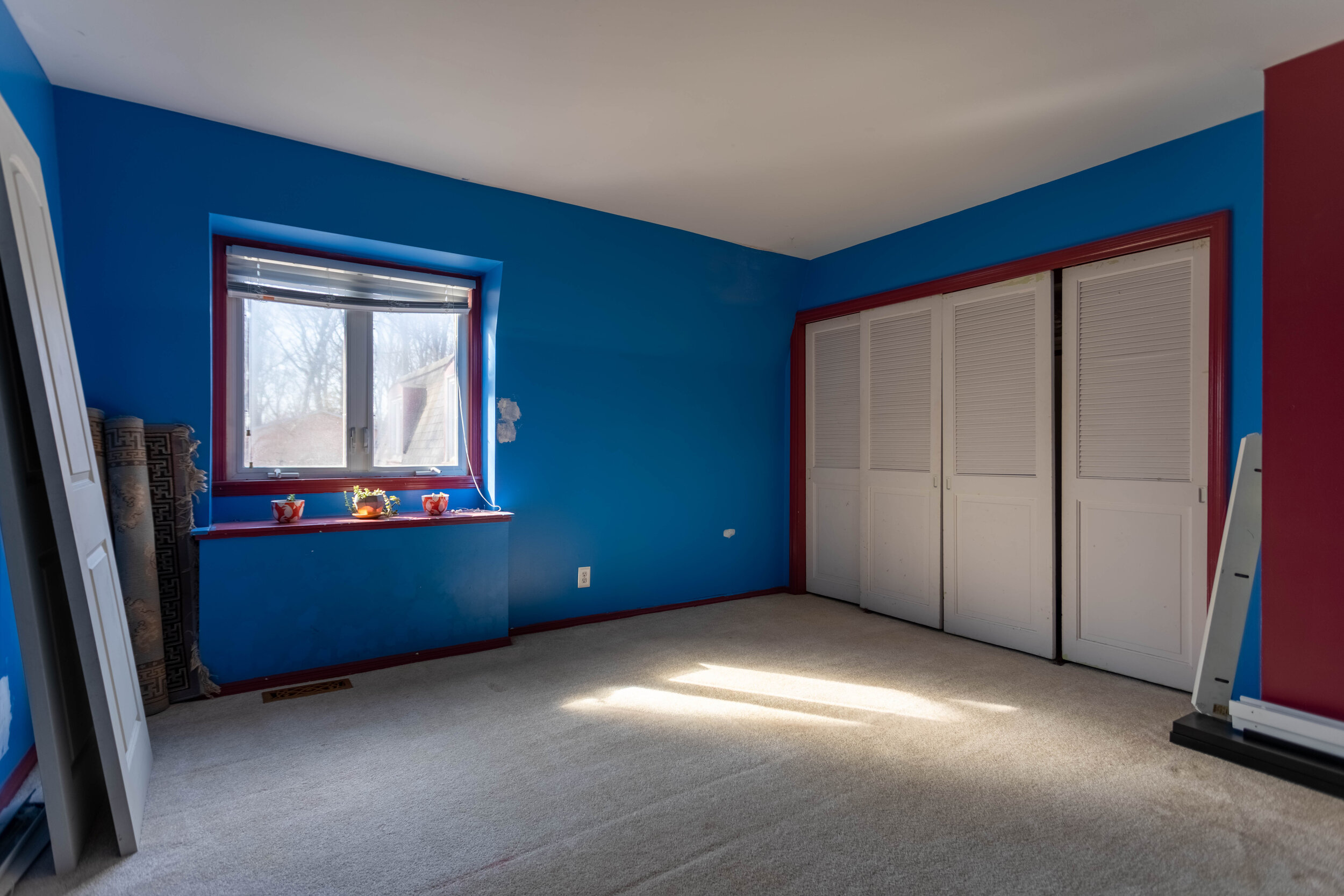
We have officially demoed our bedroom, bathroom, and closets!
Yes, it looks absolutely nuts. Yes, I’ve had more than a few “ohhhh noooo whatdidwedo!?” moments. But every time I walk into this space I get a jolt of excitement that easily puts those fears at bay. Also, LOOK AT ALL THAT NATURAL LIGHT!
Master Bedroom with Floor Plans
Several months ago, before we put our renovation shoes on, I shared a tour of the interior of our house. In that post, I talked about (and tried to show) how utterly weird the layout of our master suite was.
In fact, one of my hesitations with buying this house was that I knew we would want to reconfigure that space and it honestly intimated me. I mean, what if we couldn’t do it? What if we pulled up the floor and found termite damage? What if we got in over our heads!?
Enter Lucius, with his big dreams and dripping with confidence, who was quick to tell me exactly what I wanted to hear: that we could knock down this wall and that. That we could create a walk-in closet and the master bathroom of our dreams. Annnd as per usual I was hypnotized by the picture he painted.
Even several months ago, during the house tour, you could see pictures of where Lucius just couldn’t help himself and started tearing paneling off the wall in the sunroom (which I have learned is actually called a “loggia”). He’s been hinting at wanting to rip into the master suite more and more recently and finally, I caved. A few weeks later and our master looks like this:


We have officially demoed our bedroom, bathroom, and closets!
Yes, it looks absolutely nuts. Yes, I’ve had more than a few “ohhhh noooo whatdidwedo!?” moments. But every time I walk into this space I get a jolt of excitement that easily puts those fears at bay. Also, LOOK AT ALL THAT NATURAL LIGHT!
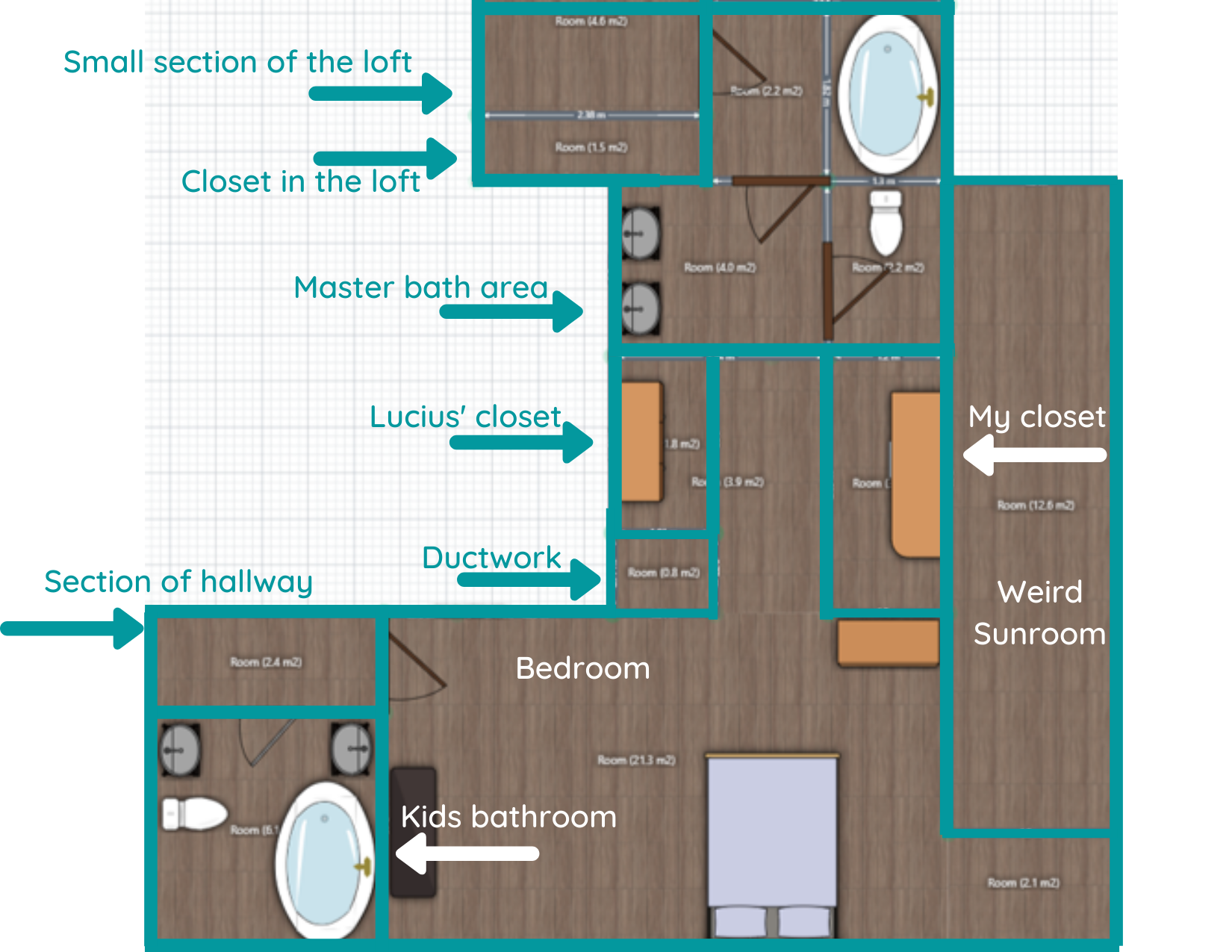
Since the pictures in the house tour are probably a little hard to follow (there’s a video in there too that explains the layout better, but still not perfectly), I’ve created a floor plan of what it looked like before demo, and how we’re thinking it’ll look when we’re done.
Before the Remodel

I’ve tried to outline each “room” to help it make more sense. Certain objects (vanities, the bed) aren’t to scale but are good placeholders to get the point across.
There are a couple of things that I want to point out before we get this “future plans” party started though.
First of all, you can now see how INSANELY DUMB this layout was. The “loggia” was the only source of natural light in the whole suite and it really wasn’t an inviting space - super long and skinny. I’d LOVE to talk to the architect and figure out whyyyyy they built the loggia at all. And then flick them in the forehead. Also, that little alcove at the end of the loggia in the corner of the room. What even is that!?
Secondly, the bathroom situation was all sorts of broken up craziness. Not only that, but we hated that the only way to get to the loft from this side of the house was to walk through our shower room. (Also, the fact that we had a shower room.)
Lastly, the floor plan doesn’t include our entire second story, but since this remodel actually impacts more than just the master suite, I’ve included snippets of the adjacent impacted areas. For instance, at the top of the layout, you’ll notice I labeled a small section of the loft. The loft is actually MUCH larger than that (it spans the entirety of our 3-car garage), but we’re only modifying a small corner of it for this project. You’ll also notice on the bottom left that I’ve labeled the hallway and kids’ bath. You’ll see why in the “after”.
Get excited! (I know I am!)
After the Remodel

Allow me to walk you through the changes because there are a lot!
Loggia Removal and Hallway Layout
One of the biggest improvements in the new layout is that we completely removed the loggia and pushed the master suite to the right. Now we’ll not only get to enjoy all the windows along this wall, but it’ll allow us to extend our current hallway so it runs past (rather than through) the master suite to the loft.
But don’t worry, the hallway won’t be a dark, closed-in tunnel. It will actually wrap around the staircase. We plan on putting up a railing, or at the very least a pony wall, all the way from where it starts on the left of the floor plan to the wall between our closet and bathroom. The orange arrows below should help you visualize.
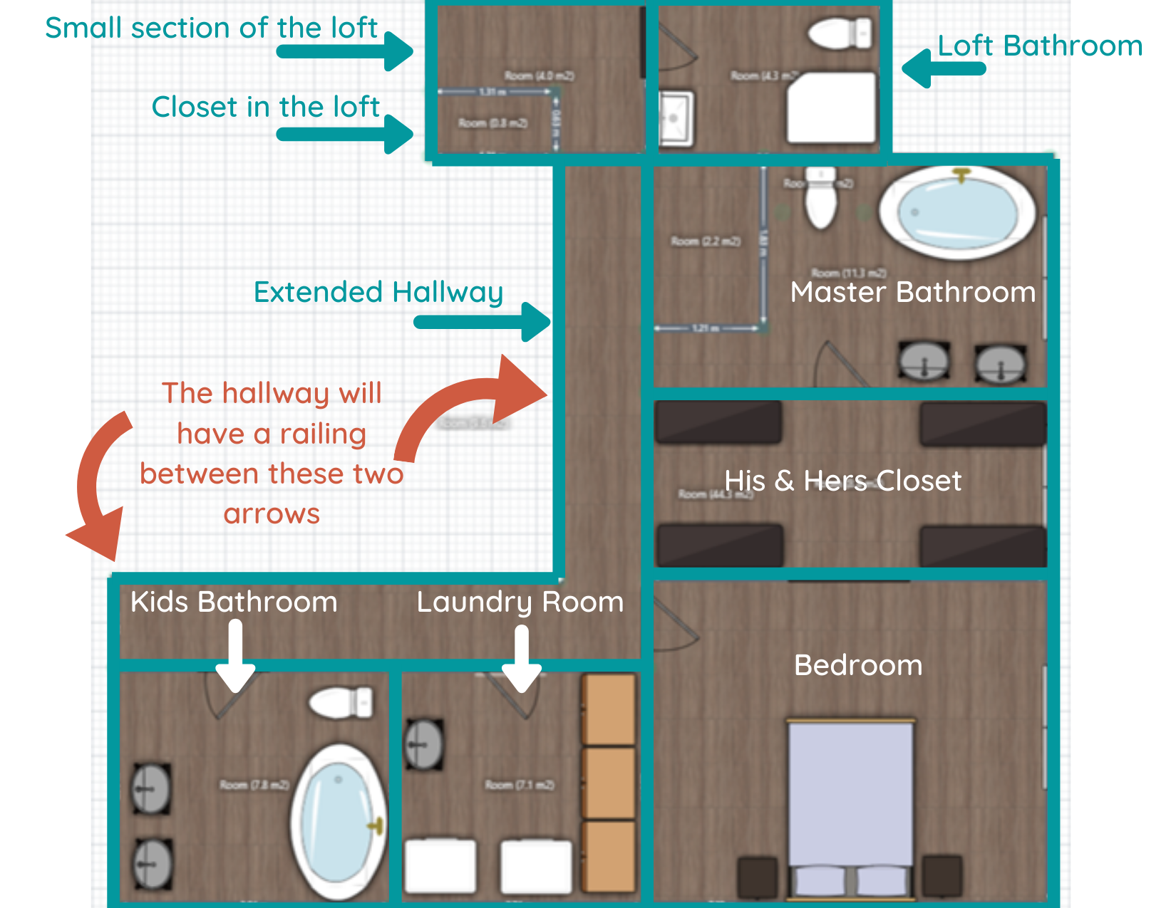
Master Bedroom and Closet
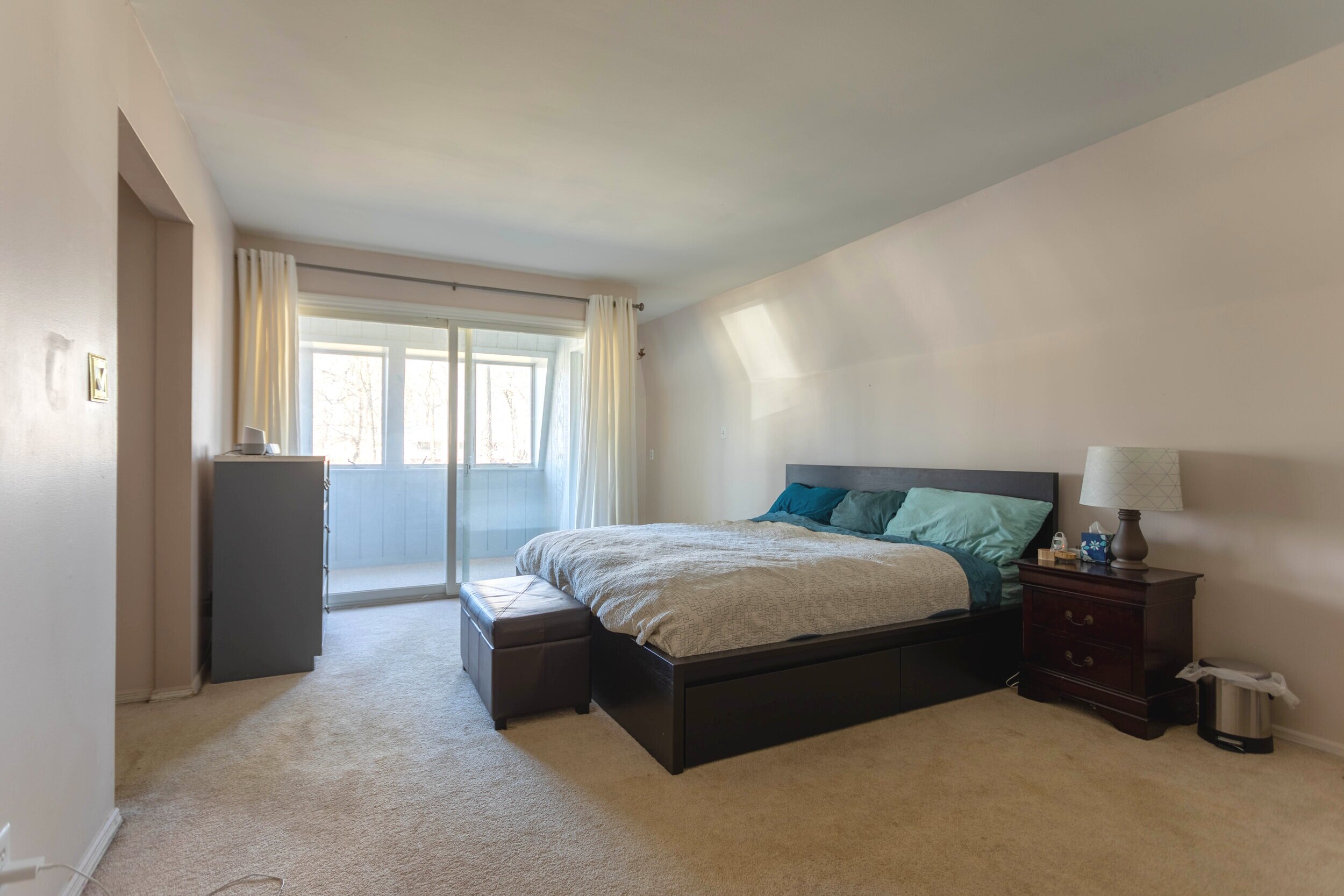
Other significant changes - you’ll notice that the master bedroom is MUCH smaller in the new layout. Considering we’re gaining a decent amount of functional closet space (we plan on installing an IKEA PAX system with TONS of storage), and the only things we really need in the bedroom are the bed and a couple of nightstands, we weren’t concerned about losing the square footage.
Even if we wanted to expand the room some, we’d be limited since the wall between the bedroom and closet is a support wall. But we’re not concerned. Even with the reduction in size, our bedroom will still be about 12x15 feet!
Kids’ Bathroom and Laundry Room
A big chunk of the space off to the left of the bedroom will instead become a new laundry room. We have a laundry room downstairs currently, but with all the bedrooms being upstairs, and the fact that we have the space to do it, why not move it? We haven’t decided what we’ll use the current laundry room for just yet. Probably a storage closet of some sort.
You may also notice that the kids’ bathroom will get a little bigger. For being such a big house, this bathroom is oddly cramped! While the kids' bathroom and the laundry room are in the plan, they’re definitely a phase II project. The priority is getting our master suite back in order.
Master Bathroom and Loft Bathroom
Lastly, a brand-spankin’ new master bathroom is on the horizon! And it’ll all be in one room! (We’re innovators like that) Because we’ll have a decent amount of space, we hope to install a nice large vanity and a soaker tub. Oh, and that rectangle in the top left-hand corner of the bathroom? That’s a 4x6 walk-in shower!
And if you’ll notice, there’s no more shower room! That’s because we’re closing off that doorway and turning what was once the shower room into a bathroom for folks who are hanging out in the loft. I honestly don’t want another full bath, but that room might be so large it’ll look weird as a half-bath, so we’re going to have to play that by ear. Because that area isn’t an immediate concern, much like the kid’s bath and laundry room, it will also be a phase II type of deal.
Final Thoughts
At this point, demo is just about done. Once everything is cleared out, we can tape off the floor and REALLY get a feel for how the spaces will work. I’m so excited for that step! It’s difficult to visualize how each space will look and feel with walls and clutter in the way. Even looking at the floor plans, the scale can be off or not quite what you’re expecting in real life. With that being said, I’m keeping an open mind and am fully prepared to have to tweak our plan.
Once we determine our final layout, then comes the hard part: putting everything back together. We plan on starting with the master bedroom first as we’ve been displaced to the loft for the foreseeable future. Since our clothes have been relocated to the spare room, we’ll likely start on the closet next. Lastly, we’ll tackle the most challenging (and expensive room): the bathroom.
I love sitting in my office every day listening to the sweet, sweet sounds of demo as Lucius rips apart that side of the house, but it’ll be even more exciting to listen to it being put back together. Soon I’ll be able to really dig into the design and I can’t wait to share it with all of you! But there’s still quite of work to be done before I can get to that point.

Related Master Suite Remodel Posts:
Master Suite Floor Plans

Feast Your Eyes on This 100-Year-Old Victorian Mansion
Each summer, our city has a festival in the historic district where homeowners open up their beautiful old houses for curious eyes like ours to stroll through. Well, one of those houses is for sale, and Lucius, being a local real-estate agent and all, is fortunate enough to be the listing agent! That means I have an “in” and absolutely HAVE to share this house with the world because it’ll BLOW YOUR MIND!
Home Tour - 1901 Victorian Mansion
If the fact that Lucius and I bought and updated a 1927 American Foursquare isn’t an indication that we love old houses, I don’t know what is. We simply swoon for them.
Each summer, our city has a festival in the historic district where homeowners open up their beautiful old houses for curious eyes like ours to stroll through. It’s certainly a treat to see all these gorgeous houses up close and personal - original woodwork and wallpaper galore! We love it.
We’ve wandered through loads of houses on that tour over the years, but some just stick in your mind more than others. Well, one of those houses is for sale, and Lucius, being a local real-estate agent and all, is fortunate enough to be the listing agent! That means I have an “in” and absolutely HAVE to share this 100-year-old Victorian mansion with the world because it’ll BLOW YOUR MIND!
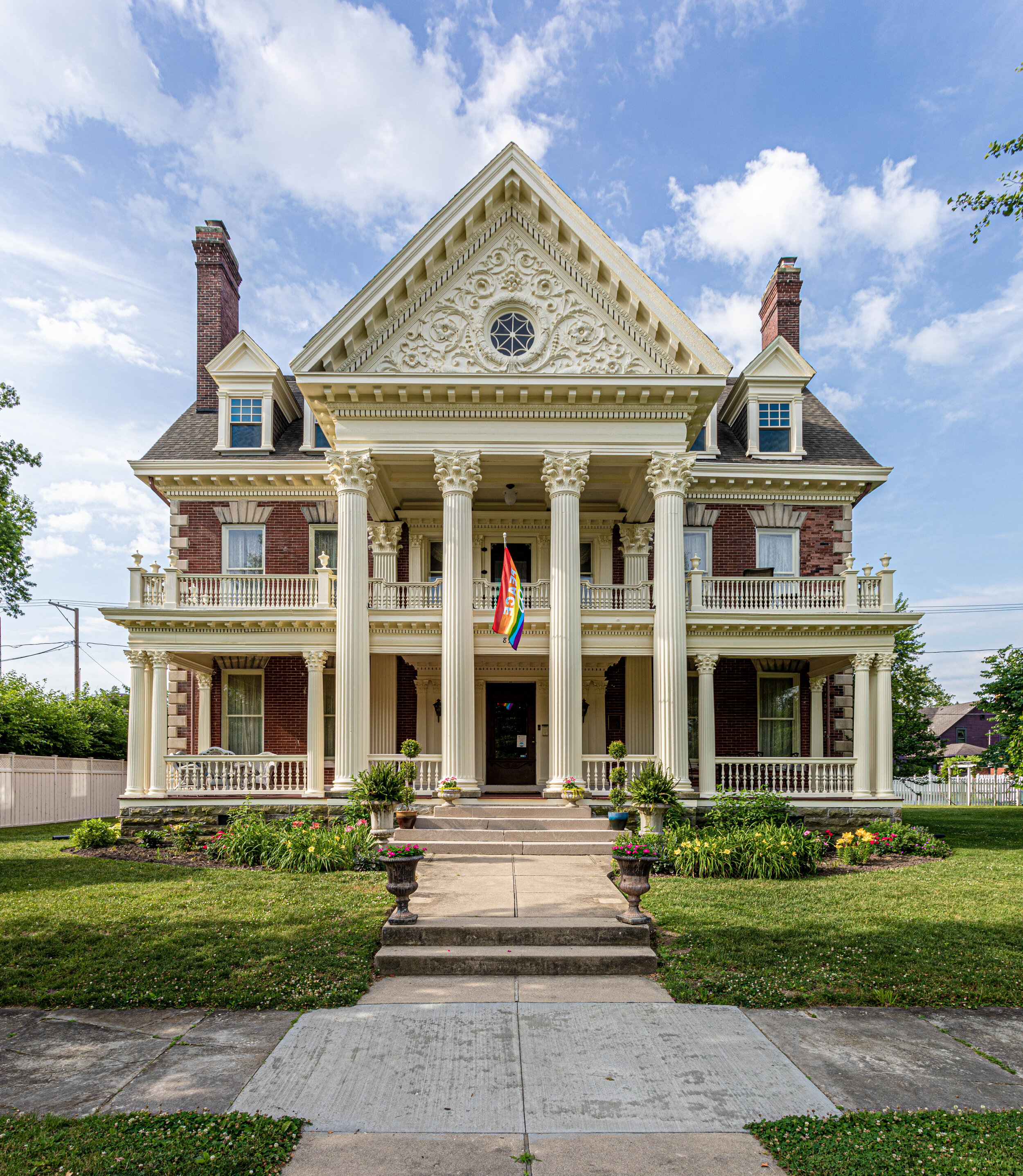
So without further ado, welcome to The Charles Over Mansion:

This incredible house was built in 1901 and is chock-full of original charm. It has 5 bedrooms, 3 bathrooms, more fireplaces than I can keep track of, 12,000 square feet, and is probably one of the most gorgeous historic homes I’ve ever seen.
I mean, just LOOK AT HER!
But before we dive in too deep, I’d like to introduce you to the homeowner, Jonathan.

Jonathan radiates creativity. He runs his own company right out of this house as a talented mask maker (many of which you can see as part of the decor around the house). He has put in countless hours of work restoring this house to its original glory after he bought it 5 years ago in a pretty neglected state. In fact, he handcrafted plaster molds for some of the exterior detail that was in disrepair!
Now, let’s head back to the tour so you can see some of the incredible details of this house and the sweet touches Jonathan has incorporated.
The Entryway and Foyer
First off, before you even walk through the front door, you’re greeted with this wildly spacious front porch. I mean, I can just TASTE the lemonade I would be sipping out here if I owned this place.

As soon as you step foot inside, you’re met with a giant foyer and an ultra-grand staircase. These features are only made grander by the 16-foot ceilings on the first floor! And that large doorway you see below? That’s one of many giant pocket doors that can be found throughout the house!

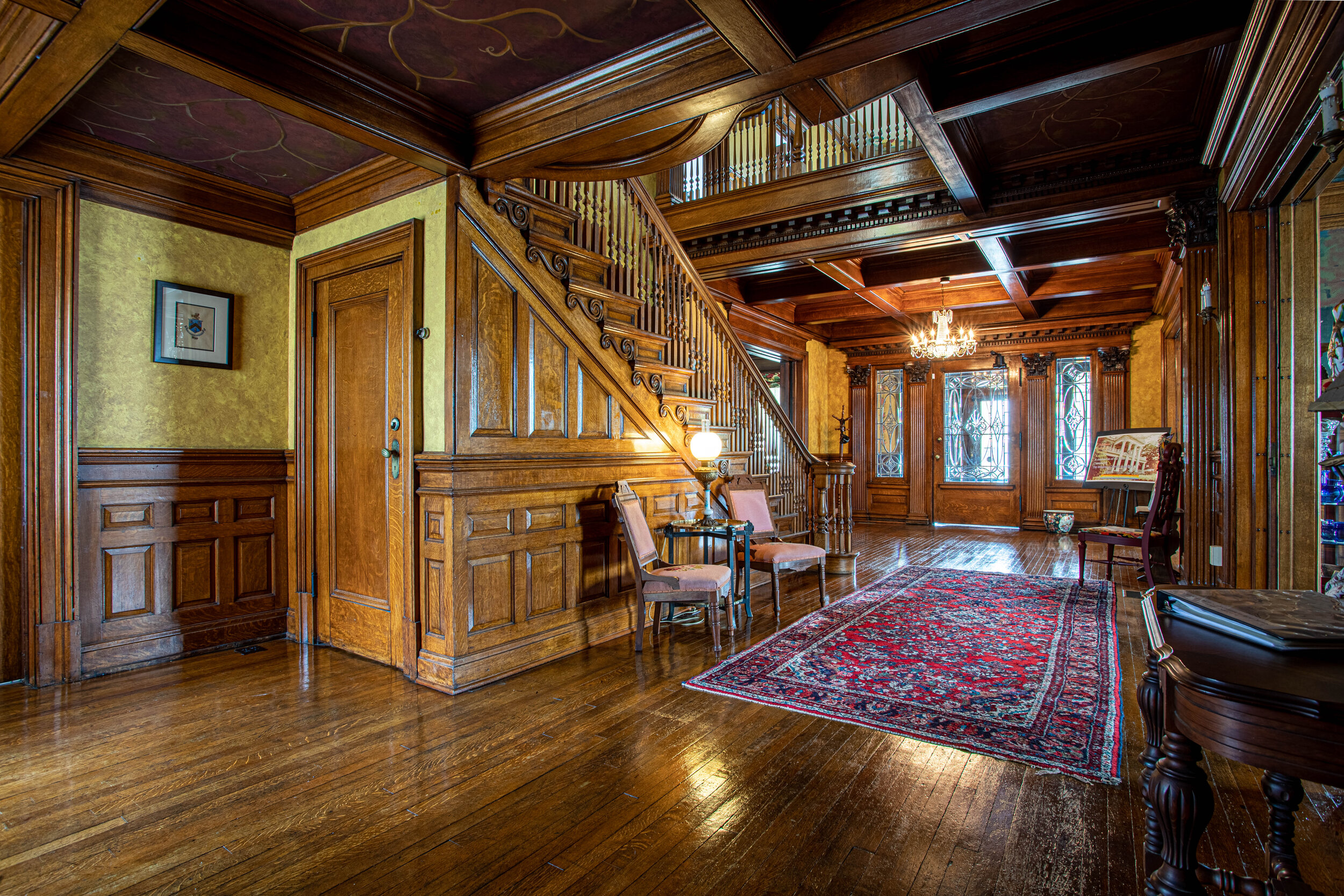

You guys, I felt like straight-up royalty walking down this MASSIVE staircase. No joke. I felt like the queen! And a little historic tidbit - this house actually was built for a prestigious family back in the day. True to this era, there’s actually a second, smaller staircase near the kitchen for “the help”. Tucked right next to the dumbwaiter, which has been turned into a cold air return. Amazingly, this house actually has modern amenities (including 4 HVAC units), which is hard to find in houses this old!
Now back to the details - check out that intricate, pristine woodwork! Not to mention the coffered ceiling in the foyer and those stained glass windows in the staircase. Am I dreaming?


And while we’re at it, let’s take a quick stroll up the stairs to get a closer look, shall we? (I promise we’ll head back downstairs in a moment.)

A fireplace on a landing? If you have space, why not!?
Okay, heading back downstairs…
You know how I mentioned the coffered ceilings? Well, check this out:
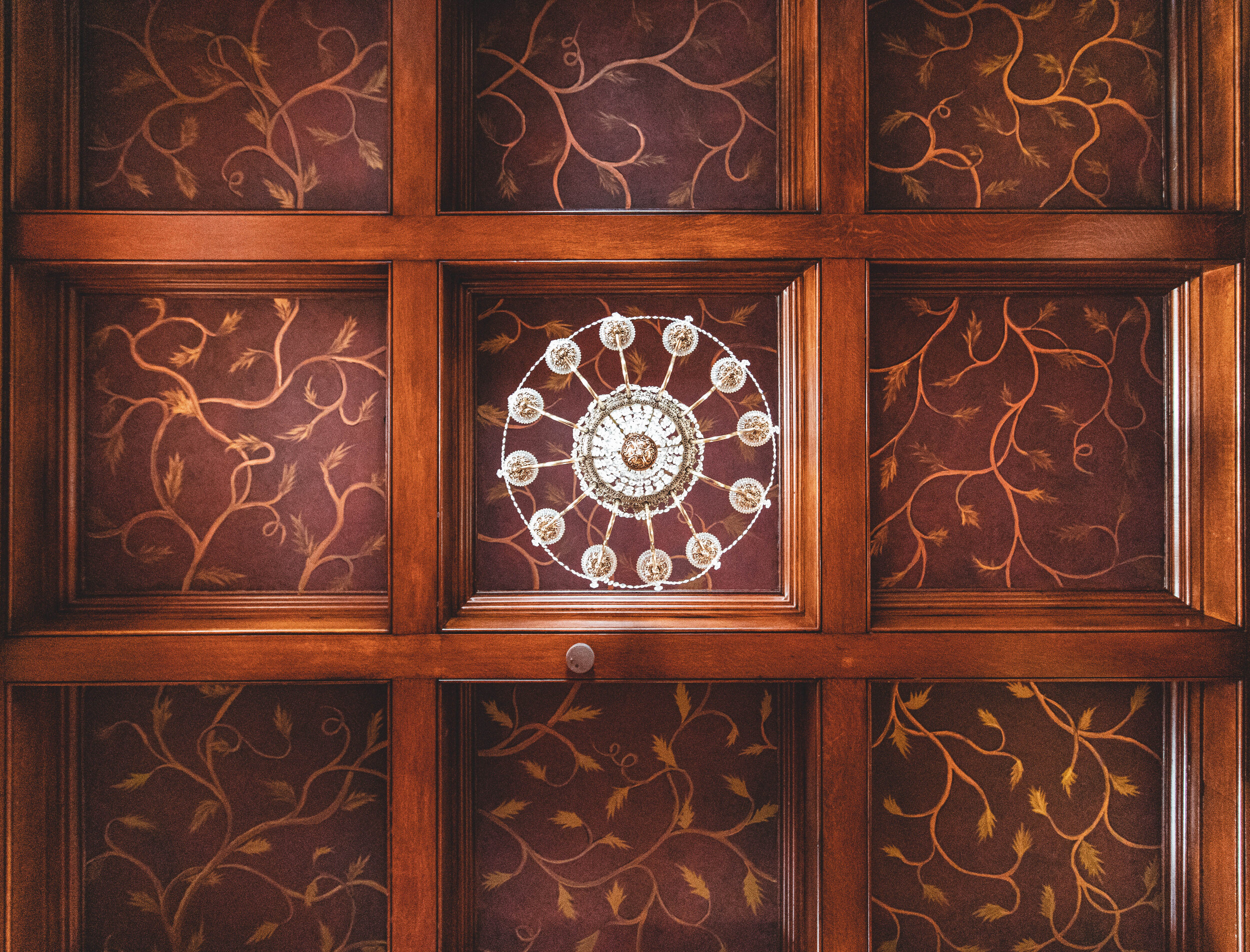
Not only is that chandelier absolutely beautiful, the pattern on the ceiling is gorgeous too! You’d think it’s wallpaper, wouldn’t you? But it’s most definitely not - it’s all hand-painted! And that’s a detail you’ll see all over this house.
The Sitting Rooms and Dining Areas
As you wander through the house, to the right of the staircase you have a sitting room with another insanely intricate original fireplace.

And just behind the sitting room is the breakfast room.

Check out those high ceilings, giant windows, and don’t even get me started on the chunky trim!
If you were to turn to the left after entering the foyer, you’d walk into another sitting room.

Through this sitting room, you’re led into the most epic dining room I’ve ever seen. I can’t decide which angle of this room is best so I’m just gonna show you all of them.
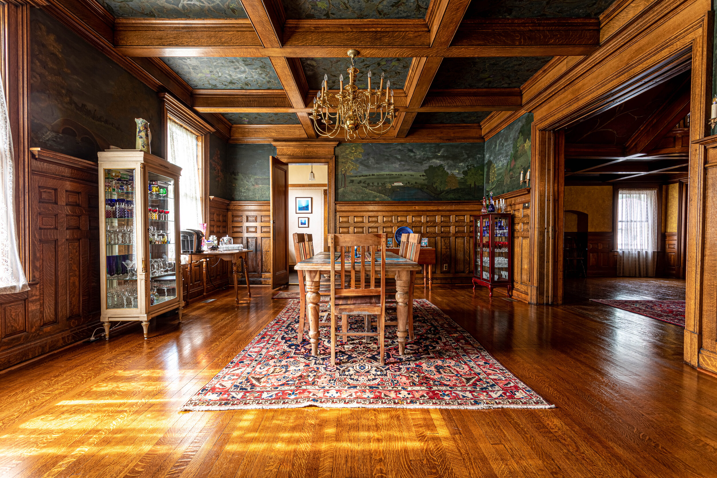
That wainscoting is simply flawless and I’m in love with the dramatic mural above it. Yep, it’s not wallpaper. The mural and the ceiling in this room were also hand-painted.
Because this room is so large, it would be easy for it to be cold and uninviting, but the use of dramatic and dark colors complements the orange in the wood and creates a really warm space. The oriental rug under the table is also a really great, dramatic touch.


The Kitchen
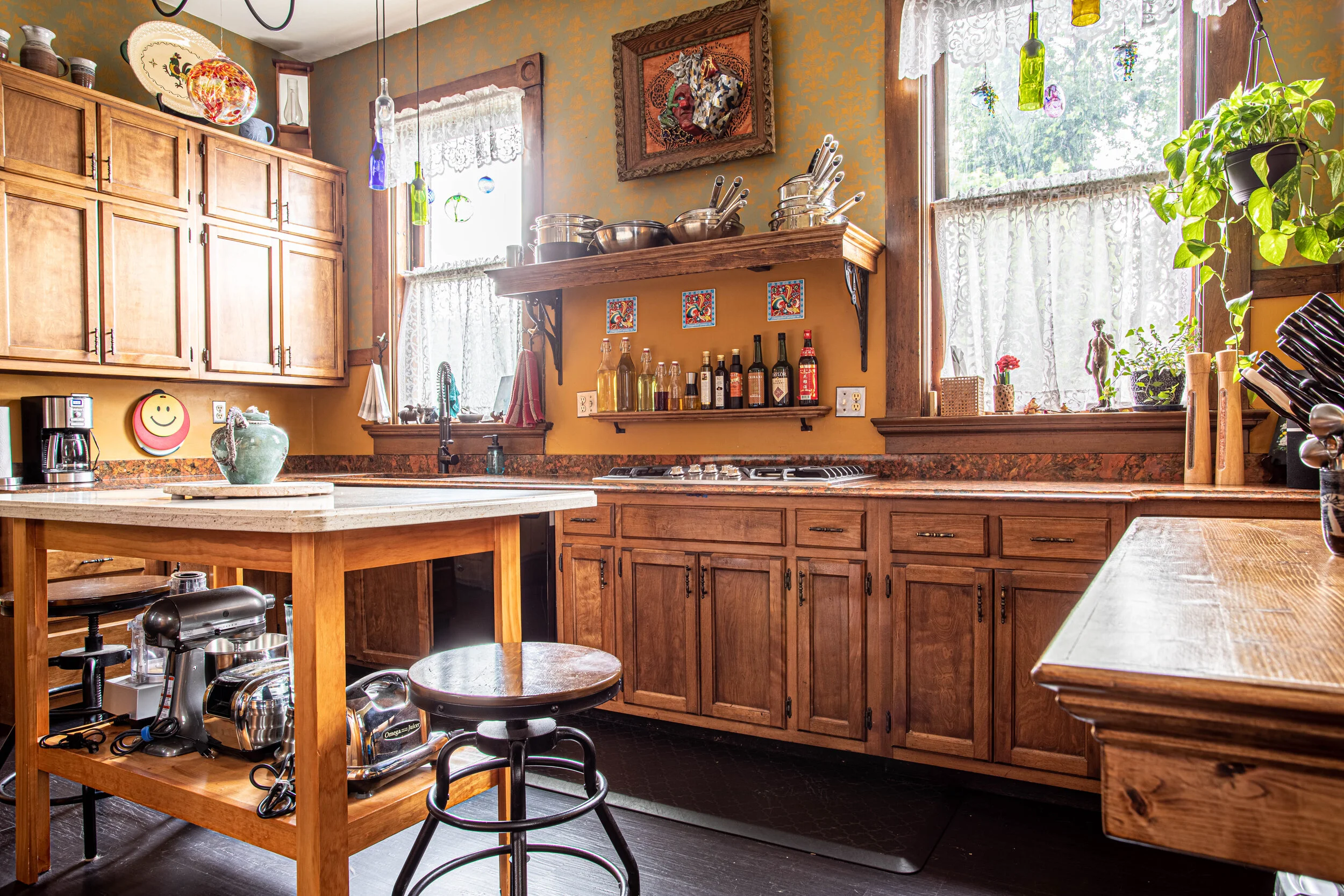
Through the dining room is one of the pantries (this house has two!) and then the kitchen. Houses from this era typically don’t have very functional (in terms of this day and age) kitchens. The kitchen in this house has been updated and is now not only functional but still flows nicely with the rest of the house in the use of wood tones and ornate wall finishes.


The Bedrooms
Heading back on up that amazing staircase… Once you make your way to the top and catch your breath, you’ll realize that you’re not in a room - you’re on a giant landing, which leads to five large bedrooms.

Our first stop on the bedroom tour is Jonathan’s room, which is simple, clean, and modern.
The other four bedrooms are decked out in true Victorian style, which is a good thing because they can be rented for an AirBnB stay! Yep, you can book your stay in your pick of one of the four beautiful bedrooms.
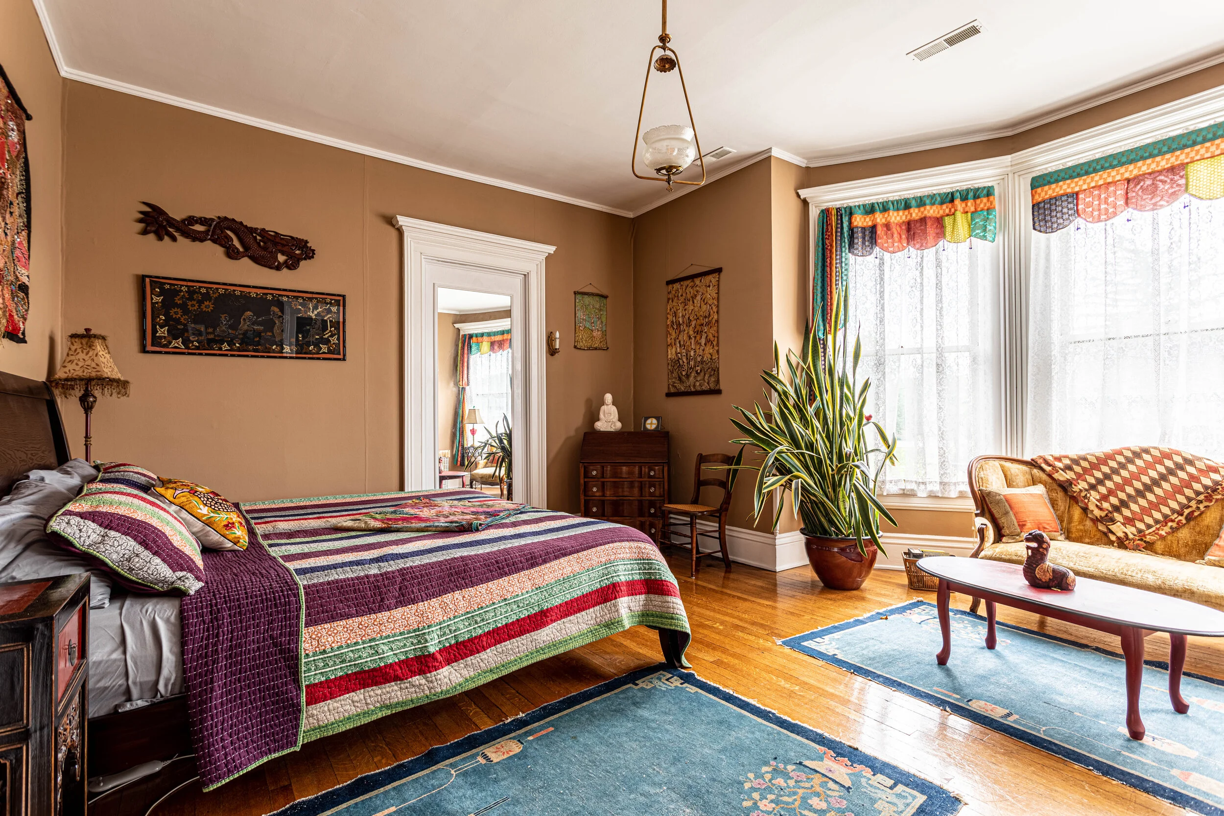
Your first option is what Jonathan affectionately calls The Rose Room (aka “Grandma’s Room”). It’s dressed in sweet, floral wallpaper and a delicate quilt.

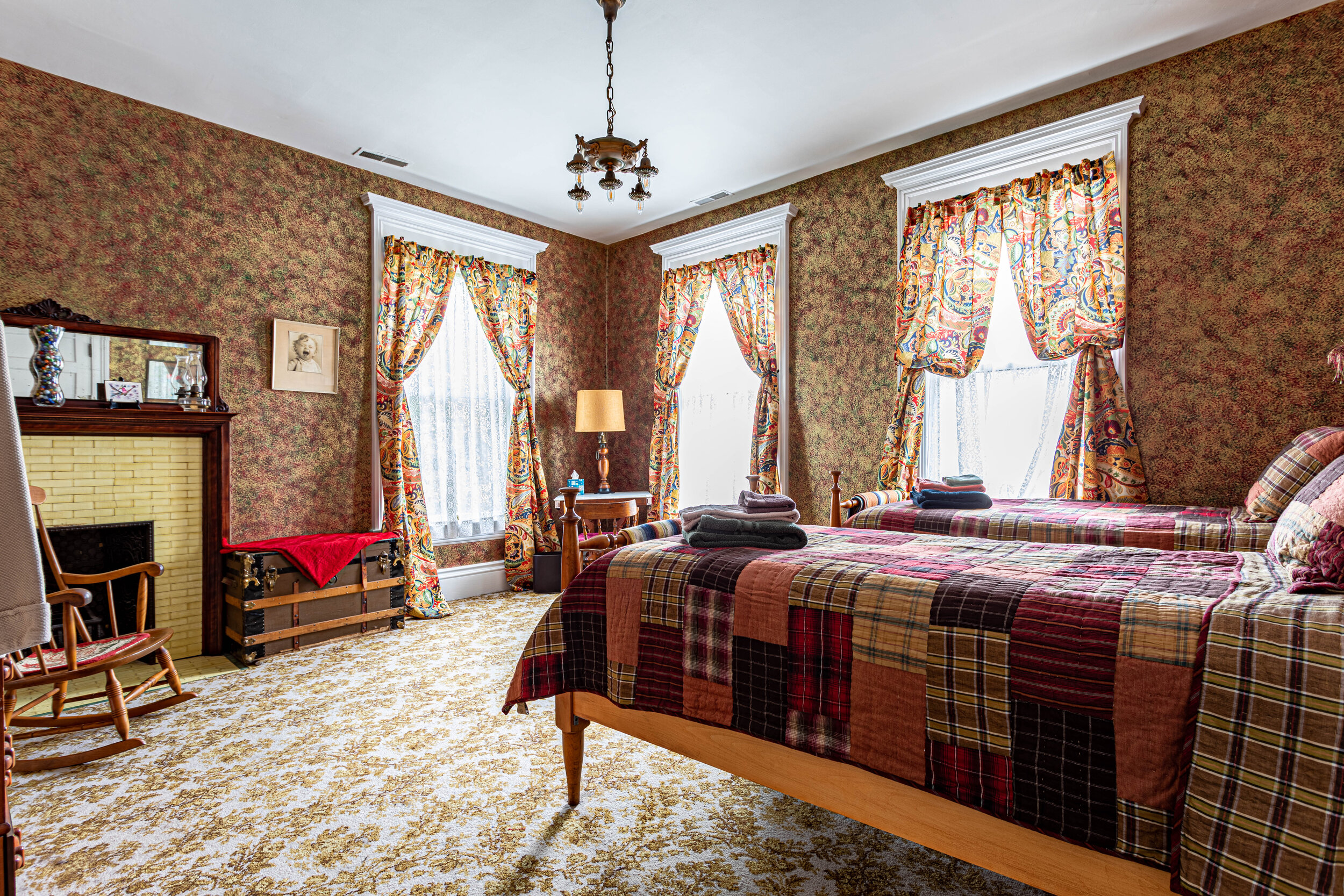
Option number 2 is what has been donned The Circus Room due to the red, yellow, and green striped wallpaper that was hung before Jonathan got his hands on it. In here you have two twin beds and a fireplace (and no more circus wallpaper!).

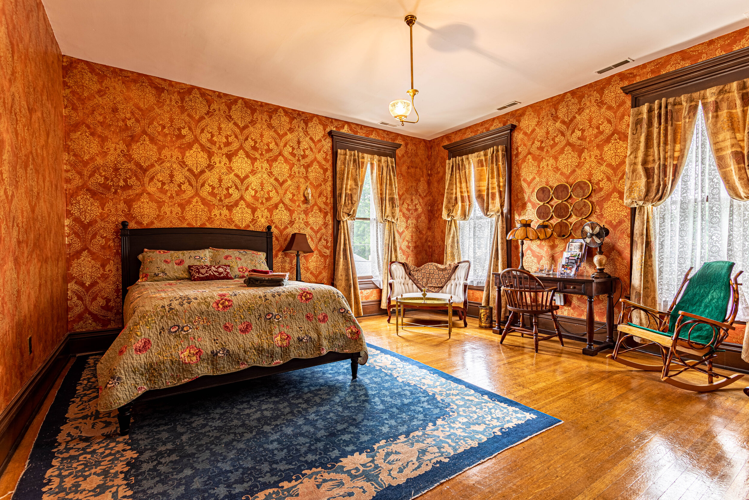
Bedroom number 3, The Gilded Room, might be my favorite with its intricately stenciled metallic walls. Jonathan explained his multi-step paint application process to me (involving 5 layers of paint!) and man, it was a labor of love at an estimated 60 hours of work.

And lastly, you have The Purple Room, one of the more Victorian-inspired bedrooms including, you guessed it, another fireplace!

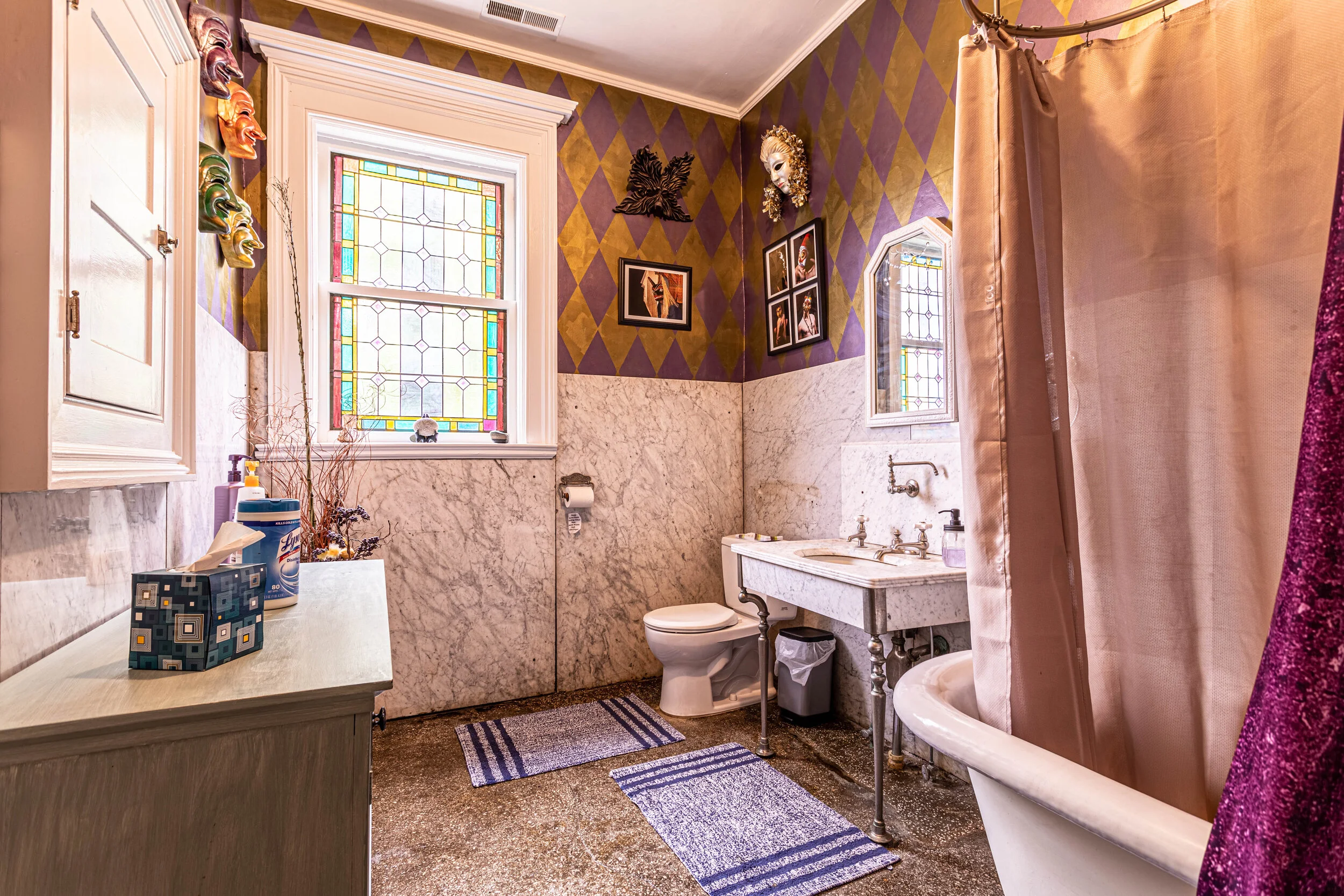
The Bathrooms
There are two full baths on the second floor (and one half bath on the first floor), that of course aren’t lacking in charm and detail.
Both bathrooms are spacious and feature beautiful stained glass windows. At the time of day I was able to visit, the sun was hitting this window just right to light the whole room in a surreal yellow glow.

And of course, in a house from this era, you HAVE to have a clawfoot tub. Also, check out the legs on that vanity!

The Third Floor
And for the grand finale, we’ll mosey up yet another set of stairs to the third floor, which is currently used as Jonathan’s workshop. However, in its heyday, it was used as a ballroom - and you’ll see why.

WOW! What a whirlwind of a house - I hope you enjoyed it as much as I did. What was your favorite part? The woodwork? The stained glass? The whole dang house!?
And don’t forget - until it’s sold you can stay here on your next trip! In case you didn’t catch the AirBnB links above, here they are: The Rose Room, The Circus Room, The Gilded Room, The Purple Room. And here’s the link to the listing.

Related Home Tour Posts:
1901 Victorian Mansion Home Tour

Dining Room Renovation Progress - A Dusty Improvement
Back in March, I posted about the beginning of our dining room renovation. In that post, I shared the progress of what we had accomplished so far and our plans for rounding out the room.
Since then, we’ve slowly been working on the dining room (while getting sidetracked with working on my office and the yard) and it’s about time for a progress report - especially because we’ve made some pretty big changes recently!
Back in March, I posted about the beginning of our dining room renovation (holy cow, it’s been that long!?). In that post, I shared the progress of what we had accomplished so far and our plans for rounding out the room.
Since then, we’ve slowly been working on the dining room (while getting sidetracked by my office and the yard) and it’s about time for a progress report - especially because we’ve made some pretty big changes recently!

A very dusty change in plans
It may be hard to immediately tell what’s different without some background. Here’s a picture of the “before” from this angle.

And here’s an “after” from a similar perspective.

Yup - we took out a wall! - well, mostly.
Here’s a comparison of the before and after from inside the dining room.

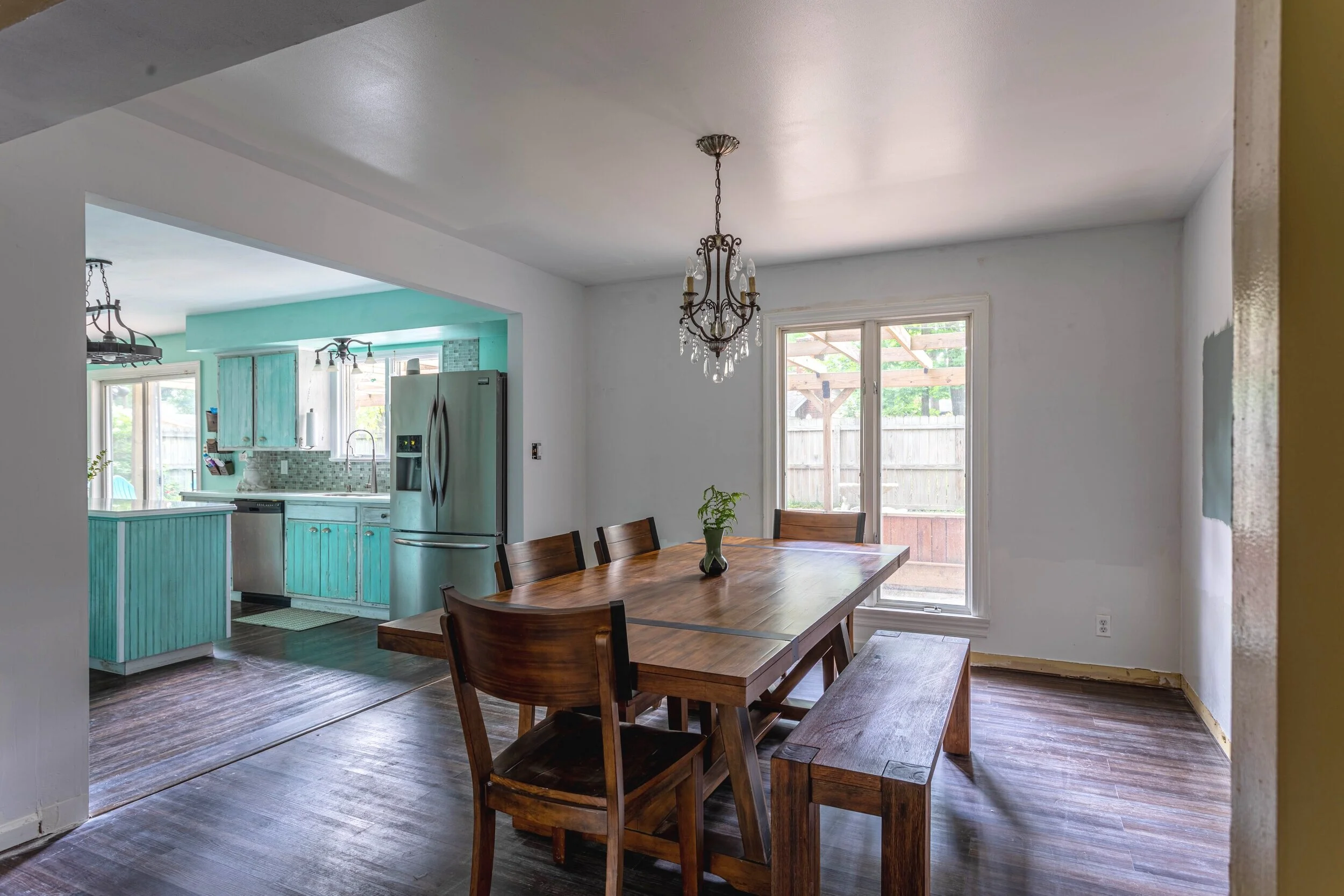
Lucius and I started daydreaming about opening that wall up shortly after we moved in. We used the pocket door that was there occasionally to wrangle our one-year-old, but it was infrequent and we knew it would be short-lived. We didn’t exactly know when we would swing the hammer, but as I was working on this room, I started to think about the order that I would need to tackle each area to avoid rework.
I previously wrote about the order of operations for painting a room efficiently for this exact purpose. But the dining room has a curveball to consider that I mentioned in the kick-off post - an accent wall! Something like this is what I have in mind:

To make the accent wall flow better, we decided to temporarily remove the trim anyway (that will make more sense when I cover that project). So I figured if we were removing some of the trim and painting the dining room, why not bite the bullet and open up the wall at the same time? Once I committed to the idea and put the bug in Lucius’ ear, there was no stopping him.

Check out the wallpaper we found under the trim.

Yowza


Unfortunately, before we decided to open this doorway, I had already stripped the wallpaper and evened out the walls. So we had to do a little bit of rework, but that’s showbiz, baby.
The big bummer is how much work I put into closing off the dining room to maintain the dust when I started the reno and how impossible that was to do when opening the doorway. Our house is covered in a fine layer of dust. We keep sweeping and mopping but drywall dust is relentless.
Benefits
Anywho, the rework that we’ve had to do is worth it. Having the wall opened up makes our dining room so much more functional. It’s not like the room moved closer to the kitchen, but just having it in plain view makes it way more inviting.
It has also improved the flow of the house. While our downstairs was pretty conducive to entertaining before, this update has elevated that functionality. Now whether you’re in the kitchen, dining, or living room you can see everyone in plain sight.
Not only has opening the wall improved the functionality and flow, but now I’ll be able to see my accent wall even better than I would have before!
And maybe the most important part - we can now open the right-hand door of the refrigerator all the way! #winwin
I read not too long ago that because of the coronavirus, open-concept floor plans might become a thing of the past as people try to distance themselves from one another (both for their health and sanity). That concern crossed my mind for a minute, but this house is pretty large so I don’t think any future residents will have issues getting space from one another. Plus, we don’t have plans to move anytime soon. Bring on the open-concept!
Future Plans
The Accent Wall
I mentioned above that I still plan on installing our accent wall. To get an idea of how the wall will work in our house and with the dimensions we have, I drafted a few different designs on graph paper. I used 1 square per 6 inches.
I love the design in the inspiration picture so I drew that out using the dimensions of our wall (the little shaded box in the top right-hand corner is the bulkhead that runs through the dining room).

Then I drafted three more designs to give myself some options.


I haven’t decided which design I’ll go with just yet. I’m not necessarily married to any of them and it’s probable that whichever design I choose will be modified as we install it, but I’d love to hear which design is your favorite!

Paint Colors
You also may have noticed in some of the demo pictures above that I’ve been testing paint colors. I mentioned in the kick-off post that this room lacks natural light (though that’s improved a bit by opening it up) so I wanted to avoid a super dark color like I had originally wanted. Instead, I’m planning on using something in a more medium tone.
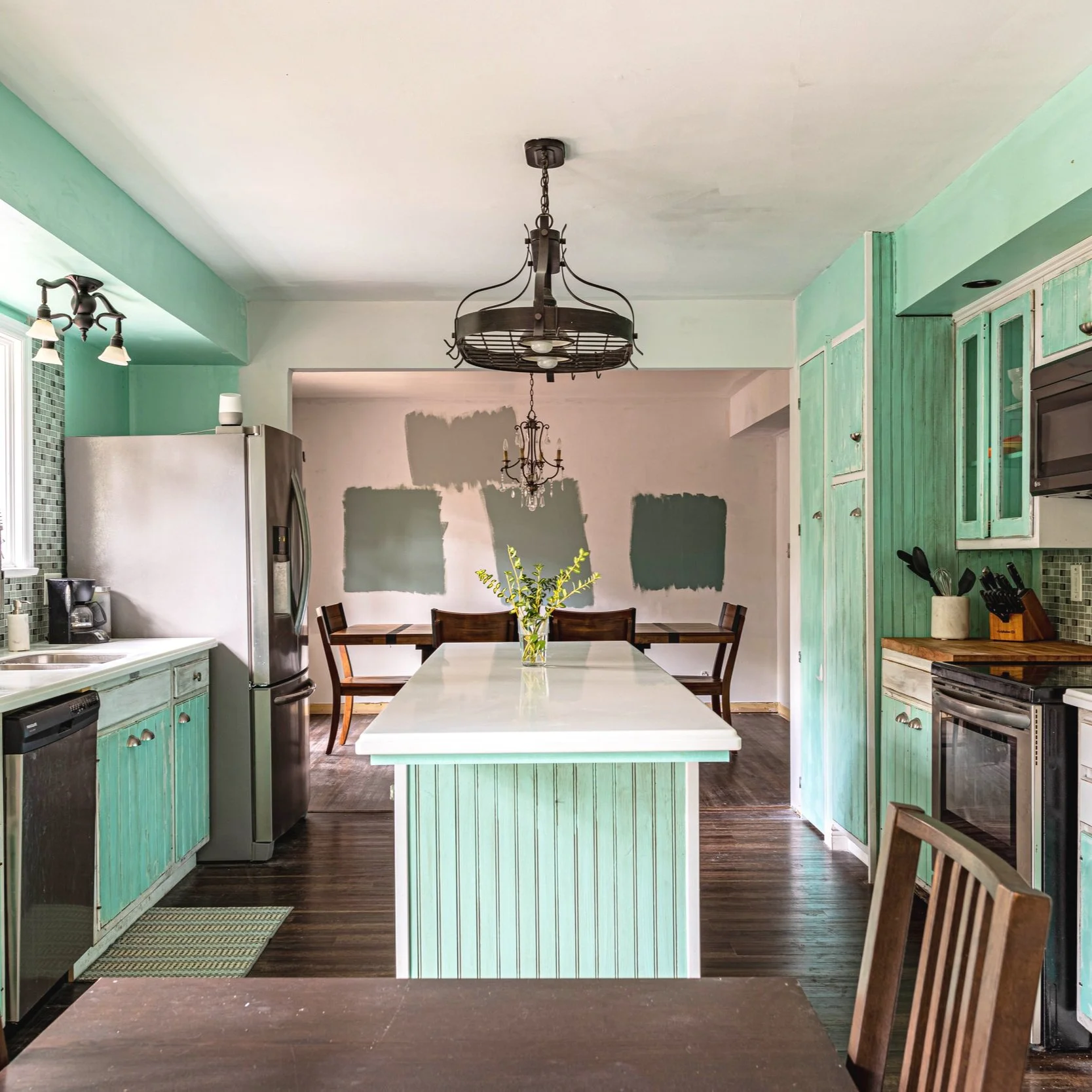
On the top is Smoke Infusion by Valspar (which is one of the colors we used in the flip). Left to right is Blue Seagrass then Desert Lake both by Sherwin Williams, followed by Secluded Garden by Valspar.
I’m leaning towards the Desert Lake color in the middle. The fact that I coincidentally bought new running shoes that are the same color solidifies my attraction to that color.

It’s probably important to note that we plan on changing up the colors in the kitchen too. Eventually the two rooms will flow seamlessly rather than feeling like two completely different houses.
The Area Rug
In my initial post about this renovation, I talked about adding an oriental rug. While that idea isn’t entirely off the table, I’m considering switching it up and putting a more abstract rug in this room instead. I still love oriental rugs and would like to use them elsewhere. But I have my hesitations that some of the strong lines in an oriental rug will compete with the accent wall. Instead, I’ve been ogling rugs like this:
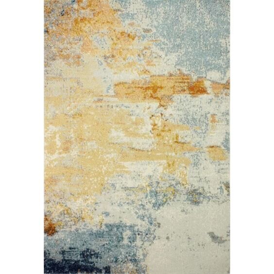
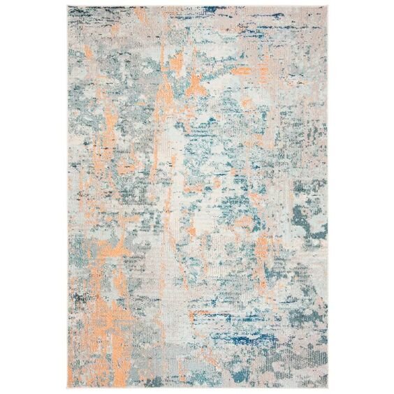
Source - Rug 1; Source - Rug 2
Now that this room has made some big strides, I’m even more excited to get it done (and to finish drywalling so we can finally get rid of all this dust)! There’s still a lot of work to do, like replacing the trim and crown molding, painting, installing the accent wall, and about a million other little steps between there, but the end product will absolutely be worth the effort. I can’t wait to share another update soon!
Pst - don’t forget to weigh in on which accent wall design you’re most drawn to!
Related Dining Room Renovation Posts

Choose the Best Paint Finish for Every Room
Sometimes I forget that not everyone has painted several houses worth of rooms and may not know what to say when the person at the paint counter asks, “what finish do you want that in?”. So this week, I’d like to bring back the basics and break down how to choose the best paint finish for every room in your house.
Ahhh… I remember the first time I painted a room. cue the “going back in time” squiggles I was a junior in high school and we had just moved into a new house. I was ecstatic because my parents let me paint my room however I wanted. I chose a soft, minty green color in a satin finish and flat black trim.
The color of the room was actually pretty classy and surprisingly the finish wasn’t too off-base either, unlike my mom who painted the rest of the house in semi-gloss even though I told her it would look weird (and it did).
But although I got lucky and made a couple of good decisions, they weren’t educated. And I certainly didn’t get lucky with all my painting decisions in my room, considering I painted the trim in a flat finish and painted the ENTIRE room (ceiling too) with the same paint I used on the walls. I’ve learned a lot since then.
My point is, we all have to start somewhere. Sometimes I forget that not everyone has painted several houses worth of rooms and may not know what to say when the person at the paint counter asks, “what finish do you want that in?”. So this week, I’d like to bring back the basics and break down how to choose the best paint finish for every room in your house.
How to choose a paint finish
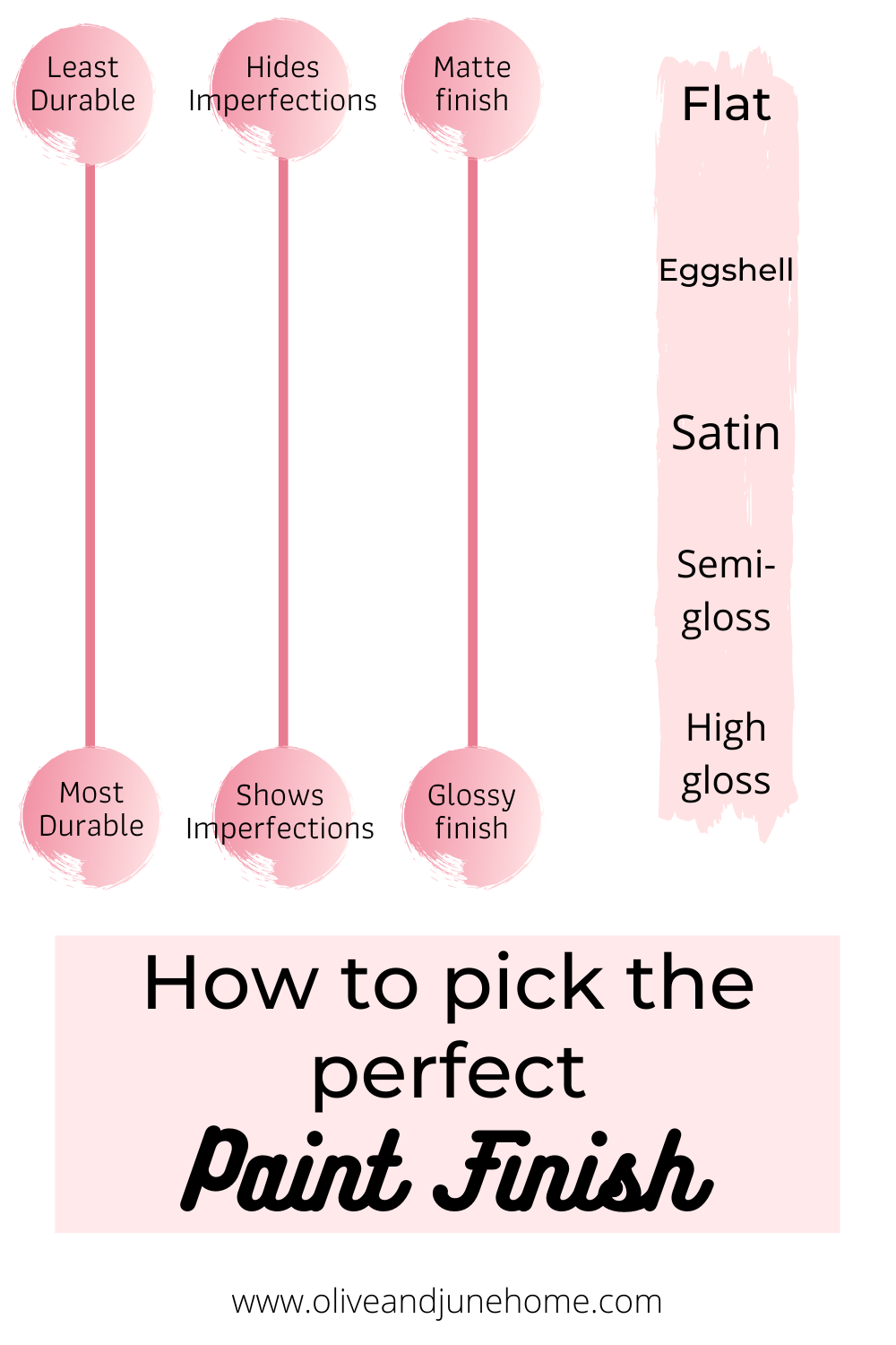
When choosing a paint finish, you can most definitely just choose what you think would look good (it’s your house, after all). But there are different finishes for a reason. It’s important to know what the purpose of each finish is before committing if you want a nice looking end product.
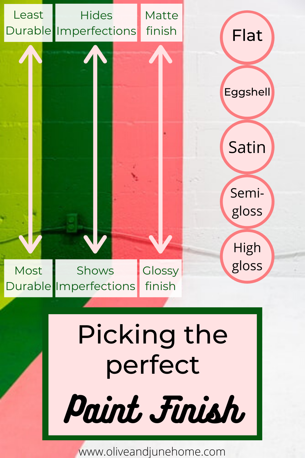
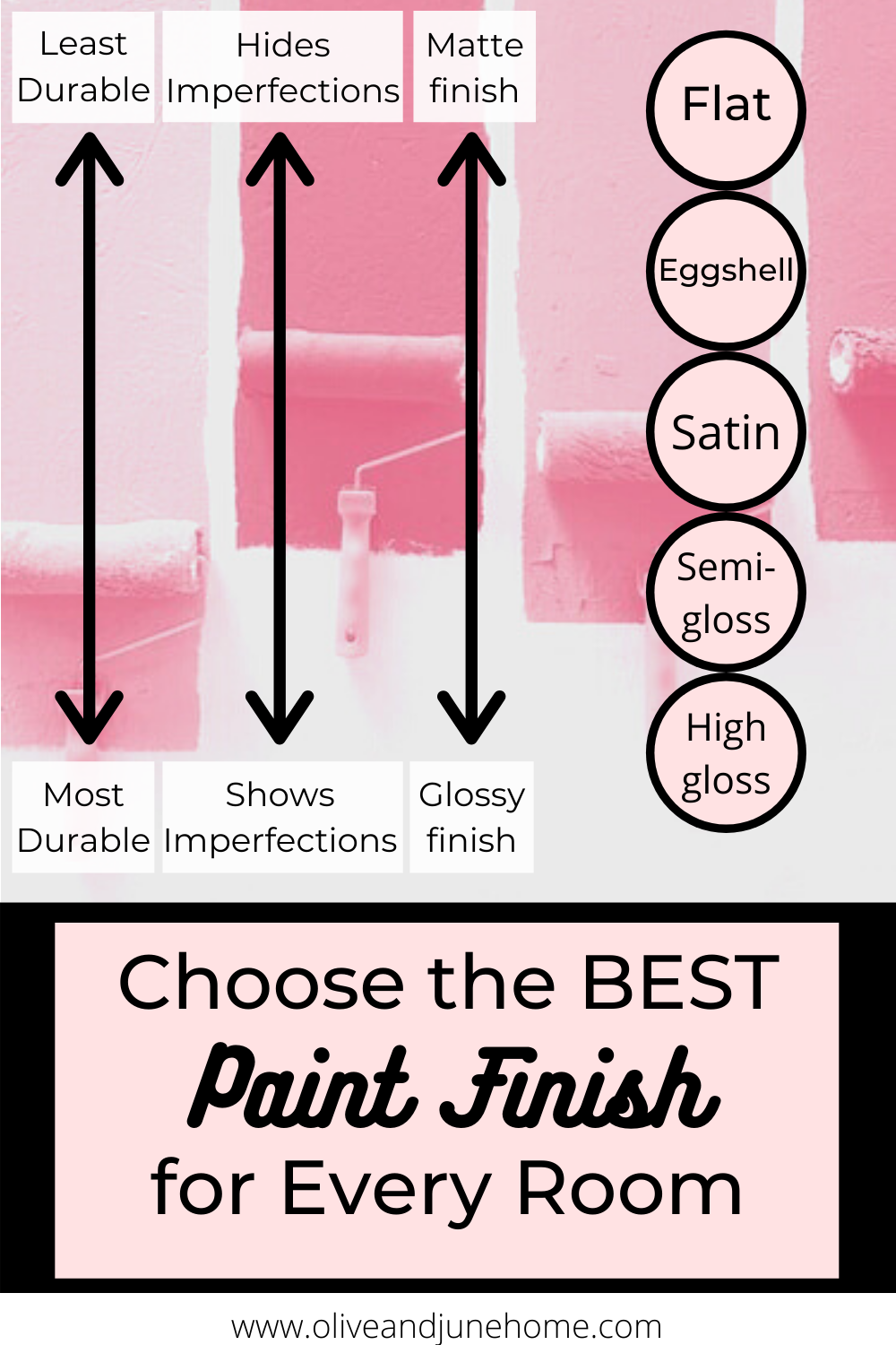
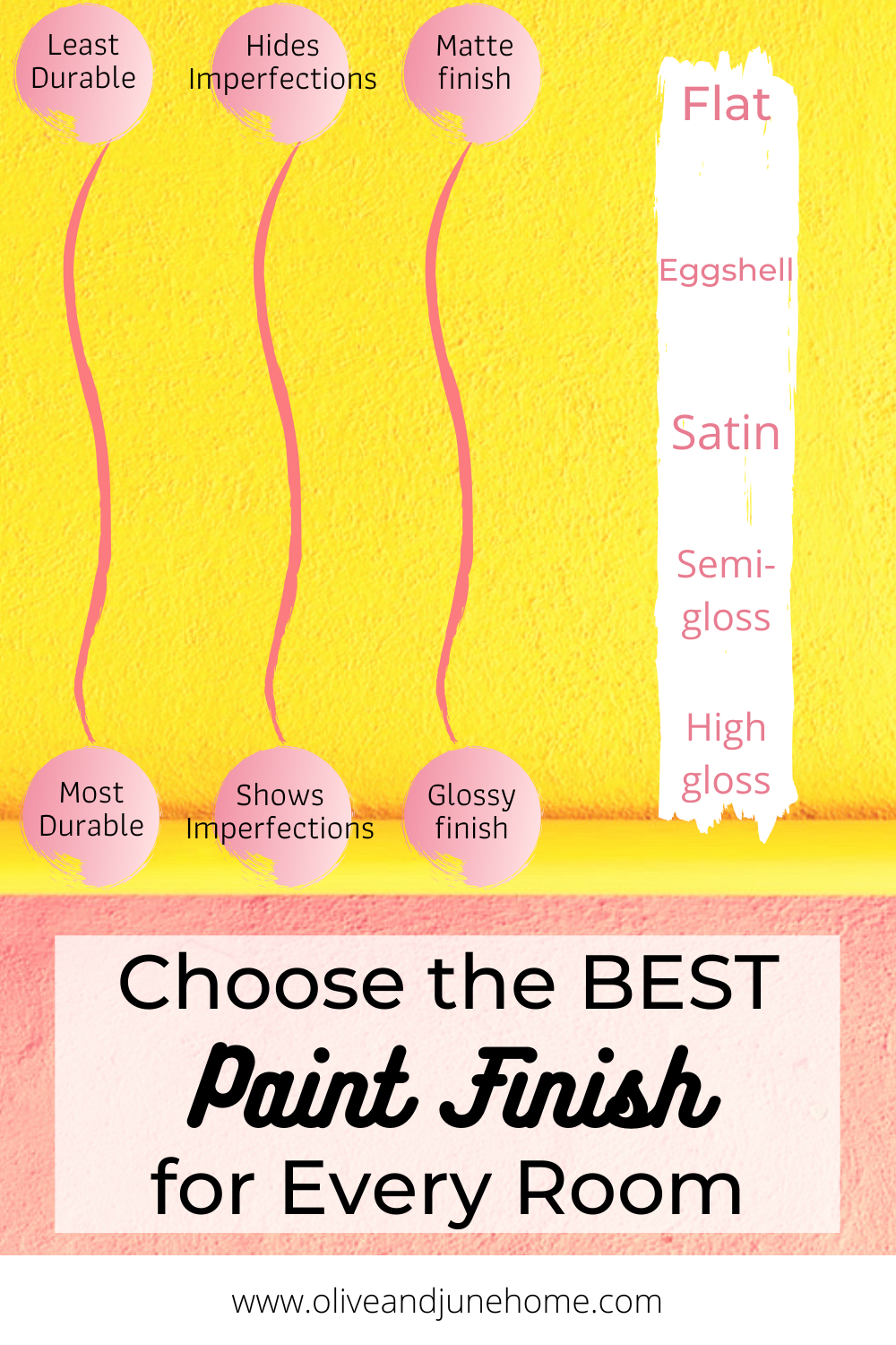
There are 5 main finishes: flat, eggshell, satin, semi-gloss, and high gloss, and 3 main aspects of each paint finish: sheen, imperfections, and durability. Below I break down how each finish stacks up and where in your home they should be used.
Flat
Sheen: Flat paint is… well, flat. Pretty self-explanatory. It’s a matte finish and doesn’t reflect light.
Imperfections: Because of its matte finish, flat paint is very good at hiding imperfections.
Durability: Flat paint tends to hold on to dirt and is difficult to clean and wipe down.
Where to use it: Low traffic areas, ceilings, or on walls with lots of imperfections (like old plaster walls)
Eggshell
Sheen: Low sheen, like an eggshell. Also pretty self-explanatory.
Imperfections: Still pretty good at hiding imperfections.
Durability: Slightly easier to clean than flat paint.
Where to use it: Low to moderate traffic areas - living rooms, dining rooms, adult bedrooms
Satin
Sheen: Moderate sheen
Imperfections: Less good at hiding imperfections
Durability: Easier to clean
Where to use it: Moderate traffic areas, like kids’ bedrooms and hallways or in areas with moisture, like kitchens and bathrooms.
Semi-gloss
Sheen: Moderate to high sheen, slightly glossy and reflective
Imperfections: Not good at hiding imperfections
Durability: Easy to clean
Where to use it: Moderate to high traffic areas like on trim, doors, and cabinets or in areas with moisture like kitchens and baths.
High gloss
Sheen: High sheen, very glossy and reflective
Imperfections: Bad at hiding imperfections
Durability: Easy to clean
Where to use it: High traffic areas, like on trim and doors
If you’re still not quite sure what these finishes look and feel like, just ask the associate at the paint counter if you can see a sample of the different finishes. A lot of times they’ll have a little sample with each of the finishes displayed to better help you make your decision.

Now that you know the “rules” of choosing a paint finish, you can have some fun with it and throw those rules out the window!… with caution.
A great example of this is painting a design on a wall using the same color in two different paint finishes.

Or painting an entire room - walls, trim, molding - with the same color and finish.
Or even painting the whole room (including the ceiling) the same color in a high gloss finish.

At the end of the day, it’s your house so do what speaks to you and makes you swoon. But at least now I’ve taken the guesswork out of it for you, so the next time you order a gallon of paint you won’t be caught off guard. Happy painting!


Tour the Exterior of our Mansard House: The Before
Back in March I posted a tour of our current house and promised to take pictures of the exterior once everything was in bloom again. Well, now that it’s summer and everything is lush and green it’s about time I followed through on my promise.
Back in March I posted a tour of our current house and promised to take pictures of the exterior once everything was in bloom again. Well, now that it’s summer and everything is lush and green it’s about time I followed through on my promise.

As you may have read in prior posts, we moved into this house last October. This was a very exciting purchase because although I loved our last house and miss it dearly, this house is in one of my favorite neighborhoods filled with families, kids, and TREES! GLORIOUS TREES!
The look of the exterior of the house isn’t my favorite - I don’t love mansard roofs and I’m not a big fan of the colors - so it took a while for me to really start to feel like this was home. It definitely didn’t help that right when we moved in all the leaves fell and everything died. But now that the trees have leaves on them and flowers are blooming, it’s growing on me. At the same time, all the plants being in bloom is also pretty overwhelming when it comes to this yard of ours.

The front of the house doesn’t look too bad at a glance, but there are a lot of overgrown areas that we don’t really know what to do with. For instance, on the right-hand side of the picture above there’s a ton of green - but we have no clue what are weeds and what are plants and how to keep the weeds at bay once we figure it out.
I definitely don’t have the greenest of thumbs and I’m hesitant to spend money on plants that I might very likely kill. On the bright side, we have well-established boxwoods for days!
We’re trying to take advantage of the nice weather and get this yard in shape little by little, or at least accomplish as much as we can in a summer. So far in the front yard Lucius has rebuilt the rock wall in the picture above, filled in some uneven areas of the yard, and relocated the basketball hoop to a more practical spot (and leveled out the yard to do so).

Before we head to the back yard, I figured I’d show you the general layout of our house on the lot with a very quick and basic digital drawing. Looking through the pictures, I think it’s pretty tricky to get a good understanding of the layout without an overhead view, so hopefully this rudimentary drawing helps.

Alright, now that I’ve wowed you all with my drawing abilities, let’s take a stroll into the backyard, shall we?
Something worth noting is that while the front yard looks okay, the backyard is a hot mess. We don’t have any grass back there - just weeds and lots of rocks! We think that this yard probably had some pretty impressive landscaping at one point but it has since been neglected and left to run wild. Because we have so many giant, beautiful trees in this neighborhood, it’s likely that prior owners let the leaves fall and accumulate and eventually they killed the grass and decomposed to create mounds of dirt.
Coming through the gate on the right-hand side of the yard we’re greeted with this overgrown mess. Lucius has actually been spending quite a bit of time taking all these plants out and trying to level the dirt so we can have a nice, clean slate, but the picture below is what we started with.

If you continue walking, you’ll quickly turn the corner to see the rest of the yard.

There’s a pretty brick path that leads from the driveway, through the gate, and alongside the deck. As you can see in the picture above, we have lots of rocks and weeds, but very little grass.


The deck is a pretty great outdoor space and spans this whole side of the house. We’ve been told by several neighbors that it used to be an atrium kind of like the picture below.

Source unknown
It probably wasn’t quite that lavish, but you get the picture.
Apparently it was a sunken atrium that you would step down into from the house or the yard. Because of this, there was an entire drainage system built into the yard to prevent flooding. You can see some of the drains running parallel to the deck a couple pictures above.
To pump the drain water out, there was a cistern installed. Lucius is absolutely giddy that he got it working recently.

It’s a little bonkers because this thing is about 6 feet deep and probably 4-5 feet wide at its widest point and it’s just chillin’ in front of our shed in the backyard.
But back to the deck! It’s a great space, but needs some work. And let me show you why…

Yup… there’s a giant hole for a hot tub in our deck. We considered putting a hot tub in, and actually had a friend offer to give us theirs that they no longer use, but it was too small so we kabashed that idea altogether. Our plan now is to extend the deck to cover the hole and just make this an additional seating area.
And don’t worry, there’s a hole inside the hot tub hole that has a sump pump. Lucius has plumbed it to drain into one of our many backyard drains so this won’t turn into some kind of disgusting swimming pool every time it rains.
Once we cover up the hole, we’ll be painting the deck.
On the flip side, the part of the deck that doesn’t have a giant hole is functional! But we definitely need to upgrade our patio furniture and build a contraption so we can hang the tire swing from one of the trees instead of the pergola.

Heading around the other side of the deck you’ll see the brick path continued and more crazy, overgrown, weedy yard. And rocks! Yay… more rocks.

And lastly on the far side of the house we have our bocce ball court… or putting green… or whatever you do with a really long, narrow stretch of yard.

Once again, the green you see is most definitely not grass.
Next summer I might plant a garden in this area. Our older daughter has shown interest in starting a garden with me, but with a very clingy 1-year-old I don’t think it’s feasible this summer. But a garden will only take up a small section of this weird part of the yard so maybe the rest will end up being a bocce ball court….
Anywho, there you go! Our insanely overwhelming, in-need-of-so-much-love yard.
I’d love to hear suggestions on how you’d go about taming this beast - we sure could use them! And hopefully with some perseverance (and advice) we’ll make some progress over the next couple of months and I’ll be able to share our improvements at the end of the summer!

How to: Paint a Room Top to Bottom Efficiently
Remember back in math class when they taught you the order of operations - PEDMAS (or, Please Excuse My Dear Aunt Sally, as I like to remember it)? I've never been good at math, but I do know that the order of operations is an integral part of it. Well, I believe there’s an order of operations to painting a room that makes it easier and faster to complete. And I’m here to break it down for you!
The Best Way to Paint a Room
Remember back in math class when they taught you the order of operations - PEDMAS (or, Please Excuse My Dear Aunt Sally, as I like to remember it)? I've never been good at math, but I do know that the order of operations is an integral part of it. Well, I believe there’s an order of operations to painting a room that makes it easier and faster to complete. And I’m here to break it down for you!
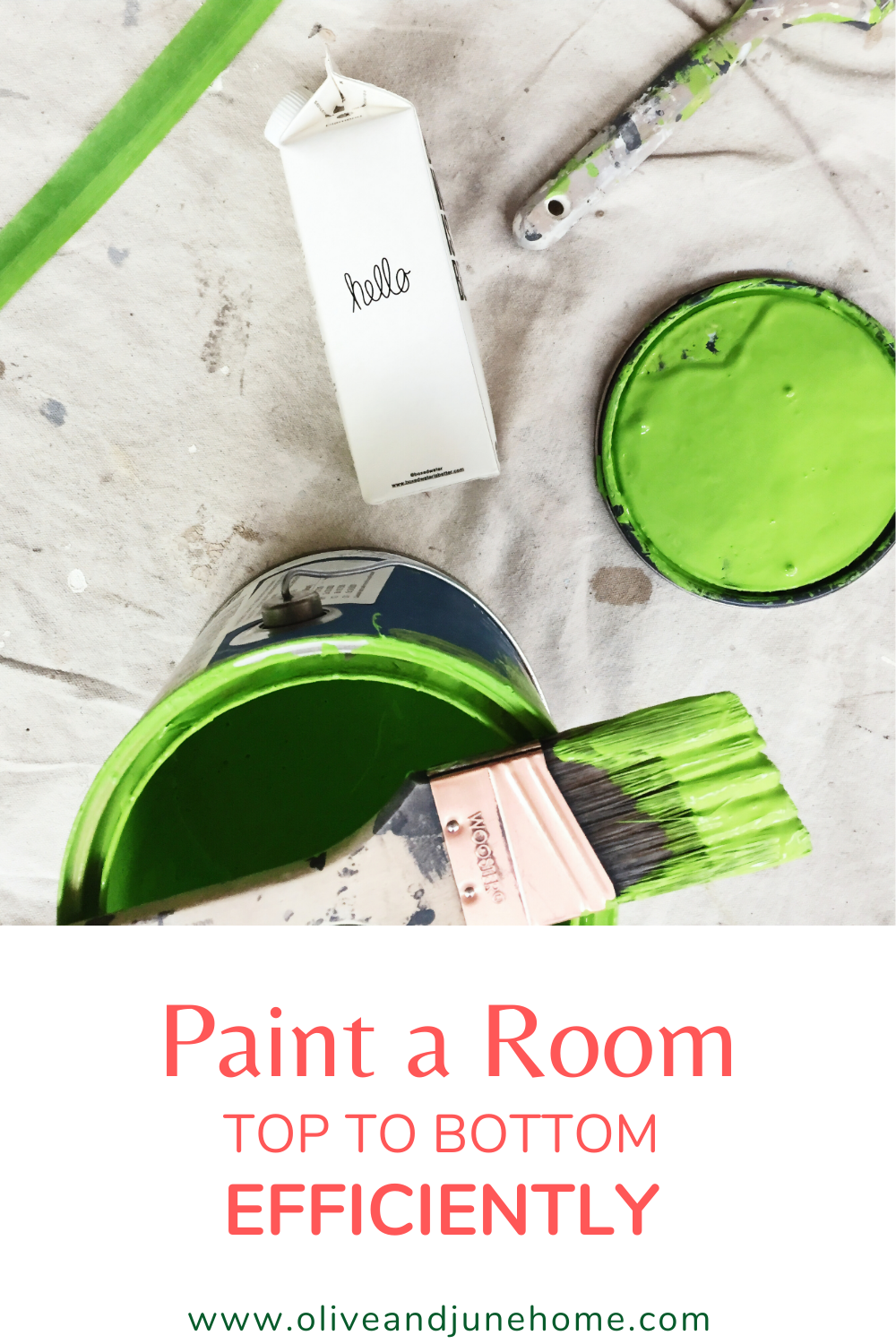
Not all of these steps apply to every room, but you can skip any unnecessary steps for your specific project and just hop on over to the next applicable one.
And just for fun, here’s the acronym for the steps and some weird phrases to help you remember it (because I clearly have too much time on my hands): Prep work, Prime, Caulk, Trim, Ceiling, Walls - PPCTCW
Pretty People Call Tom Cruise Weekly
Punk Princesses Create Tortured Comic Worlds
Philosophical Penguins Cry To Callous Wombats
Okay, I’ll get to the post now… (but feel free to send me any phrases you come up with because they make me laugh).
As an Amazon Associate, I earn from qualifying purchases. This post may contain affiliate links, meaning I receive commissions for purchases made through those links, at no cost to you.
Prep work
First thing’s first - to get a great-looking finished product, you have to put in the time and effort of creating a solid foundation. That means prepping your walls (and ceiling if you’re painting that too) by patching any holes. Once your holes are patched, make sure to sand them smooth. If you’re patching a large hole and it isn’t smooth on the first go-round, slap another layer of spackle on it and sand again once it’s dry.
I get it, it’s frustrating not to be able to just jump into painting your room, but that uneven spot will drive you nuts if you don’t fix it now.

Once everything is sanded, vacuum/wipe down surfaces to remove any dust build-up, especially on the tops of door frames, window frames and sills, and your trim. And don’t forget to remove any outlet or light switch covers!
Prime
This is where you get to have a little bit of fun if you’re repainting the whole room because you can go nuts and you don’t have to be careful at all.
In my office, for example, I knew I was getting rid of the red trim and blue walls. So I slapped a coat of primer on everything. And because I had to patch a few areas on the ceiling anyway and I was therefore going to have to repaint that too, other than making sure I wasn’t getting any paint on the floor, there was no need to carefully edge around anything. It was kind of liberating, in a way.


If you’re not painting everything in a room, you’ll obviously need to be more careful in how you apply your primer. Or, you may not even need primer at all if you aren’t drastically changing the paint color. In my office, I plan on using white paint on the walls and trim, so primer was a must to cover up the bold colors it was painted when we moved in.
On the flip side, if you are drastically changing the color in a room but you’re going from a light to a dark paint or from a bold to a more muted paint (like we did in our loft) save yourself some time and money by having your primer tinted.


Bonus: primer is a great way to highlight any nail holes you may have missed initially. If you find any stragglers, just spackle over them, sand, and call it a day!
Caulk
To create a nice, seamless look, caulk any gaps between your trim and your walls. I like this kind.
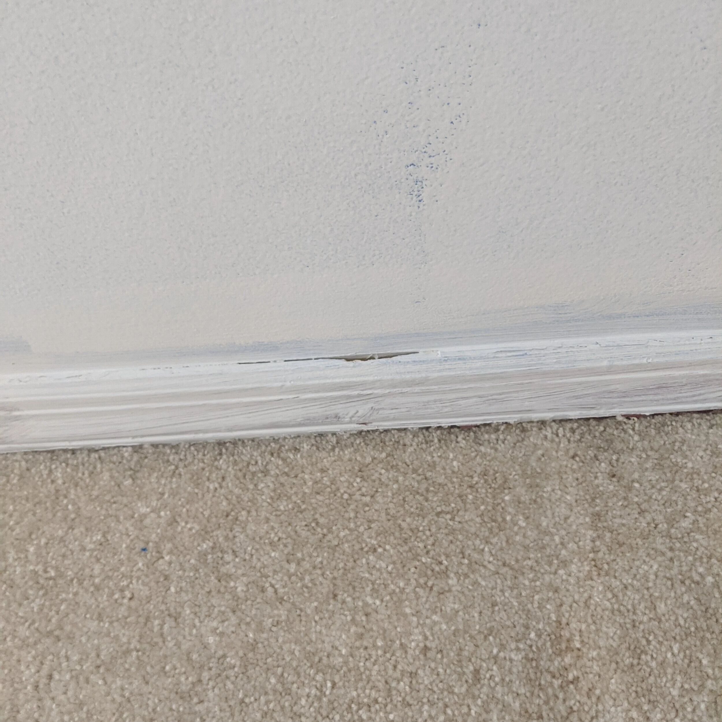
I’m coming for you, gap.
Caulking is simple. Just cut the tip at an angle, run a bead along where the wall and trim meet and smooth it with your finger. I like to keep an old rag handy to wipe off my hands, and it’s helpful if you wet the tip of your finger before you smooth it out.
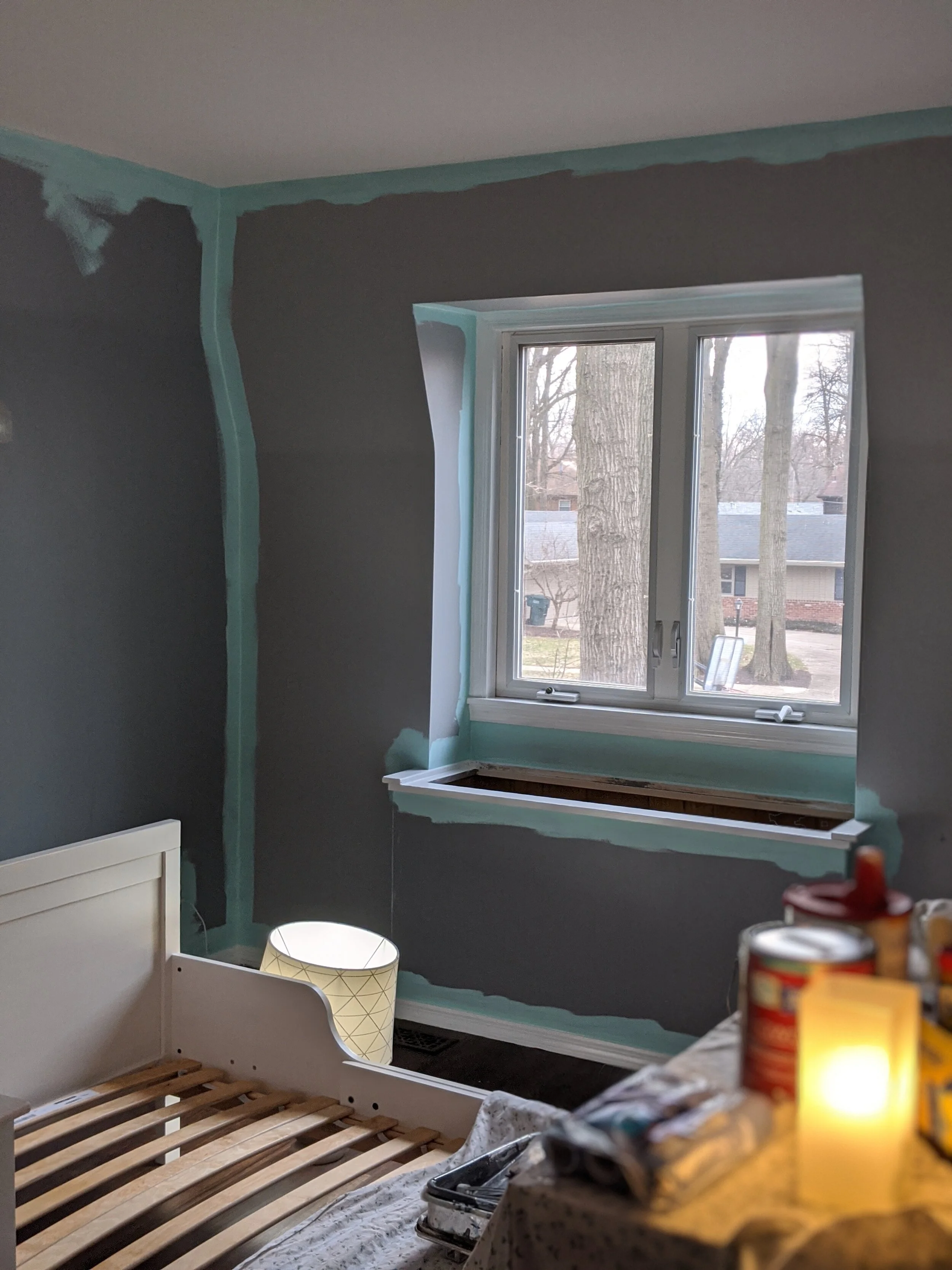
Trim
As with primer, if you’re painting the whole room, you really don’t have to be careful to cleanly cut in your edges. If you’re painting your walls, paint the trim first and go to town.
I love to paint, but painting trim is one of my least favorite things. What makes it even worse is that the trim in our current house is small and thin and it’s really hard to not get any on the walls. At least when I use this order of operations it makes the chore of painting trim a little easier. Since I’ll be painting the walls once the trim is complete anyway, when I paint the trim I don’t worry about using tape to keep any paint from getting on the walls.
Here’s a picture of our daughter’s room in progress. The wall color wasn’t changing drastically so I didn’t worry about primer. Because I knew I was going to paint the walls later, I painted the trim first and didn’t worry about “staying in the lines” while doing it!

You do, however, want to make sure you’re not going so crazy that you paint your floor. You can put some painter’s tape on the floor to protect your surface, or even use a large putty knife to block your brush from touching the floor as you paint your trim.
Ceiling
Unless you have crown molding (that would have already been painted in the last step), or you’re only painting the ceiling (and not touching the walls), you don’t need to worry about carefully cutting in your edges in this step either!
Walls
FINALLY, the moment you’ve been waiting for that will make all the difference in your room and straight up blow your socks off: you can now paint your walls! At this point, you’ll definitely want to be careful when cutting in because you just spent all that time painting your ceiling and trim.
I like to start by cutting in my edges, but some people prefer to roll their paint first and that’s totally okay! I prefer to use a short 2” angled brush. Definitely feel free to use painter’s tape if you don’t have a steady hand.
Then use a roller to roll the rest of the paint on your walls.
I don’t care what the paint companies say: I will never believe that “one-coat coverage” is a thing. Yes, the paint may cover well with one coat, but I guarantee there will be areas where you may have left the paint a little thin or didn’t quite get into the texture of the wall enough. Do your walls a solid and just paint two darn coats.
Sit back and enjoy
Now that you just put a ton of work into your room, ENJOY IT! You earned it!
For more painting-related posts, check out the articles below:
Tips and Tricks for Painting a Room Quickly

How (Not) to Stain Butcher Block
While working on the flip recently we had one of those “oh crap” moments when we realized we ruined the brand new butcher block counters. It would be easy to pretend we didn’t screw anything up and post a perfectly flawless “how-to” post, but where’s the fun in that? So follow along, because in this post I’ll share what went wrong and how we made it right so you can avoid making the same mistakes!
Staining My Butcher Block Counters
One of my goals for this blog is to be real - showing the good, the bad, and the ugly. Of course, I wish every project turned out perfectly the first time and that I could walk on water and teleport, but that’s just not how it goes. This is one of those “bad and ugly” posts.
While working on the flip recently we had one of those “oh crap” moments when we realized we ruined the brand new butcher block counters. It would be easy to pretend we didn’t screw anything up and post a perfectly flawless “how-to” post, but where’s the fun in that? So follow along, because in this post I’ll share what went wrong and how we made it right so you can avoid making the same mistakes!

It was actually Lucius’ idea to put butcher block counters on the island of the flip house, so I have to give him credit there because they look really nice… now that we’ve fixed them. But let’s take a step back to see why we had to fix them in the first place.
The flip isn’t a house with a lot of character, so we did our best to add some in ourselves. Adding butcher block was a good way to add character without breaking the bank. We got ours from Lowe’s for around $200 for an 8-foot piece. Since we only used it on the island, 8 feet was plenty. You can see the layout of the kitchen in this post.
While I was working my normal 9-5, Lucius grabbed all the materials to stain and seal the butcher block, including a couple cans of stain in Gunstock, and went to town. Then I got this text:

We were hoping the counters would complement the flooring nicely, but that definitely didn’t end up being the case. When the stain was applied it was much redder than the picture on the can, likely because the type of wood used for butcher block, and clashed terribly with the floors. Long story short, we learned our lesson the hard way: test your stain on some scrap wood before staining your main piece!
If we had more time, we could have sanded down the butcher block to raw wood and started over. However, we were planning on getting the flip on the market in just a few days and due to the time crunch, and the 10,000 other little things to wrap up, we chose to just buy new counters.
On the second go-round we decided not to stain the counters at all but instead to only use an oil and finish product to keep as much as the natural color as possible, and man do they look a heck of a lot better!

This is how they looked while they were still wet.

And here’s the finished product!


As you can see, they’re a much more natural tone now, since we essentially kept them their natural tone by not staining them at all. We also decided to use butcher block as our open shelving above the sink to make that space more functional and tie the butcher block counters into another element in the room.
Now, don’t get me wrong here. I don’t mean to imply that you can’t or shouldn’t stain your butcher block. By all means, go for it! But make sure you have a good idea what it’ll look like by testing your color before you go nuts like we did and end up creating more work for yourself.
If you want to stain your own butcher block, here’s what you’ll need and the steps to make it happen:

As an Amazon Associate, I earn from qualifying purchases. This post may contain affiliate links, meaning I receive commissions for purchases made through those links, at no cost to you.
Materials
- Painter’s tape
- Cloths
- Paintbrush meant for staining
- Stain (optional)
- Oil/Finish
- Sandpaper (we used 400 grit)
- Mineral Spirits (optional)
- Tack cloth (optional)
Step 1 - Apply painter’s tape where your cabinets and the butcher block meet - you don’t want to get stain on your pretty cabinets!
Step 2 - Wipe down your butcher block with a microfiber or tack cloth. To get the butcher block super clean, you can wipe it down with mineral spirits.
Step 3 - If you’re using stain, this is where you’ll apply it using the directions on the can. BUT FIRST! Stop what you’re doing, step away from your counters, and apply that stain to a scrap piece of wood.
The stain we used recommended applying it with a cloth, then wiping off any extra and letting it try for at least 6 hours. You could also apply it with a foam brush or paintbrush meant for stain, but you’ll still need cloths handy to wipe off any excess.
Step 4 - Once your first layer of stain is dry, sand your butcher block down with fine sandpaper to knock off any rough bits, wipe off the dust, then apply another layer of stain. Follow these steps until you have your desired look.
Step 5 - Apply your sealer with the same steps you used for the stain, being sure to sand between coats. We used Watco butcher block oil & finish and really like how it turned out.
And there you have it! Staining butcher block doesn’t have to be a scary, daunting task. Just learn from our mistake and don’t do what we did. Plus, take solace in the fact that if you do screw it up you can sand that bad boy down to the bare wood and start all over. Happy staining!
For more how-to’s, check out these posts:
Step By Step Guide to Staining Butcher Block

The Flip is Complete!
I’m so excited I’m not even gonna try to think of a formal introduction for this post… THE FLIP IS DONE!!! We put it up for sale 4 days ago and as of yesterday, it’s officially under contract!!! Picture me (and Lucius) with all the jazz hands!
Okay, now that that’s out of my system, I’ll take a step back and think of a more formal introduction… Oh yeah, here we go….
We finished the flip! (and have the pictures to show for it)
I’m so excited I’m not even gonna try to think of a formal introduction for this post… THE FLIP IS DONE!!! We put it up for sale 4 days ago and as of yesterday, it’s officially under contract!!! Picture me (and Lucius) with all the jazz hands!
Okay, now that that’s out of my system, I’ll take a step back and think of a more formal introduction… Oh yeah, here we go….
In early March, Lucius and I took the leap we’d been talking about for years and bought a house to flip! We had invested in flips previously and weren’t completely flying solo on this flip either, but this is the first flip that we took on as the primary party. From project management to design, it was all us, with a little financial backing from just one other investor.
It was definitely scary, but we’re so happy with how everything came together! I’m insanely excited to share the finished product with you all, so without further ado, welcome to our finished flip:
As an Amazon Associate I earn from qualifying purchases. This post may contain affiliate links, meaning I receive commissions for purchases made through those links, at no cost to you.
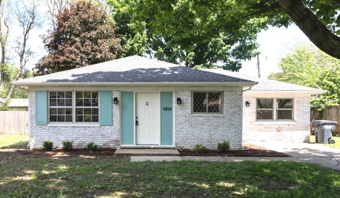
The Exterior
When we bought this house it was… sad. That’s the best word I can think of to describe it. It came across as an afterthought - a house that you would drive right by and never even notice was there.
Well, look at her now! I think I’ll call her Claire.
Now you drive by this gorgeous girl and do a double-take because she looks THAT good.
Here’s a little comparison to remind you what we started with.


The changes to the exterior are pretty obvious, and that was the point! I’m so happy we put all the manpower we did into amping up the curb appeal because I think it makes a huge (and much needed) improvement!

Here’s a rundown of what changed: I limewashed the brick, painted the shutters and wood on either side of the door (and wrote a post about how I chose the perfect paint color scheme), replaced the light fixtures, address numbers, and the front and side doors, threw a door knocker on the front door, and added some landscaping.
Oh, we also took out that tree in the “before” picture that had half of it being held together with a tow rope! The neighbors were very appreciative.
That seems like a ton of stuff, but it pales in comparison to what we changed inside.
The Living Room/Dining Room

Now I know an empty house isn’t crazy exciting to look at, but this isn’t HGTV, and staging an empty house isn’t always practical (though I would have loved to do it anyway!). But take a look at how far this space has come!
To start, we completely removed the wall you see in the picture below. This isn’t a big house so keeping the main living areas all chopped up just wasn’t a good use of the space. Plus, when you walked in the front door before, you ran right into a closet. This is what it looked like when we bought it.


What we changed: One of the major things we did throughout the house was replace the flooring. The previous renter put laminate on top of carpet padding… then there was a leak in the kitchen. When we bought the house the floors squished as you walked on them. So out they came!
We also replaced all the trim and doors, painted, and updated the light fixtures. Here’s the light fixture in the living room - and I love this light fixture so much it’s not the first time I’ve used it. I actually put it in the kitchen of our 1927 American Foursquare!
The paint color in the main living area is Smoke Infusion by Valspar. I ended up using colors from the same swatch throughout the house (except for the bedrooms) and I think I’m in love with it. It’s sort of a blue/green/gray color. It’s definitely more blue than green overall, but in certain lighting, it does take on more of a green hue.

The Kitchen
Aside from the exterior, the kitchen definitely underwent the most dramatic changes. I can’t stop looking at this before and after comparison.


I mean… is this even the same house!?
And that’s not even the best representation of the kitchen.

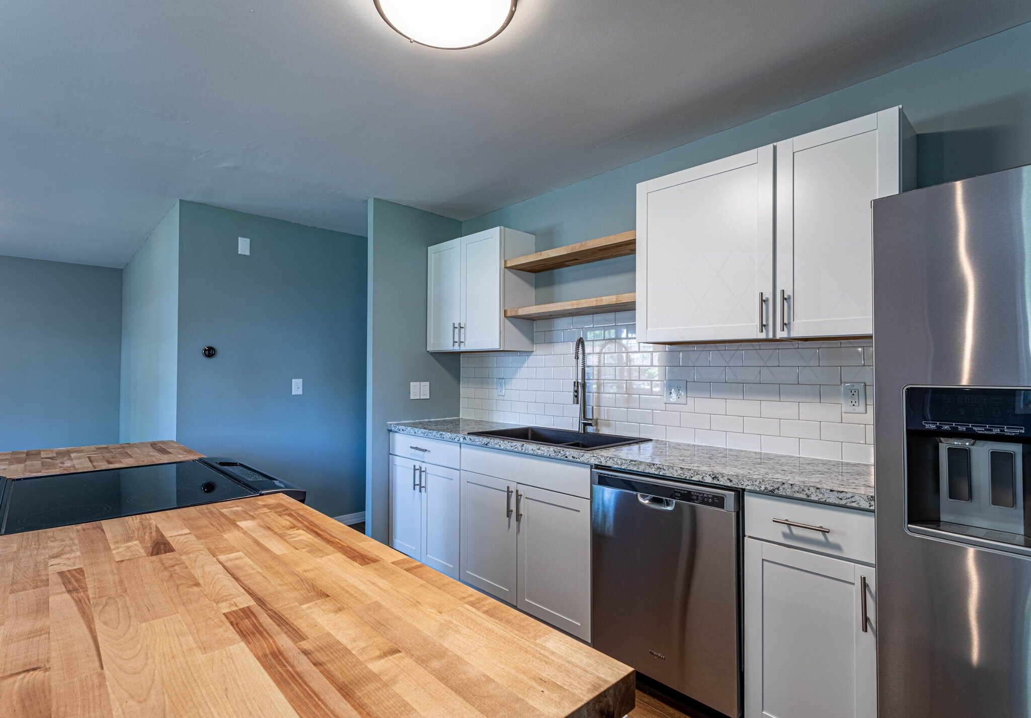

I wish I personally could take more credit for this amazing space, but honestly, Lucius came up with most of the ideas for it (who knew he had so much design acumen!?). I’m definitely the more risk-averse one between us (he comes up with the crazy ideas and I reel him back in. It’s a good balance). So when Lucius suggested removing a wall and changing the entire layout of the kitchen my alarm bells started ringing. But I have to admit that he was right and now this kitchen is so much more functional than it was when we bought the house.
The new layout adds way more counter space than was previously there and even increased the number of cabinets! Not only that, but it flows so nicely with the rest of the main living area and creates a much more conversational space.
The Bathroom
This house is tiny (around 1,100 square feet) and only has one small bathroom (which is tricky to photograph!), but it needed to be completely gutted. We carried the same laminate we used in the rest of the house into the bathroom as well.


The Bedrooms
This house has 3 bedrooms that are all pretty similar in size and style so I’ll just share one of the pictures. We put new carpeting in all the bedrooms and painted them a nice cool gray color - Tempered Gray by Valspar.
Side note: I feel like I should mention that I’m not sponsored by Valspar or Lowe’s since I mention them a lot. I would LOVE to try Benjamin Moore or BEHR paint but we only have Lowe’s and they only carry Valspar and Sherwin Williams. Therefore, those are the brands you’ll see me reference in a lot of my posts.

We also have new closet doors on the way but I couldn’t wait to share this post so they aren’t installed yet in this picture.
The Bonus Room
This house had a garage once upon a time, but at one point it was turned into a bonus room. It started out (like the rest of the house) in pretty rough shape.


But MAN does she clean up nice!


I love how the flooring brings some warmth to this house and I think it pairs really nicely with the calming paint tones. In this room, I used Paris in Winter everywhere except for the accent wall, which has Seafoam Storm, both by Valspar.

I wasn’t able to find a digital swatch of SeafoAm storm :(
We also replaced the french doors with a new sliding glass door. Normally I love french doors, but the ones in this room were failing and the sliding glass door brings in so much more light!
Lastly, we turned the closet back into a closet (it seemed like it was previously used as an entertainment center). This house has very little storage so we figured a closet would be more functional.
All the other things
Now that you’ve seen all the pretty stuff, I think it’s important to note that there are definitely parts to flipping a house that need attention that don’t have that “WOW!” factor but still gotta get done.
Water Heater
The biggest “hidden” item that we replaced was the water heater. We switched the old at-the-end-of-its-life traditional water heater to a tankless water heater. We installed one in our last house and we loved it! They’re not only much more energy efficient because they’re heating the water up as it’s being used (rather than continuously heating a tank full of water), but you don’t have to worry about running out of hot water AND they’re about the same price as a traditional water heater. Win-win-win!
Light Switches
First of all, I think one of the most simple and inexpensive ways to update a space is to switch out those old off-white light switches, outlets, and covers to white. Of course, we made that change throughout the house, but Lucius took it a step further. He’s a technology nerd and is really jumping on the “smart switch” train. He’s been changing all the light switches in our house to smart switches and was really excited to put them in the flip too!
In both our house and the flip we used Lutron Caseta switches and I have to admit they’re pretty cool. I think the best part is that they work with Google and Alexa so they’re great when you have little kids who a) leave the lights on all the time or b) can’t reach the lights yet to turn them on/off. Instead of walking around the house flipping switches all the time, you can just tell Google/Alexa to do it and you don’t even have to leave your seat.
Thermostat
Lastly, Lucius the technology nerd just HAD to replace the thermostat with a NEST thermostat. We’ve actually put one of these in our last three houses because we love them so much. As with the smart switches, I love that I can change the thermostat from wherever I’m at (I think technology is making me lazy…), but it’s also great because they learn your habits and recognize when you’re typically at home or away and adjusts the temperature so you’re not unnecessarily heating or cooling your house. Yay for energy efficiency!
And there you have it, the crisp, clean, COMPLETE tour of the flip!

Our goal during this flip (and what we will continue to strive for during future flips because, come on, there will definitely be future flips) wasn’t to earn the most profit. Our primary goal was to take a sad, neglected house and show its full potential. We of course still had a budget to stick to, but we weren’t concerned with using cheap flooring and finishes just to make a profit. We made sure we chose items that looked and felt good - like laminate with some padding, nice bathroom fixtures, and sweet, homey details like a door knocker.
Obviously, we wanted the end product to be beautiful, but it was also so important for us to make sure it was safe and didn’t have any hidden issues. That seems like a no-brainer, but you’d be surprised how many people flip houses and just touch the cosmetic stuff. Overall, we wanted this house to do the neighborhood (and the neighbors) justice.
I think best of all is that we had FUN doing it! The real estate market is a little nuts right now and there isn’t much inventory, but once we get our hands on another one of these babies you better believe I’ll be writing all about it! In the meantime, I guess I have some time to work on my own house. I have a dining room that has had three different paint samples up for a few weeks now that is calling my name….


The flip is now officially complete!
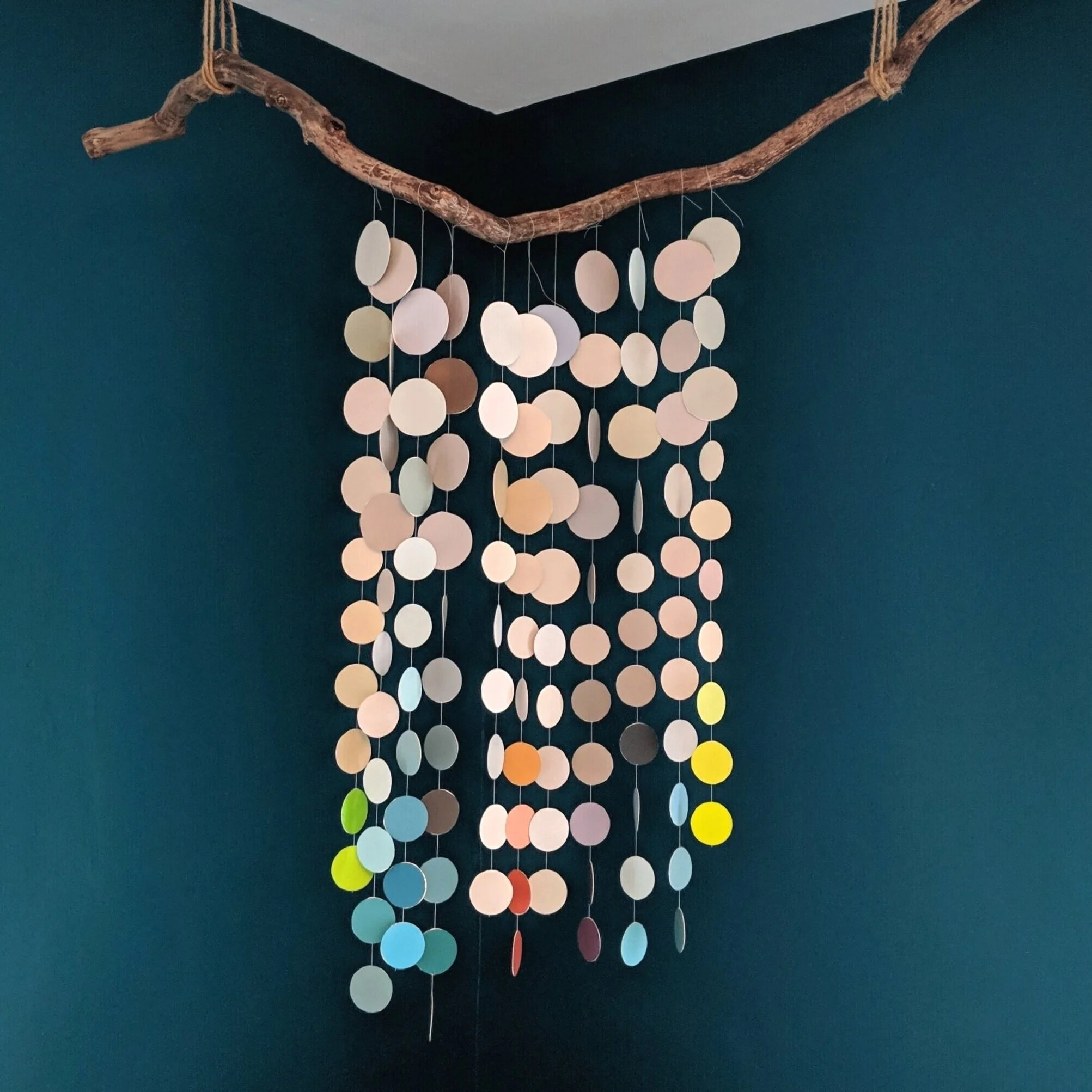
How to: DIY Nursery Mobile on the Cheap
When I was pregnant with my second daughter and couldn’t continue with my normal home renovations, I had to redirect my energy somewhere else. I spent some time reupholstering our dining room chairs, painting, and creating curtains for our front door and sidelights. Then I got the idea to create a mobile for her room. Today I’d like to share my process with you so you can create one of your very own at little to no cost!
How to Make a Nursery Mobile
When I was pregnant with my second daughter and couldn’t continue with my normal home renovations, I had to redirect my energy somewhere else. I spent some time reupholstering our dining room chairs, painting, and creating curtains for our front door and sidelights. Then I got the idea to create a mobile for her room. Today I’d like to share my process with you so you can create one of your very own at little to no cost!

As an Amazon Associate, I earn from qualifying purchases. This post may contain affiliate links, meaning I receive commissions for purchases made through those links, at no cost to you.
Materials:
- Paint chips
- Several heavy books
- Glue
- Thin string/thread
- Twine
- A branch
- Scissors
- Command hooks or Cup hooks
Step 1: Collect paint chips - lots of them!

Honestly, this step is kind of misleading off the bat - you don’t necessarily have to use paint chips for this project. You could really use anything that’s a similar thickness, like colored cardstock. Oooo… or you could draw a pattern on cardstock and use that! The world is your oyster.
For me, paint chips were the most logical choice because for some reason I never get rid of them when I grab them from the store, so I had a whole box full of paint chips for no reason. Until now!
Most of the paint chips in the box were colors I had used around our house, but I find it sweet that the bright colored paint chips are ones that my older daughter picked out. She’s also a paint chip hoarder, but can only reach certain colors at the store… which usually end up being the brightest ones. I like that she was able to have a part in this project for her sister.
There are two big benefits I see to using paint chips for this project:
You have soooo many colors to choose from!
They’re free!
Step 2: Cut paint chips into shapes

For this step, I found 3 different sizes of circular-shaped items and spent my free time tracing and cutting circles while watching TV.
Apparently, there are punches in different sizes of circles that you can buy, but by the time I realized that was an option I was already in the process of tracing my circles and didn’t want to start over.
As with Step 1, you don’t have to follow my process exactly. I chose to cut my shapes into circles to keep the design from getting too crazy, but that’s just my preference. Really you could use any shape or shape combo you want!
Step 3: Pair your shapes up

No, you’re not seeing double. Yes, this is the same picture from Step 2. I created this mobile over a year ago when starting a blog wasn’t even on my radar. Luckily I took some random pictures of the process that are certainly coming in handy now!
This step is where you should actually follow my rules a little more closely. Because we’re going to be stringing the shapes up in Step 4, it’s important to lay out your design before you break out your glue.
First, pair each shape up with another shape of the same size. Then, lay out your design how you want it strung together.
Step 4: String your shapes together
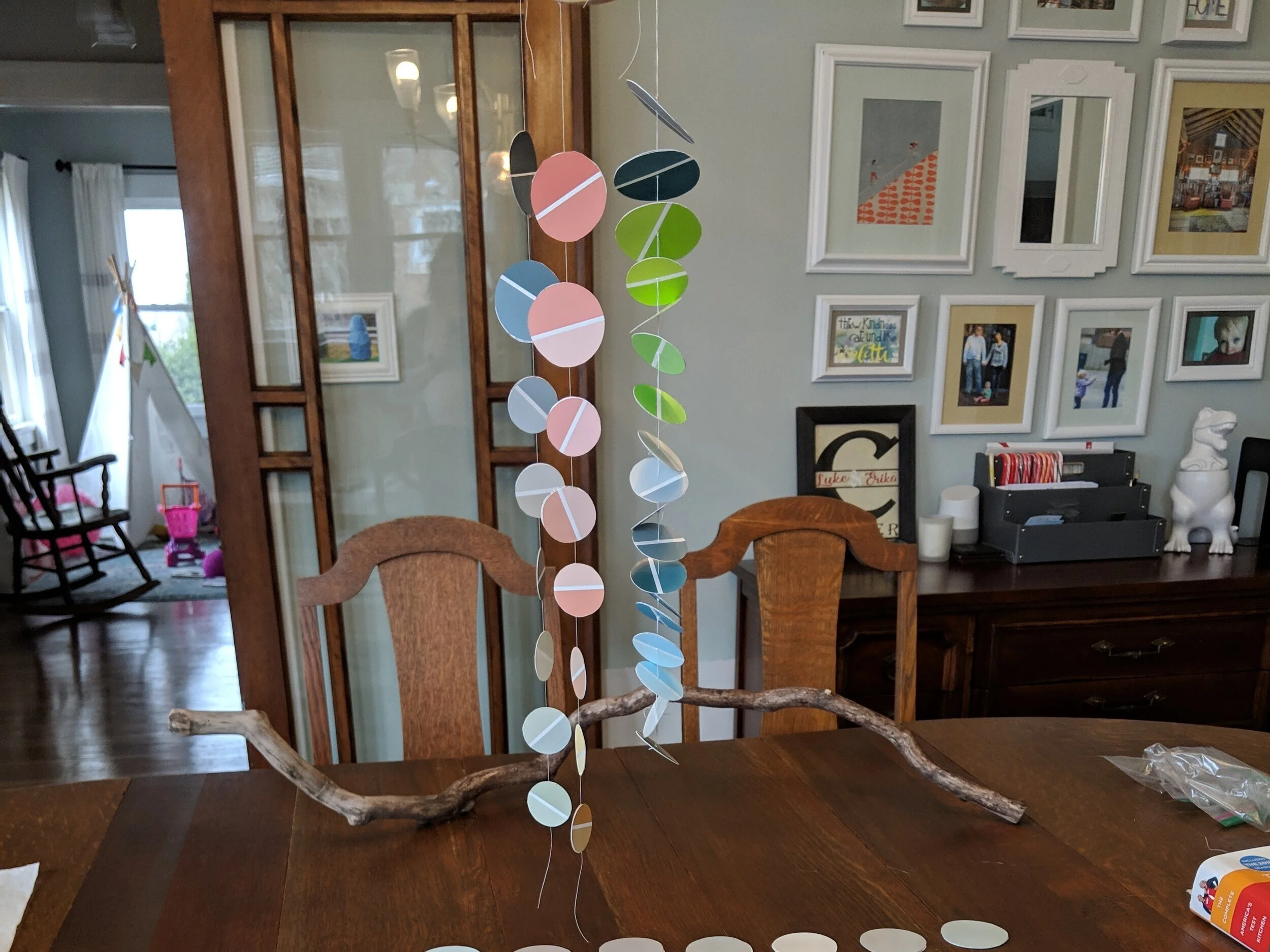
This is where I experimented a little with some of the shapes from my discard pile.
As you’ll see, the two strands on the left are hung with the string pressed between two shapes, where the string on the right is hung with the string thread (threaded?) through the middle of the shapes after they’ve been glued back to back. Either way works (this is YOUR mobile, after all), but I will warn you that the process on the right was MUCH more difficult. But I’ll give you the steps for both processes and let you decide which route you want to take.
For both processes, I cut a long piece of white sewing thread to begin - make sure it’s plenty long so you can string all your shapes and have room to tie it to your stick. You can always cut some of it off, but you can’t add more.
I used white sewing thread because I knew I wanted something thin and not super obvious. Also, it was something I already had around the house so it was virtually free! You could use other types of string or thread, but I recommend not using anything too thick or your shapes won’t be able to be glued together.
For the process on the left I put glue on the back of one circle, placed the string in the center, and placed the other circle on top. I did this for the whole strand, being sure to leave space between each circle. Then put a book on top of the entire strand as I worked on the other strands. Each time I finished a strand I placed a book on top of it and let it dry like that for about an hour.
For the process on the right I glued two circles back to back and put a heavy book on top of them and let them dry. Once dry, I took a needle and poked a hole in the center of each pair. Then, I strung the circles, tying a knot after threading each one so it didn’t slide down the thread.
Not only does the second process take more time, but you also need a lot more shapes because you’re hanging them horizontally. If you’re really committed though, you could end up with something awesome like this:

Step 5: Tie your strands to your support
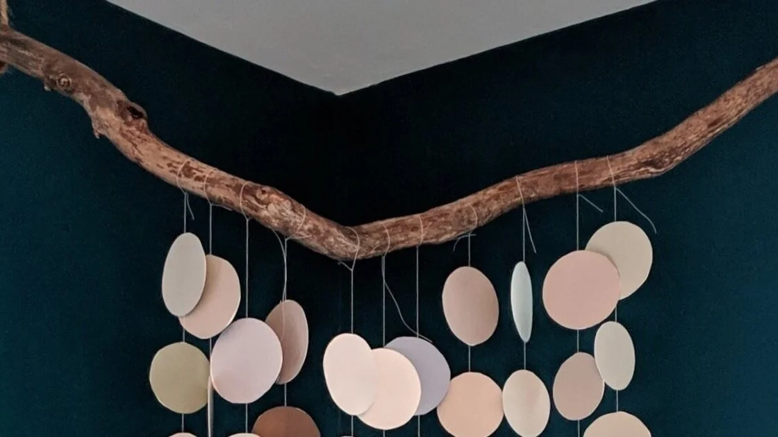
I love wood tones, so for my mobile, I found a really cool branch to use as my support (note: branches are also free) that I cut down on my miter saw. If you wanted a circular mobile you could use an embroidery hoop instead, or a dowel rod for something less “natural”.
I love wood tones, so for my mobile, I found a really cool branch to use as my support (note: branches are also free) that I cut down on my miter saw. If you wanted a circular mobile you could use an embroidery hoop instead, or a dowel rod for something less “natural”.
Step 6: Hang your mobile, sit back, and enjoy

Okay, this is where I actually had to buy a couple of things.
To hang my mobile, I bought some twine and cut two pieces of the same length (one for each side). Then I looped it around each end of my branch several times until it hung at the height I wanted. Finally, I used a couple Command Strip hooks and hung the mobile from the ceiling. You could also use cup hooks, but I prefer Command Strips because I don’t have to patch a hole if I want to take them down later.
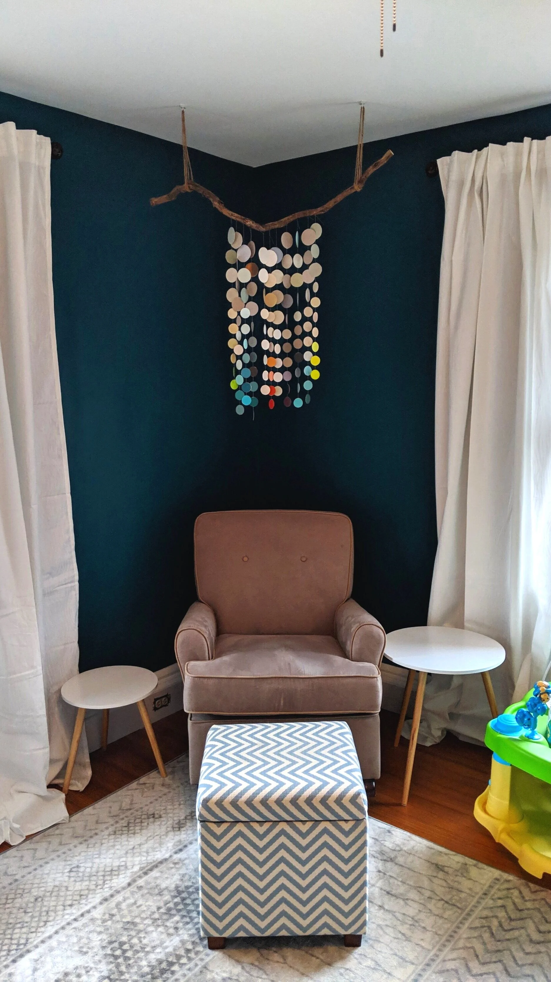
I love how the mobile turned out (and so does my little one!). I really enjoy sitting in her rocking chair with her and watching her watch the mobile as the strands slowly spin and sway with even the slightest breeze, revealing lots of different colors. Additionally, it brings me immense joy knowing I made something beautiful without breaking the bank!
The possibilities with this project are really expansive and you can put your own spin on it in so many different ways. I hope some of you will create your own mobiles while loosely following my steps and share your projects with me!
For more DIYs, check out these posts:
DIY Mobile with Paint Chips

5 Home Decor Trends I'm Loving in 2020
I’ve been spending a lot of time on Pinterest lately. Like, a lot more than usual. And I’m noticing some design trends that are really catching my eye. It’s very possible I’m behind the curve on these and most everyone already knows about them. But for those of you that don’t, in this post I’m going to talk about 5 trends I’m seeing a ton of right now that I’m really digging. Ready. Set. GO!
Hey all you cool cats and kittens!
Ya know… my brain told me not to say that and I should have listened. I regret my decision. I’m sorry.
ANYWAY, I’ve been spending a lot of time on Pinterest lately. Like, a lot more than usual. And I’m noticing some design trends that are really catching my eye. It’s very possible I’m behind the curve on these and most everyone already knows about them. But for those of you that don’t, in this post I’m going to talk about 5 trends I’m seeing a ton of right now that I’m really digging. Ready. Set. GO!

Cane/Rattan Furniture

Caning is making a comeback, ya’ll!
You may not realize it at first glance, but furniture using caning fabric has been around for a loooong time. If you think way back, you may remember your parents and grandparents probably had furniture with caning in their homes. And this trend is even older than that!
Look familiar?
But these days I’m seeing caning being used on more than just chairs. It’s popping up on the fronts of sideboards, on end tables, and even on headboards. And I’m really getting into it.

As I mentioned in my post about designing my home office, I’m being drawn more toward lighter wood tones, and I’m seeing a lot of that paired with caned furniture lately. I love the airiness and the more casual feel the cane fabric brings to the pieces it’s incorporated into.
The problem I see with all the popularity springing up with caning? It’s not exactly cheap. However beautiful, much of this trendy furniture can be pricey. Luckily, there are tons of tutorials popping up that teach you how to DIY your own cane furniture. And I’m totally on board!
Another trend stemming from the same family that isn’t DIY-able is rattan. Similar to caning, rattan is a natural, plant-based product that brings the earthy/airy/bohemian vibes straight into your home.

Rattan may even be more versatile than caning as I’m seeing it appear in even more places - headboards, light fixtures, chairs, daybeds, and this basket that I saw at IKEA and briefly considered putting on my head and running out of the store with.
Velvet
Mmmm… velvet…

While some folks don’t appreciate velvet (coughLUCIUScough), I think it’s a luxurious fabric and texture that can really step up a room’s game.
I’m noticing velvet more and more on couches and chairs (heck - I even bought a velvet chair for my office!), but it can also be used to add some drama and weight as curtains, or for a punch of color as a throw pillow. I’m really drawn to saturated jewel toned velvet fabric, but it’s versatile enough that you can easily find velvet items in more neutral tones too if you want to incorporate it more subtly.
While velvet can seem like a weighty and dramatic textile, pairing it with lighter elements can help bring it down a notch and make it more casual. Don’t believe me? Just check out the juxtaposition of that beautiful emerald green velvet couch with the light and airy rattan coffee table below.

Green Cabinetry
In recent years we’ve seen several varieties of kitchen cabinet styles, most popular being the classic all white, the formal tuxedo, and the more flirty pop of color on the island.
But lately I’m seeing a more daring use of color where people are using various shades of earthy green tones on all their cabinets - and I love it so much I’m tempted to do it in my own home!
Yes, I know that hearing “green cabinets” sounds a little crazy but just check out these beauties:
The green cabinet trend ranges from tones of soft greeny gray all the way to the other end of the spectrum to deep forest green and from the look of it you can’t go wrong with any shade.
Brass
In case you didn’t catch it, many of the cabinetry examples in the trend above feature brass hardware - because green and brass might just be a match made in heaven. But brass isn’t just appearing on cabinet pulls and knobs - it’s everywhere and it’s beautiful!

I know brass was big back in the day and got pushed aside for more “trendy” finishes like brushed nickel or oil rubbed bronze. And don’t get me wrong, you can still incorporate those other metals into your home, but give brass a chance! It’s not the outdated finish you’re picturing from the 80’s anymore.
The brass of today is being used in everything from light fixtures, to curtain rods, to the legs of chairs (and beyond!) in updated and fresh ways. It’s even being combined with velvet!

Unlike other metals, brass brings a warmth to the space. But don’t think it’s an “all or nothing” type of deal. You can use more than one type of metal in your home as long as you’re doing it with intention and each type of metal appears more than once in a space.
With that being said - give it a whirl! Buy a brass lamp or an end table with brass legs and see how you can make it work for you. I’ve already incorporated a little bit into our living room in my curtain rod and Lucius doesn’t know it yet but I’m not stopping there.

Macrame Plant Hangers
Maybe it’s because everyone has been stuck in quarantine with nothing else to do or maybe this has been going on longer than I realize, but I’m noticing a major uptick in the amount of macrame plant hangers lately. Whatever the reason, I’m glad it’s happening.

For someone who has little kids and cats, both of which like to eat and/or destroy plants, getting my plants out of reachable territory is a huge plus. Honestly, I don’t even have very many plants but seeing the beautiful designs made from these macrame hangers makes me want to fill every window.

Aside from the gorgeousness of the hangers themselves, plants are so beautiful and add such a sense of warmth to your home - how could you not want a reason to add more?
Final Thoughts
So there you have it - a post full of home decor eye candy that makes me want to blow my savings and BUY ALL THE THINGS! I hope you enjoy oogling these trends as much as I do because thinking about these beauties and how to incorporate them into my home is the reason I can’t sleep at night, and misery loves company.
Related Home Decor Trend Posts

Picking Exterior Paint Colors
I posted last week about how we majorly changed the appearance of the exterior of the flip house by limewashing it. While the outcome is a huge improvement from what we started with, it left the house pretty monochromatic and kinda blah. Well, now it’s time to shake things up by adding some color!
The Easy, No Mess Way to Choose Exterior Paint Colors
I posted last week about how we majorly changed the appearance of the exterior of the flip house by limewashing it. While the outcome is a huge improvement from what we started with, it left the house pretty monochromatic and kinda blah. Well, now it’s time to shake things up by adding some color!
In this week’s post I’ll walk you through the different color options and combinations we considered, how we tried them out without actually painting a thing, and what we decided on in the end!

Testing paint colors without painting anything
Let me tell you, picking exterior paint colors is intimidating.
With interior paint you can at least limit the number of people that see if you pick a hideous color, but exterior paint isn’t so easy to hide.
Painting a flip added another layer of complexity because I couldn’t follow my normal loooooooong paint color choosing process of trying several different samples and staring at them at different times of the day. I work full-time and have two little kids so finding time to go to the flip can be tricky. Not only that, but we’re in the home stretch of wrapping this flip up and are trying to stay on schedule, so I didn’t have my normal “ho hum” thinking time.
All these factors got me to thinking, “How can I test colors without actually testing colors?” The answer was simple - photo editing software!
I haven’t used Photoshop in years and my skillz are definitely lacking. I didn’t want to waste time relearning how to use it, so I researched some other resources. One option I considered was the Sherwin-Williams Visualizer, which allows you to upload a photo and outline certain areas that you want to test colors on. It’s a good concept, but it was a little clunky. What I ended up using was Canva, which is a free graphic design software platform that I was already familiar with - yay!
To test different colors I simply took the “final” picture I posted last week of the limewashed house and pulled it into Canva. I then drew blocks over the areas we plan on painting, resized them, and went to town picking out tons of different color combinations.
The great big world of color possibilities
Before I jump into showing you all the colors we tried out, let’s refresh our memories of what the house looked like before and after the limewash…

Pretty big improvement, but as you can see, the house was looking a little flat so adding color was a MUST.
Here’s what the house looked like with our different tests:
My initial idea was to paint the front door coral, but painting the shutters to match was too intense. To tone it down I changed the colors to charcoal gray in one example and white in another. When Lucius saw the gray and the white options with the coral door he thought the house was still looking too monochrome. What a buzzkill.
But mark my words, I WILL get my coral door one day! You just wait….


Before I share the next color combo, let’s just take a moment to laugh at those ridiculous bushes. If you squint a little they look real-ish… right? This method of picking paint cracks me up with the combination of color blocking on top of real-life photos, but hey, it served its purpose and saved us time and money! Plus, it gave me some laughs.
In the next example, the pink door with blue was kinda fun, but I just wasn’t feeling it 100% for this house. I could see it working on a different house though!

I was pretty drawn to the red door below, but again, Lucius thought the white was too monochrome. Seriously guys. Buzz. Kill. I’m tellin’ ya.
Side note, in case you didn’t notice, I tested out some different, and equally realistic looking, landscaping below.

I actually really liked black/yellow/white combination in this picture, but I felt like it was a little busy with the other factors going on on the exterior of this house (the texture of the brick, the 3 different types of windows that unfortunately aren’t in the budget to replace) so I kept on testing!

I love teal so I couldn’t help but try a few combos with a couple of different shades of teal in the next few pictures.


So many options, and I didn’t even share all of them!
At this point I felt like I had enough examples so I ran them past Lucius and there was one mock-up that stood out from the rest for both of us.
And the winner is….
…..the example in the very last picture! But before we set anything in stone we continued to bounce some ideas off each other and made a few tweaks to get it juuuuuust right. Or, as right as it could be with color blocking.
First off, we decided to paint the door white and the things next to it (they’re not really sidelights - just pieces of wood) teal instead of the other way around. We also color blocked the window sills and liked how much it made them pop, so we’ll be painting those.
To make take it a step further and get it as close to the real thing as possible (plus, let’s get real, I was having fun playing around), I added some makeshift lights on either side of the door and updated the address numbers to something more modern.
Lastly, I made the doorknob and knocker oil rubbed bronze because apparently I didn’t get the memo that the doorknob wasn’t going to stay brass. The disgusted face Lucius gave me when I thought he was going to leave the brass doorknob was priceless though.

Testing the paint colors in this way wouldn’t work for every scenario. For instance, if you were using a picture with a bunch of stuff in the way or needed to color block a ton of areas it’d be a bit of a pain. But for this project it was the perfect way to sample lots of options.
Because I only had a few areas I’m painting and they’re simple shapes to outline, this method was really simple and it gave me the ability to let my mind run wild and try out tons of different possibilities that I would never have considered if I were testing the paint old school style.
I’ve actually started painting it already and IT LOOKS AMAZING!!! I want to share a sneak peek SO BAD, but I’m not going to juuuuuuuust yet.
We’re crazy close to being done with this property and when it’s complete (we’re shooting for a couple of weeks from now) I’ll be sure to post tons of pictures of the inside and out and even throw in a budget breakdown of what it all cost. Until then, I’m gonna go find something else to color block…

Related House Flipping Posts:
How to Choose Exterior Paint Colors Without Paint

How To Limewash Your Brick House
If you’ve read some of my previous posts, you may have come across the post where I wrote about the flip that we bought. In that post, I talked about painting our little brick flip house white. Well, I’m excited to say that now it IS white! But I didn’t end up painting it - I limewashed it!
How I Limewashed our Flip
If you’ve read some of my previous posts, you may have come across the post where I wrote about the flip that we bought. In that post, I talked about painting our little brick flip house white. Well, I’m excited to say that now it IS white! But I didn’t end up painting it - I limewashed it!

What is limewash?
You may be asking yourself, “What the heck is limewash!?” Well, I’m here to fill you in!
At a high level, limewash is essentially crushed limestone that is combined with water to make a wash. It’s a method that’s been around for centuries. When applied to a porous surface (like brick), it creates a chalky, matte finish. In the picture above I’ve only applied one coat, but you can apply multiple coats for a more opaque finish.
How is that different from whitewash?
There are actually lots of differences between limewash and whitewash. Allow me to break it down for you.
Going Green: First of all, limewash is environmentally friendly. In fact, it’s also mold-resistant, so once applied you shouldn’t have to worry about power washing that green fungus off the side of your house! On the flip side, whitewash is made with diluted water-based paint, which is pretty chemically and not so great for the environment.
Permeability: Limewash penetrates the brick, which means it won’t peel with time whereas paint never truly soaks in and can peel and flake after a couple of years. Limewash will erode eventually, but it takes much longer and can actually end up making the brick look antique and even better. But if you don’t like how it looks once the limewash starts to wear off, you can always apply more on top.
COST!: The ingredients for limewash are incredibly inexpensive. One 50-lb bag of hydrated lime cost us around $8. The only other ingredient is water.
Color: Limewash really only comes in one color - white. You can add pigment, but I didn’t explore that option for our house and didn’t see a lot of “how to’s” out there so I’m not sure how tricky it is. Whitewash on the other hand can technically be done with any color of paint.
Safety: Limewash is highly caustic and will burn you if it touches your bare skin. Paint on the other hand is… paint. No big deal.
Why did we choose limewashing over whitewashing?
Obviously, there are pros and cons to both limewashing and whitewashing. But how do you choose one method over the other? I think it’s really up to personal opinion. After hours of research, there were several big reasons that pushed me to give limewashing a try.
I knew I wanted the brick to be white, so color wasn’t an issue.
I really like the matte finish of limewashing. However, it’s worth noting that you can get a matte finish if you were to use flat paint for whitewashing.
I had never tried this method before, so it was definitely intriguing to try something new.
COST! Since this is a flip, we’re always focused on the budget. But even if it were my own house it’s just my nature to be sensitive to how much things cost.
And the biggest factor: permeability. Knowing that the limewash would stay on the surface of the brick for longer, and may even look better over time, was a big plus. Even though I won’t be living in this house, I want to do right by the person who eventually buys it, so the option with the proven longer-lasting result felt like the right way to go.
How did you do it?
Ah yes, the the fun part, where I give you a step-by-step first-hand experience as to how I limewashed our house! Here’s what you’ll need to get your limewashing on -
Materials

As an Amazon Associate I earn from qualifying purchases. This post may contain affiliate links, meaning I receive commissions for purchases made through those links, at no cost to you.
- Hydrated lime
- Large paintbrush (mine was 4 inches)
- 5-gallon bucket
- Hose w/ spray nozzle
- Gloves
- Long sleeves
- Mask
- Safety goggles
- Long stir stick or drill with mixing paddle
- Nice weather - I know this isn’t really a “material”, but it’s super important for a nice finished product! Avoid weather that is too cold or too hot. You should also try to avoid applying your wash in direct sunlight (especially on hot days) as it can dry out too fast, or on overly humid days (which will slow down the drying process).
Step 1 - Preparation

When preparing to do any finish on the exterior of a home it’s important to get rid of any grime or dirt that could cause a barrier between your exterior surface and your paint/wash. Several days before I limewashed the house, Lucius took some time to power wash the exterior to get it so fresh and so clean, clean.
It would have been smart to remove the shutters before the power washing but, meh. You live, you learn (and now you have Alanis Morissette stuck in your head). Above is my father-in-law helping me with a tricky screw on the shutters before I got started limewashing.
Step 2 - Mixing your wash

The main ingredient for this project is hydrated lime. Everything I read makes it sound like this is available at any hardware store, but in my experience, it was crazy hard to find! I was thisclose to buying a bag off Amazon for a lot more when we finally found a store that carried the brand above.
When I say this project is cheap, I mean it. The entire 50 lb bag cost us less than $8! And although only the front facade of our house is brick, we barely made a dent in the bag.
As previously mentioned, lime is really caustic. The hydrated lime comes in a fine powder that gets EVERYWHERE so before you start mixing your wash cover yourself up! Throw on some pants, long sleeves, gloves, goggles, and a mask.

I don’t know why i felt the need to smile in this picture.
To mix your wash you need an 80/20 ratio - 80% water, 20% hydrated lime. I poured water and the hydrated lime in the correct proportions into a 5-gallon bucket until it was pretty full, then took my drill with the mixing paddle and mixed it up.
If you’re limewashing a whole house, several of the sources that I read talked about how it’s worthwhile to mix all your wash at once in a wheelbarrow so you have a consistent batch. You can mix batches as needed, but you run the risk of one batch being more opaque or transparent than the next. Since our house is small and only the front is brick, I didn’t think I’d need more than one small batch.
I don’t know why but I was anticipating it to be MUCH more difficult to mix. It was actually very easy and could be done with a long stir stick if needed. The most commonly used comparison I found when researching this process was that your final product should be the consistency of whole milk.
Step 3- Application
Changing the exterior of your house is pretty terrifying, especially with a process you’ve never done first-hand and that isn’t easily reversible if you dislike the end product. But let me tell you that limewash is insanely easy to apply!
To begin, wet the brick down with your hose. I recommend wetting it down in sections as you work your way around the house so it doesn’t dry before you get to it. Then, start at the top and work your way down in sections.
You can apply your limewash liberally, just take care not to drip a ton on any concrete or porous surfaces below that you don’t want limewashed. Depending on the look you’re going for, it’s not necessary to get in every nook and cranny.
Below is a quick little video I shot as I was applying the wash so you can see first-hand how easy this is.
As you can see, I wasn’t shy about loading up my brush and just slapping it on. I did try to avoid big drips on the lower bricks because I didn’t want them to dry before I could smooth them out, but even the inevitable drip here and there ended up being a nonissue.
Something good to know ahead of time - the wash goes on very transparent. Don’t let this scare you! I only did one coat on the whole house and as you can see in the picture below, as the wash dries it gets more opaque.

In fact, you can do multiple coats of the wash to create a completely opaque look.
This project is not only inexpensive and easy, but it’s pretty fast! Because you don’t have to be super precise with your wash (and if you’re going for an uneven look it’s even less important to apply wash to every square inch), this project only took me around 3 hours! Granted, only the front of our house is brick, an entirely brick house could be limewashed in a day or two, especially if multiple people were taking part in the limewashing party.
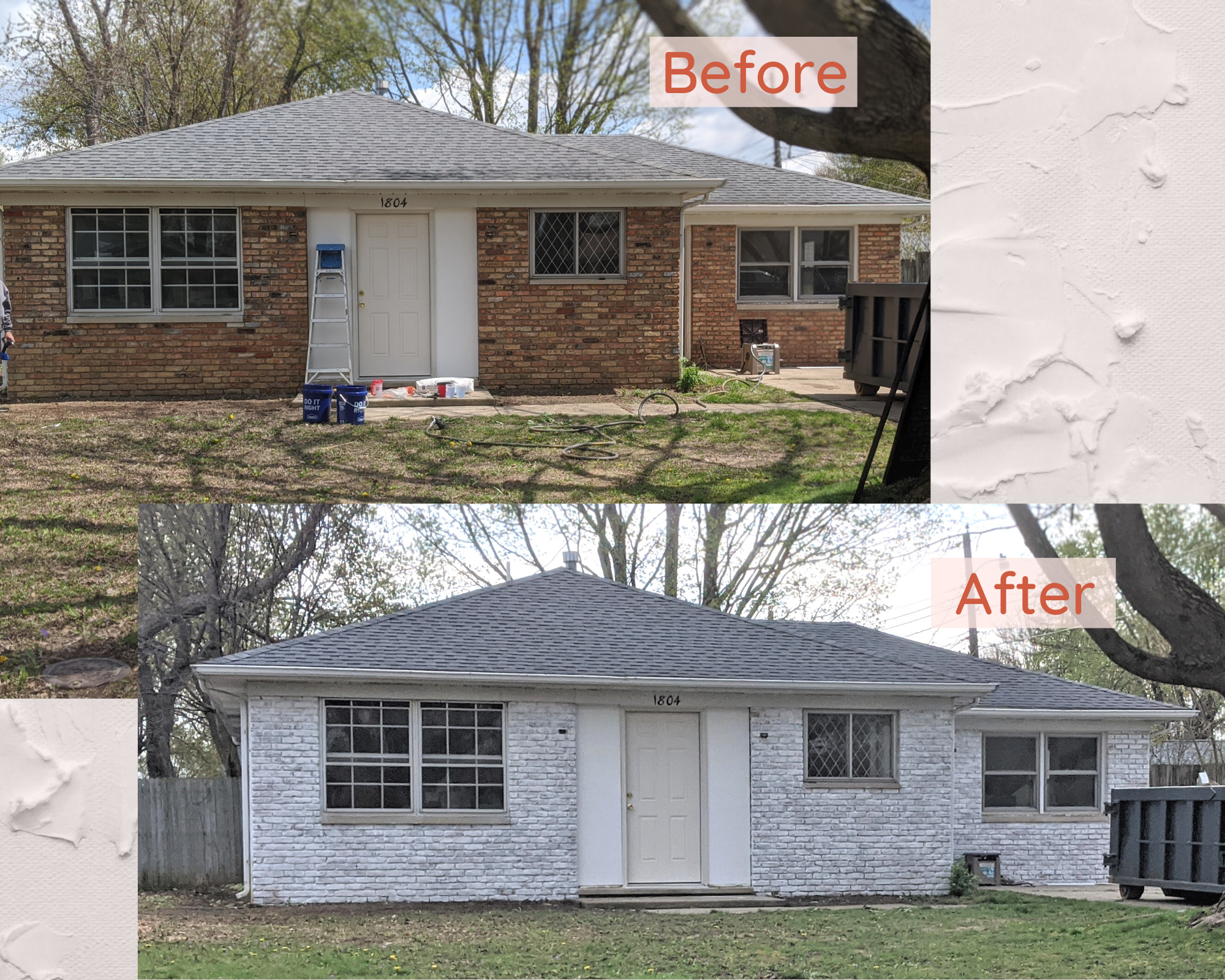
Admittedly, the house is looking pretty monotone right now, but have no fear! I’m deep in the brainstorming process of adding some pops of color and landscaping, which this house desperately needs.
We hope to finish up this flip in the next few weeks and I most definitely plan on sharing lots of photos when it’s all complete. Keep checking in so you can check out the final product!
Related Flip House Posts:
How To Limewash Your Brick House

Mini mantel makeover
By now you’ve seen the lay of the land and you’ve probably noticed the massive mantel we have on the brick wall in the living room. What you may have not noticed is that since we’ve moved in, we’ve actually made some updates to it…

By now you’ve seen the lay of the land house and you’ve probably noticed the massive mantel we have on the brick wall in the living room. What you may have not noticed is that since we’ve moved in, we’ve actually made some updates to it.
When we moved in, we were greeted with this:

The picture above is from the listing so the furniture wasn’t actually there when we moved in, but it’s the only one I have with the shelves still there since we knocked them out the next day. I considered keeping them for about 5 seconds, then I thought about having to dust them and about little kids taking everything and anything off them and decided that taking them out would be better for our family, and for my sanity.
If there’s anything I’ve learned renovating our past houses, it’s that our family certainly favors function over form. There are tons of great décor ideas out there, and I can certainly appreciate the aesthetic, but if it’s going to require me to dust more stuff or constantly worry that a kid is going to destroy it, it’s not for me. These shelves just weren’t functional for us, so out they came! Not only that, but I also felt like they were pretty busy considering they were in front of a brick wall.
Once we removed the shelves, we realized there was a charming little wood storage area built into the brick that was previously boarded up. WHO IN THEIR RIGHT MIND WOULD COVER THAT UP!?
Once we got settled, we lived with the mantel as shown above for a few months, but during that time Lucius was spending most of his freetime walking around the room convinced he could feel a draft. Seriously, he would be in the middle of talking, stop, and run his hands over the mantel and exclaim, “Come here, don’t you feel a draft!?” I thought he was a little nuts.
Okay, I might have felt a little draft too, but he still looked crazy.
To stop the insanity, I went along with Lucius’ plan to take the mantel apart and try to seal whatever was letting in a draft. And what we found when we popped the front of the mantel off was…

…another mantel!
It’s hard to tell in the picture above, but the mantel underneath was a little rough and definitely uneven. It also wasn’t as deep as the old mantel, so putting things on it would have been tricky. Therefore, once we filled the gaps (yes, there were actually some gaps seeping cold air), we opted to put the mantel back together.
However, if you scroll up a couple of photos you’ll notice the narrow strips of wood on the old mantel facade. I felt like these were a little busy (like the shelves), unnecessary, and more farmhouse chic than I could handle, so I was happy to take them off for good.
Sidenote, in the picture above you’ll also notice that the previous owners didn’t carry the German smear to the brick behind their TV! I’m not quite sure how to update that area so it blends nicely yet, but it haunts me daily.
Once we put the solid piece of wood back on the face of the mantel, I had to fill nail holes, prime and paint. Then I put all my decor back.

After living with the mantel as seen above for several months it was starting to feel a little busy, like all the decor items from the ends of the mantel were creeping towards the TV. Plus, I really needed to dust up there so that was good incentive by itself to pull everything down.
I started by taking everything I could off the mantel - but there were a couple of items that had to stay. The Google Home lives up there and luckily is inconspicuous enough for me not to mind too much. The lamp unfortunately also has to stay on the mantel for now. I plan to replace it with a floor lamp when I start focusing more on this room but we have (many) other areas of the house we’re working on at the moment.
Next, I shopped around my own house and gathered all my decor items from the mantel and the haphazardly designed bookshelves in the playroom.

I call this look: Unpack all the boxes and put stuff wherever it fits
Actually, that’s a good tip - if you ever want to refresh your decor, shopping around your own house is a great way to start. Sometimes taking something from one room and putting it in another can completely transform how the space/the item looks or feels. Also, it’s a good activity to keep yourself busy during quarantine that doesn’t involve spending any money or leaving the house! #winwin
Since I knew I had to keep the lamp on the mantel, I needed to find a way to balance it on the opposite end with something with the same visual height and weight. Here was my first attempt:

I felt like I was on the right track, but it still seemed a little more cluttered than what I was hoping for. I did, however, really like the introduction of the plants on either end of the mantel so I knew I wanted to work those into the end product. One note - if you don’t have identical items to put on either end of your mantel, don’t stress! It’s certainly not a requirement for each end to be symmetrical and would actually be kind of boring.

I realize the change from the previous set up is pretty subtle, and that’s because I didn’t change a whole lot. Really this is just an experiment in seeing what works and what feels the best to you. I was still feeling a little bit of that creep going on with this set up, so I tweaked it one more time.

And this is the set-up I ultimately landed on, except I switched the tan colored items at a day or so later. I like this one the most in how the larger picture echoes the height and the contrasting colors of the lamp. Obviously I have my little plants up there and then I threw in a rock and a box in a similar tone/shape to mirror one another. Lastly, I put a small candle on the left-hand side of the mantel to balance out the Google Home.


As for the leftover decor items…

The bookshelves in the playroom got a little makeover too!
Admittedly, these bookshelves don’t look how I would ideally want them to, but I’m definitely restricted with how much I can put on each shelf since they’re glass. Plus, there’s still those stupid mirrors on the back that make them look busier than they are. Once we update the built-ins and remove the glass I’ll be able to add some books and really style these the way I’d like. But at least for now they’re looking better than they did before.
So here we are, after a pretty quick, easy, inexpensive update we have our updated and, more importantly, SIMPLIFIED mantel so we can focus more on all that glorious, glorious brick and that amazing fireplace.
Related Mantel Decor Posts

Designing a Home Office
I never really thought I’d need a home office, so until recently I hadn’t given much consideration as to how I would want it to look if I were to create one. But now that it was actually happening, my mind was buzzing with possibilities. In this post (and subsequent posts on this subject, since I’m just in the beginning stages of this room makeover) I’ll give you a sense of how I tackle a room and walk you through my overall design thought process start to finish.
How I Designed My Home Office

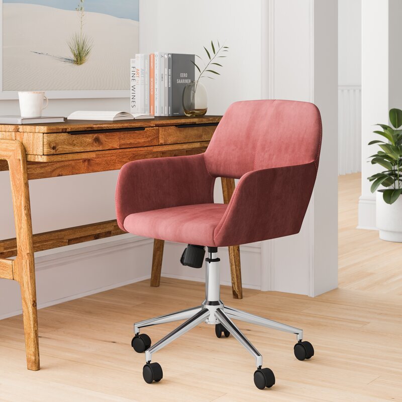
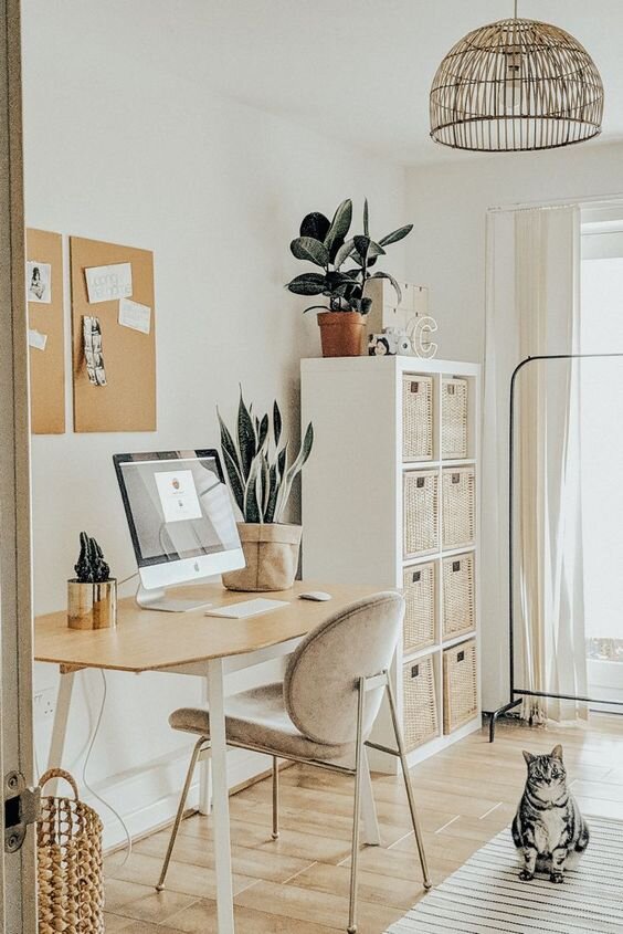
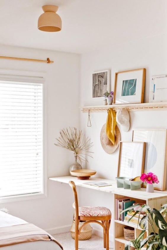
I mentioned in our house tour that I, like many people these days, have been working from home. During this time, the living room has been my office. (Picture me sitting on the couch in my sweatpants with a cozy blanket and my laptop.)
Well, before COVID-19 when I was only working from home a couple days a week, the couch worked just fine. But once I got the call that I’d be working from home consistently for who knows how long, Lucius suggested I get a desk and set up an office in our previously empty spare room. I was on board right away. Not only because by the end of the day working from the couch I usually feel pretty gross and lazy, but Lucius telling me to buy house stuff? Okay!
I’m the type of person who likes to do lots of research before I commit to anything. I like to know what I’m getting myself into and I like to avoid the unexpected when at all possible. So I figured since I’m starting at ground zero for this project, why not take you guys along as I plan out my home office?
In this post (and subsequent posts on this subject, since I’m just in the beginning stages of this room makeover) I’ll give you a sense of how I tackle a room and walk you through my overall design thought process start to finish.

As an Amazon Associate I earn from qualifying purchases. This post may contain affiliate links, meaning I receive commissions for purchases made through those links, at no cost to you.
Finding your inspiration
I never really thought I’d need a home office, so until recently I hadn’t given much consideration as to how I would want it to look if I were to create one. But now that it was actually happening, my mind was buzzing with possibilities.
One of the biggest pieces of advice I can give is when you’re starting to design a room, don’t overthink it. This can be hard advice to follow, especially if you’re like me and tend to overthink just about everything. But when designing a room I try to force myself to let one thing be my inspiration and build on that, otherwise you can get really overwhelmed really fast.
For this room, the biggest necessity was of course a desk and a chair, so that’s where I started, but really ANYTHING can be your inspiration - it doesn’t have to be a big piece of furniture or the color you plan to paint your room. It CAN be those things, but your inspiration could also be something as simple as a vase or a painting that you like.
Since this room was empty to begin with, using the immediate necessities as my inspiration was the most logical choice for me.

I knew my minimum requirements were to have a desk that fit my computer and all my stuff and a chair that I could comfortably curl up in. (Even when I work in the office at work I tend to sit cross-legged in my chair, so I certainly wouldn’t expect anything different at home.)
Being the cheap budget-conscious person that I am, I started looking at desks and chairs on Facebook Marketplace. I use Marketplace a lot like I use Pinterest to organize my thoughts. I saved everything that was intriguing and then looked at them as a group. This helped me figure out the style I was most attracted to for these staple items and I highly recommend using this technique to figure out your style, too.
Here’s how you do it: hop on Pinterest, search for the item you’re after, and pin anything that looks even remotely interesting to the same board. Once you’re done pinning, look at your board as a whole and you should start to notice some recurring themes/trends. You can take it a step further and either delete anything that doesn’t fit into the general theme or create a second board and pin your favorite items to that. Then go searching in real life for items similar to what you were most drawn to!
When I looked at all my saved items, I noticed I was saving a lot of light colored desks and velvet jewel-toned desk chairs so I figured that was where my head was at and I ran with it.
Because I have commitment issues, I continued to brainstorm options to make sure I was buying exactly what I wanted. We ended up taking a trip to IKEA to see what they had available too. This trip was a great way to also figure out what size desk felt best by sitting down and “testing” out several options.
I was most drawn to the Hilver desk and I was really considering pairing it with the Ekero armchair.


We almost bought them, except we didn’t have enough room in the car with both kids. We figured Lucius would just have to take a quick trip back the next day.
This was actually a blessing in disguise because I wasn’t 100% sold on either of those items. The desk felt a little too much like a table and I was concerned with the chair being difficult to move in and out since it didn’t have wheels. There were actual desk chairs at IKEA, but I wasn’t really in love with the look of any of them.
As an Amazon Associate, I earn from qualifying purchases. This post may contain affiliate links, meaning I receive commissions for purchases made through those links, at no cost to you.

One of the most exciting things about designing this room is that the only person I have to think of is myself! Normally I’m trying to design a room with Lucius in mind too so I have to be a little more thoughtful in some of my choices. It’s not very often that I get to run uninhibited with my ideas. With that being said, I totally bought a pink velvet chair AND I LOVE HOW IT LOOKS!

Building on your inspiration
For the past month or so (I’m losing track of my days at this point so it could be longer) I’ve been working in my new office. It’s still lacking quite a bit considering all I’ve done so far is bought the necessary furniture, stole a lamp from our bedroom, threw down an area rug, and hung a mirror I had lying around.

But of course I’ve been daydreaming and planning like crazy! Now that I have my staple items, my wheels are really turning.
My next tip: once you have your main source of inspiration, use that to drive your design. You can pull colors or patterns from your inspiration piece and use them elsewhere in the room. You can look on Pinterest for rooms with similar items as your inspiration piece(s) and create a board to pin images that get you excited and pull ideas from there. You might even realize that what you thought was your original inspiration shifts to something else once you start building up some reference images.
Here are my thoughts for this room…
Maybe it was the trip to IKEA, but I picture this room being somewhat Scandinavian design inspired: bright and airy, small bursts of color, natural wood tones, clean lines. I already had the desk with wood tones and the chair with my burst of color, so I was on the right track. Below are examples of some inspiration photos.

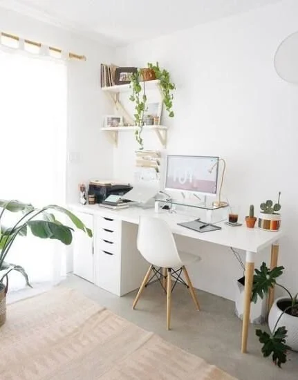

But I also want a little more dimension and excitement in the room than what you see above. I considered doing wallpaper in here but I’d like to save that for the nursery once I get to updating that room. And if you haven’t noticed, I really like trying new/different wall treatments so in this room I’m going to draw a pattern with Sharpie paint pens!
I’ve been obsessed with the pattern below lately. It’s a little bit art-deco but I think I can make it work with the Scandinavian-inspired elements.

My plan as of right now is to paint the walls a light gray/off-white color and draw the pattern on the wall that my desk is facing using a gold paint pen. The design could end up being too in your face if it were black or high contrast compared to the wall color, so I think the gold paint pen with the light colored paint will help make the pattern more subtle.
Below is an awesome example of a Sharpie paint pen wall using the gold pen and a really cool design.

I have a strange addiction to mindless, tedious tasks (painting rooms, peeling wallpaper), so this undertaking doesn’t scare me in the least. In college I even created a conceptual art piece where I made a tally on a piece of wood for every dollar I owed in student loans!

This represents one student loan. I actually made one for each of my loans! Apologies for the terrible photo. And yes, it currently lives in my garage because I graduated college years ago and don’t know what to do with it but can’t seem to throw it away.
The point being, if I’m feeling really crazy I might even draw on all the walls! We’ll see how difficult it is and how much I like the design.
Since the desk has some strong lines in it and the wall pattern is very geometric, I’d like to switch out the current mirror with a simple round mirror. I’ve been stalking this one at IKEA for a while now.

I whisper sweet nothings to it every time I pass it in the store.
I think the circular shape of the mirror will really help soften up some of those hard lines and tie in nicely with the softness of the chair. Plus, it has more of the wood that I’d like to pull into the room.
I’ll also need a new desk lamp so I can put the one I’m currently using back in our bedroom. Here I might introduce some more natural materials like stone or at least go with a softer, rounder silhouette for the lamp. Here are a few ideas:


Rounding out the room
Now that I have my office space somewhat planned out, there’s a whole other two-thirds of the room to consider! We planned on turning this into a guest room originally and I’m confident this space can still serve that purpose. It’s just a matter of working it into the overall design.
Obviously to make this into a guest room we’ll need a bed.
The natural wall where you’d place the bed is actually where I’m setting up my desk area. I could put my desk elsewhere in the room, but I figured since this will primarily be used as my office I should make it the most inviting space possible for me - and this wall gets the most light and has the best view. With that being determined, I have to rethink the bedroom portion of the room.
I think a normal bed might be a little awkward in the space available, but a daybed or stylish sofa bed could work! Apparently I’m pretty into jewel-toned velvet right now in general, because I’m really feeling this sofa bed:

I’ll also likely bring some end tables, maybe a footstool, and a dresser into this room. I’ve been thinking about stealing the dresser from the nursery and putting it in this room instead too.

I picked this dresser up from a thrift store years ago and refurbished it. I love it, but it can be difficult to open and I figure once our younger daughter will want to start dressing herself she’s going to have a heck of a time getting to her clothes. Plus, I think this dresser will fit nicely in the spare room both in style and function.
In a perfect world this room would have hardwood floors and I would have an awesome area rug in place of the carpet that’s in there currently. Replacing the flooring in the house is pretty far down the line, so for now I’ll just keep dreaming of what’s to come. I’m picturing a natural fiber rug, but I could be swayed for something with a design…. don’t even get me started on rugs. I’ll go down a rabbit hole I might never come out of.
Finishing touches
Of course the room wouldn’t be complete without some artwork on the walls and just some general decor items so I’ll be sure to add those once I get to that point. In the meantime, I have one last piece of advice: be comfortable changing your plans.
I find that a lot of times when I’m updating a room I’ll think I’m in love with an item I’m planning on buying or an idea I’d like to run with but once I make other updates it just doesn’t make sense in the space anymore. And that’s okay!
We’re not perfect and you can’t expect to get it right on the first try. I’m sure some of the things I’ve shared in this post won’t make it in the final room. Flexibility is key to winding up with an end product that flows. And at the end of the day, the point is to make yourself happy and to create a space that you love.
Related Office Design Posts
How I Designed My Home Office

The 1927 American Foursquare
We put our house on the market and moved so quickly after announcing to our family and friends that we were going to make that our forever home, that I think we left many of them baffled as to the sudden change. Most people didn’t get a chance to even see the listing – let alone how the house looked when it was complete. So I’d like to take the opportunity now to show the before and afters and give those who know us personally, and those who don’t, a peek at how we modernized our 1927 American Foursquare, while still keeping its charm.
How We Modernized Our 100-year-old Home
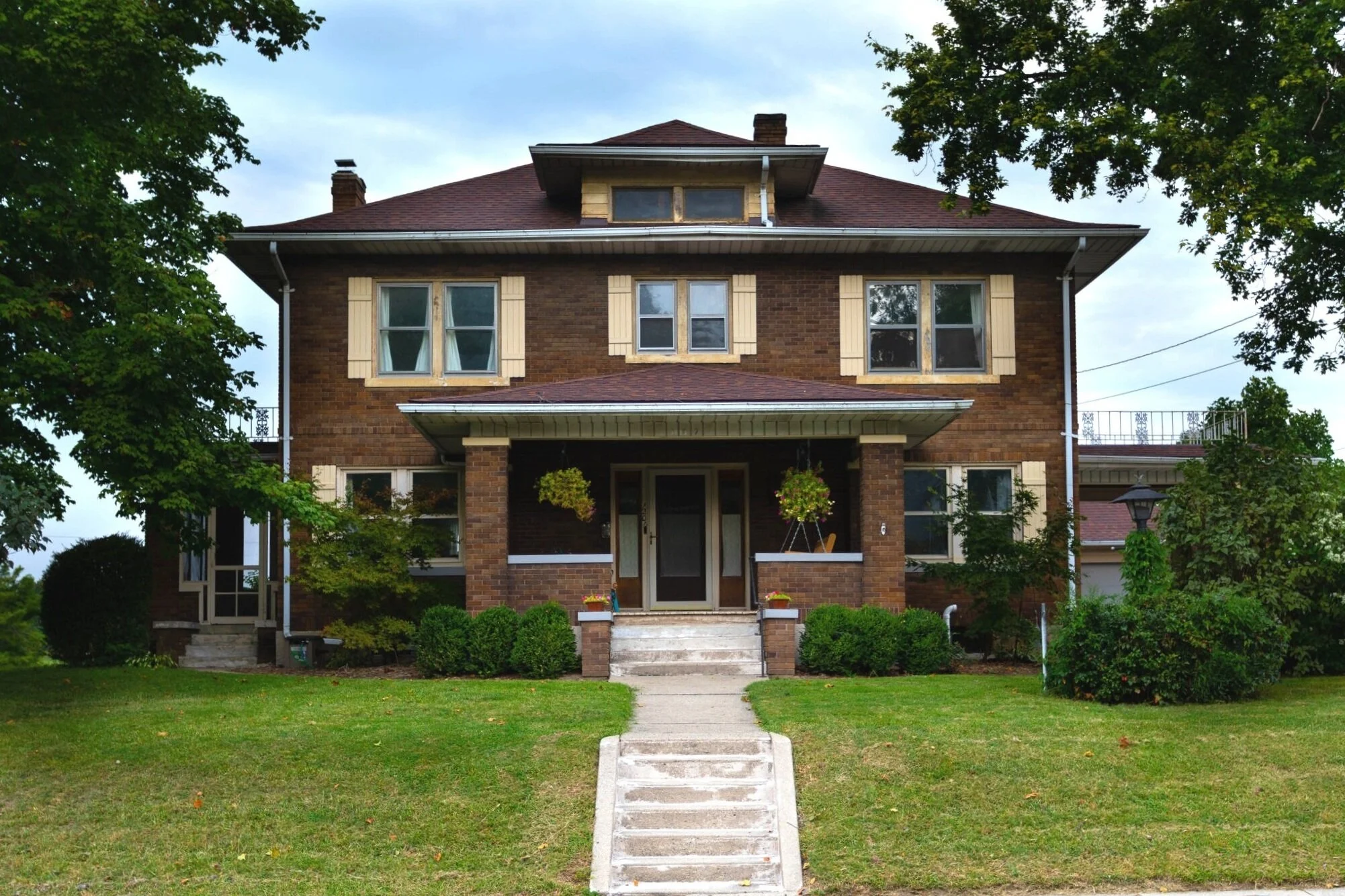
As I’ve mentioned before, we’ve only lived in our current house since October 2019. Our move was pretty sudden and unexpected.
We actually hadn’t planned on moving from our previous house… ever. Seriously. A couple of months after we decided to make our former house our “forever home”, we had to majorly shift gears and start looking for a new house.
The decision to list our house was made on a Sunday night and we had it listed the following Wednesday. The first day our house was on the market we had 10 showings and 3 offers! I barely had time to clean, let alone style and declutter the house the way I would have preferred.
We put our house on the market and moved so quickly after announcing to our family and friends that we were going to make that our forever home, that I think we left many of them baffled as to the sudden change. Most people didn’t get a chance to even see the listing – let alone how the house looked when it was complete. So I’d like to take the opportunity now to show the before and afters and give those who know us personally, and those who don’t, a peek at how we modernized our 1927 American Foursquare, while still keeping its charm.
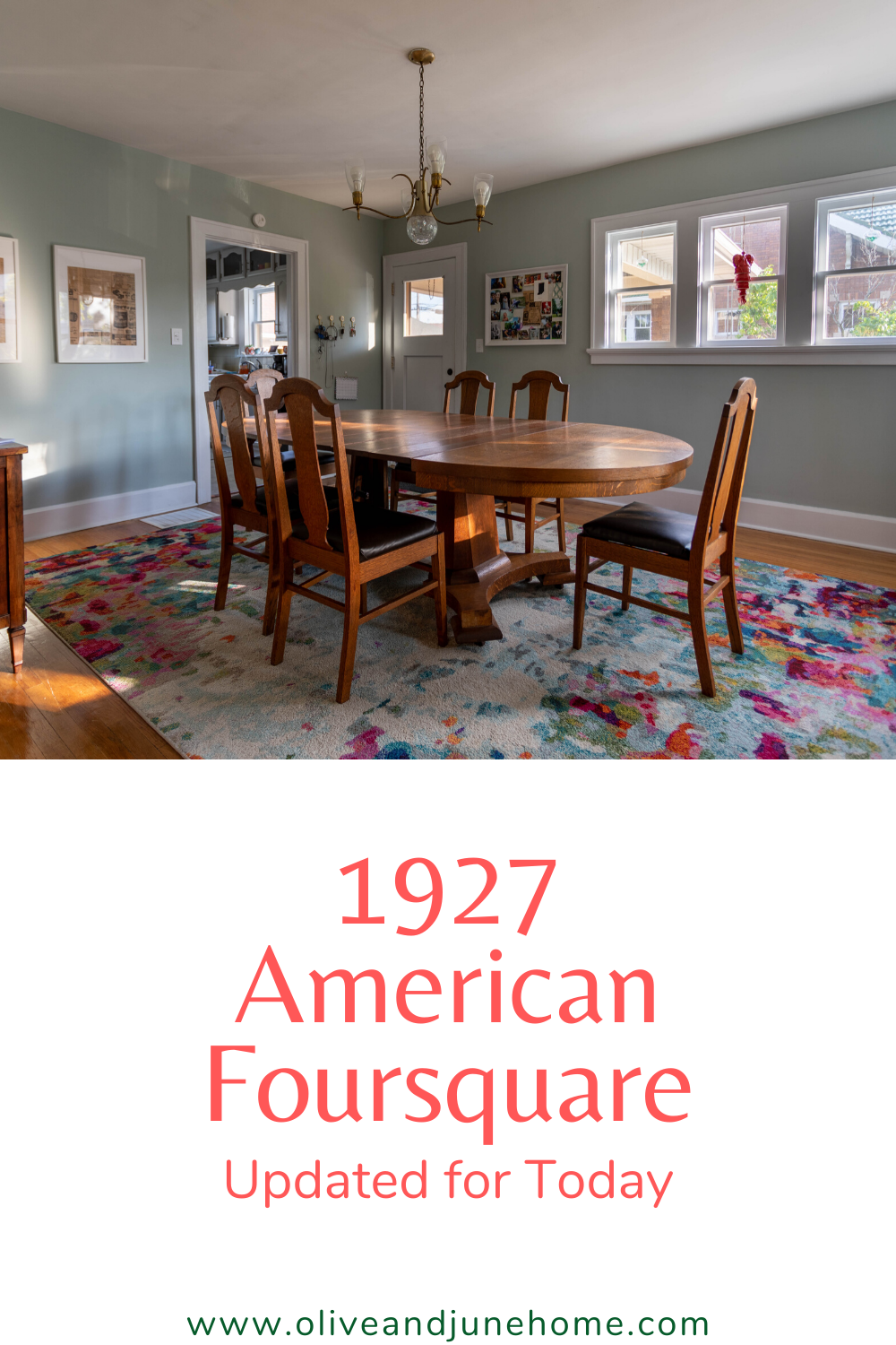
As a side note - if you love checking out old houses like I do, I highly recommend the Instagram account Cheap Old Houses where they highlight old houses across the country, typically for sale under $100k. I also wrote a post where I got the opportunity to tour a gorgeous historical Victorian mansion (built in 1901!). Now, let’s get into this house tour!
The exterior
We actually didn’t do much to the exterior of our old house. I would never paint the brick on a historic house like this, but we did want/need to repaint the shutters and window sills.
I love the symmetry and functionality of the exterior of this house. On all four sides of the house, there’s an exterior door leading to some sort of functional outside area. For instance, the front door leads to that amazing porch. Unfortunately, it took me almost two years to buy a porch swing because I’m cheap… and then we moved a few months later. It got a lot of use during that time, though!
In the driveway the side door leads to a carport, on the back of the house the door leads to a patio, and on the opposite side of the house from the driveway there’s a screened-in sun porch. There’s even a balcony over the sun porch which you get to through the master bedroom!
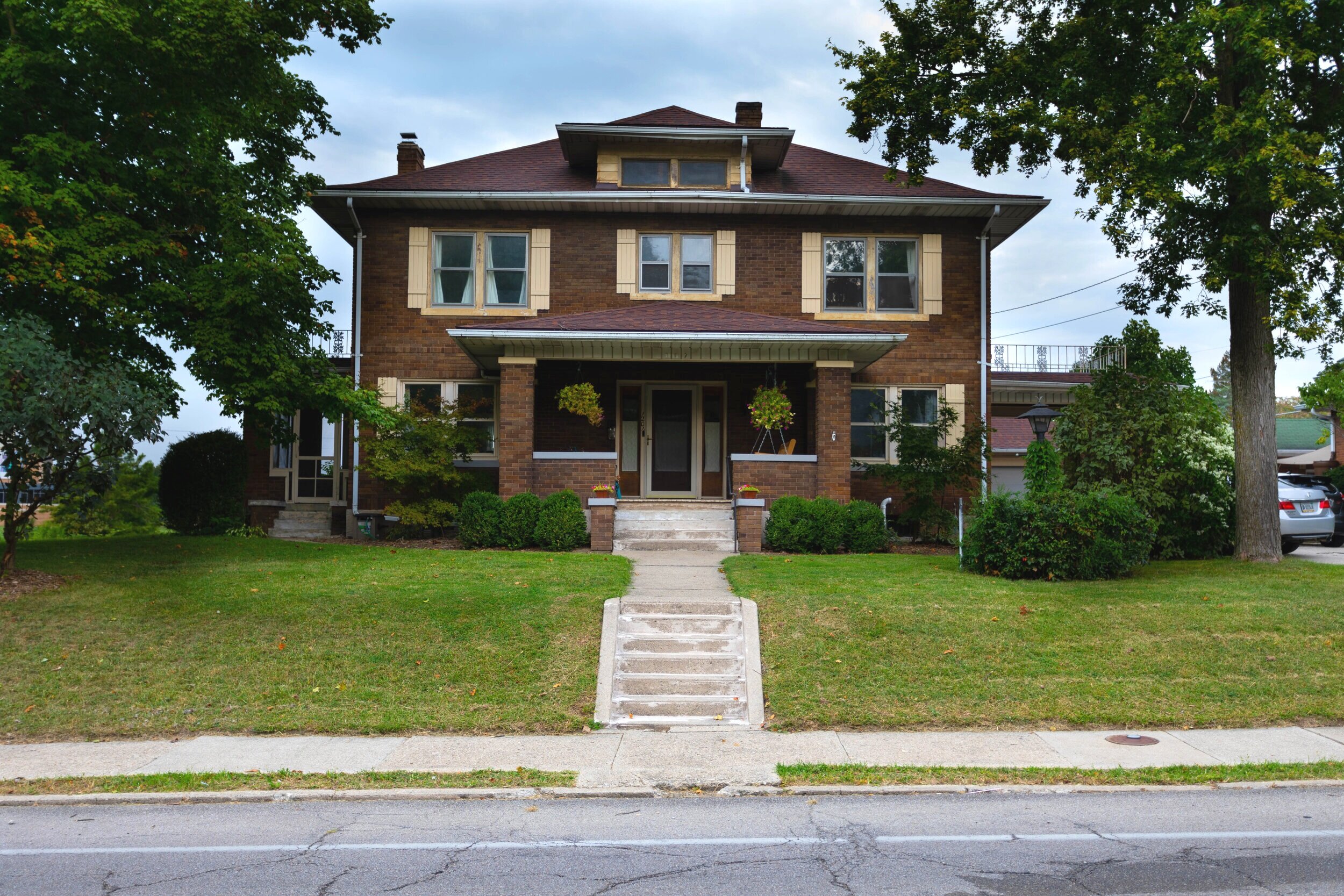
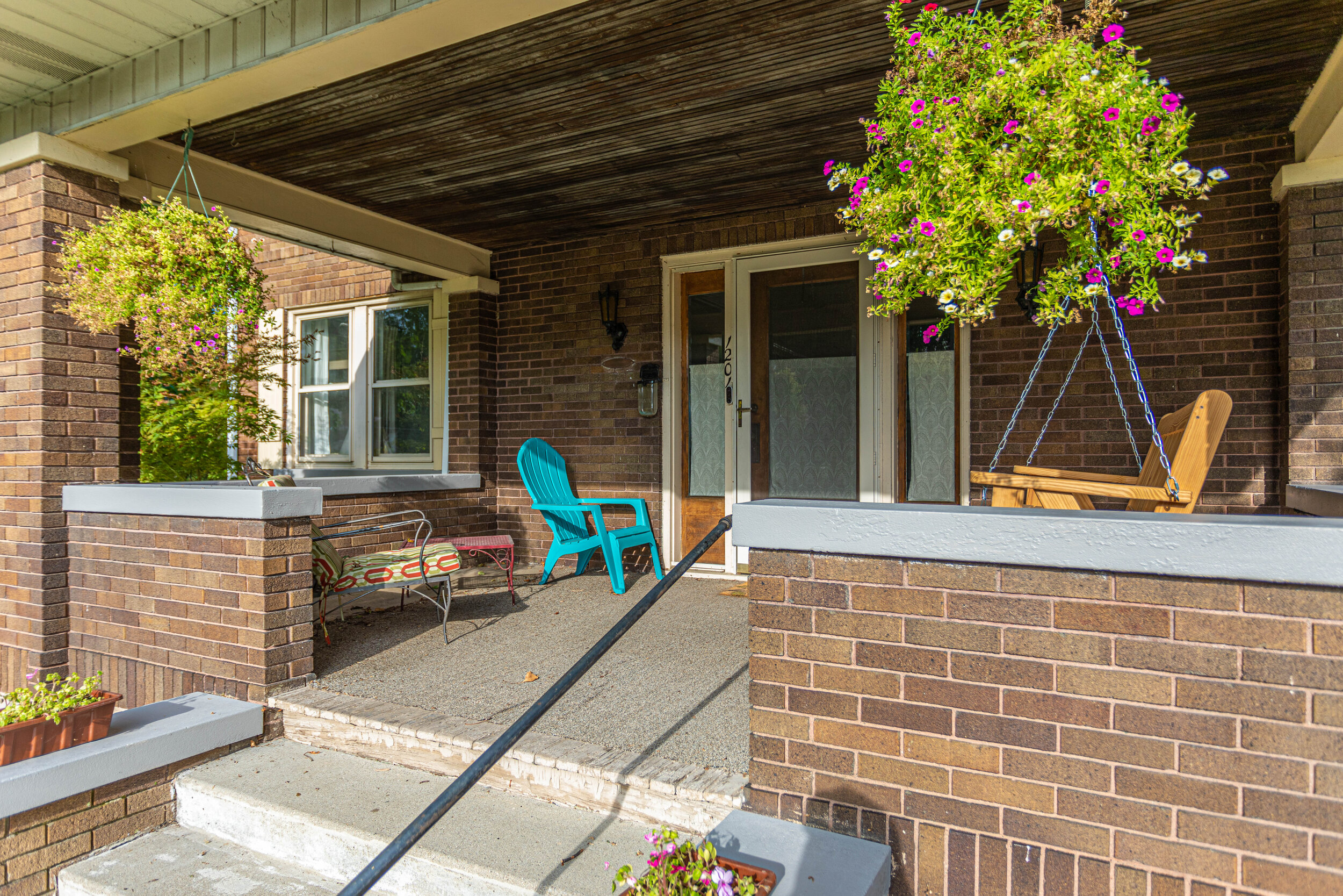
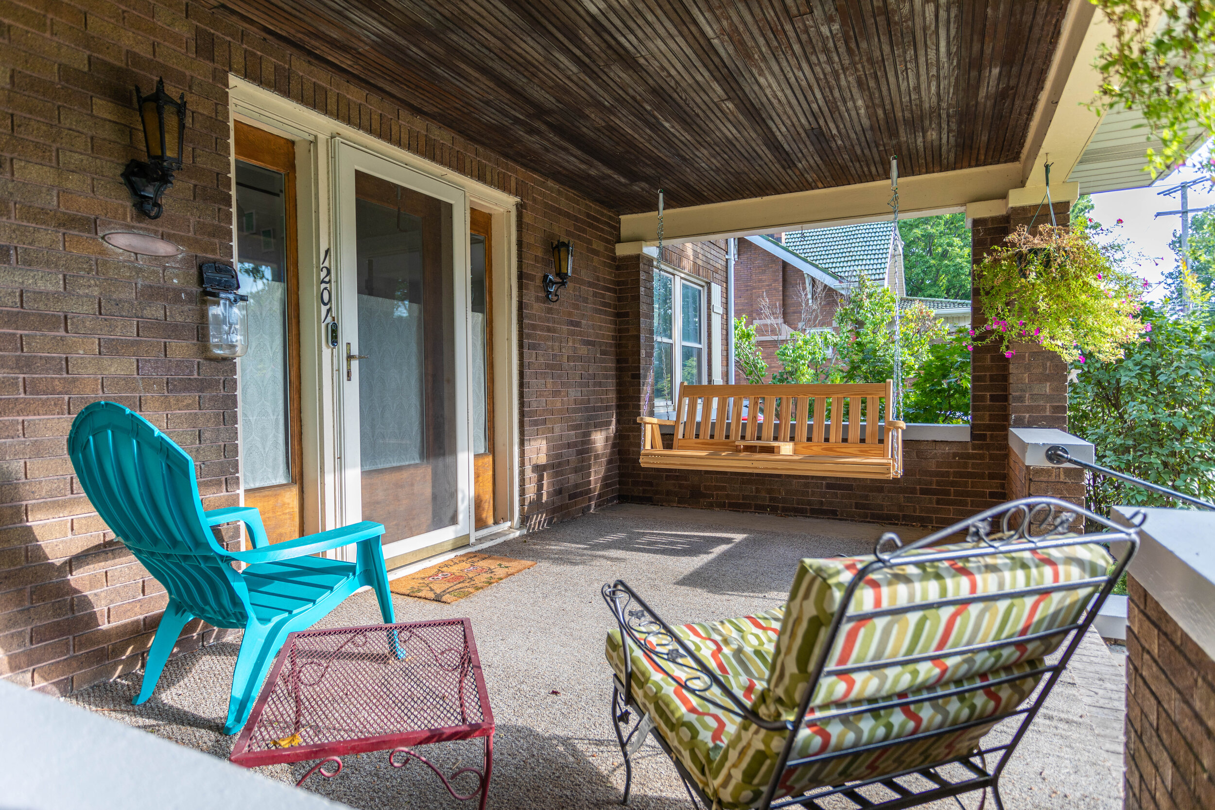
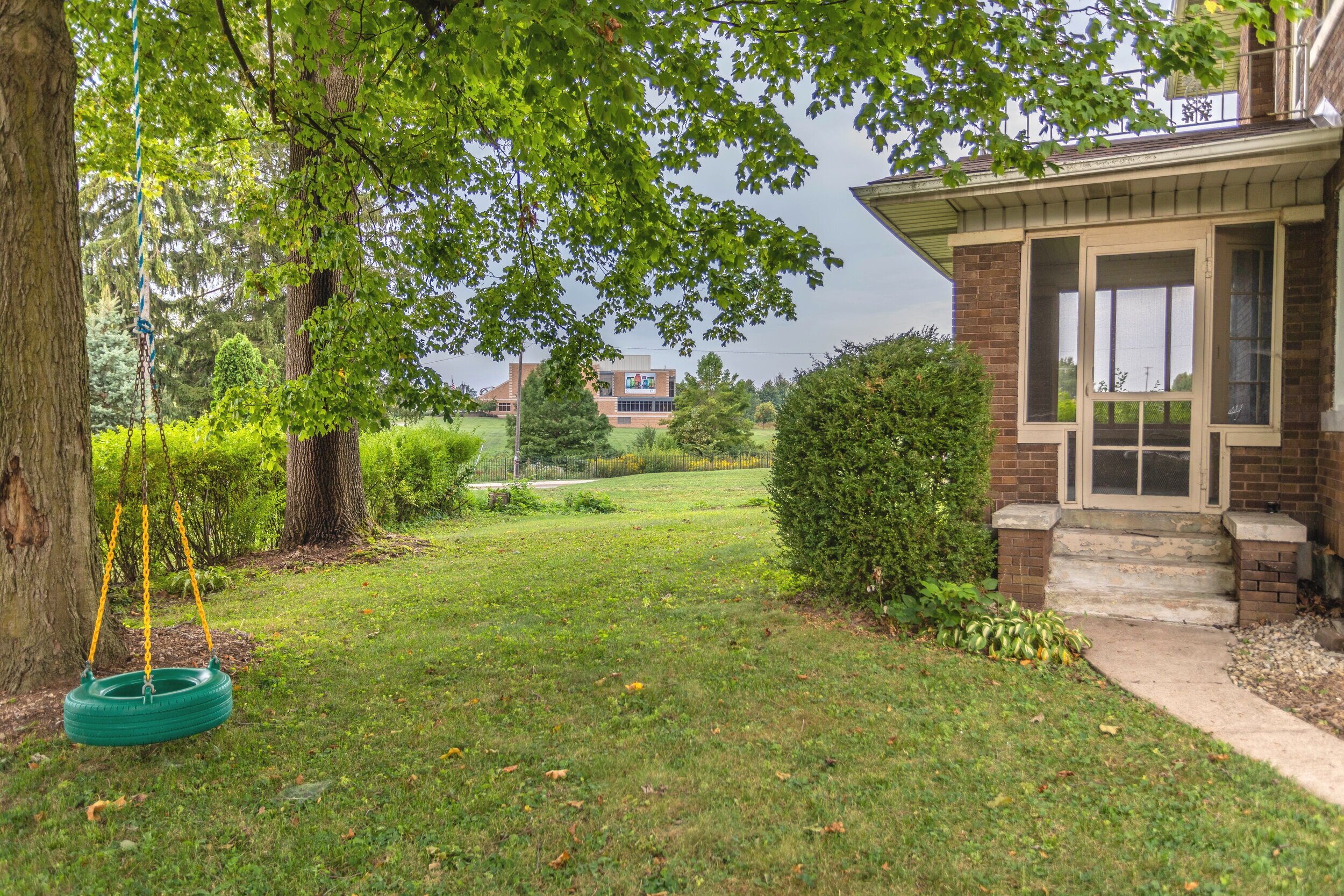


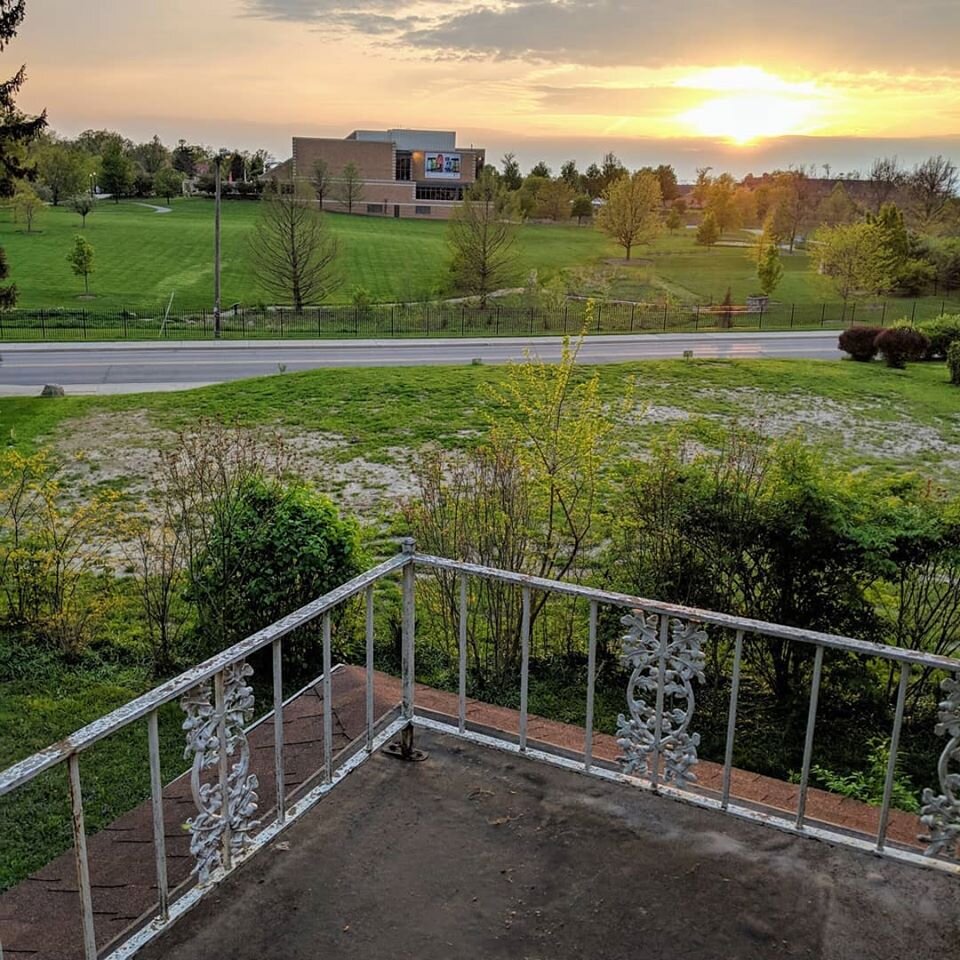
If you’ll notice in the pictures above, the last one is taken from the balcony overlooking some sad looking grass (and a pretty awesome sunset). Here, I’ll post it below so don’t have to go searching:

When we bought the house, our property ended at the treeline you see above. About a week after we moved in, the house that once lived in that empty space of land beyond the treeline was demolished and by today’s standards it was too small to build a new structure. It just so happened that the next door neighbor of that house owned it.
So last summer when we decided to make this our forever home we bought it from him, planning on putting up a retaining wall, a fence, adding a pool, and pretty much making the yard into an oasis. Obviously those plans didn’t work out, but we did sell the land with the house so at least we don’t still own a random plot of land!
The foyer
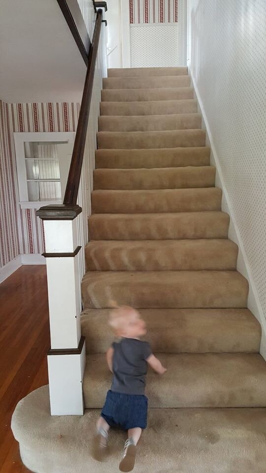
Check out all that sweet, sweet wallpaper. And it didn’t stop here! There was wallpaper in every single room of this house (bathrooms and kitchen included) when we moved in with the exception of ONE bedroom. Also, apologies for the creepy looking child in the picture of the stairs.
By the time we left, I had removed all the wallpaper! So I definitely meant it when I said I’ve had my fair share of stripping wallpaper. This house was a doozy!
Aside from stripping wallpaper in the foyer and painting it with my favorite neutral (Villa Grey by Valspar), we pulled the carpet off the stairs. I planned on refinishing them, and actually started experimenting with how much effort they would be to sand down to the bare wood, but soon after I got pregnant with our younger daughter and had to put that project on hold. And then we moved a few months after she was born.
While I was on maternity leave with her I did manage to paint all the trim in the foyer and the upstairs hallway though.
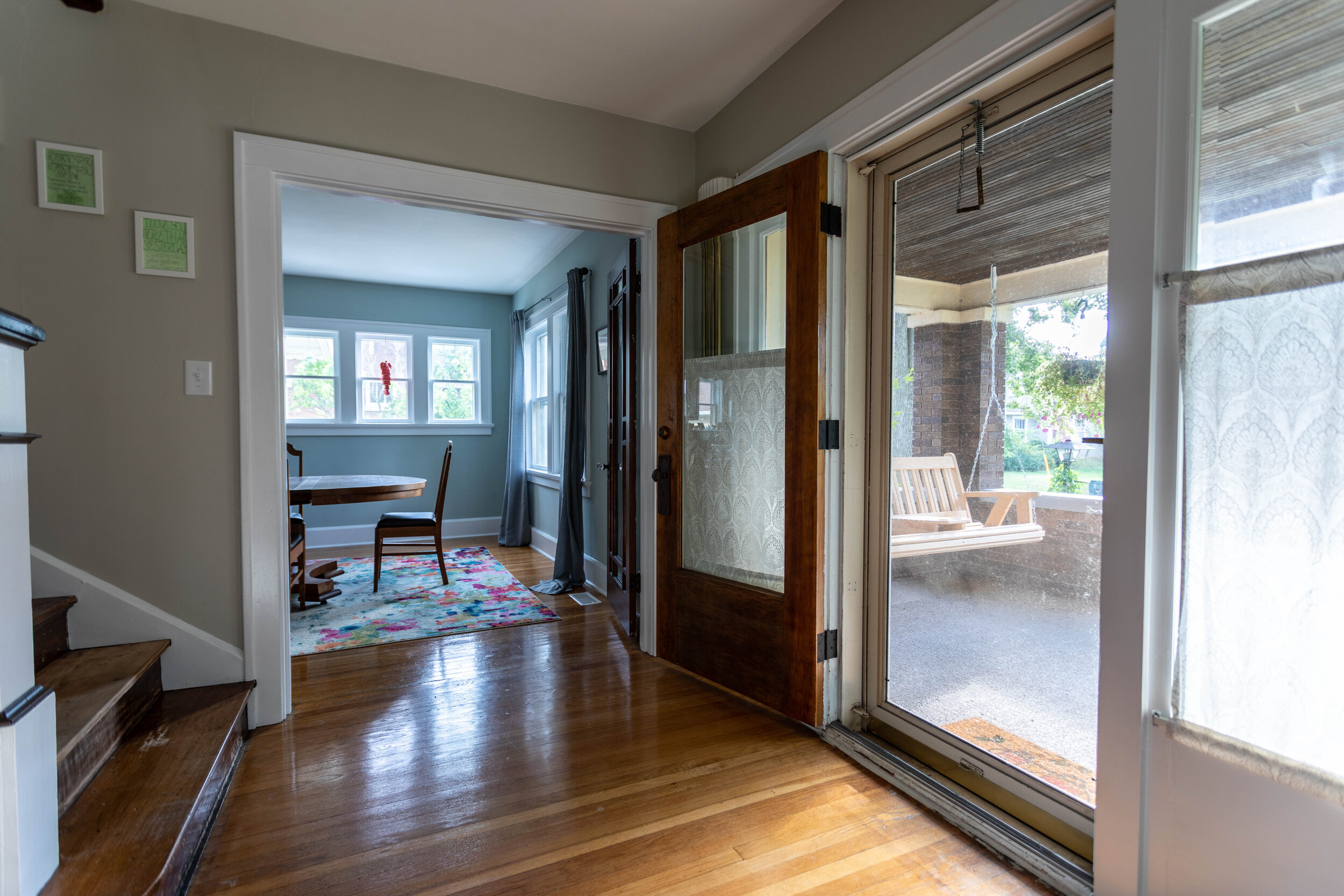
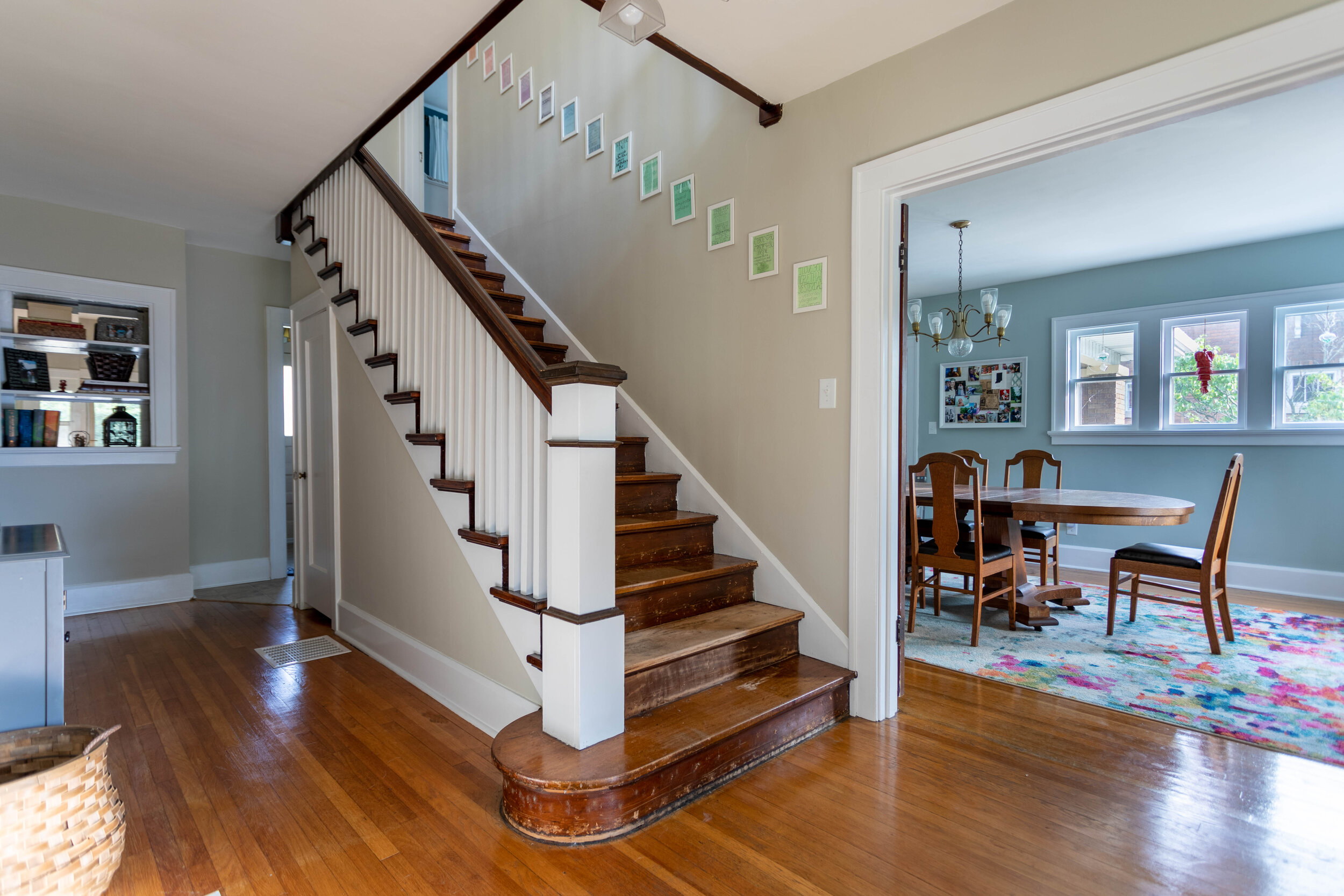
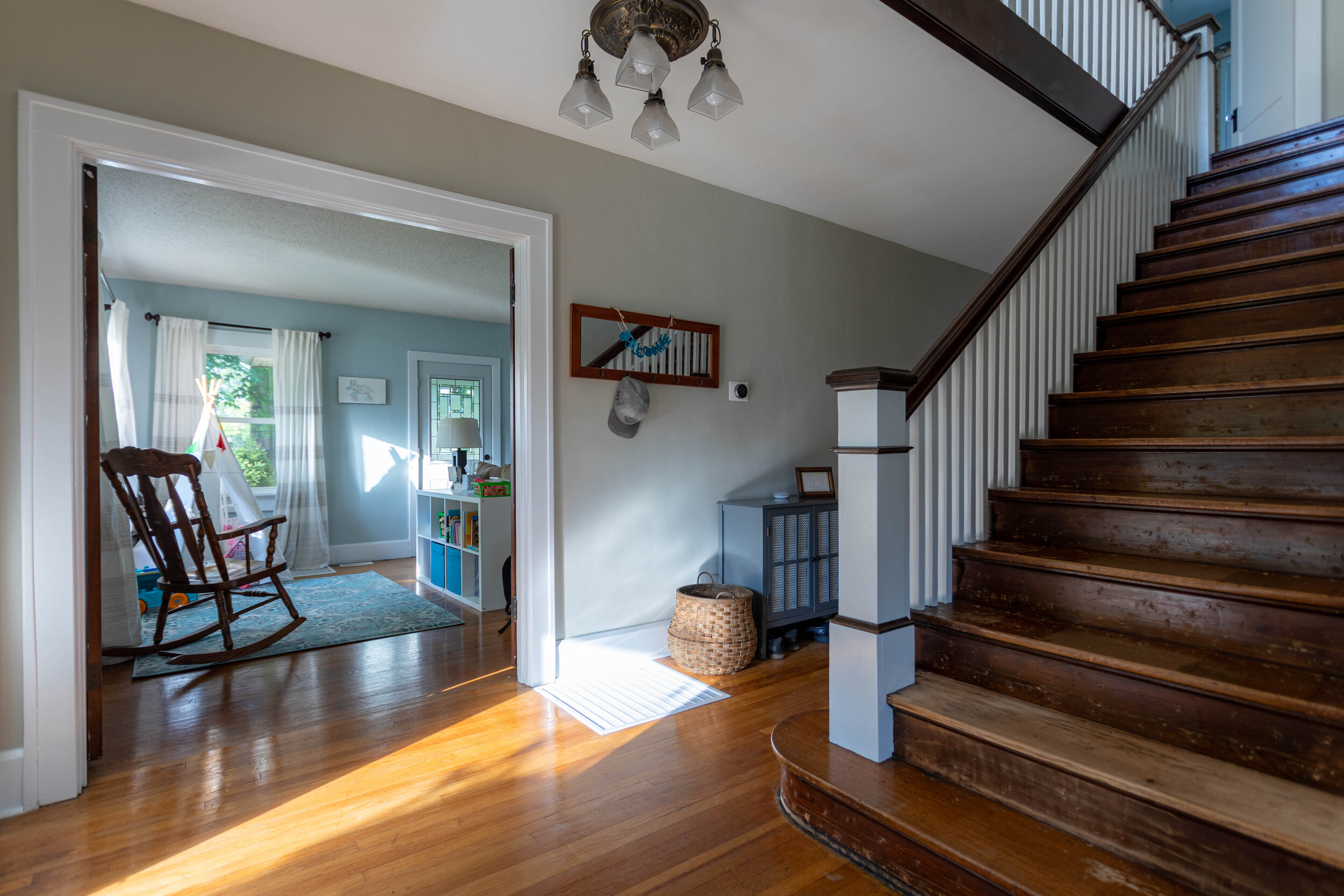
The half bath
I debated not sharing this room because it didn’t have any sort of real transformation, but decided to go ahead and show it anyway because, why not?

I liked to call this the Harry Potter bathroom because it’s under the staircase on the main floor. It’s super tiny and Lucius, being a rather large fella at 6’1’’, could barely fit.
I had big dreams for this tiny space that I would have loved to see to fruition. I pictured doing something bold and unexpected in here, like painting it a strong jewel-toned color. I even considered (gasp) WALLPAPER. Hey - just because I tend to strip wallpaper in every house I live in doesn’t mean I don’t like it. It just needs to be the right pattern and style.
I also planned on replacing pretty much everything else in this room - the vanity, mirror, toilet, light fixture. All of it.
Unfortunately, the most I was able to tackle in this room was stripping the wallpaper and potty training a toddler. Hence the M&M’s & Reese’s Pieces (for bribery, of course).

The living room
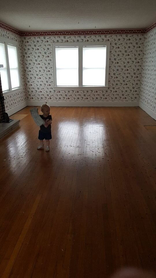
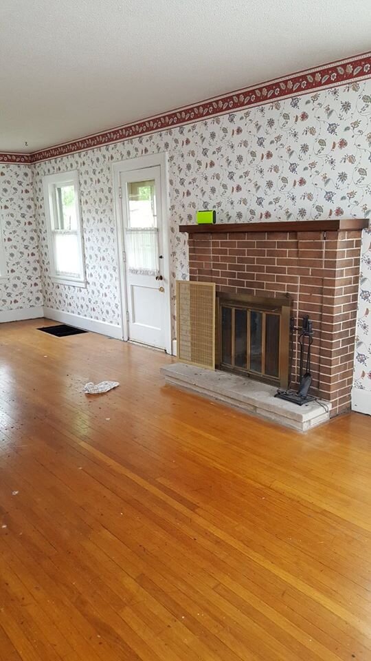
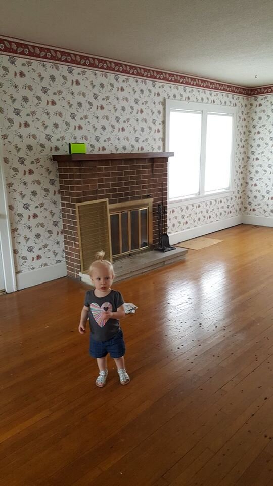
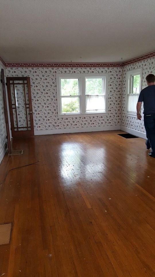
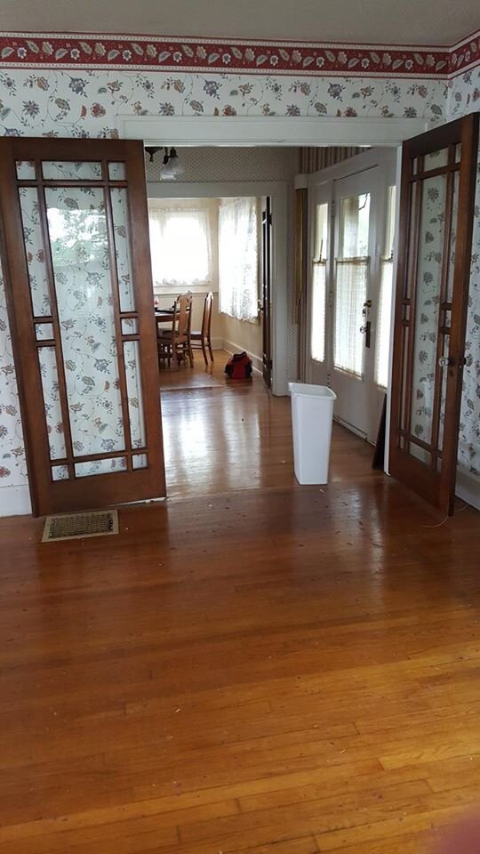
We were so excited after we closed on this house that we drove straight from the closing to the house and ripped up the carpet in the living room. Aside from removing the carpet, we also stripped the wallpaper/painted, replaced the sun porch door, replaced three windows, and whitewashed the fireplace.
Thankfully this was the easiest room in the whole house to de-wallpaper because it’s also the biggest. The wallpaper actually came off in full-sized floor-to-ceiling sheets. We literally just pulled them off by hand (no steamer, no wallpaper goo) in about an hour.
The sun porch door was old and drafty so we replaced that pretty early on. The windows throughout the whole house were original and also so, so drafty and noisy so we started replacing some of those before we moved. We ended up replacing 6 windows in the whole house. Three of them happened to be in this room.
Since this house is by a pretty busy intersection, every time someone playing loud music would stop at the stoplight nearby we’d hear the windows vibrate. Also, most of them didn’t open so strategically replacing them gave us the ability to let some fresh air flow through the house! Also, you know, fire safety…
Lucius taught himself how to install windows and reframed the windows in the first picture above at least 3 times… without consulting with me first. Seriously. I walked downstairs one day and there was a gaping hole in my living room. And no, that isn’t the first time something like that has happened (and I’m sure it won’t be the last).
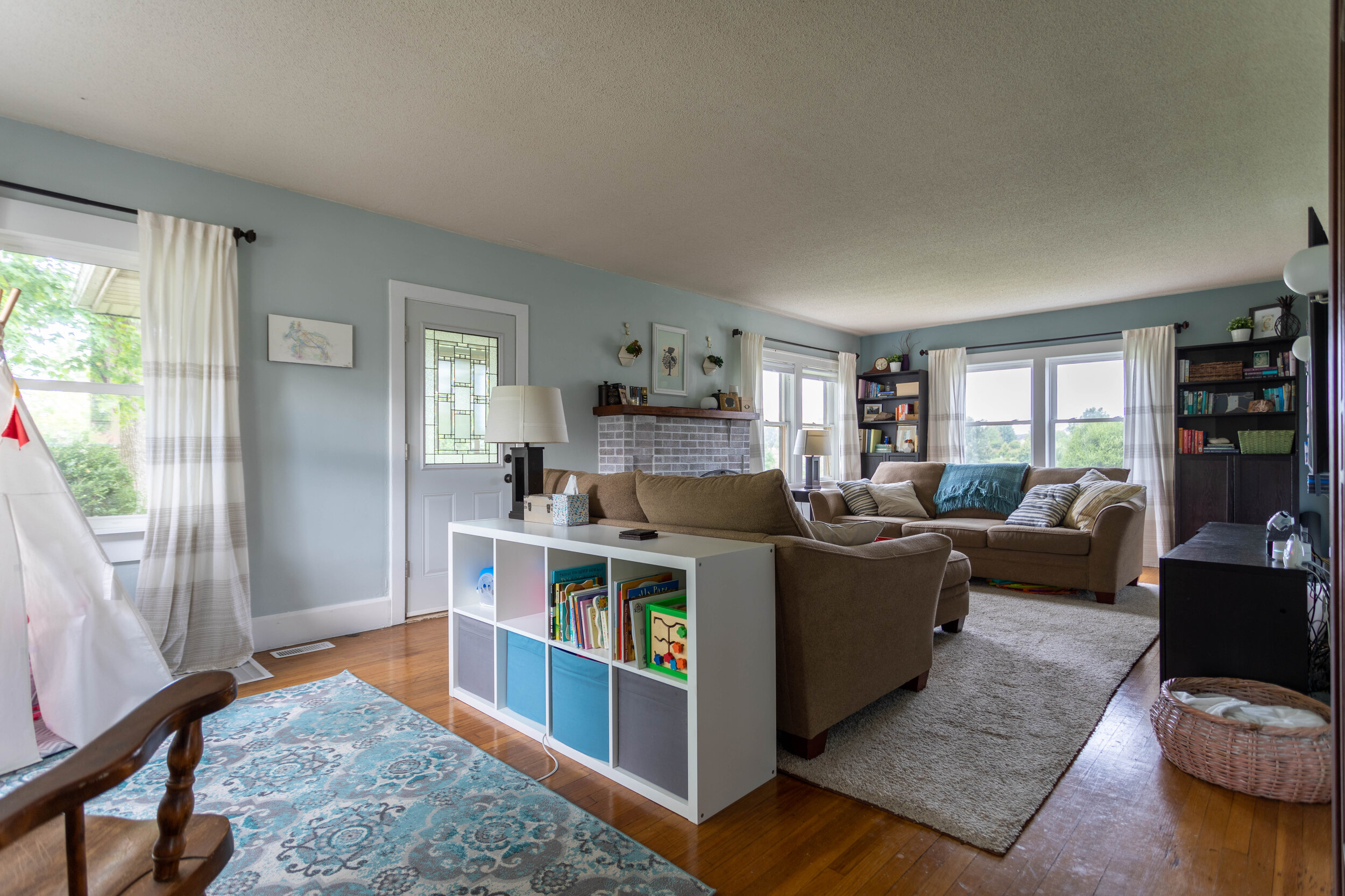
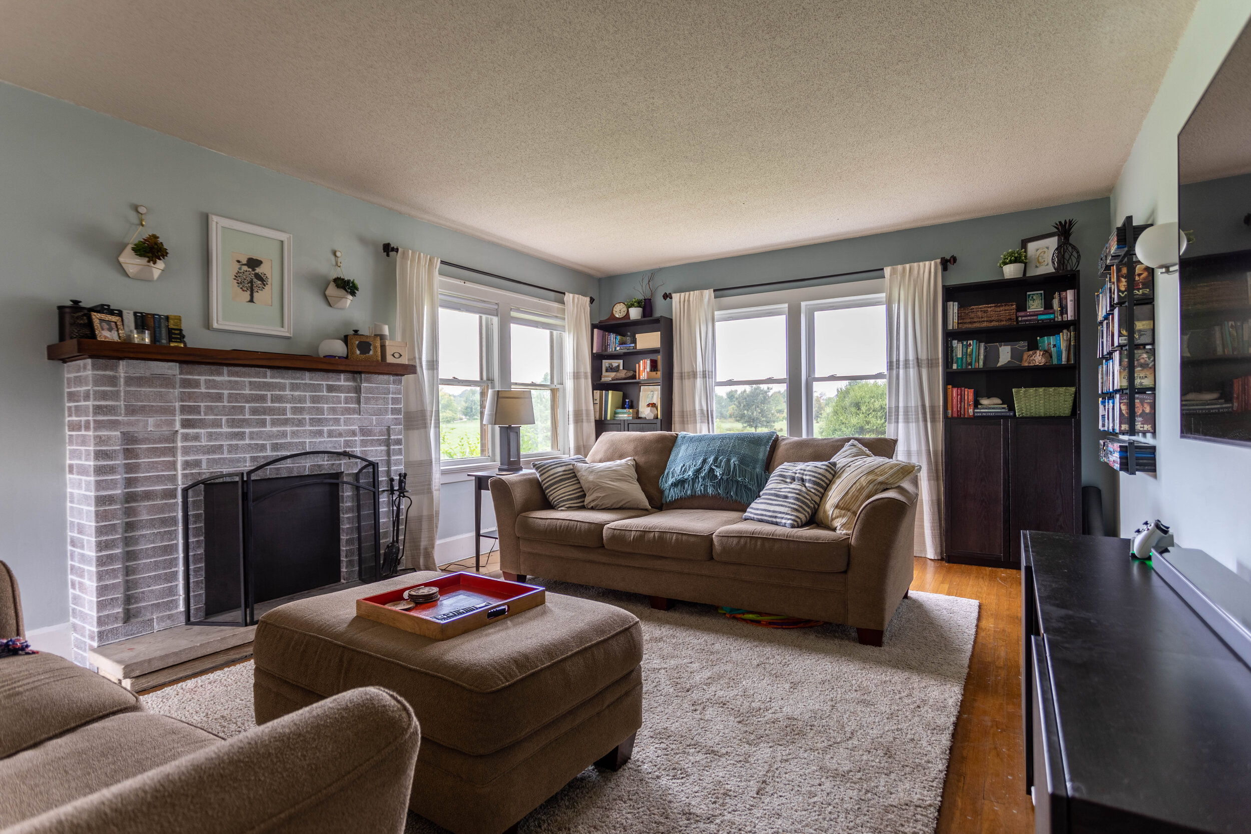
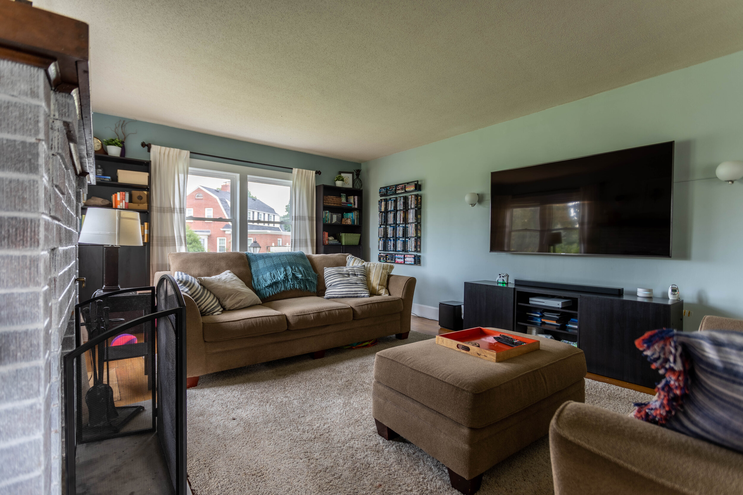
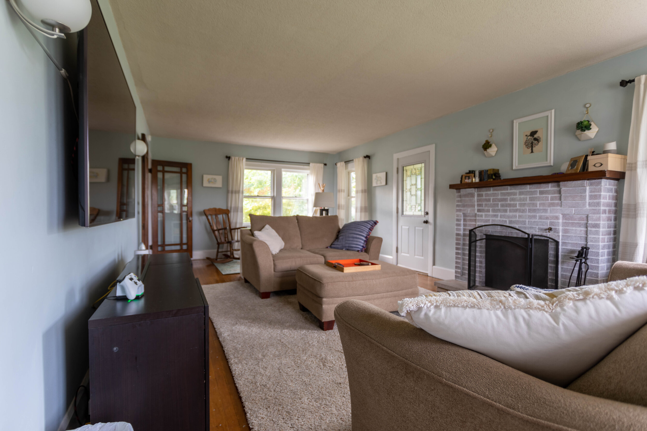
The dining room
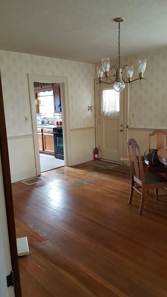
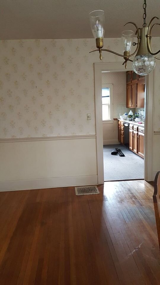
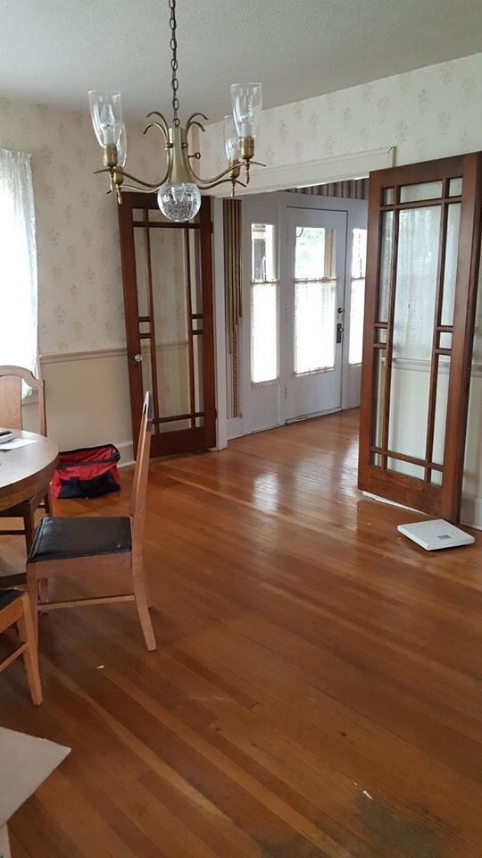
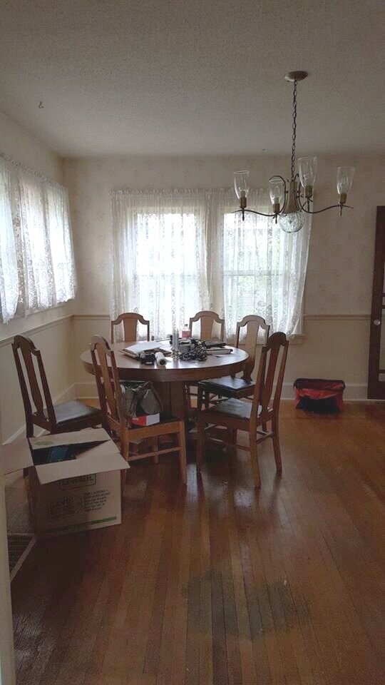
Oddly enough, the dining room ended up being one of my favorite finished rooms in the house by the time we left.
In this room we, once again, stripped the wallpaper and painted the trim. We also removed the chair rail and I took my first stab at scraping a popcorn ceiling (which is actually really easy)!

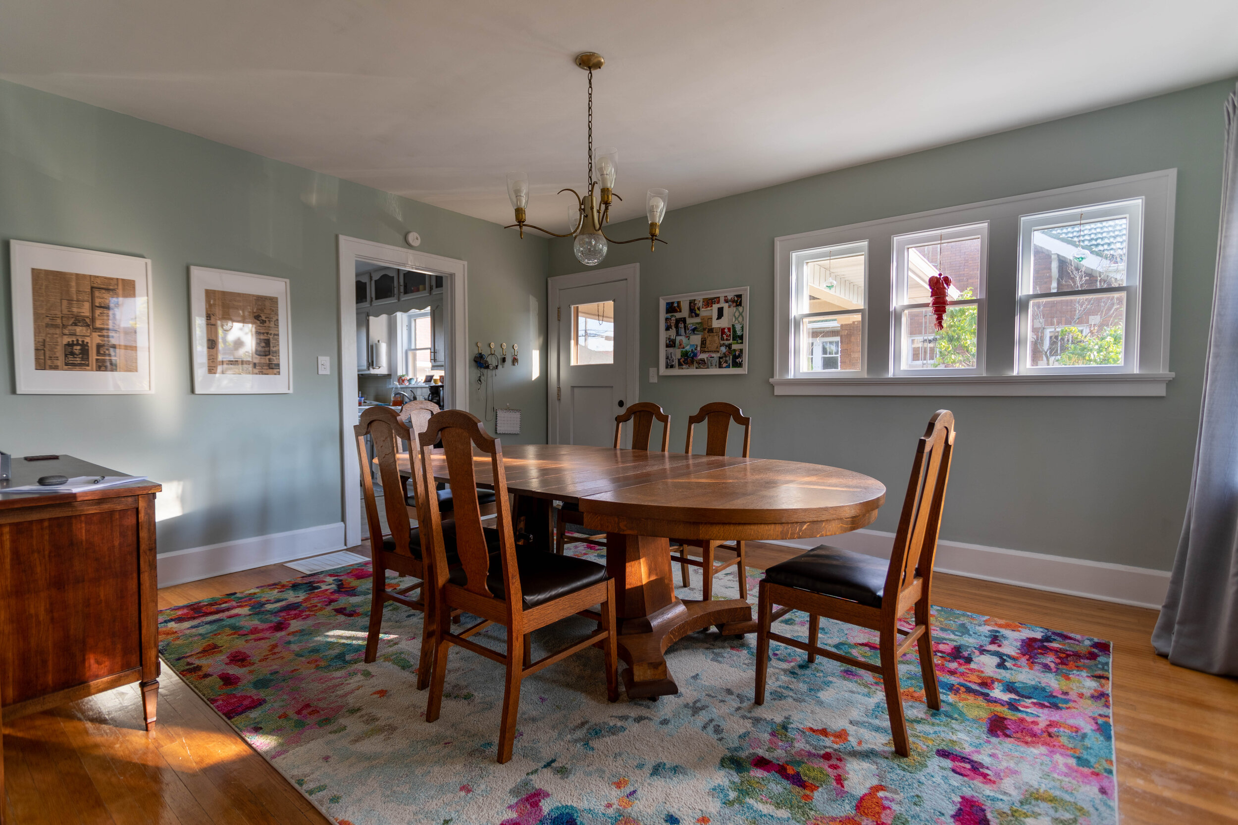
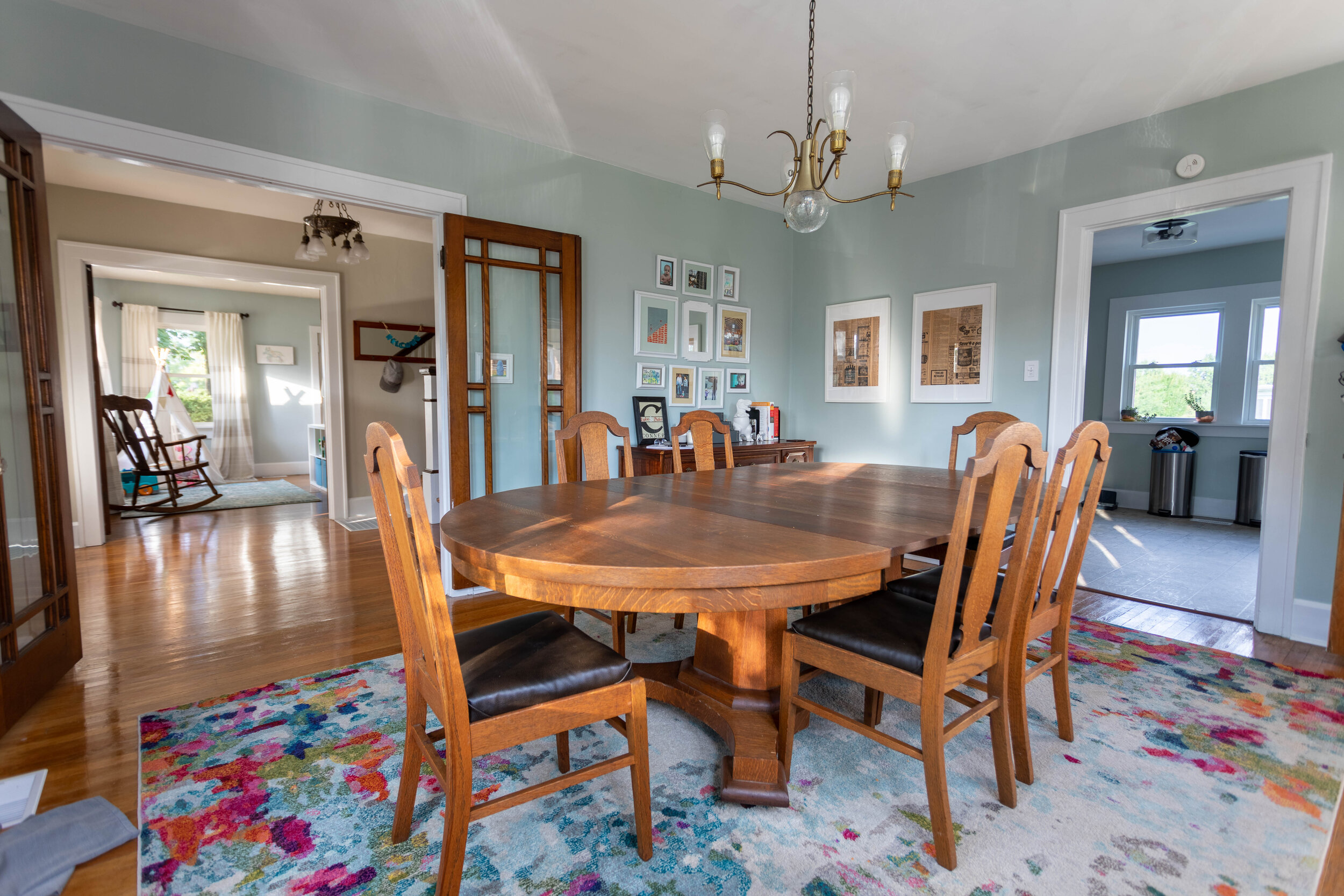
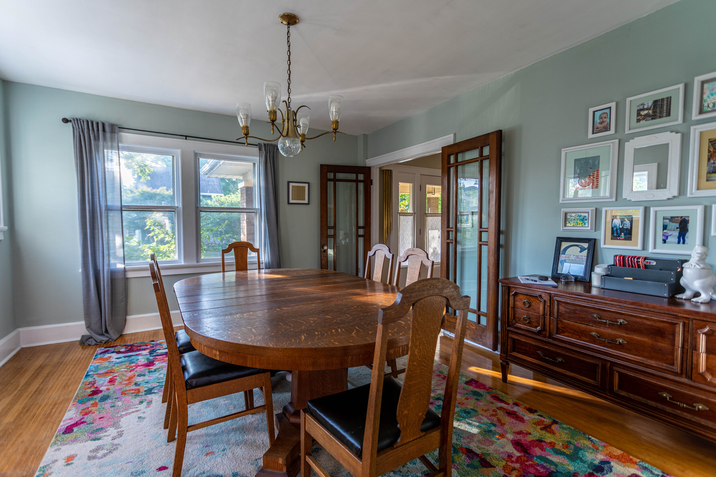
Lucius really hated the light fixture, but once I redecorated the room I felt like it actually fit in the space pretty well and I managed to procrastinate replacing it until it was too late and we moved. Luckily, the new owners like it too!
You know how they say styles always come back around? The light fixture in this room is a great example of this. The use of gold tones are really popular right now, and I’m seeing sputnik lights pop up all over the place. In a way this light has kind of a sputnik-style to it, while still being pretty traditional. If you don’t know what a sputnik light is - check out the picture below.

The story of the dining room table is actually pretty interesting, too. The previous owner was elderly and was moving to a retirement home, so his family was auctioning off all of the furniture in the house. Someone at the auction was bidding up the table just for fun, then decided at the end of it all they didn’t want it.
The owner’s children, who showed us the house, remembered me commenting on the table during our showing and called Lucius to see if we wanted to buy it. They sold it to us really really cheap, considering that it’s such a large table (it has SIX leaves!). And we learned that the table is actually older than the house, which I thought was pretty cool.
It didn’t feel right to take the table with us since it had lived there for so long, so we sold it with the house and I have no regrets. It just belongs there.
You can also see the buffet table I talked about in our dining room renovation kick-off post and how it just doesn’t work in our current house. Maybe I should have just left that, too.
The kitchen
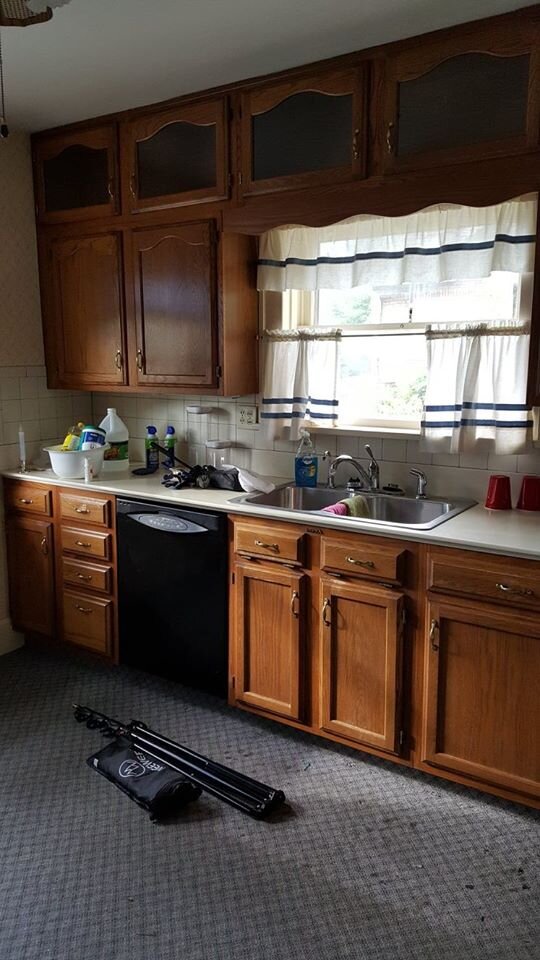
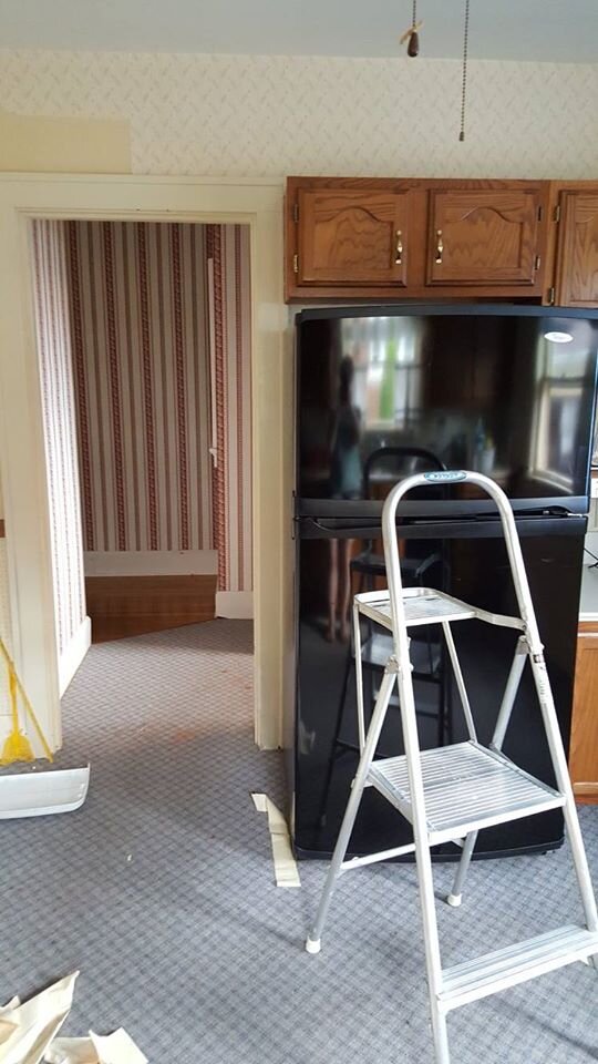
Whyyyyy with the carpet!? Seriously.
And the surprising thing is, this isn’t the first house I’ve lived in with carpet in the kitchen. Gross.
In this room I, you guessed it, stripped the wallpaper! I also painted the trim, the ceiling, and the walls. Can we just assume that’s a given from here on out? Because I made those updates in just about every room.
Aside from the above, we tore out the carpet in here and replaced it with some rolled laminate. It definitely wasn’t the nicest or most expensive stuff, but we assumed it was going to be a temporary fix that would be replaced with something nicer, like tile, down the road. It at least got us through a couple of carpet-free years and gave the new owners a cleaner slate to start with.
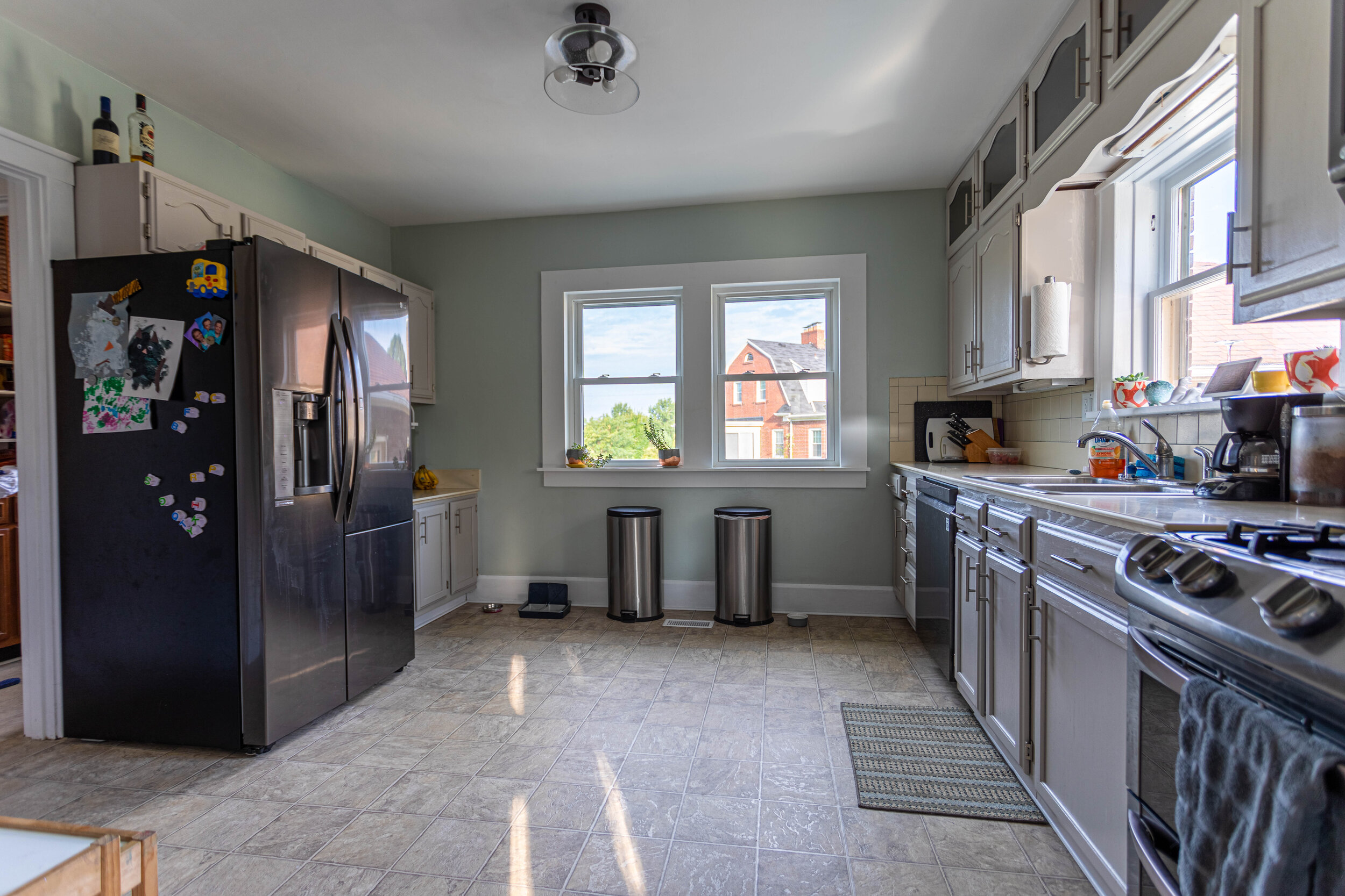
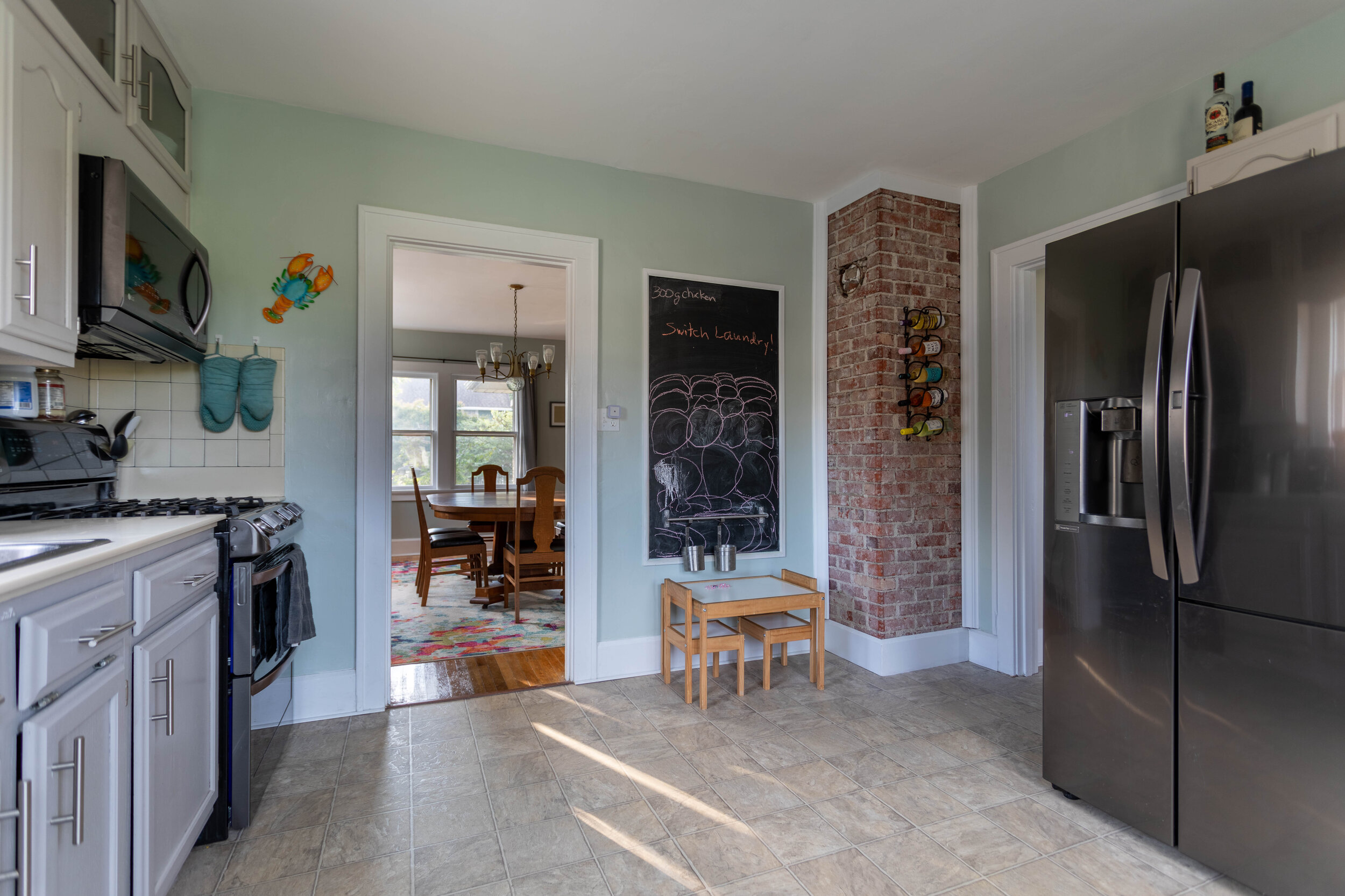
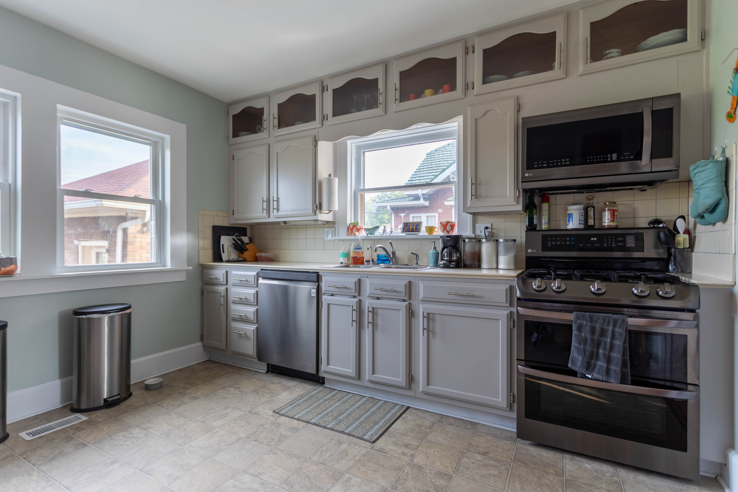
We also replaced the hardware on the cabinets, the appliances, the two side-by-side windows, updated the light fixture, made a chalkboard area, and exposed the brick chimney, because I love me some exposed brick. And Lucius loves destroying things.

The upstairs hallway


Unfortunately the only “after” picture I have of the upstairs hallway is from one end, but I think you get the gist.
Oddly enough, the foyer and this upstairs hallway are what really sold me on the house. I was actually on the fence when Lucius started talking seriously about wanting to buy it, but there was something about these spaces that really drew me in.
In the picture above, the little bench at the end of the hallway is actually one of my favorite elements to this house - a laundry chute to the basement! Man, that definitely came in handy. Though we often joked about adding a pulley system to bring the laundry back up two flights of stairs that never did happen.

Aside from the aforementioned list of updates, we also replaced all the door knobs to the bedrooms after I got trapped in the master bedroom one day.
And just for fun, here’s a not-scary-at-all shot of me stripping wallpaper over the staircase:

Cool as a cucumber…
The bathroom
Like the half bath on the first floor, I considered not sharing this bathroom either because it wasn’t even a little bit close to the finished product when we moved. But, I’d like to be honest and transparent in this blog and sometimes things just don’t work out the way you want them to in the end.
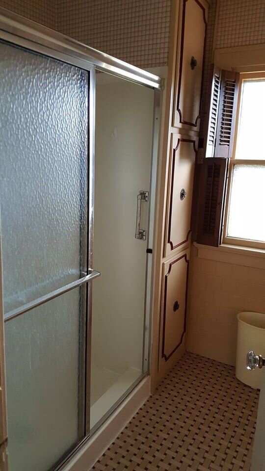
For a long time we called this bathroom “The Smoker’s Lounge” because of its beige and burgundy color scheme. It just felt old and dingy like someone back in the day spent a lot of time smoking cigars in there.
We started to remodel this room little by little, first replacing the shower with a bathtub. We moved into this house with an 1.5 year old and bathing her in a portable baby tub just wasn’t cutting it. That update required us to replace the cupboards next to the shower stall because the tub wasn’t the same proportions as the shower stall.
After we stripped the wallpaper, popped off the tiles on the bottom 2/3rds of the wall, and painted, we ran into a ton of issues with the plaster cracking. We were so sick of trying to patch and smooth this room that we decided (before we made the decision to move) that we would gut this room and start from scratch during the coming winter… then of course we moved and none of that happened and when we left the bathroom looked like this:
It was certainly an improvement from where we started, but definitely a far cry from where we wanted it to be.
The office
Let’s start the tour of the bedrooms with the least exciting one: the office. This was the only room in the house we didn’t really touch before we moved, aside from removing the carpet and the shutters.
Fun note: this was also the only room in the house that didn’t have any wallpaper.
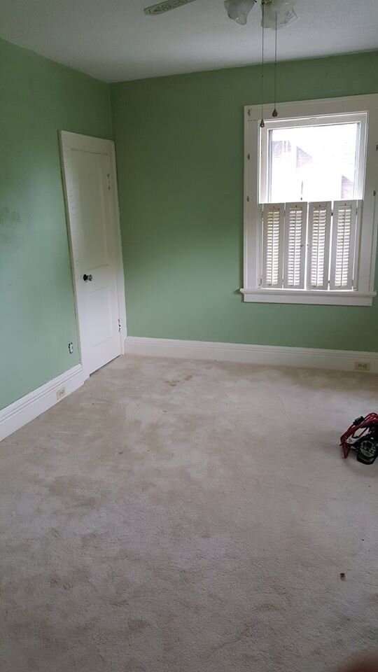

The master bedroom
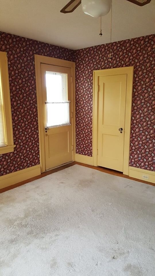
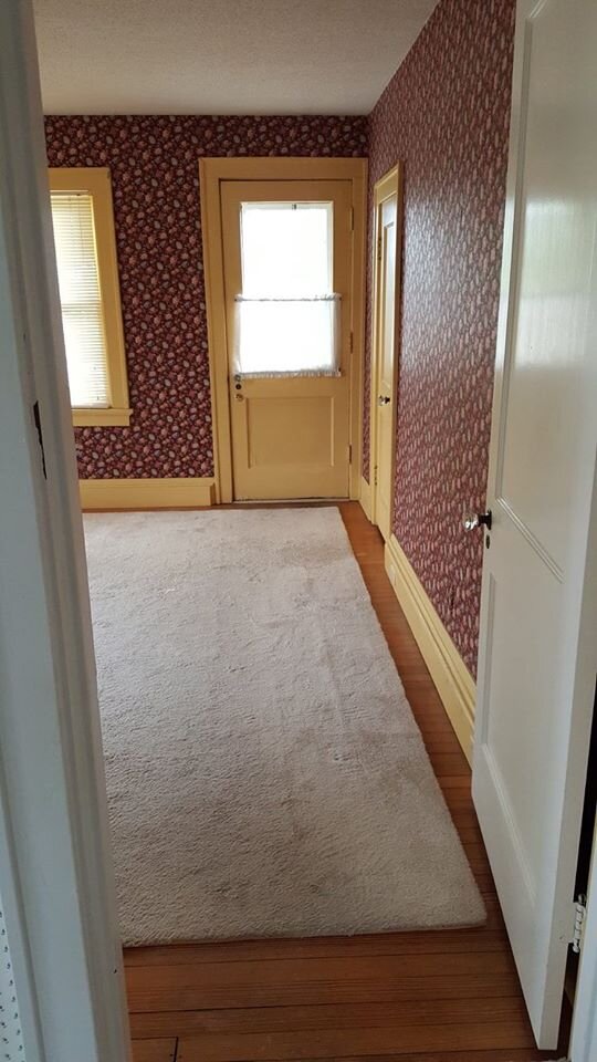
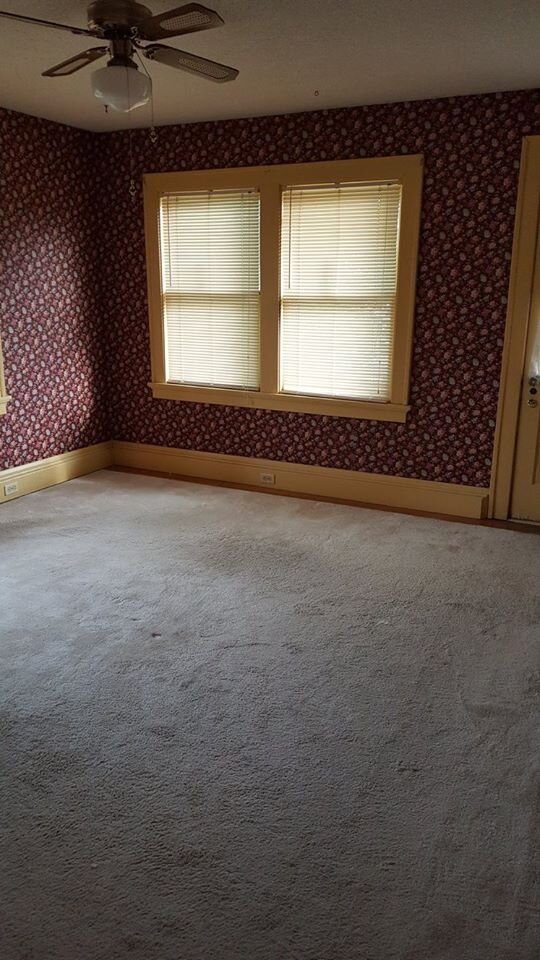
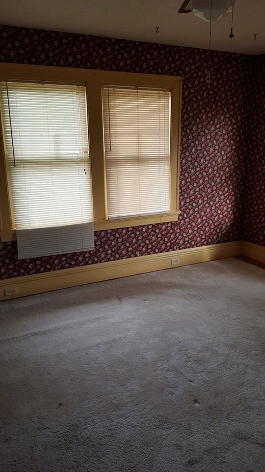
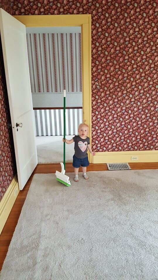
This room was pretty overwhelming to look at when we moved in, but it was surprisingly easy to update, even with two layers of wallpaper.

Can you imagine how it used to look with that green/yellow wallpaper!?
In the end, the updates made the room feel so much lighter and airier.
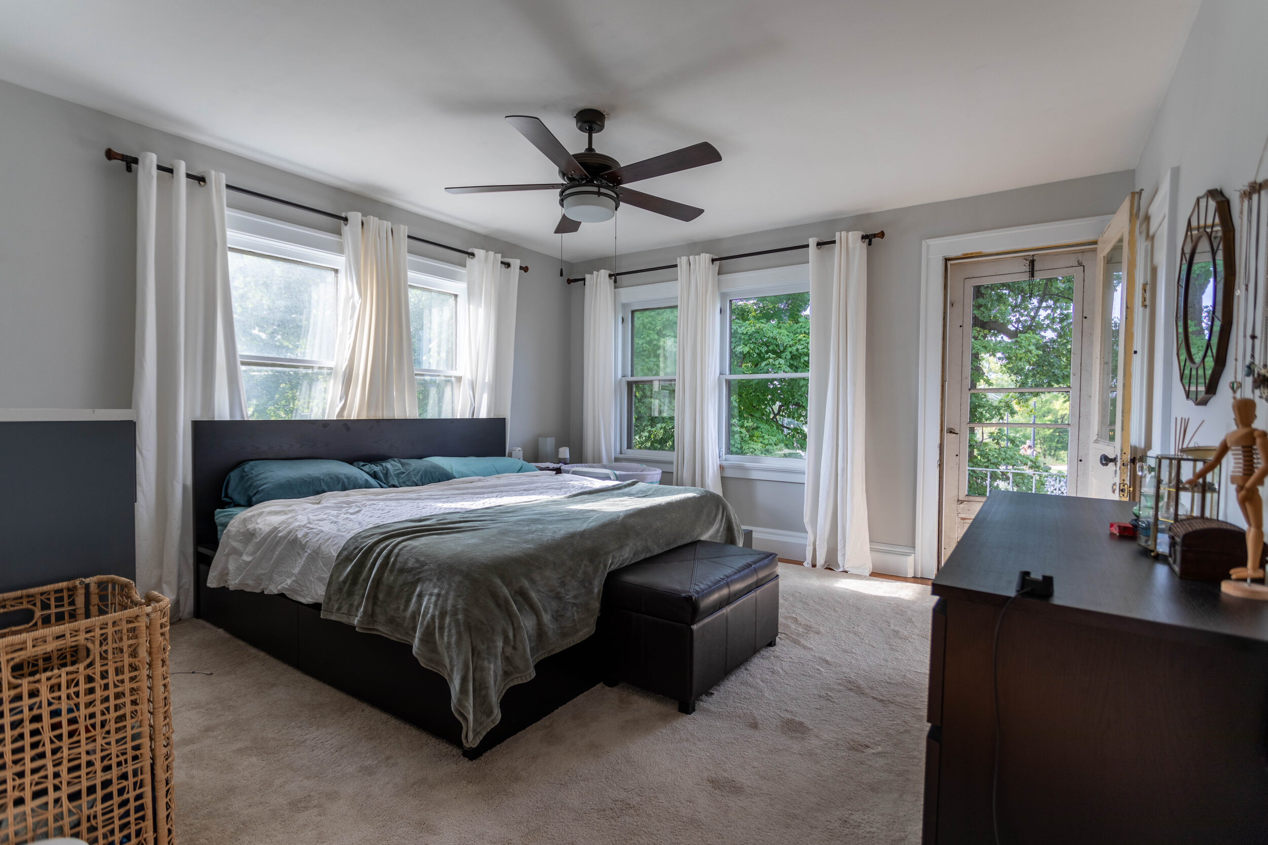
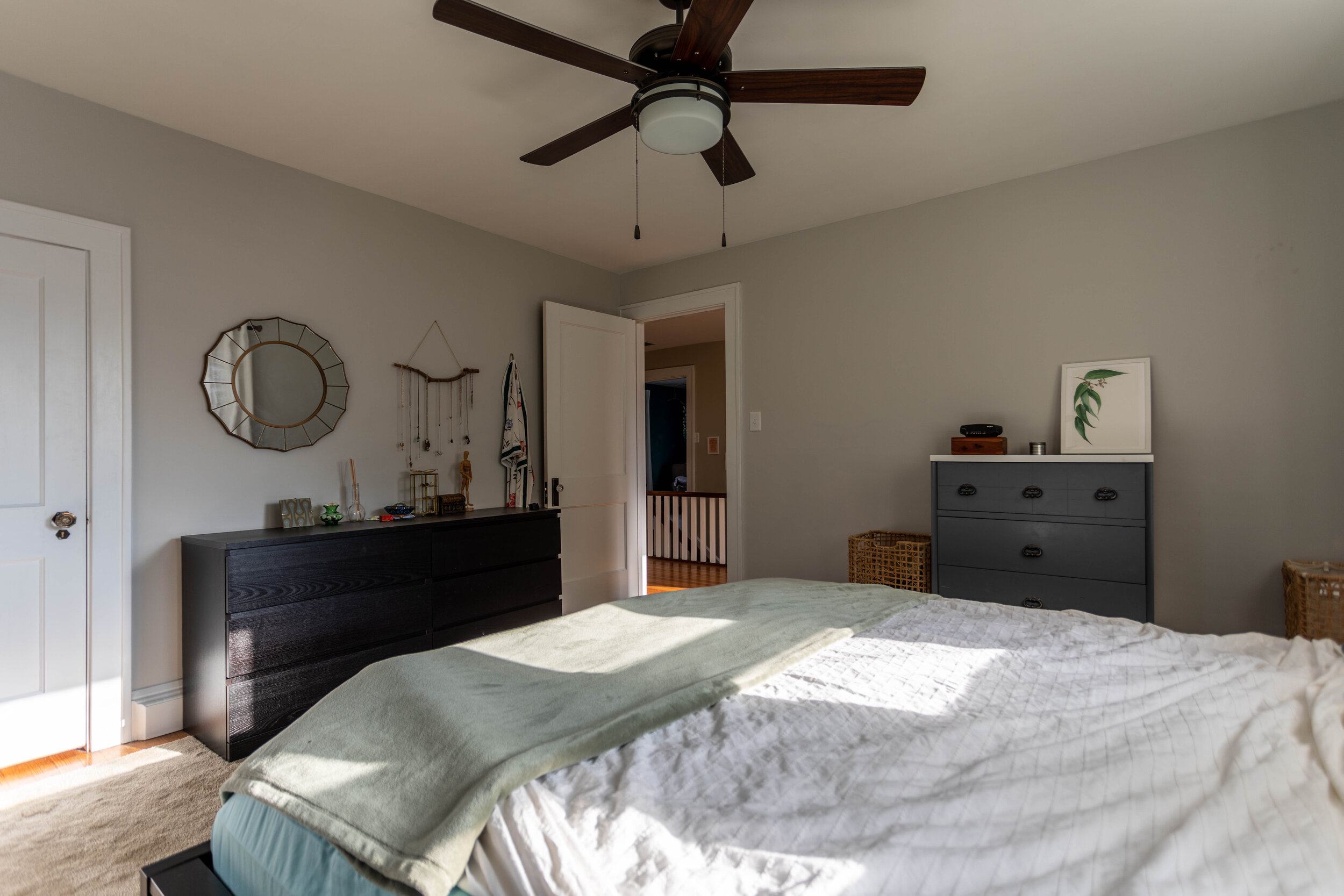
Our older daughter’s room
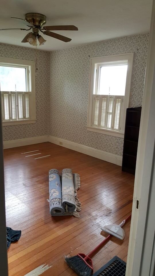
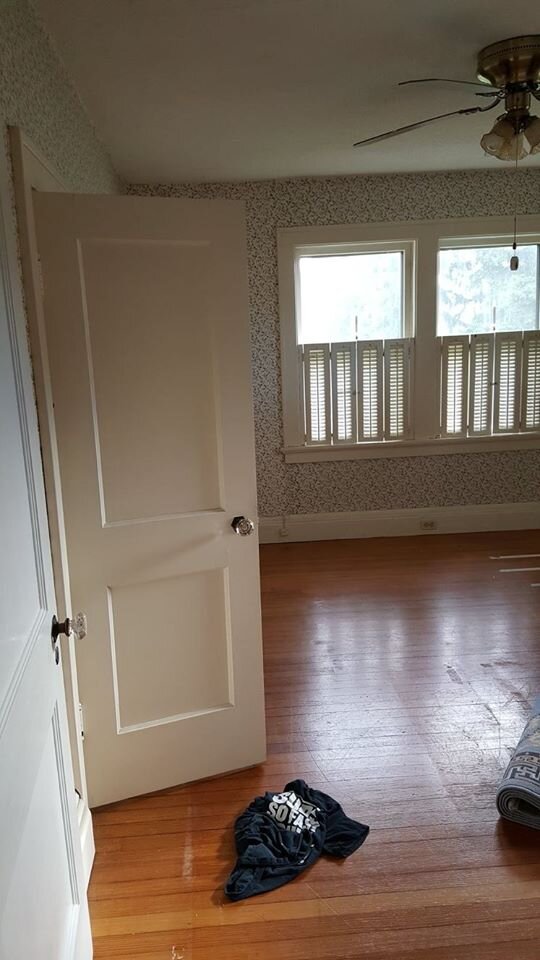
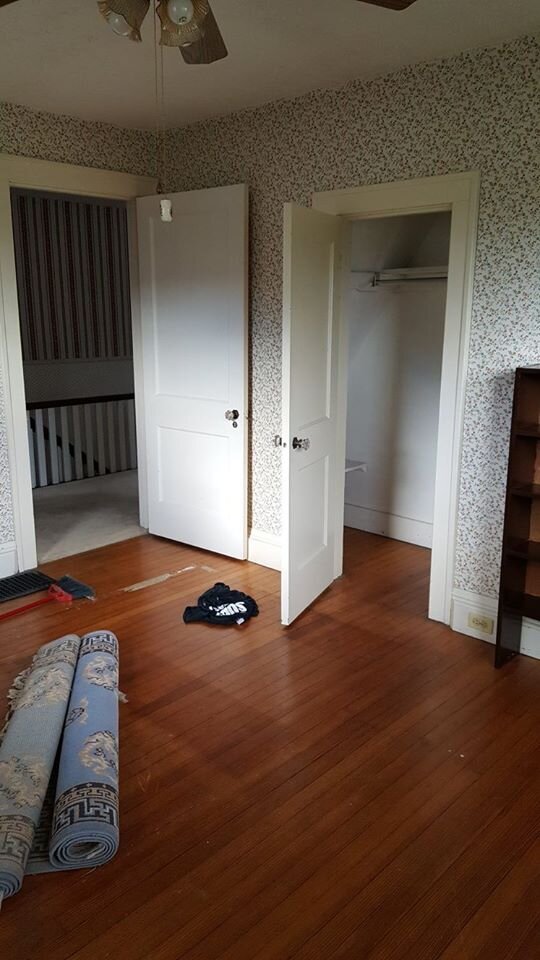
I actually didn’t mind the wallpaper in this room - most likely because we knew it was going to be our daughter’s room and the floral wallpaper was dainty and cute. But I got the itch about a year after we moved in to do something fun in here so I took a week off work and tackled this room and the nursery, because that’s my idea of a good time.
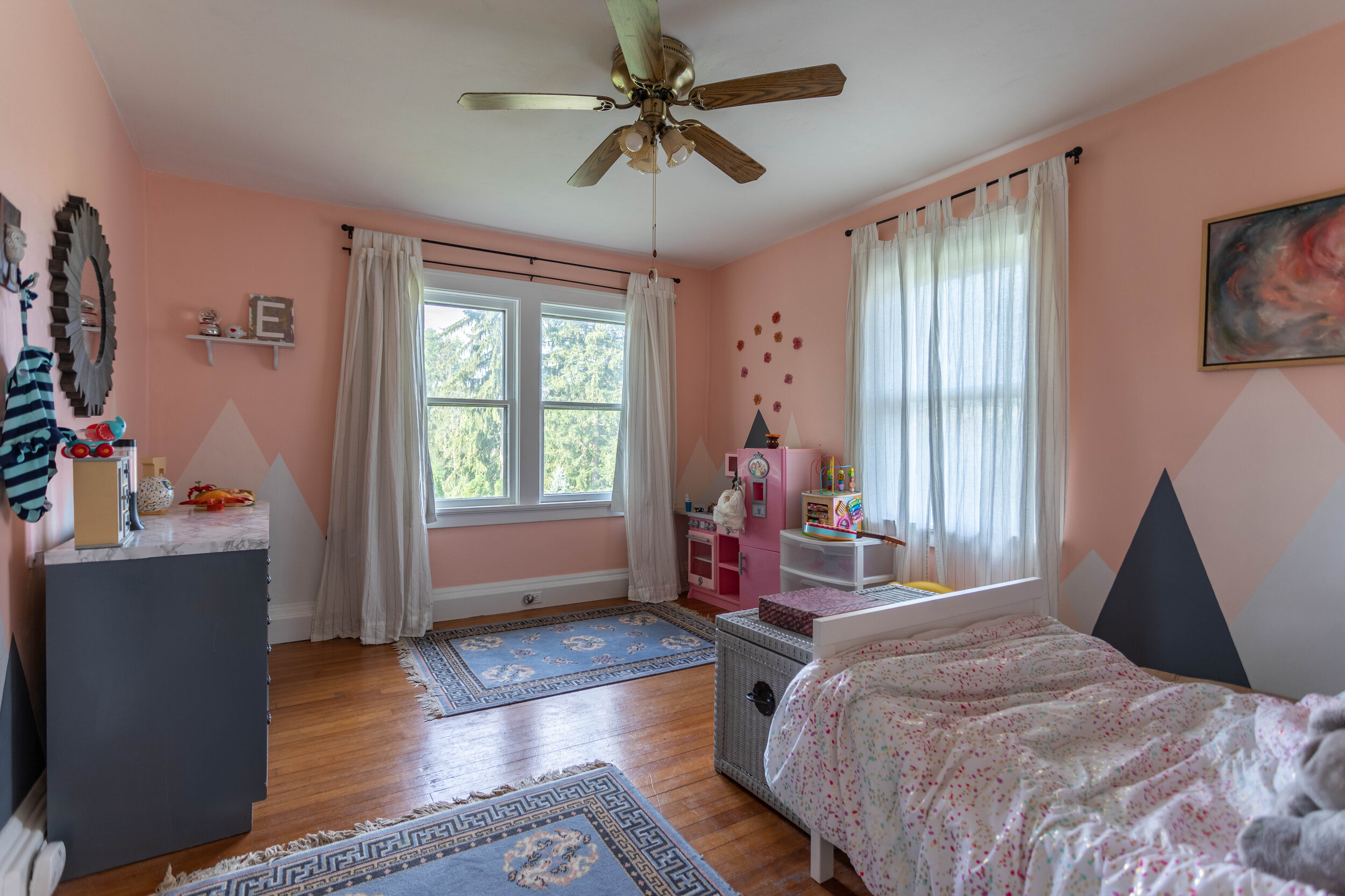
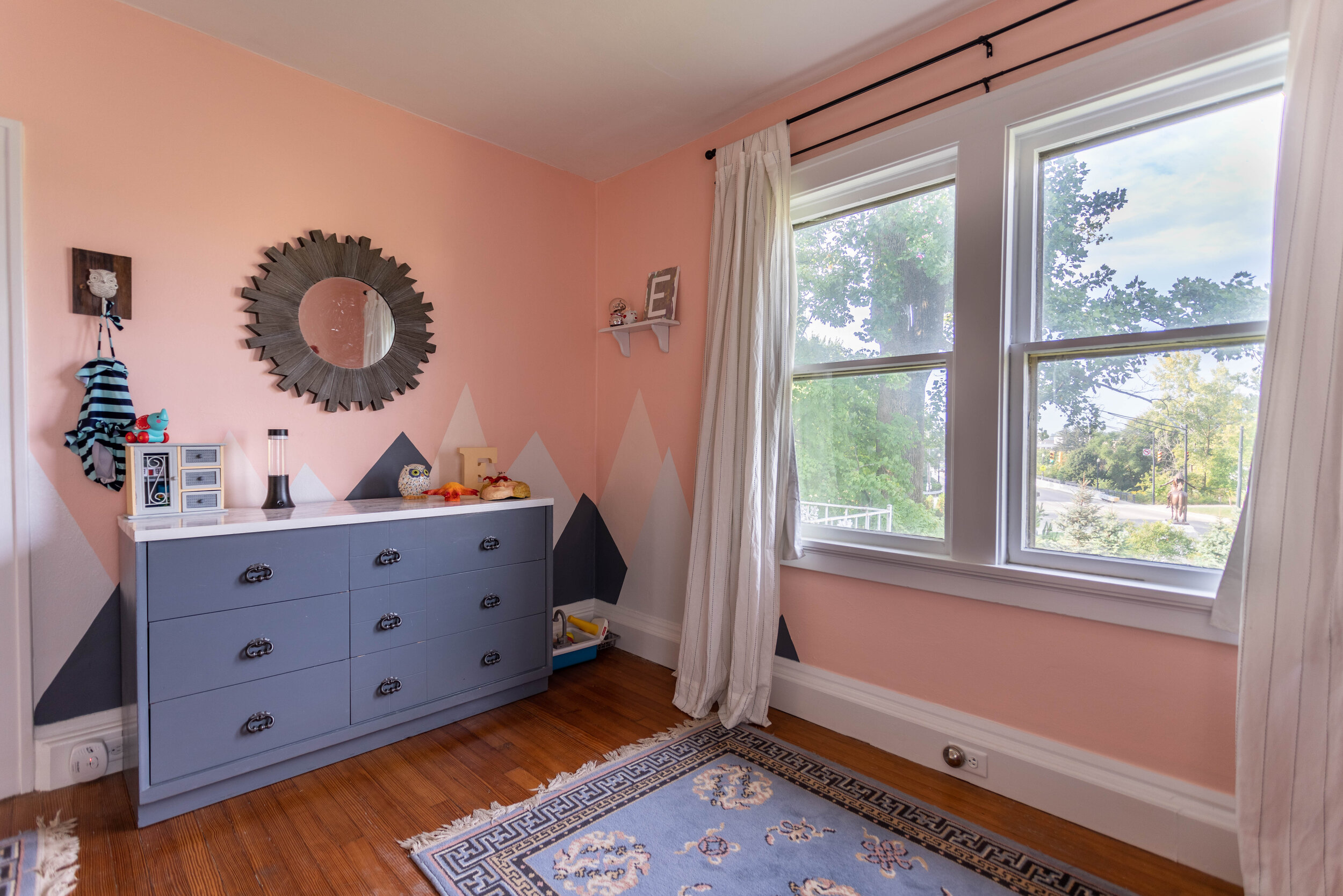
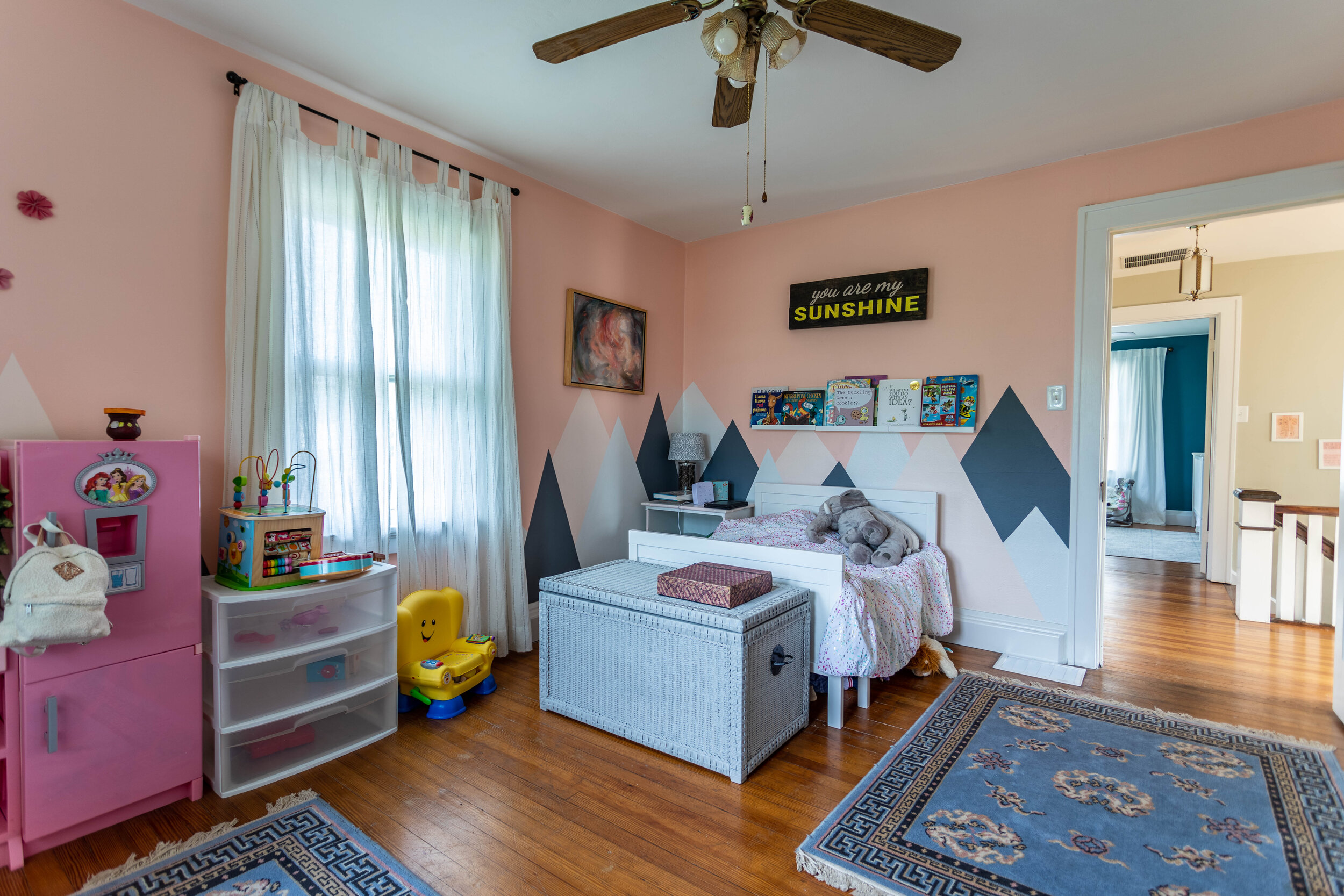
The area rugs were actually left by the previous owners and fit perfectly into the color scheme so I kept them. I wish I had a chance to switch out the light fixture before we moved, but whaddyagonnado?
The nursery
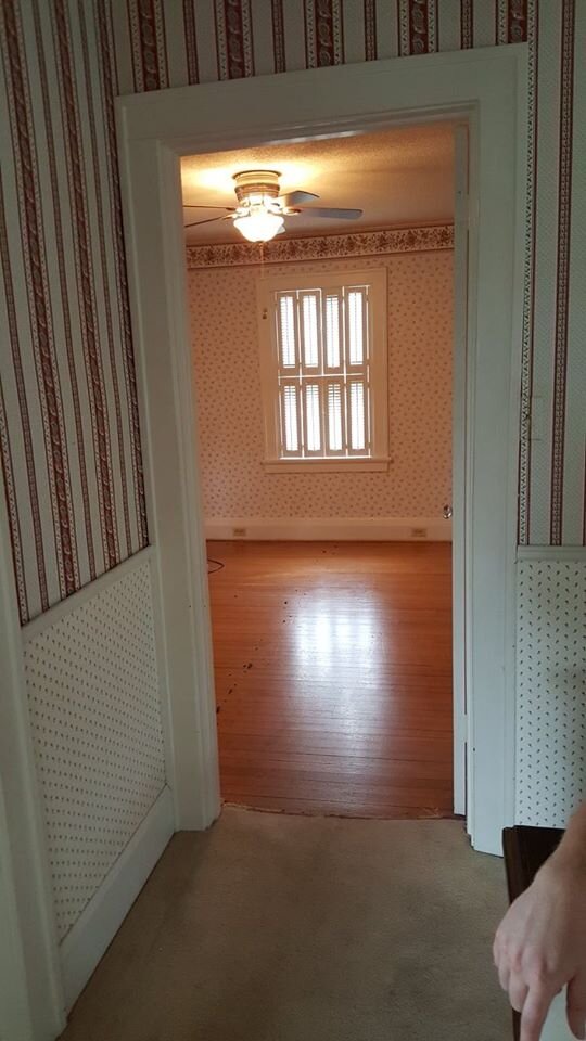
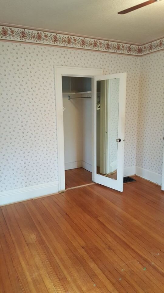
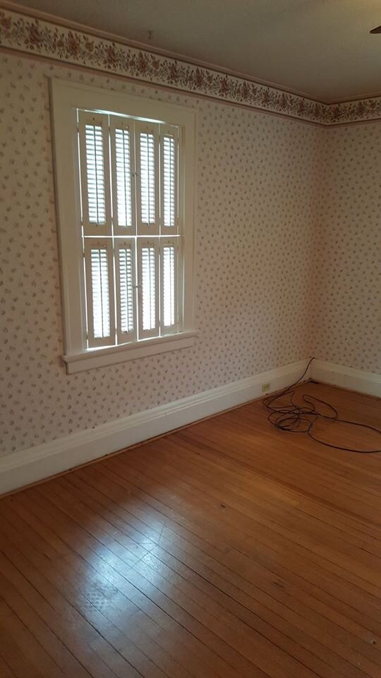
This is another room that we ripped the carpet out of as soon as we closed on the house, so in the pictures above it’s already gone. For being one of the smallest rooms in the house, this one took the most time to de-wallpaper. There were two stubborn layers of wallpaper on the walls and even some sort of wallpaper backing under the popcorn ceiling! By the end of it, my shoulders were lookin’ gooooood.

The color inspiration for this room stemmed from the fact that Lucius told me I was being a wimp using so many light colors in the house, which caused me to have an “I’ll show you!” moment. And I’m so glad I did because I loved the dark teal so much I want to paint it everywhere now.
There’s a lot of fear in using dark colors, and although I’m still choosy on where I use them, painting this room a dark color gave me a lot of confidence. It didn’t make the space feel small at all and brought a neat kind of drama to the space.
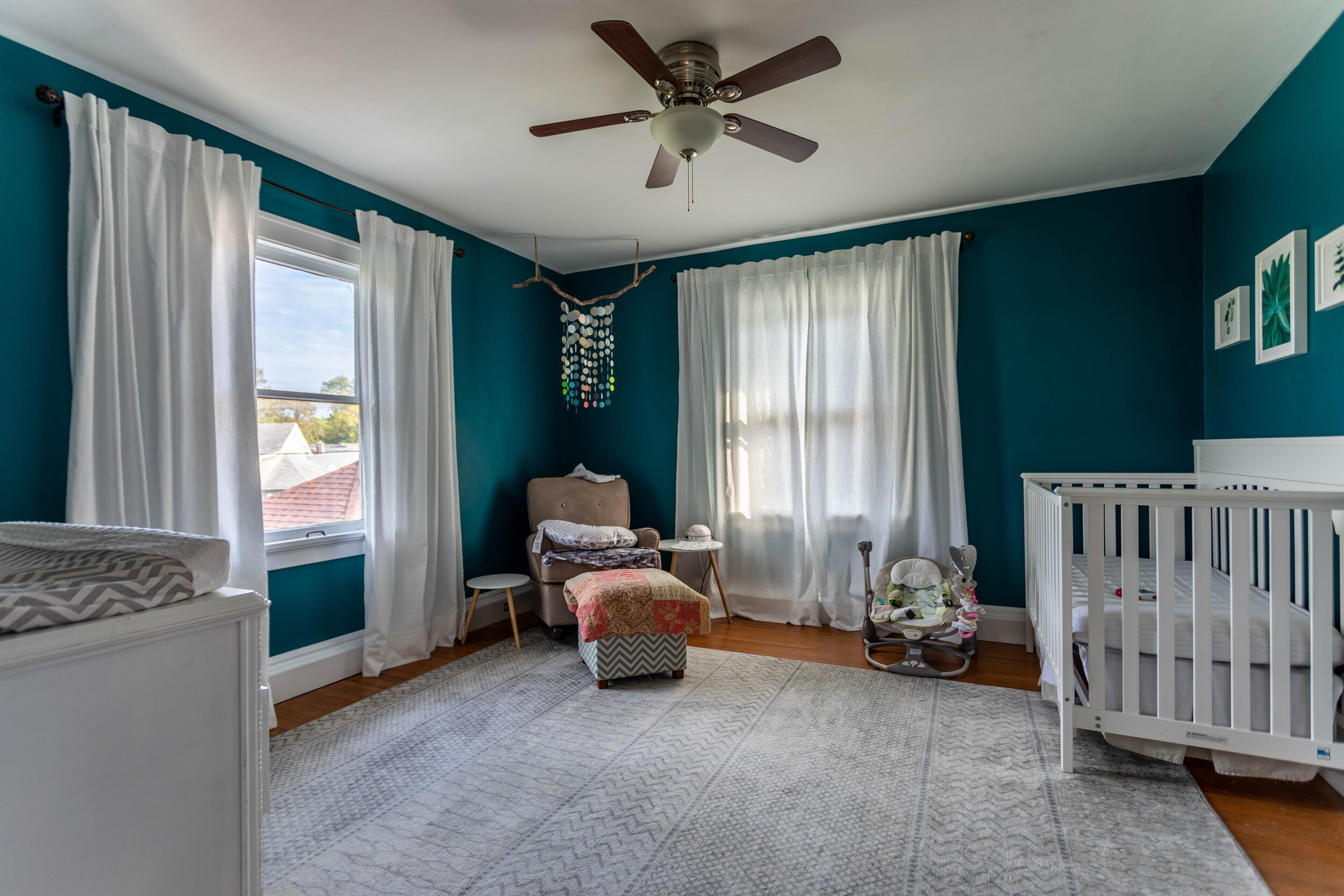
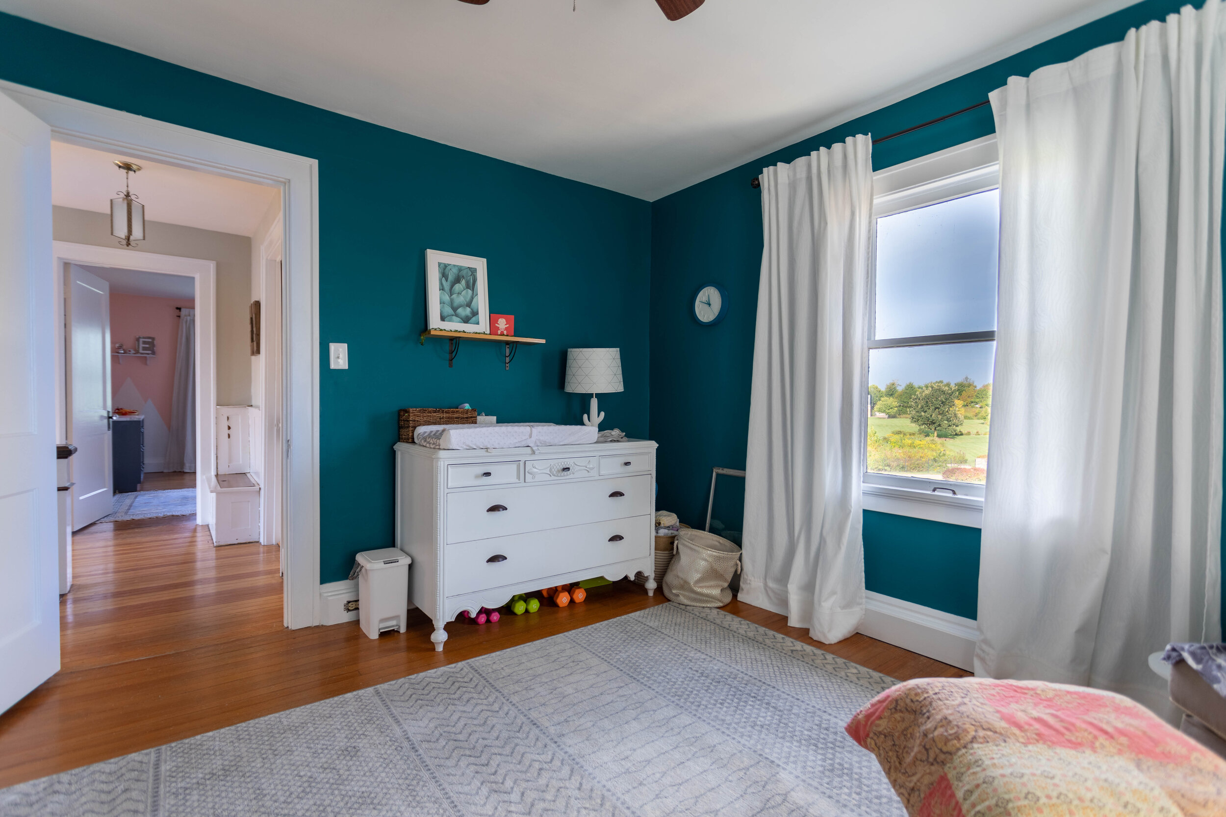
What you can’t see
Although I showed a majority of the house, it also has a full basement and a walk-up attic that I, unfortunately, don’t have pictures of.
When we moved in, the basement was finished but old, dark, and musty. It had dark paneling everywhere and forest green carpet. We ended up tearing everything out and it’s a good thing we did because we discovered that there was water gradually seeping in every time it rained. Interestingly, we also uncovered an old root cellar behind the paneling that we turned into an unfinished storage area. The previous owners had no idea it was there!
The attic is actually a pretty cool space with a lot of potential. Most of it is usable space, though unfinished, with enough headroom for even Lucius to walk around. It’s a walk-up attic that you access through a door in the upstairs hallway. I had visions of turning it into the ultimate kids’ playroom someday, but again, the whole moving thing got in the way.
Lastly, one major renovation you can’t really see is the HVAC. We ended up replacing the furnace and air conditioner and having the venting rerouted for efficiency. Spending money on those types of updates is always a little hard to swallow because you don’t get that visual gratification, but it was definitely worth it when temperatures dipped or soared.
A happy ending
Lucius and I had a blast renovating this house and we learned so much along the way. A super common reaction I heard when word got out that we were moving was along the lines of, “But you put so much work into it!”
Yes, we did put a ton of work into the house, but when we bought it, and for much of the time we lived there, we didn’t expect to stay long-term. We renovated it because it’s what we enjoy doing.
In the end, I definitely ended up falling in love with the house and it was hard to leave. But finding the silver lining: moving to a new house is giving us an opportunity to flex our reno muscles again on a new project and gave me the motivation to start this blog!
Related Posts With Before and After Pictures
Historic House Tour: Before and After

How to Paint an Ombre Wall in 5 Easy Steps
Unlike most people, I love painting. I love it so much I got my BFA in painting - true story! Not only do I love painting paintings, I also love painting rooms. I love the process of turning my mind off, getting in the zone, and drastically changing the look of a room in just a few hours with a gallon or two of paint. Let’s be honest - some of that might be the paint fumes talking.

Unlike most people, I love painting. I love it so much I got my BFA in painting - true story! Not only do I love painting paintings, I also love painting rooms. I love the process of turning my mind off, getting in the zone, and drastically changing the look of a room in just a few hours with a gallon or two of paint. Let’s be honest - some of that might be the paint fumes talking.
Although it’s not appropriate in all rooms, I love trying new things with paint. Whether it’s adding a simple accent wall that’s a couple shades darker than the main color or painting a room a bold, dark, moody teal to creating a stencil to make a design or (in my most recent room makeover) painting an ombre wall.


As I mentioned in this post, once I got sucked into the world of ombre walls on Pinterest, I knew I had to give it a try. Ombre walls are definitely trending right now, and as with any trend there’s always the fear that it’ll go out of style. You know another thing I love about paint? It’s SO easy to change if that happens! Plus, I figured if I could pull it off, it would look amazing. So off I went!

I was so excited to work on our daughter’s room and take it from the dark, light-sucking blue/gray we inherited to something bright and girly.
This is our daughter’s room from the listing photo. It worked for the teenage boy who resided here, but for a four-year-old girl? No way.
Picking a color
For some reason I couldn’t shake the idea of using pink and teal in this room, so then it was just a matter of picking the exact paint colors.
I love to hang out in the paint section at Lowe’s. I take so many paint chips that I might just single-handedly keep someone in a job constantly restocking them. I actually created our younger daughter’s mobile with paint chips I collected over time and for some reason felt the need to keep. (You can check out how I made the mobile HERE.)

This project was no different. I headed over to Lowe’s and grabbed a whole bunch of colors in the family I was thinking of and taped them to the wall.
Then I let them hang out there until I got a chance to paint a few weeks later. Sometimes my paint chips only stay up for a day or two, but typically it’s much longer. I’ve had paint swatches on our living room wall for a few months, with no real timeline of taking them down. I actually like to leave them up so I can see how they look in all different sorts of light.
In the end, for this project, I went with the lightest shade of blue on the first blue swatch on the left (Tame Teal by Sherwin Williams) and the middle shade of coral in the first swatch in the second row (Coral Mist by Valspar).

Usually, once I decide on a color, I get a sample container of paint and paint big swatches on several different walls. Then I let it hang out for at least a couple of days to once again see how it looks in different light. I can be very indecisive, and paint colors can change drastically during different times of day, so I feel like these steps help me to be sure in my decision and not waste money on paint.
A gallon of paint isn’t that expensive, but it can definitely add up if you keep repainting because you don’t like the color you chose! Those little sample paint containers are only around $5 each and are well worth it if it helps you commit to a color. I know I said I love painting, but that doesn’t mean I want to paint the same wall over and over again.
In this room, I actually felt confident in my paint choice just by looking at the paint chips and didn’t end up following my own rules. I just grabbed a couple of gallons and went to town!
The Process
I painted all the solid walls first since those were run-of-the-mill and straightforward. Then it was a matter of painting the ombre wall.
I researched a lot of different tutorials and used the steps that I thought would work best. The step-by-step process is below including what I wish I had done differently.
One quick note - if you want a smooth transition from color to color, you have to work FAST. This can be intimidating. I pictured myself breaking a nervous sweat trying not to mess up the wall, but honestly, once I got started I just went with the flow and I love how it turned out.
Start by making light marks on the wall where you want your colors to transition.
Grab 3 paint trays and 3 rollers. Pour one color into one paint tray and the other color into another. In the third paint tray, pour equal amounts of both colors.
Make sure you mix enough of the combined color so you don’t have to mix more partway through (working quickly is the name of the game here), and so you don’t risk your new mixture mismatching the original.
Then, paint your color of choice on the bottom and the top. Since the goal is to have a smooth transition from one color to the next, don’t worry about taping anything off or painting a harsh line where the colors change.
Apply the mixed paint to the middle section of your wall, blurring the dividing line of color.
Using the roller you applied your mixed paint with, lightly dip your roller into the color on the top of the wall and start to soften the transition. Now do the same with the color on the bottom of the wall.
The most difficult part of this project, that no tutorial seemed to talk about, was what to do with the edges of the wall. Since your roller can’t get all the way to the edge, I used a brush to blend as well as I could. If you’re not good at cutting-in edges, apply painter’s tape to the adjoining walls before you begin.
And there you have it - how to paint an ombre wall. If you’d like to paint one in your house, I say, give it a try! It’s only paint, after all. If it turns out poorly, you can always paint over it. Easy peasy. Below is a list of supplies to help you get your ombre on. Enjoy!

Supply list
3 paint trays
3 rollers
1 paint brush
painter’s tape
2 gallons of paint (1 of each color) - this should be more than enough for one wall and you’ll have a lot of extra, but a quart won’t quite be enough.